
Summer rolls around, the sun’s blazing, flowers are blooming like there’s no tomorrow, and you’re sitting at home staring at your sad, neutral walls, wondering why your space feels about as exciting as watching paint dry. Been there, done that. 🙂
Here’s the thing: summer is literally screaming at us to embrace color, yet so many of us play it safe with our interiors. Why? Because we’re terrified of commitment? Maybe. But after experimenting with my own spaces over the years, I’ve learned that colorful doesn’t have to mean chaotic. It can actually be incredibly sophisticated and mood-boosting.
So grab your iced coffee (or wine, no judgment), and let me walk you through 15 vibrant summer interior designs that’ll transform your home from “meh” to “YES, PLEASE!”
1. Coastal Turquoise and Coral Paradise
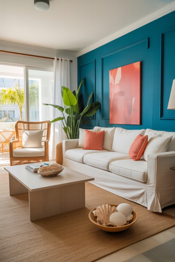
Picture this: Deep turquoise walls paired with coral accents that make you feel like you’re permanently on vacation. This combo is my personal favorite because it brings that beachy, carefree vibe without requiring you to live near actual water.
The key here is balance. Paint one accent wall in a rich turquoise—think tropical ocean, not swimming pool blue. Then layer in coral through:
- Throw pillows that pop against white or cream sofas
- Artwork featuring abstract coral patterns
- Table lamps with coral-colored bases
- Fresh flowers in terracotta pots
Pro tip: Add natural textures like rattan furniture or jute rugs to ground all that color. Otherwise, you risk looking like a beach-themed restaurant, and trust me, that’s not the vibe we’re going for.
2. Sunny Yellow Kitchen Revival
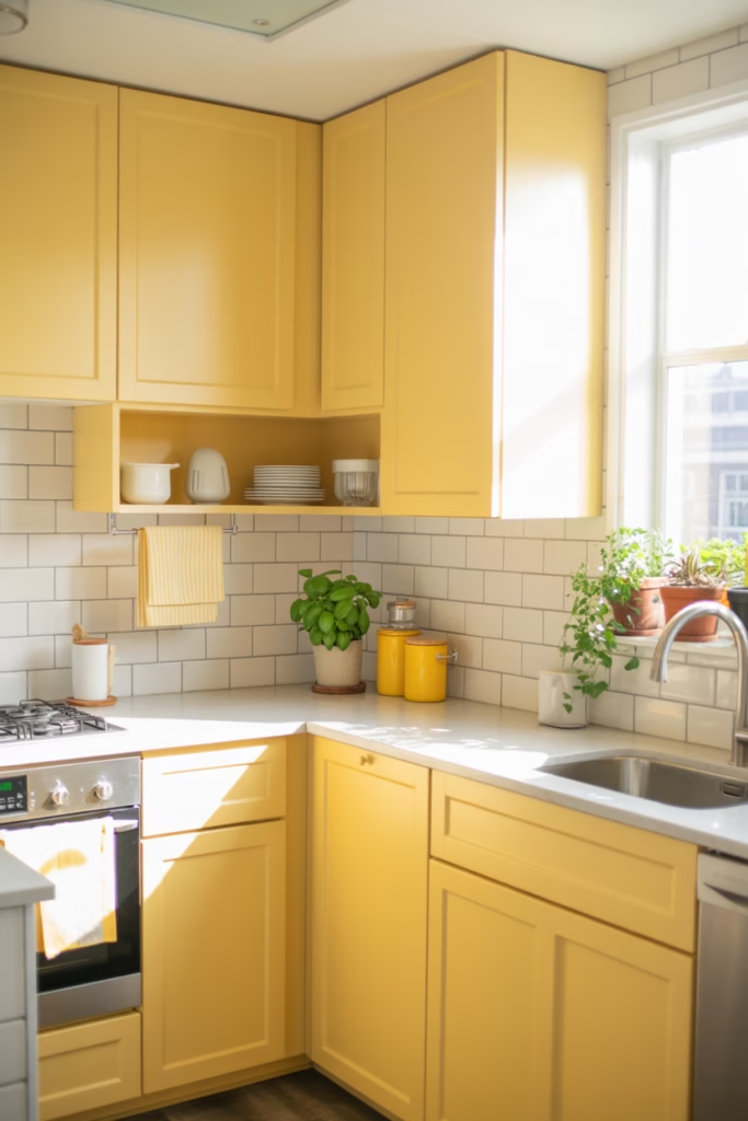
Ever walked into a yellow kitchen and felt instantly happier? Yeah, there’s actual science behind that. Yellow stimulates optimism and energy—perfect for the room where you’re trying to convince yourself that cooking is fun.
I painted my kitchen cabinets a soft butter yellow last summer, and honestly? Best decision ever. It transforms morning coffee from a necessity into an actual pleasant experience.
Here’s how to nail it:
- Choose softer yellows for larger surfaces (cabinets, walls)
- Use brighter yellows as accents (dish towels, canisters, bar stools)
- Pair with white countertops and stainless steel appliances to keep it modern
- Add green plants because yellow + green = chef’s kiss
The trick is avoiding that “primary crayon yellow” situation. Go for honey, buttercream, or pale lemon shades instead.
3. Lavender Dream Bedroom Sanctuary
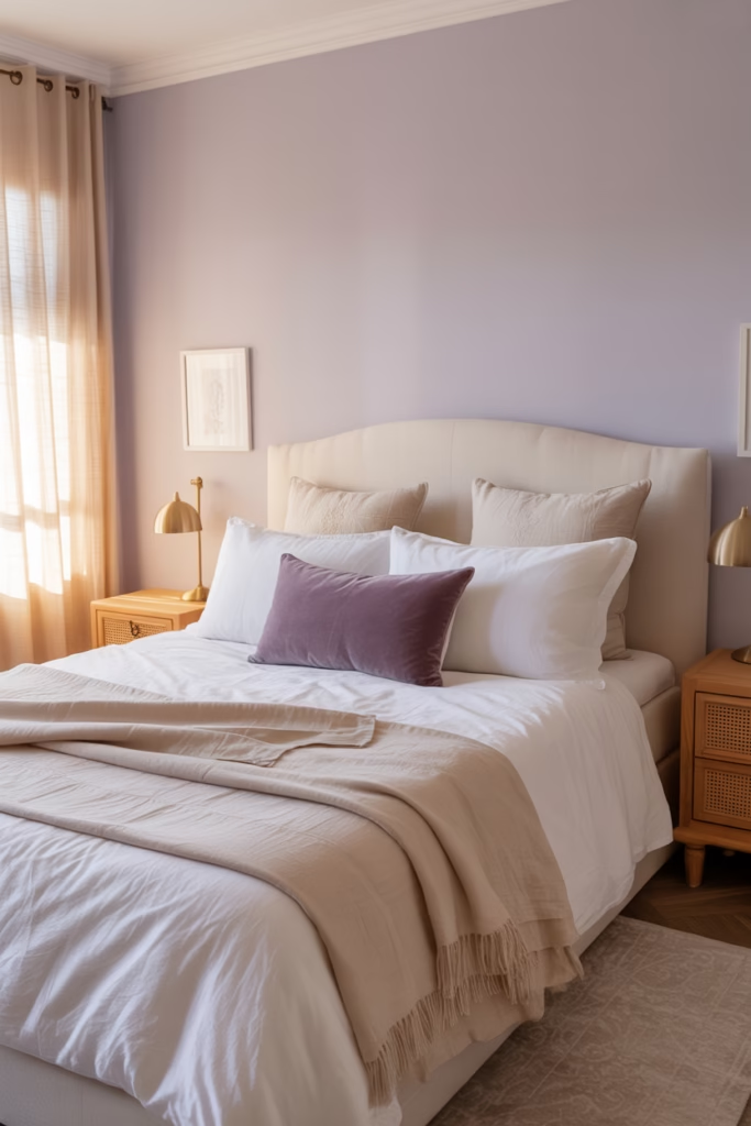
Okay, hear me out. Lavender isn’t just for your grandmother’s sachets anymore. When done right, a lavender bedroom is sophisticated, calming, and perfect for those hot summer nights when you need all the zen you can get.
I converted my guest room to a lavender sanctuary last year, and guests literally don’t want to leave. The color psychology here is real—lavender promotes relaxation and reduces stress.
Execute this look with:
- Pale lavender walls that catch natural light beautifully
- White or cream bedding to keep it fresh
- Deeper purple accents through velvet pillows or curtains
- Gold or brass fixtures for unexpected elegance
FYI, the secret sauce is layering different shades of purple rather than going monochrome. Otherwise, you risk looking like you raided a unicorn’s closet.
4. Energizing Orange Living Room
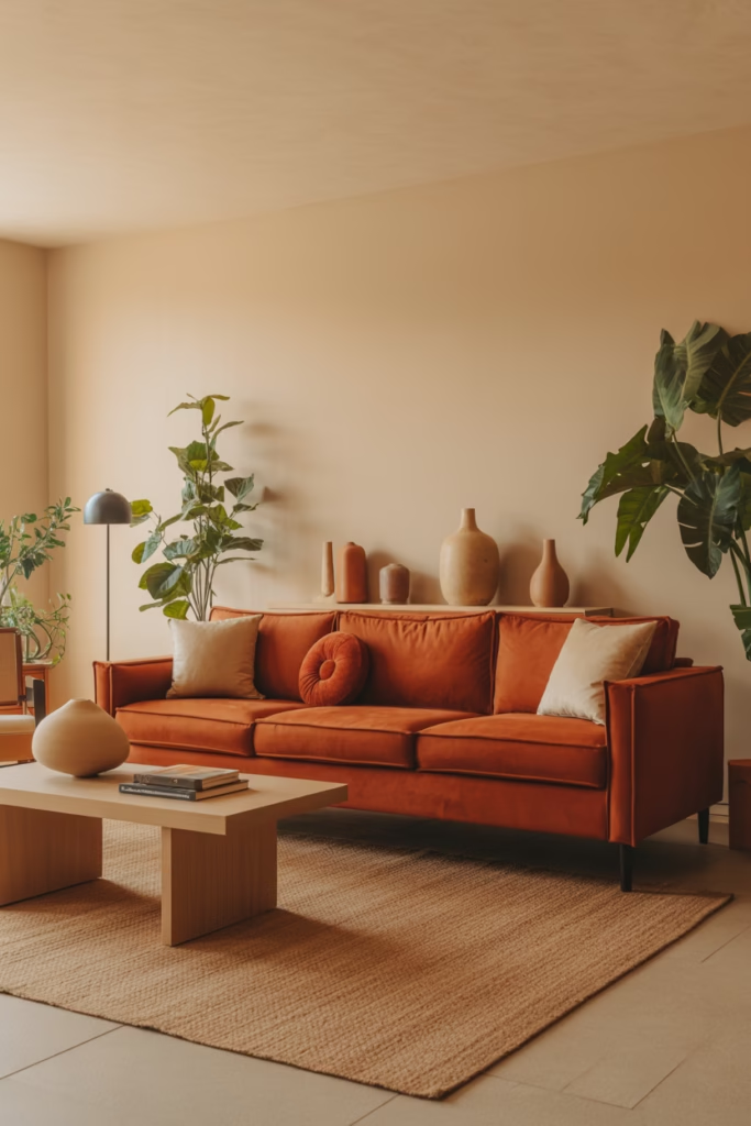
Controversial take incoming: Orange is criminally underrated in interior design. People avoid it like it’s going to assault their eyeballs, but hear me—burnt orange and terracotta are absolute game-changers for living spaces.
I was skeptical too until I added a burnt orange velvet sofa to my living room. Suddenly, the whole space felt warm, inviting, and distinctly summer without being aggressively bright.
Create this look by:
- Starting with one major orange piece (sofa, accent wall, or large rug)
- Balancing with neutrals like cream, tan, or gray
- Adding plants to cool down the warmth
- Incorporating natural wood tones
The beauty of orange is that it works with literally everything. Pair it with navy for sophistication, pink for playfulness, or green for an unexpected combo that somehow just works.
5. Mint Green and Blush Pink Romance
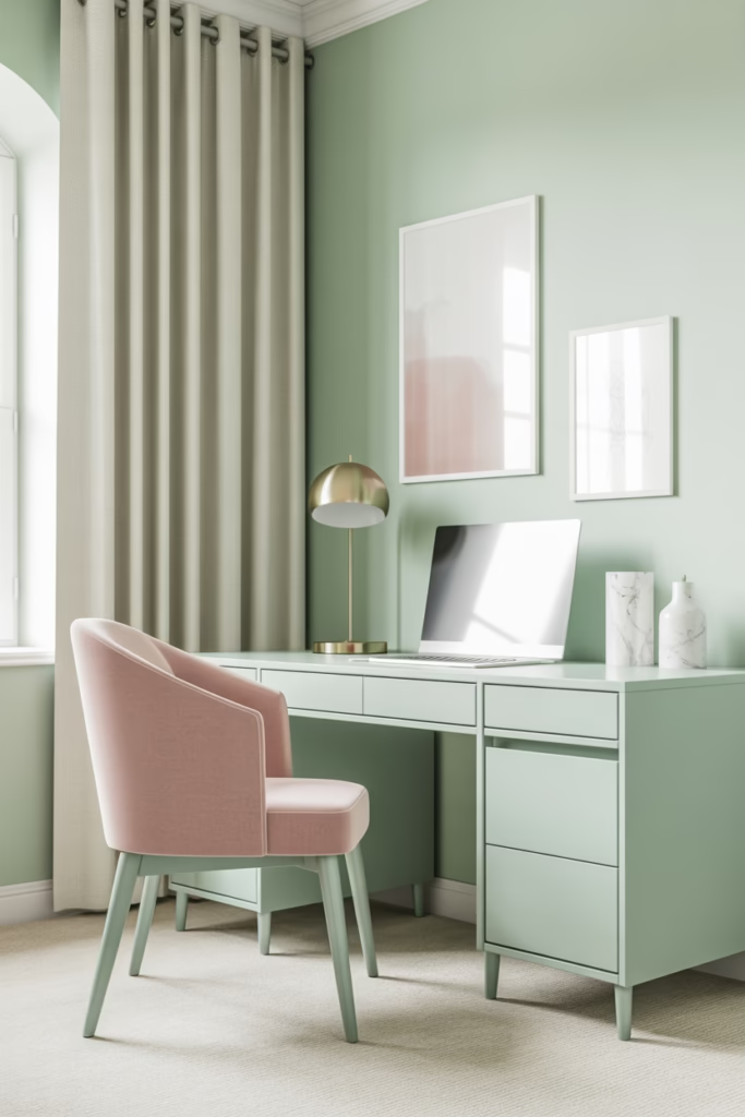
This combination screams summer garden party, and I’m absolutely here for it. It’s feminine without being childish, fresh without being cold, and incredibly versatile across different rooms.
I used this palette in my home office, and productivity honestly went up. Something about these colors makes work feel less like… work, you know?
Make it work:
- Paint walls a soft mint green
- Layer in blush through upholstery, curtains, or artwork
- Add gold accents for a grown-up touch
- Include marble or white elements to break up the color
The secret? Keep the shades pastel and dreamy rather than bright and intense. You want ice cream shop vibes, not candy store chaos.
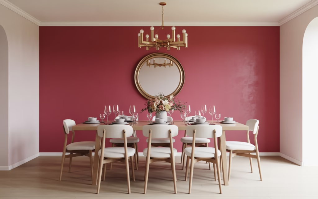
6. Bold Fuchsia Dining Room Drama
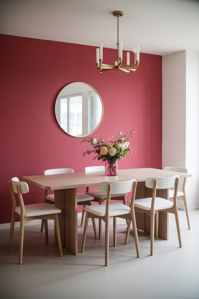
Want to make a statement? Go big or go home with a fuchsia dining room. This isn’t for the faint of heart, but if you’re ready to commit, the payoff is spectacular.
My friend did this in her dining space, and I swear, dinner parties became infinitely more interesting. There’s something about eating in a vibrant space that makes conversations flow easier. Maybe it’s the color psychology, or maybe people are just distracted by the walls. :/
Pull it off by:
- Painting one or two walls in deep fuchsia
- Keeping furniture neutral (white, black, or natural wood)
- Adding metallic accents like brass chandeliers or gold-framed mirrors
- Incorporating fresh flowers that complement the pink tones
Warning: This look requires confidence. If you’re second-guessing, try fuchsia as an accent wall first before committing fully.
7. Aqua Blue Bathroom Oasis
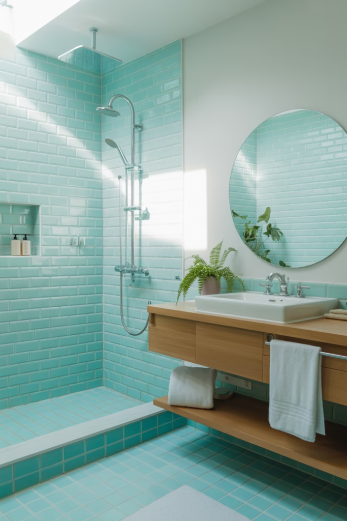
Bathrooms are tragically overlooked when it comes to colorful design. Most people default to white or gray because… safety? Boring. An aqua blue bathroom feels like a personal spa every single day.
I renovated my bathroom with aqua subway tiles, and taking a shower genuinely became a highlight of my day. It’s amazing what color can do for mundane routines.
Create this oasis with:
- Aqua tiles (subway, hexagon, or mosaic patterns)
- White fixtures to keep it fresh and clean
- Natural wood accents through shelving or vanity
- Plants that thrive in humidity
IMO, bathrooms should feel like escapes, not afterthoughts. Aqua delivers that vacation vibe without booking a flight.
8. Peacock Blue and Gold Glam
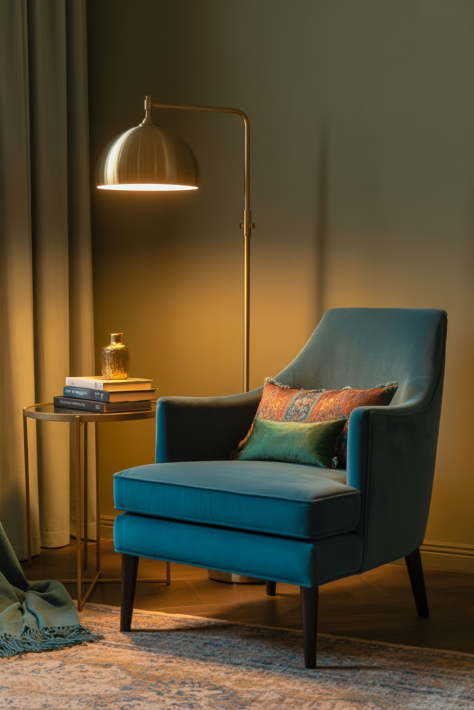
Nothing says “summer luxury” quite like peacock blue paired with gold accents. This combination is rich, dramatic, and perfect for spaces where you want to feel like royalty—even if you’re just binge-watching Netflix in your pajamas.
I incorporated this in my reading nook, and suddenly reading felt like an event rather than just something I do before bed.
Execute the look:
- Use peacock blue for upholstered furniture or accent walls
- Layer in gold through light fixtures, picture frames, and decorative objects
- Add jewel-toned accent colors like emerald or amethyst
- Include luxe fabrics like velvet or silk
The key is restraint. Too much gold, and you’re living in Trump Tower. Balance is everything.
9. Citrus-Inspired Kitchen Refresh
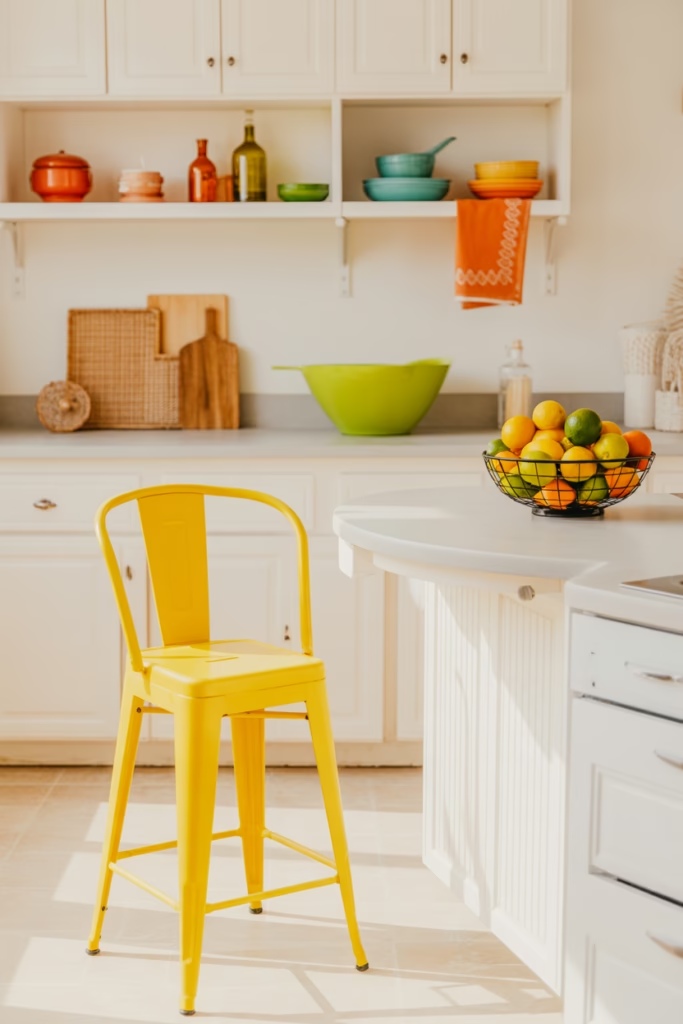
Why choose one citrus color when you can have them all? A kitchen featuring lemon yellow, lime green, and orange accents is cheerful, energizing, and perfectly summer.
This works especially well if you have white cabinets and want to add personality without permanent commitment. Switch out your accessories seasonally, and boom—instant refresh.
Bring in citrus through:
- Colorful bar stools in yellow, green, and orange
- Fruit-printed tea towels and pot holders
- Colorful dishware displayed on open shelving
- Fresh citrus in bowls as natural decor
The beauty here? You can dial the intensity up or down based on your mood. Feeling wild? More color. Need a break? Swap in neutrals temporarily.
10. Sage Green Serenity Space
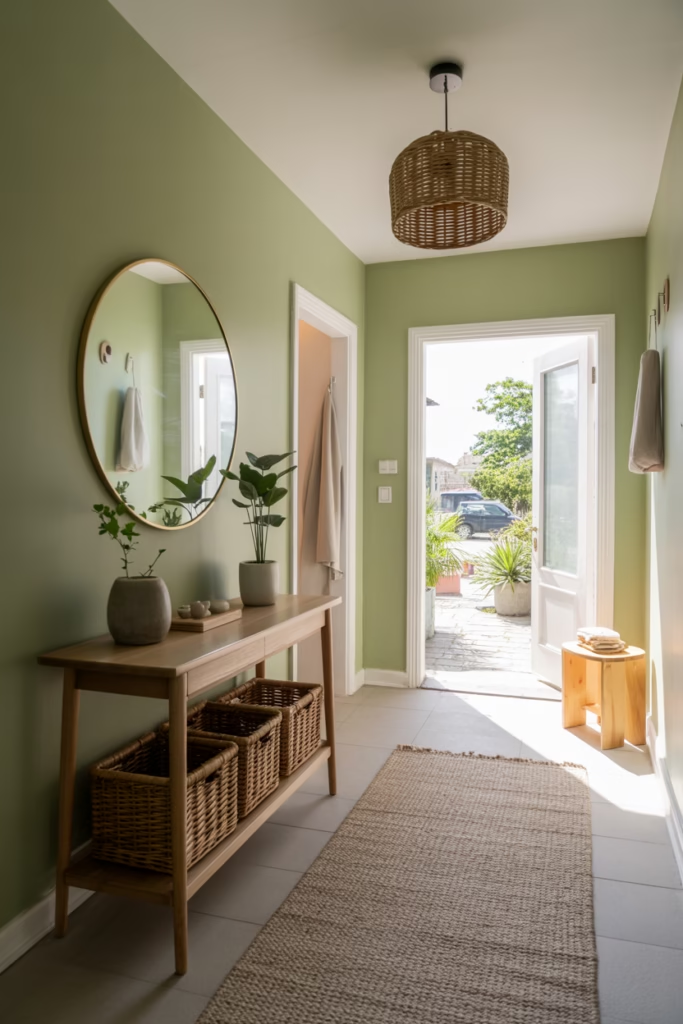
Sage green is having a major moment, and honestly, it deserves it. This color is calming, sophisticated, and works in literally any room. It’s basically the Switzerland of interior design colors—everyone agrees it’s good.
I painted my entryway sage green, and guests always compliment it. It sets a peaceful tone the moment people walk in.
Style it successfully:
- Use sage on walls as a neutral alternative to gray or beige
- Pair with natural materials like wood, linen, and rattan
- Add pops of terracotta or rust for warmth
- Include plenty of plants (because green + green = nature vibes)
This is a gateway color for people scared of bold choices. It’s colorful enough to be interesting but muted enough to feel safe.
11. Ruby Red Accent Wall Magic
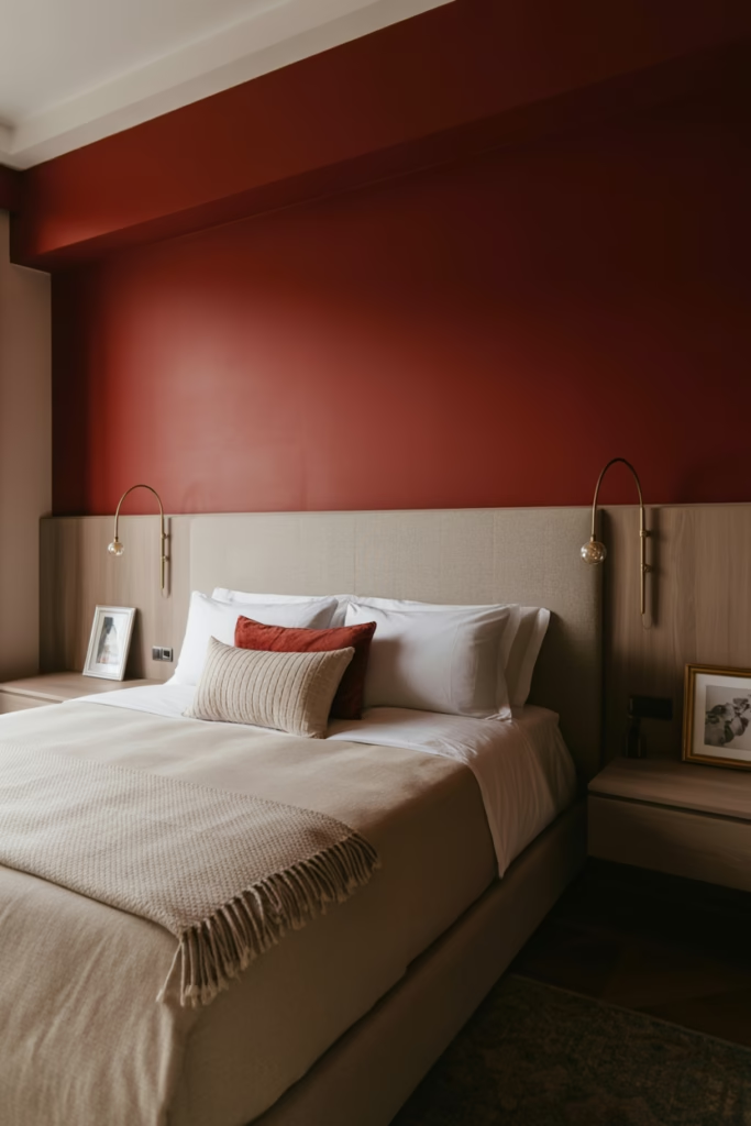
Red gets a bad rap in interiors because people think it’s aggressive or overwhelming. But a deep ruby red accent wall? Chef’s kiss. It’s sophisticated, cozy, and adds instant depth to any room.
I added a ruby accent wall in my bedroom, and it transformed the space from bland to boutique hotel. The trick is choosing the right shade—think wine, not fire truck.
Make ruby work:
- Limit it to one accent wall max
- Balance with neutral furniture and bedding
- Add gold or brass accents for elegance
- Layer in texture through curtains, rugs, or artwork
Red is warm and energizing, perfect for summer evenings when you want your space to feel intimate and inviting.
12. Tropical Green Living Wall
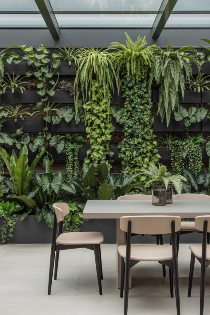
Want to go next-level with your colorful summer interior? Create a living plant wall that brings the outdoors in. This is technically “color through nature,” but the impact is stunning.
I installed a small living wall in my dining room, and it’s become the conversation piece at every gathering. Plus, hello, air purification.
Set up your green wall:
- Choose a sunny wall with good natural light
- Install a vertical planting system or use wall-mounted planters
- Select tropical plants like pothos, philodendrons, or ferns
- Add grow lights if natural light is limited
This approach works for commitment-phobes because you can change the look by swapping plants rather than repainting walls.
13. Cobalt Blue and White Mediterranean Escape
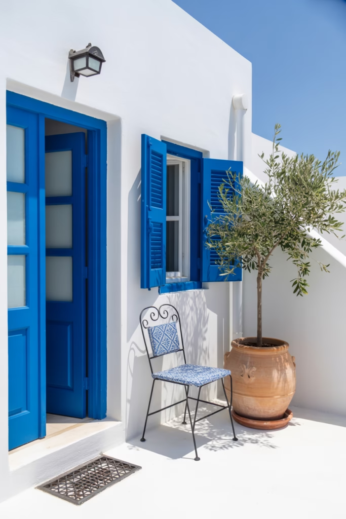
Ever dreamed of living in a Greek island villa? Same. While most of us can’t afford beachfront property in Santorini, we can steal that iconic cobalt blue and white aesthetic.
This combination is crisp, refreshing, and feels impossibly chic. I used it in my outdoor patio area, and suddenly my concrete slab felt like a European vacation spot.
Capture this look:
- Paint trim, doors, or shutters in vibrant cobalt blue
- Keep walls bright white for maximum contrast
- Add blue and white patterned tiles or textiles
- Include wrought iron furniture painted black or dark blue
The Mediterranean vibe is all about simplicity and bold contrast. Don’t overthink it—just embrace the drama.
14. Peachy Keen Bedroom Bliss
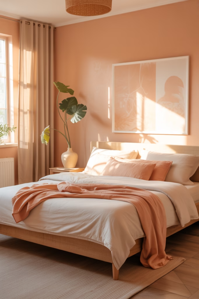
Peach is that girl of summer colors—warm, flattering, and effortlessly stylish. A peachy bedroom feels like waking up inside a sunset, which sounds cheesy, but I promise it’s amazing.
I switched to peach walls in my bedroom last spring, and my mood genuinely improved. There’s something about the color that feels optimistic and cozy simultaneously.
Create peachy perfection:
- Choose a soft peach for walls (not neon orange)
- Layer in white or cream bedding to keep it fresh
- Add warm wood tones through furniture
- Include plants and natural textures to balance the warmth
Peach works beautifully with both modern and traditional styles, making it surprisingly versatile.
15. Rainbow Maximalist Kids’ Space
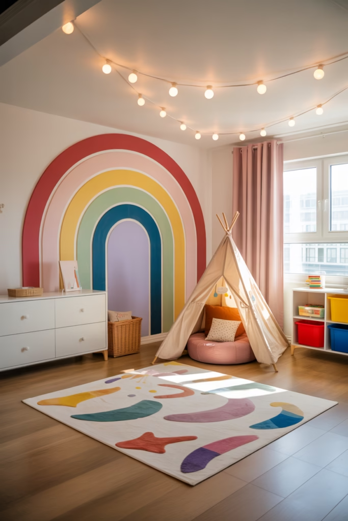
If you have kids (or just embrace your inner child), why not go full rainbow? A colorful, maximalist kids’ room celebrates summer’s playful energy and creates a space where creativity thrives.
My sister did this for her daughter’s room, and honestly, even as an adult, I’m jealous. It’s pure joy in room form.
Go rainbow by:
- Using multiple bright colors throughout the space
- Creating a feature wall with rainbow paint or removable wallpaper
- Adding colorful storage solutions that make cleanup easier
- Including fun elements like a teepee, bean bags, or string lights
The key to pulling off maximalism? Intentionality. Choose a unifying element—maybe all colors are pastels, or all furniture is white—to prevent chaos.
Wrapping It Up
Here’s what I’ve learned after years of experimenting with colorful interiors: life’s too short for boring spaces. Summer especially demands we embrace vibrancy, playfulness, and joy in our homes. Whether you go full rainbow maximalist or dip your toe in with a single accent wall, adding color transforms not just your space but your mood.
Start small if you’re nervous, a colorful throw pillow won’t kill you. Then gradually build confidence until you’re painting entire rooms ruby red without fear. Your home should make you happy, and sometimes happiness looks like a peacock blue velvet sofa or a sunny yellow kitchen.