
Picking the right living room color scheme sounds easy… right up until you stare at 47 paint swatches that all somehow look beige. If your living room feels flat, chaotic, or just a little “meh,” the color palette usually plays a huge part. The good news? You don’t need an interior design degree or a suspiciously expensive designer lamp to fix it.
I’ve spent way too much time looking at living room inspiration, testing paint colors, and realizing that the “perfect neutral” can turn weirdly pink at 4 p.m. So if you want a space that feels cozy, stylish, and actually pulled together, these beautiful living room color schemes will help you get there without the drama.
Why your living room color scheme matters
Your living room does a lot of heavy lifting. It hosts guests, collects throw blankets, survives snack spills, and somehow becomes the default room for everything. So yes, the colors you choose really matter.
A great color scheme can make a small room feel bigger, a dark room feel warmer, and a plain room feel intentional. The right combination creates mood, balance, and personality. Ever walked into a room and instantly felt calm? Color usually gets the credit.
What makes a color scheme work?
A living room color palette looks best when it includes a clear balance of tones. You don’t need 12 competing colors fighting for attention like they’re auditioning for a reality show.
Here’s what usually works well:
- A main color that sets the overall mood.
- A secondary color that supports the main shade.
- An accent color that adds contrast and interest.
- Texture and materials like wood, linen, metal, and velvet to keep the room from looking flat.
1. Warm white and beige
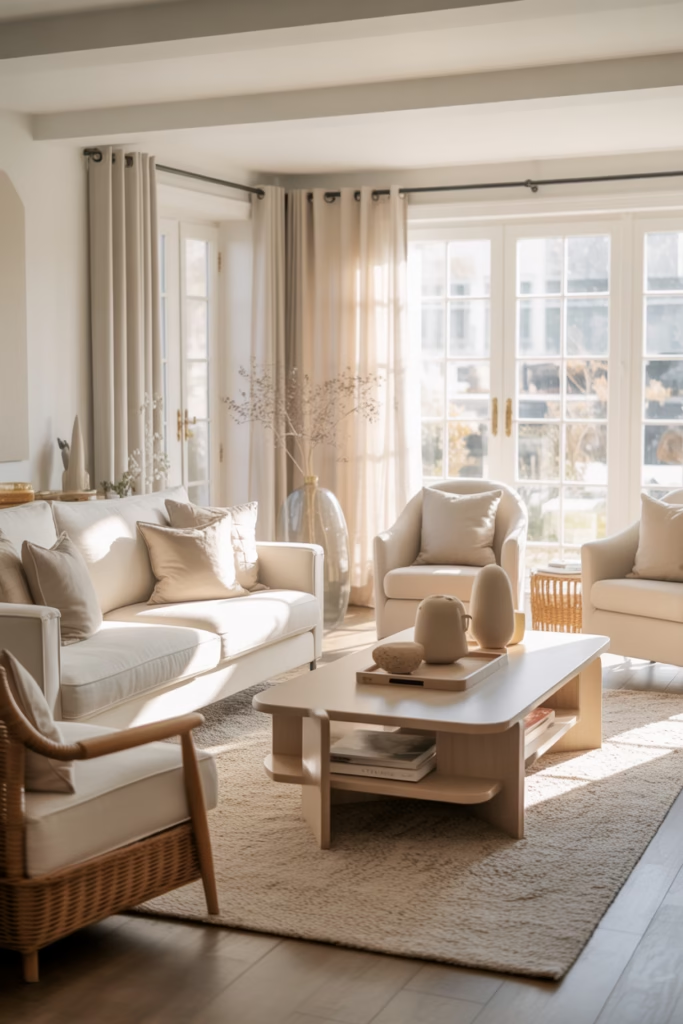
If you love a soft, cozy look, this combo never lets you down. Warm white and beige create an airy, relaxed living room that feels clean without feeling cold.
I like this palette because it works in almost any home style. It suits modern spaces, farmhouse rooms, minimalist interiors, and even traditional homes. That kind of flexibility deserves a little respect.
Why it works
Warm white brightens the room, while beige adds softness and warmth. Together, they create a layered neutral look that feels calm and welcoming.
Best accents for this palette
- Natural wood furniture.
- Cream or oatmeal textiles.
- Black metal details for contrast.
- Olive branches or greenery for freshness.
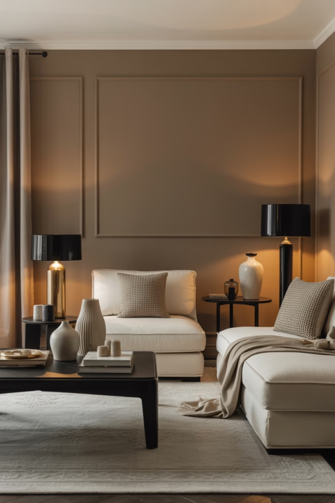
2. Greige and charcoal
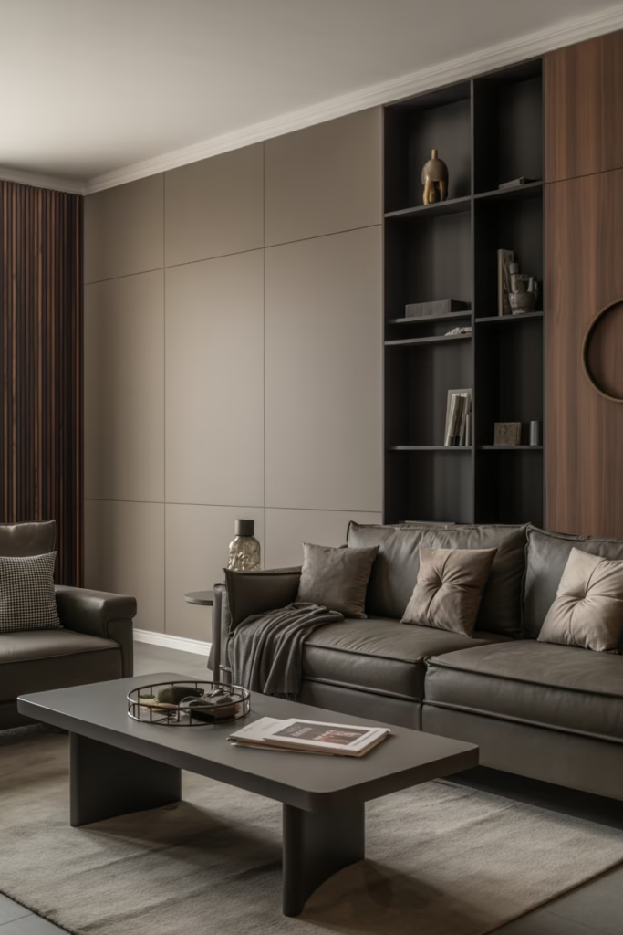
Can’t choose between gray and beige? Meet greige, the peacemaker of the paint world. Greige and charcoal create a sophisticated living room color scheme with depth and modern appeal.
This combo works especially well if you want neutrals that don’t feel boring. Charcoal grounds the room, while greige keeps it soft and livable. IMO, this is one of the easiest palettes to make look expensive.
Styling tips
Use greige on the walls, then bring in charcoal through a sofa, accent chairs, or a rug. Add warm wood or brass so the room doesn’t look too serious.
3. Sage green and ivory
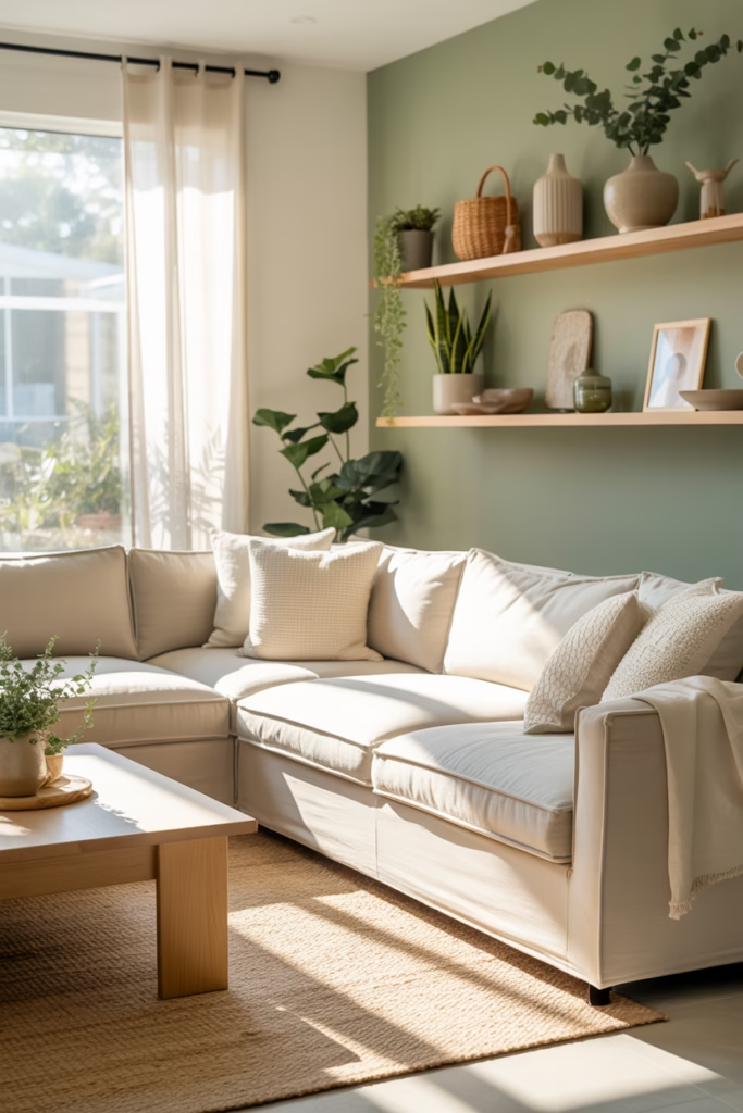
Sage green has been everywhere lately, and honestly, I get it. Sage green and ivory create a peaceful, fresh living room that feels natural and easy on the eyes.
This color scheme works beautifully if you want a soft earthy vibe. It feels grounded, but it still looks light and refined. Ever wanted your living room to feel like a calm exhale? This is that palette.
Best uses
- Sage walls with ivory curtains.
- An ivory sofa with sage pillows.
- Light wood furniture and woven textures.
- Soft gold accents for warmth.
4. Navy blue and crisp white
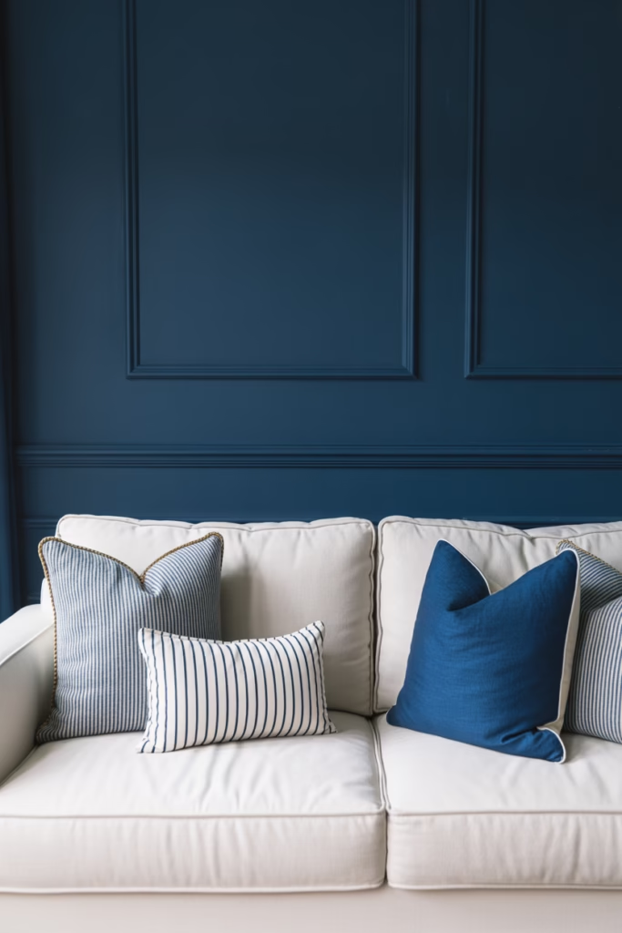
Want something classic with a little punch? Navy blue and crisp white create a timeless, polished living room that always looks sharp.
I love this scheme because navy adds drama without making the room feel gloomy. White keeps everything fresh and balanced. It’s basically the design version of looking effortlessly put together.
How to keep it cozy
Navy can feel a little formal if you overdo it. Bring in softer textures like boucle, linen, or a chunky knit throw to make the space feel inviting.
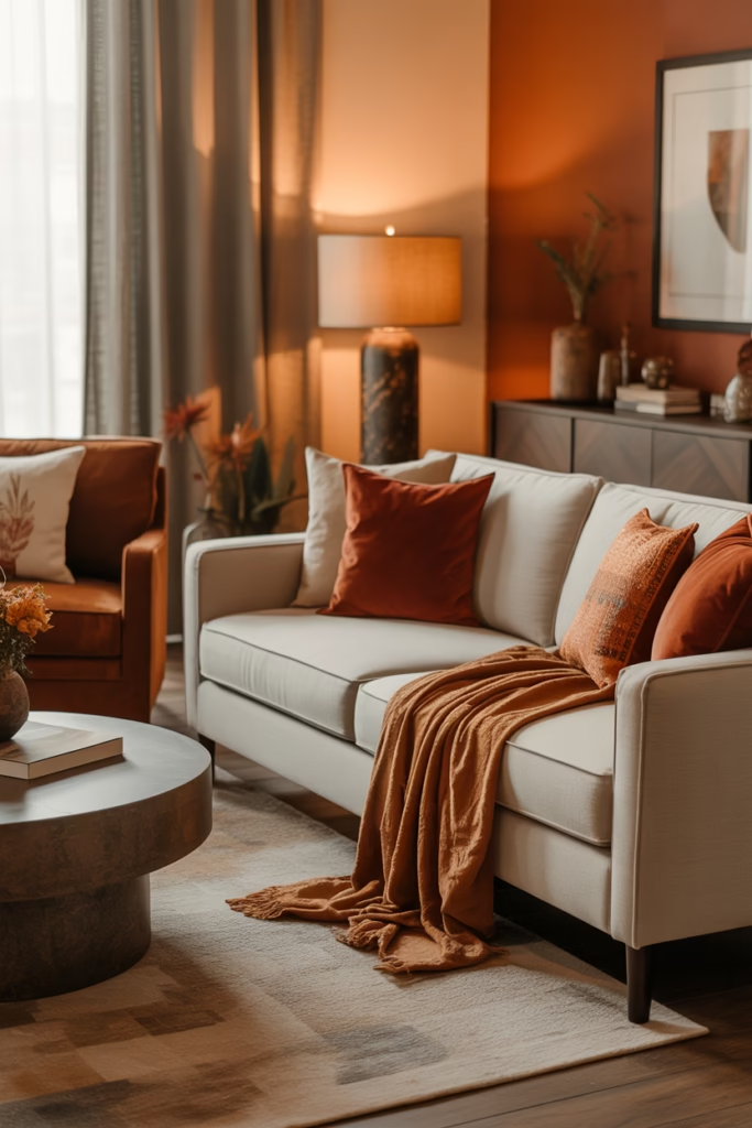
5. Terracotta and cream
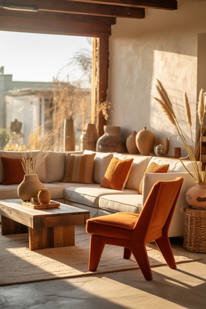
This palette feels warm, earthy, and slightly sun-soaked in the best way. Terracotta and cream create a cozy living room color scheme with personality and natural charm.
If your room gets good sunlight, this combination glows. Terracotta adds warmth and richness, while cream softens the look so it doesn’t feel heavy.
What pairs well with terracotta?
- Rattan or cane furniture.
- Rustic wood finishes.
- Clay pots and ceramics.
- Muted rust, camel, and dusty rose accents.
6. Dusty blue and soft gray
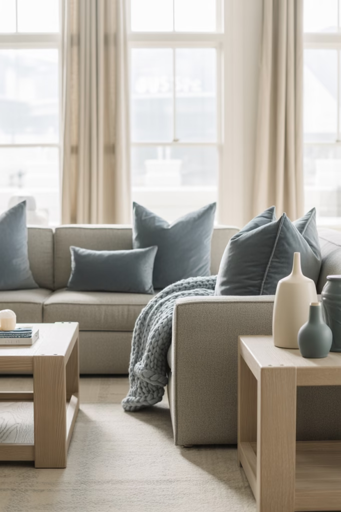
If you want a calm and slightly coastal feel without going full beach-house cliché, try this one. Dusty blue and soft gray create a serene living room that feels balanced and elegant.
This palette suits both small and large living rooms. The blue adds color without shouting, and the gray smooths everything out.
Where this palette shines
It works especially well in rooms with lots of natural light. Add white trim, pale wood, and layered textiles for a relaxed but polished finish.
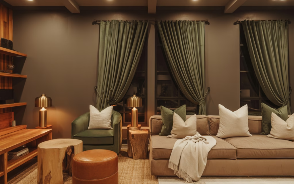
7. Olive green and warm taupe
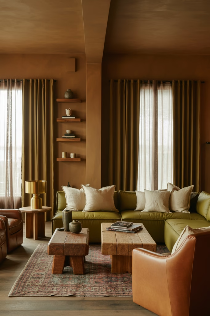
Olive green brings depth, while warm taupe keeps it grounded. Olive green and taupe create a rich, earthy living room color scheme that feels mature and inviting.
This palette has more depth than lighter neutrals, but it still feels approachable. I recommend it if you want something moodier without going too dark.
Easy ways to style it
- Paint the walls taupe and use olive in furniture or curtains.
- Add leather, wood, and black accents.
- Use cream textiles to lighten the palette.
8. Blush pink and camel
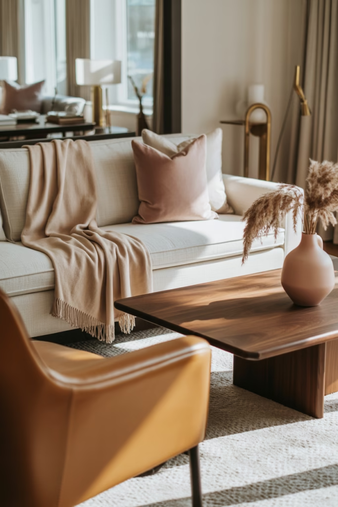
Before you roll your eyes, hear me out. Blush pink and camel can look incredibly chic in a living room when you use them in muted, grown-up tones.
This pairing feels warm, soft, and a little unexpected. It works best when blush acts as a supporting shade rather than the star of the whole room. Nobody wants their living room to look like a cupcake exploded in it :/
Keep it sophisticated
Choose dusty or clay-based pinks instead of sugary tones. Pair them with camel leather, walnut wood, and cream fabrics for a balanced look.
9. Black, white, and warm wood
This is for anyone who loves clean contrast. Black, white, and warm wood create a bold yet welcoming living room that feels modern without feeling sterile.
I’ve always liked this palette because it looks crisp, but the wood keeps it human. Without that warmth, black and white can feel a little too “fancy gallery where you can’t touch anything.”
Key design elements
- White walls for brightness.
- Black lighting, frames, or coffee tables for contrast.
- Warm oak or walnut to soften the look.
- Textures like linen, wool, and leather.
10. Moody teal and brass
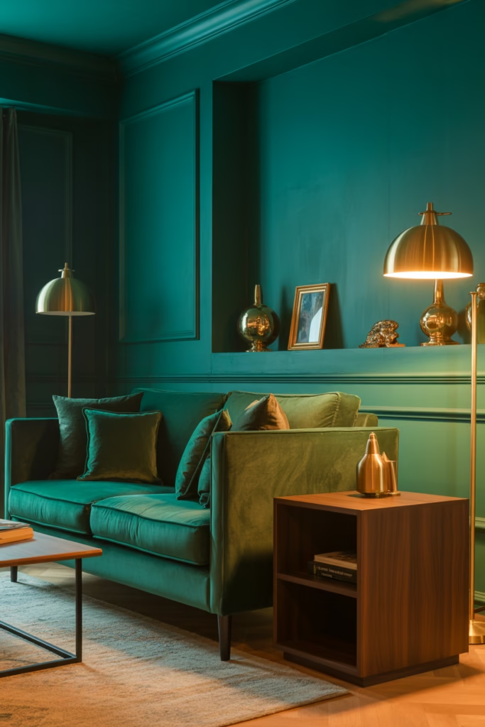
If you want your living room to feel dramatic in a good way, this one delivers. Moody teal and brass create a luxe living room color scheme full of depth and personality.
Teal adds richness without going as dark as forest green or navy. Brass brings warmth and a little glow, which helps the room feel polished instead of heavy.
Best for
This palette looks amazing in:
- Apartments with good lighting.
- Vintage-inspired homes.
- Eclectic spaces with layered decor.
- Cozy rooms with velvet or darker woods.
11. Soft yellow and warm white
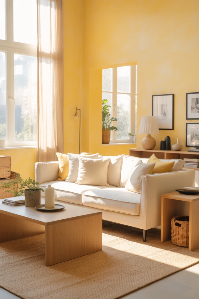
Soft yellow doesn’t get enough credit. Soft yellow and warm white create a cheerful, sunny living room that feels upbeat without being loud.
This scheme works really well if your room lacks natural light. The yellow bounces warmth around the space, and the warm white keeps it from looking too bright or childish.
How to use it well
Go for buttery or muted yellow shades, not neon lemon. Add natural textures, light wood, and a few black accents to keep the room grounded.
12. Taupe, cream, and black
Want a neutral palette with a little edge? Taupe, cream, and black create a refined living room color scheme that feels balanced, stylish, and easy to update over time.
This is one of my favorite options for people who want something elegant but practical. You can swap in seasonal decor, different textures, or accent colors without redoing the whole room. FYI, that flexibility matters when trends start acting dramatic.
Why this palette lasts
- Taupe adds warmth.
- Cream softens the room.
- Black creates structure and contrast.
- Almost any wood tone works with it.
13. Forest green and tan
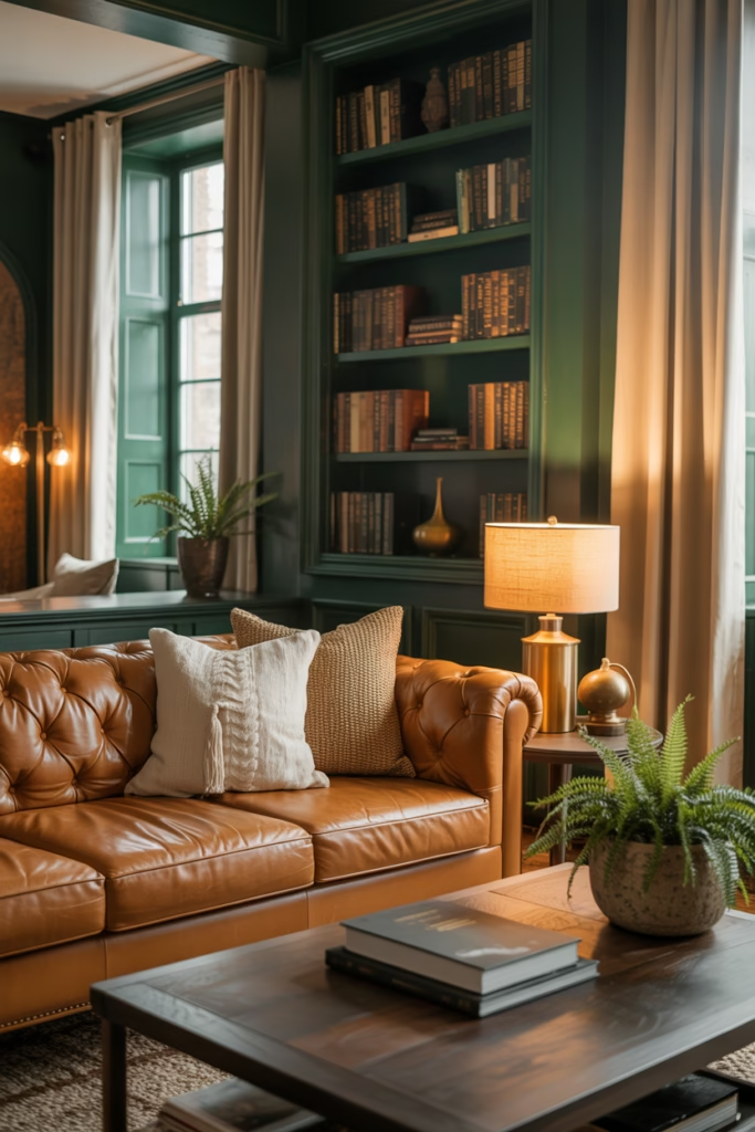
This palette feels grounded, cozy, and slightly dramatic. Forest green and tan create a nature-inspired living room that looks rich and inviting.
Forest green works beautifully on walls, built-ins, or a statement sofa. Tan leather or warm tan textiles prevent the room from feeling too dark.
Add these materials
- Brass or antique gold.
- Medium to dark wood.
- Cream curtains.
- Woven baskets and natural rugs.
14. Lavender gray and off-white
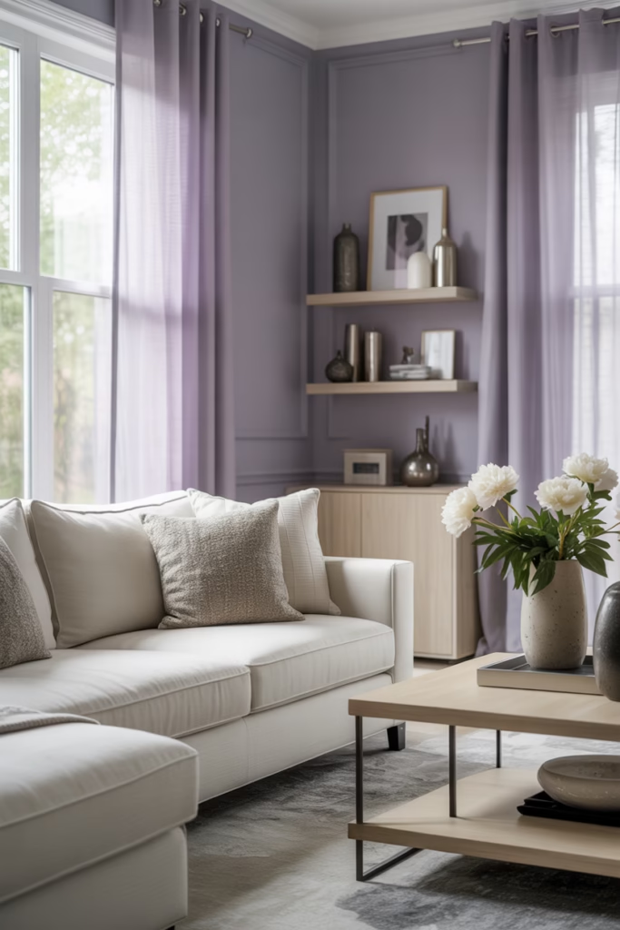
If you want something soft and a little unexpected, this combo deserves a look. Lavender gray and off-white create a gentle, elegant living room with a subtle designer feel.
This palette works best when the lavender reads more gray than purple. You want soft sophistication, not a tween bedroom flashback. Used well, it looks airy, fresh, and surprisingly modern.
Good accent choices
Silver, pale oak, soft charcoal, and dusty mauve all work nicely here. Keep the lines clean and the textiles light for the best result.
15. Rust, brown, and cream
This color scheme feels cozy, warm, and full of character. Rust, brown, and cream create a welcoming living room that feels especially perfect for fall-inspired interiors, though it works year-round too.
I love this palette in homes that need warmth and depth. Rust gives you that rich hit of color, brown anchors the room, and cream keeps everything from feeling too heavy.
Where to use each color
- Rust in pillows, art, or an accent chair.
- Brown in wood furniture or leather seating.
- Cream on walls, rugs, or larger upholstered pieces.
How to choose the best living room color scheme
With so many options, how do you pick the right one? Start with your room instead of chasing whatever color trend currently rules social media for five minutes.
Consider your lighting
Light changes everything. A color that looks dreamy online can look muddy or icy in real life.
Ask yourself:
- Does the room get a lot of natural light?
- Is the light warm or cool?
- Does the room face north, south, east, or west?
- Do you use the room mostly during the day or at night?
Think about the mood you want
Color creates emotion fast. Want the room to feel calm, bright, cozy, dramatic, or elegant? Your answer should guide your palette.
Here’s a quick cheat sheet:
- Calm: sage, dusty blue, soft gray, ivory.
- Cozy: terracotta, rust, taupe, cream.
- Elegant: navy, charcoal, greige, black.
- Fresh: white, soft yellow, pale green.
Work with your existing pieces
You don’t need to replace everything. Start with what you already own and actually like, then build around it.
Look at your:
- Sofa color.
- Flooring tone.
- Wood finishes.
- Curtains, rugs, and artwork.
A living room color scheme should support your existing furniture, not start a feud with it.
Tips for making any color scheme look better
Even the prettiest palette can fall flat if the room lacks contrast or texture. Color matters, but the way you layer it matters just as much.
Use the 60 – 30- 10 rule
This classic decorating rule keeps color balanced and easy to manage:
- 60%60% for the dominant color, usually walls or large furniture.
- 30%30% for the secondary color, often textiles or curtains.
- 10%10% for accent color in decor, art, or accessories.
This method helps the room feel intentional instead of random. Ever seen a room where every item screams for attention? Exactly.
Layer textures
If you stick to similar tones, texture keeps the room from looking flat.
Mix:
- Linen.
- Velvet.
- Leather.
- Wood.
- Woven baskets.
- Metal accents.
Add contrast
Every room needs a little contrast. Even soft neutral spaces benefit from a darker element or sharper line.
You can add contrast with:
- Black frames.
- Dark wood.
- Bold lighting.
- Deep accent pillows.
- Patterned rugs.
Common mistakes to avoid
A few wrong moves can throw off even a beautiful living room palette. The good news? Most of them are easy to fix.
Choosing paint first
I know, paint feels like the obvious starting point. But furniture, rugs, and textiles usually offer fewer choices than paint, so choose those first if you can.
Ignoring undertones
This one gets people all the time. Beige can look pink, gray can look blue, and white can suddenly look yellow depending on the light and nearby finishes. Fun, right?
Using too many statement colors
One or two bold colors can look amazing. Five bold colors usually look confused. Pick a direction and let the room breathe.
Forgetting about black or wood
Rooms often need something grounding. Black adds structure, and wood adds warmth. Without one of them, some color schemes can feel a little unfinished.
Final thoughts on beautiful living room color schemes
The best living room color schemes don’t just look pretty in photos. They make your space feel good to live in every single day. That means the “right” palette depends on your light, your furniture, your style, and the mood you want when you walk into the room.
If you want a safe choice, go with warm white and beige, sage and ivory, or taupe and cream. If you want more drama, try navy and white, moody teal and brass, or forest green and tan. And if you want something cozy and full of warmth, terracotta and cream or rust, brown, and cream can work beautifully.
At the end of the day, your living room should feel like you. Pick a color scheme that makes you want to sink into the sofa, grab a coffee, and stay awhile. Honestly, that’s the whole point, isn’t it?