
Your bedroom shouldn’t feel like a storage unit with a mattress in it. It should feel like a place where your shoulders drop the second you walk in like your room whispers, “Hey, you survived the day, now go be a cozy little burrito.” That’s exactly why I keep coming back to earthy color palettes. They don’t just look pretty; they make a space feel grounded, warm, and actually relaxing.
I started messing with earthy tones when I got tired of bright whites that looked “clean” but somehow made my room feel like a dentist’s waiting area at night. Earthy shades think terracotta, sage, clay, sand, mushroom brown fix that fast. They add warmth without screaming for attention, and they play nicely with wood, linen, rattan, and all those textures you already love scrolling past at 1 a.m. on Pinterest.
And here’s the best part: you don’t need a full renovation or a designer budget to pull off 15 stunning earthy color palette bedroom ideas. You just need a solid color direction, a few smart texture choices, and a little bravery with paint samples.
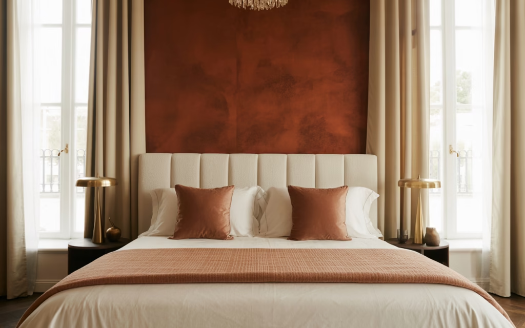
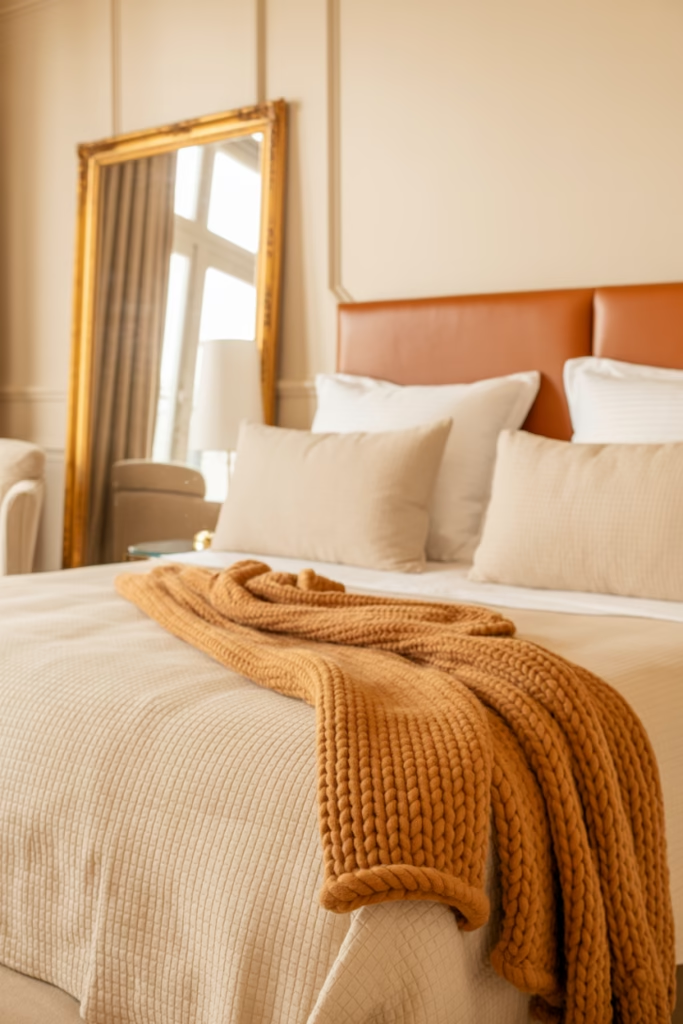
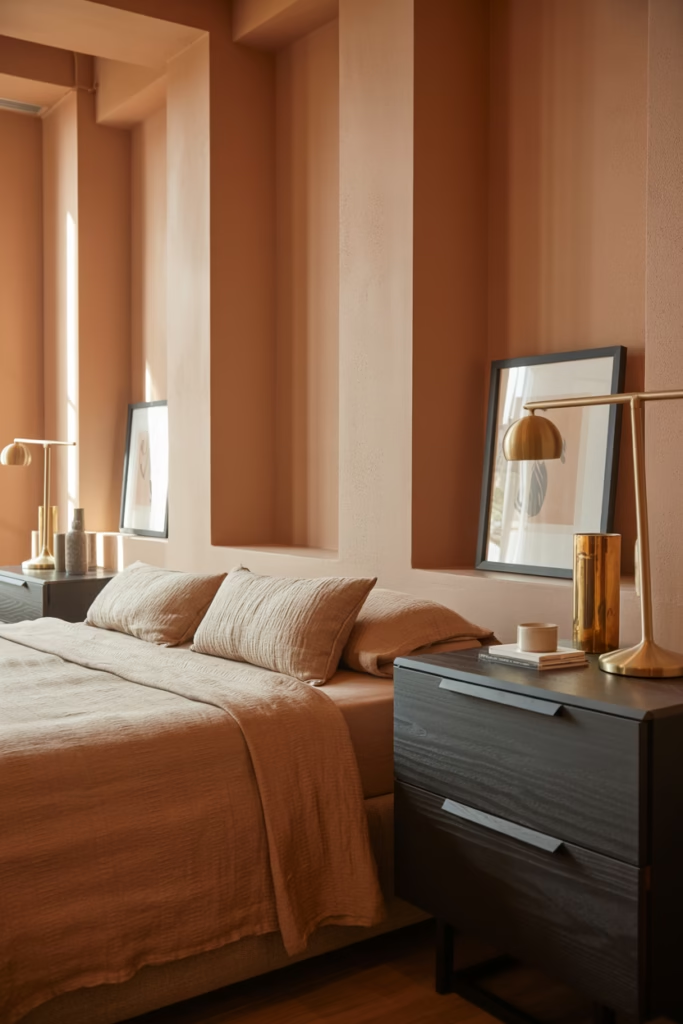
Terracotta Walls with Natural Wood Accents
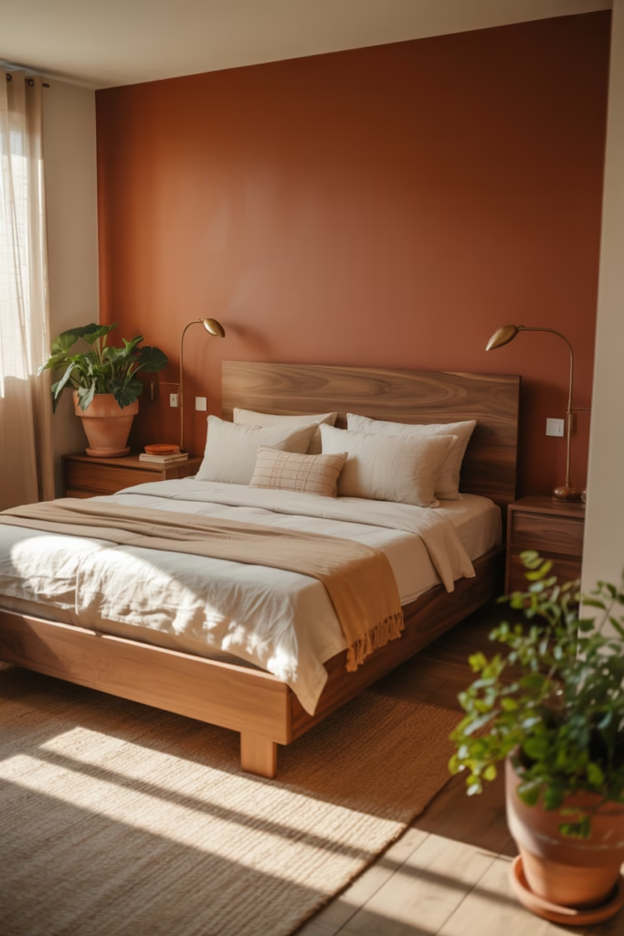
Here’s where I always tell people to start if they’re new to earthy palettes. Terracotta isn’t just a color—it’s an entire mood. When you paint your bedroom walls in a warm terracotta shade, you’re basically wrapping yourself in sunset vibes every single night.
The magic happens when you pair it with natural wood furniture. I’m talking about that gorgeous walnut dresser or the reclaimed wood bed frame you’ve been eyeing. The contrast between the warm orange-brown walls and the rich wood grain creates depth that photographs beautifully and feels even better in person.
Pro tip: Don’t go full terracotta on all four walls unless you want your room to feel like a cozy cave (which, honestly, might be exactly what you’re going for). Try an accent wall behind your bed instead.
- Use matte finish paint to avoid harsh reflections
- Pair with cream or off-white bedding to balance the warmth
- Add brass or copper fixtures for extra earthiness
- Include plenty of greenery—terracotta and plants are basically best friends
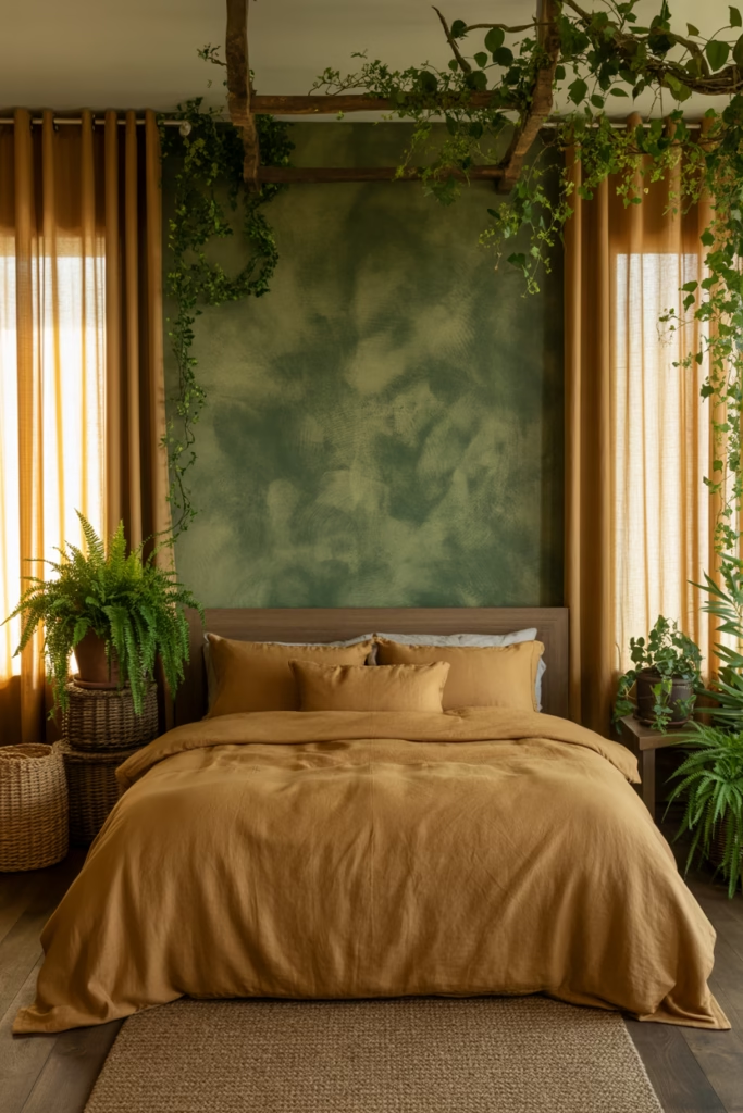
Sage Green Haven with Linen Textures
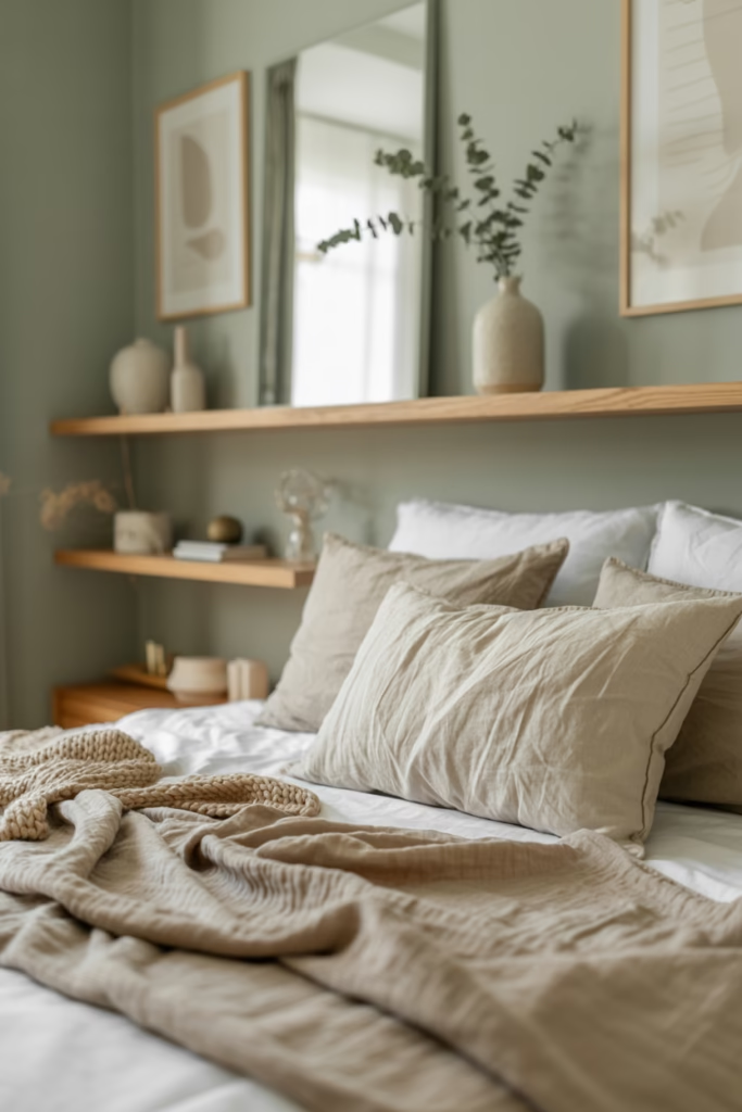
Sage green is having a major moment, and I’m not mad about it. This isn’t your grandma’s mint green (no offense to grandmas everywhere). Modern sage has this sophisticated, muted quality that feels both calming and intentional.
I’ve used sage in my own bedroom, and the difference it made to my sleep quality was wild. Something about that connection to nature just tells your brain it’s time to chill out. Layer it with linen bedding in cream or beige, and you’ve got yourself a boutique hotel situation right at home.
The texture is crucial here, though. Flat sage walls without texture can look a bit sterile, so you need to bring in those tactile elements. Think chunky knit throws, macramé wall hangings, or even a jute rug.
Adding Depth to Your Sage Space
- Paint your ceiling in a lighter sage for a cohesive look
- Use eucalyptus stems in simple glass vases
- Install wooden floating shelves in light oak
- Choose curtains in natural linen—the wrinkles add character, FYI
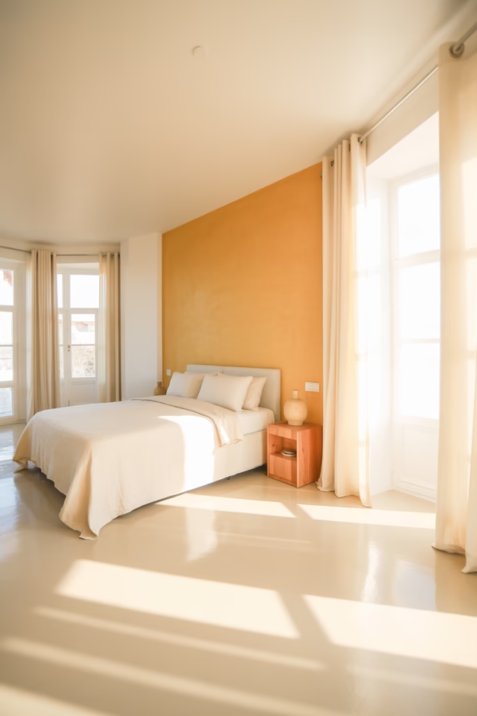
Clay and Cream Minimalist Retreat
Ever wondered why minimalist bedrooms always look so expensive? It’s because they nail the color balance, and clay with cream is the ultimate cheat code for this aesthetic.
Clay tones sit somewhere between terracotta and brown—think of wet pottery before it’s fired. When you combine this with cream walls or bedding, you get this incredibly soothing contrast that doesn’t scream for attention but definitely gets noticed.
I’m a huge fan of this combo for people who want earthy but don’t want their room to feel too rustic or bohemian. It’s clean, it’s modern, and it still has that grounded quality that makes you actually want to spend time in your bedroom.
- Keep furniture to a minimum—quality over quantity
- Use clay-colored pottery as decor pieces
- Stick to one or two wood tones throughout
- Add a single large-scale art piece in complementary earthy tones
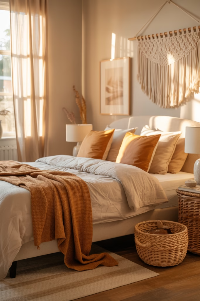
Warm Taupe with Gold Undertones
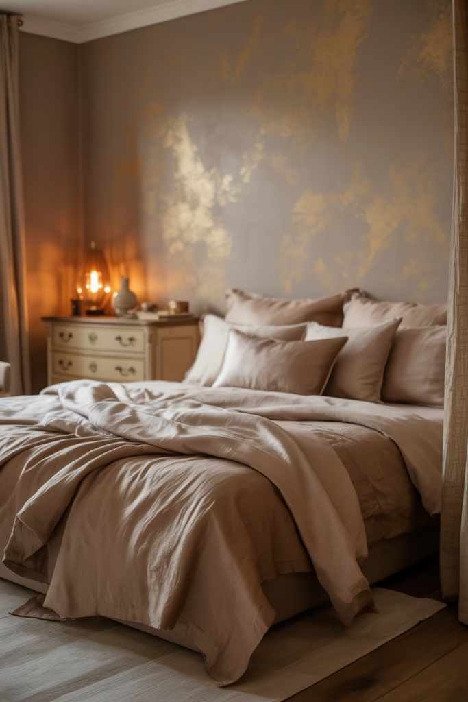
Taupe gets a bad rap for being boring, but that’s because people are doing it wrong. When you choose a warm taupe with gold or yellow undertones, you’re creating a foundation that works with literally everything in the earthy spectrum.
This is your chameleon color. In morning light, it looks almost beige. At sunset, those golden undertones come alive. And at night with warm lighting? Chef’s kiss. It’s like having three different bedroom moods without changing a thing.
The best part? You can go bold with your accent colors because taupe is such a neutral player. Want burnt orange pillows? Go for it. Deep forest green throw? Absolutely.
Making Taupe Work Harder
- Layer different taupe shades for depth (walls, bedding, curtains)
- Use gold or brass hardware on furniture
- Add warm white string lights for ambiance
- Include natural fiber baskets for storage
Desert Sand and Dusty Rose Combination
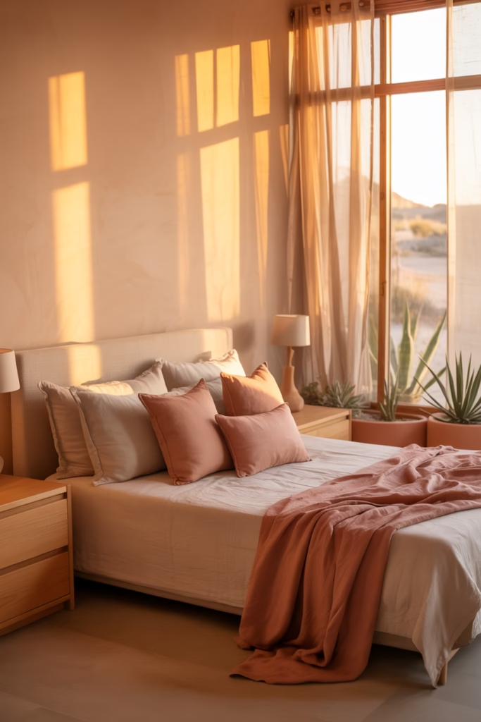
Okay, hear me out on this one. I know dusty rose sounds like it might lean too feminine or trendy, but when you pair it with desert sand tones, something magical happens. It becomes this sophisticated, gender-neutral palette that feels both modern and timeless.
Think of a desert at sunset—those peachy-pink skies against sandy dunes. That’s exactly what you’re recreating in your bedroom, and it’s absolutely stunning. I’ve seen this combination work in everything from studio apartments to sprawling master suites.
The trick is getting the ratio right. Too much dusty rose and you’re veering into blush overload territory. Too much sand and it looks washed out. Aim for about 70% sand tones and 30% dusty rose accents.
- Use dusty rose in throw pillows and small decor items
- Paint one accent wall in a soft rose shade
- Choose sand-colored bedding as your base
- Add terra cotta pots with trailing plants
Olive Green with Charcoal Gray Sophistication
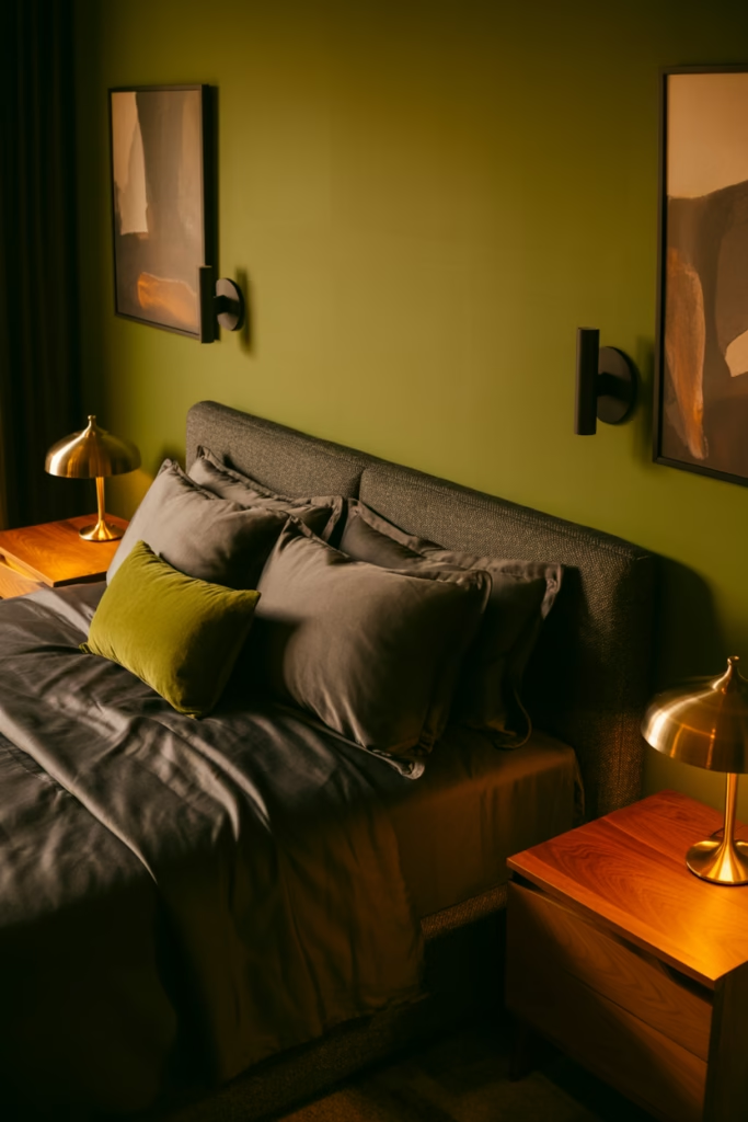
IMO, this is the most underrated combo on this list. Olive green has this vintage, almost military-inspired quality that could easily feel too heavy, but when you balance it with charcoal gray, it becomes incredibly sophisticated.
This palette works especially well in smaller bedrooms because the darker tones actually create depth rather than closing the space in. I know that sounds counterintuitive, but trust me on this one.
The key is lighting. You need multiple light sources—bedside lamps, maybe a floor lamp, even some LED strips behind your headboard. Dark colors eat light, so you’ve got to compensate.
- Use olive on one or two walls maximum
- Choose charcoal gray bedding with olive accent pillows
- Add warm-toned wood furniture to prevent it feeling cold
- Include black metal fixtures and frames
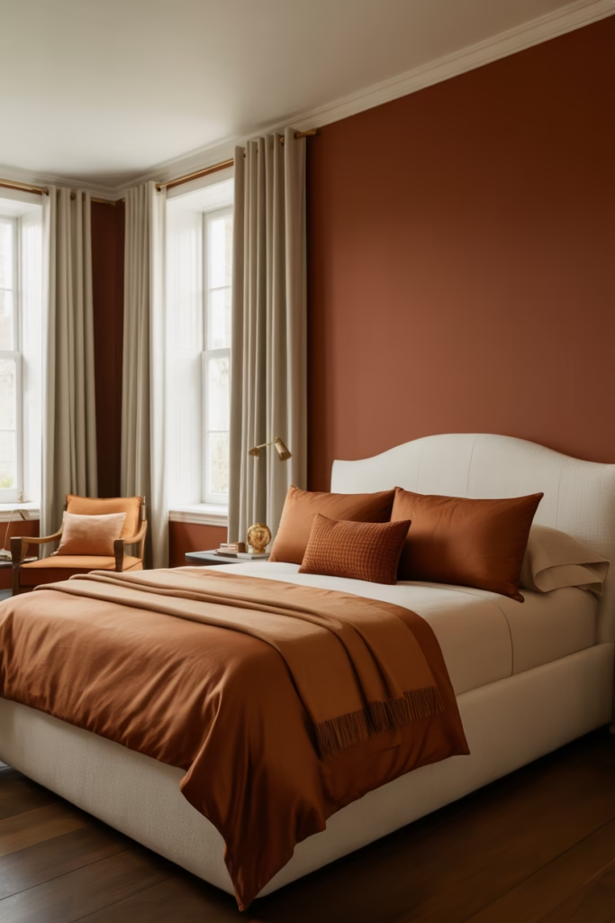
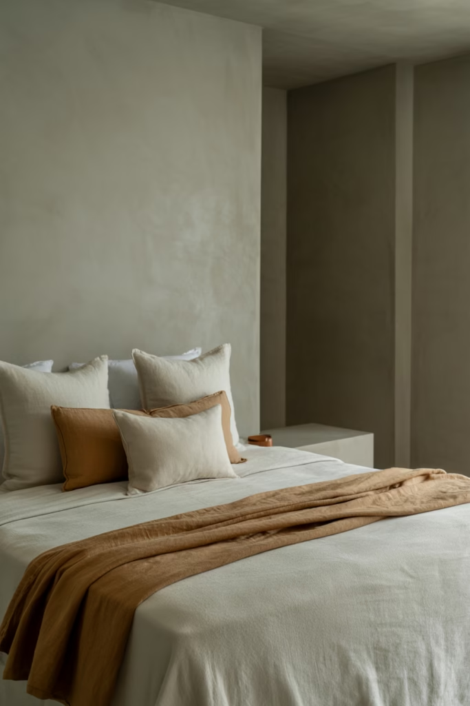
Warm Beige Base with Rust Accents
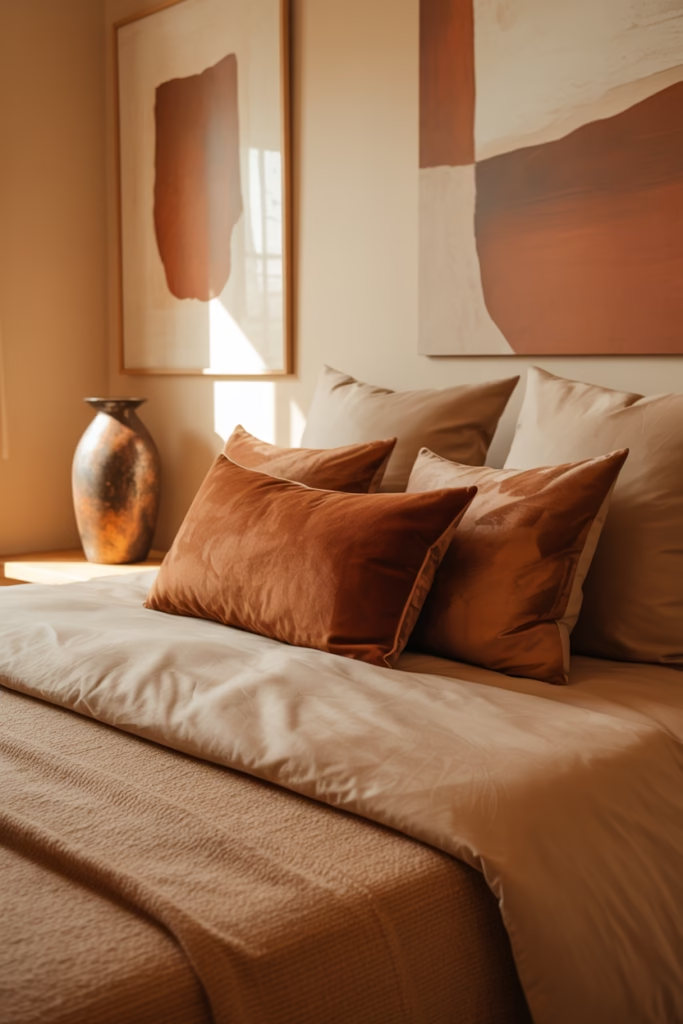
Beige is back, baby, and it brought rust along for the ride. This isn’t your builder-grade boring beige—we’re talking about rich, warm beige that has depth and character. It’s like the difference between instant coffee and a proper pour-over (sorry, coffee snob moment there).
Rust accents are what take this from safe to stunning. We’re talking burnt orange, deep terracotta, that gorgeous oxidized metal color that makes everything feel curated and intentional.
I love this combo because it’s so forgiving. You can’t really mess it up. Add too much rust? Still looks good. Not enough? The beige holds its own. It’s the bedroom equivalent of a safety net, which is perfect if you’re still finding your design confidence.
Rust Accent Ideas That Actually Work
- Rust-colored velvet throw pillows (texture is everything here)
- Ceramic vases in varying rust shades
- Abstract art with rust and beige tones
- A rust-colored area rug under the bed
Mushroom Brown Cocoon
Mushroom brown is having its main character moment right now, and honestly? It deserves it. This color is what you get when beige and gray have a sophisticated baby. It’s neutral without being bland, earthy without being rustic.
When I say cocoon, I mean it. This palette creates the ultimate cozy retreat vibe. It’s perfect for people who want their bedroom to feel like a genuine escape from the world outside.
The secret to nailing mushroom brown is layering. You need different shades—from pale champagne mushroom to deep coffee mushroom. Otherwise, it can read flat and one-dimensional.
- Paint walls in mid-tone mushroom
- Use darker mushroom for curtains or an accent wall
- Add lighter mushroom bedding
- Include cream and white accessories to break it up
Cream and Caramel Layers
Sweet tooth for your bedroom? The cream and caramel combo is basically dessert in design form, and I’m here for it. This palette is all about those delicious, warm tones that make you want to curl up under the covers and never leave.
Caramel brings richness without being too dark or heavy. It’s got enough yellow undertone to feel warm but enough brown to anchor the space. Paired with cream, it creates this luxurious, hotel-worthy aesthetic.
What I love about this combination is how it photographs. If you’re someone who likes sharing your space on social media (no judgment, I basically live on Pinterest), this palette is incredibly photogenic in both natural and artificial light.
- Layer different textures in similar tones
- Use caramel leather accents (headboard, bench, chair)
- Choose cream bedding with caramel stitching or borders
- Add gold-toned mirrors and frames
Soft Ochre with White Balance
Ochre is one of those colors that people either love immediately or need convincing on. I was in the second camp until I saw it done right. Soft ochre (not the intense mustard yellow—we’re going gentler here) paired with crisp white is absolutely transformative.
This combo brings sunshine into your bedroom without relying on actual sunshine, which is clutch if you’ve got a north-facing room or limited natural light. The white keeps it from feeling too earthy or heavy.
The balance is crucial though. You want roughly equal parts ochre and white, or lean slightly more white. Too much ochre and your bedroom starts feeling like a 70s throwback (and not in the cool way).
Getting the White Balance Right
- Use white for 60% of the room (walls, ceiling, bedding)
- Bring in ochre through accent walls or large decor pieces
- Add natural wood in medium tones
- Keep window treatments light and airy
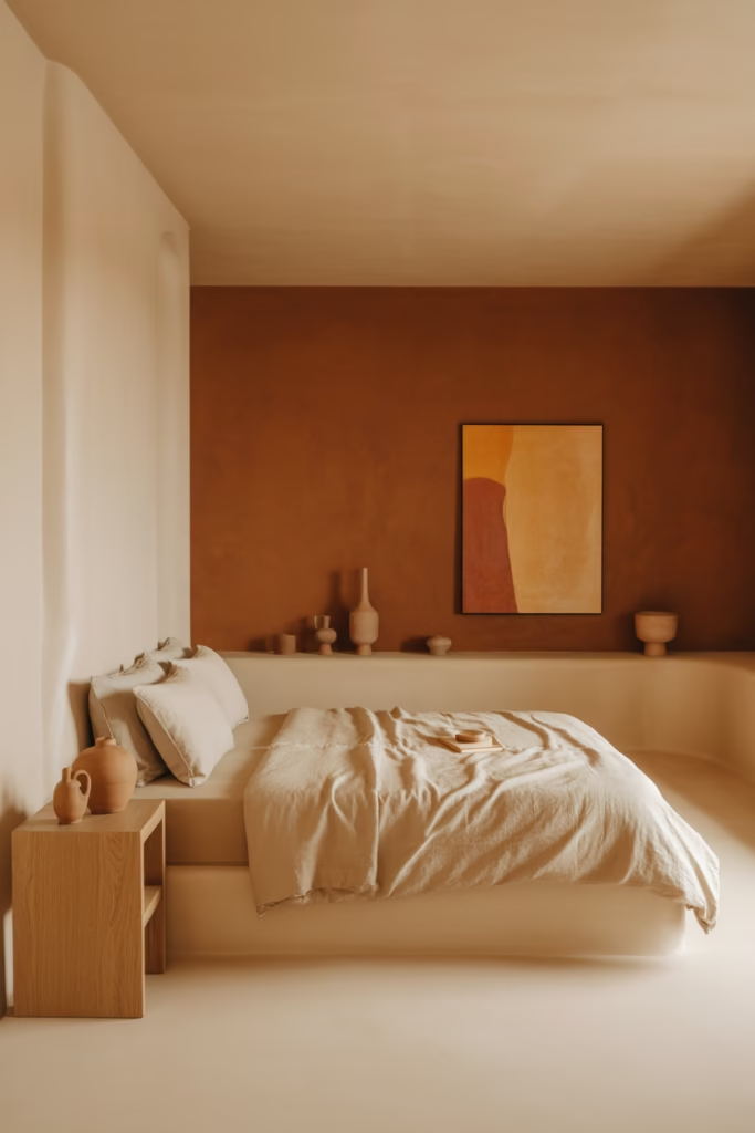
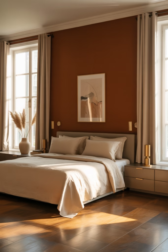
Burnt Sienna and Ivory Elegance
Burnt sienna is basically terracotta’s sophisticated older sibling. It’s deeper, richer, and has this incredible warmth that feels luxurious rather than rustic. Pair it with ivory (not stark white—ivory has just enough warmth to complement the sienna), and you’ve got yourself an elegant earthy palette.
This is my go-to recommendation for people who want earthy tones but also want their bedroom to feel polished and put-together. It’s got that grounded quality without sacrificing sophistication.
The ivory is what keeps this from feeling too dark. It brightens the space while maintaining that warm, cohesive feel. If you swapped ivory for bright white, the whole thing would fall apart—trust me, I’ve tried.
- Use burnt sienna for an accent wall or large furniture pieces
- Choose ivory bedding with burnt sienna throw pillows
- Add brass or gold fixtures
- Include ivory curtains to maximize natural light
Stone Gray and Sandy Brown Serenity
This palette is like a peaceful beach and a mountain cabin had a baby. The cool tones of stone gray get balanced by the warmth of sandy brown, creating this incredibly serene environment that works for literally any season.
I’m obsessed with this combo for master bedrooms because it feels mature and calming—exactly what you want in a space dedicated to rest. It’s not trying too hard, it’s not making bold statements, it’s just… peaceful.
The beauty of gray and brown together is that they’re both neutrals, which means you can add pretty much any accent color you want. Want a pop of green? Works. Burgundy? Absolutely. Coral? Why not?
- Use stone gray for walls or major furniture
- Add sandy brown through textiles and smaller decor
- Layer with cream and white to prevent it feeling too dark
- Include metallic accents in pewter or brushed nickel
Moss Green and Wheat Gold Harmony
Moss green is earthier than sage, deeper than olive, and absolutely gorgeous when paired with wheat gold tones. This combination feels like a walk through a forest in autumn—all those rich, natural colors working together in perfect harmony.
I’ve used this palette in a guest bedroom, and every single person who’s stayed there has commented on how well they slept. There’s something about these nature-inspired tones that just hits different for relaxation.
The wheat gold brings warmth and light to what could otherwise be a pretty dark color scheme. It’s that perfect bridge between the cool undertones of moss and the neutral base you need to keep things balanced.
Creating Moss and Wheat Harmony
- Paint three walls in a warm neutral, one wall in moss
- Use wheat gold in bedding and curtains
- Add darker green plants for cohesion
- Include natural wood furniture in medium to light tones
Cinnamon and Cream Dream
Cinnamon is warmer than rust, softer than terracotta, and honestly one of my favorite underused earthy tones. When you pair it with cream, you get this dreamy, cozy aesthetic that feels both contemporary and classic.
This palette works particularly well if you’ve got a lot of natural light because the cinnamon tones shift throughout the day. Morning light makes it look almost peachy, afternoon sun brings out the orange, and evening light deepens it to a rich brown.
The cream is essential here—it prevents the cinnamon from overwhelming the space and gives your eyes a place to rest. Without it, cinnamon can feel too intense for a bedroom.
- Use cinnamon as an accent color (20-30% of the room)
- Choose cream for walls and major textiles
- Add texture through woven baskets and macramé
- Include warm wood tones in furniture
Sandstone and Soft Black Contrast
Okay, so technically black isn’t an “earthy” color, but hear me out. Soft black (which is really just a very dark charcoal) paired with sandstone creates this incredible earthy contrast that feels modern and grounded at the same time.
This is for people who want earthy tones but also crave a bit of edge. It’s sophisticated, it’s current, and it definitely makes a statement without being loud about it. The sandstone keeps it from feeling too stark or cold.
I love this combo for smaller bedrooms because the contrast actually makes the space feel larger. Your eye moves between the light and dark elements, creating visual interest that expands the perceived space. :/
- Use sandstone for 70% of the room
- Bring in soft black through furniture and accents
- Add warm metallics (brass or copper) to bridge the contrast
- Include plenty of texture to prevent it feeling flat
Let’s Conclude
So there you have it 15 earthy color palette ideas that’ll transform your bedroom from “meh” to “wow, did you hire a designer?” The beautiful thing about earthy tones is that they’re inherently forgiving. You can mix and match these ideas, combine palettes, or put your own spin on any of them.
The biggest mistake I see people make is being too timid. They’ll choose one earthy tone and surround it with stark white because they’re scared of commitment. But earthy palettes work best when you layer them, when you let different tones play off each other.
Start with one combination that speaks to you, test it out with paint samples and fabric swatches, and then commit. Your bedroom is supposed to be your sanctuary, so make it feel like one. And remember there’s no wrong way to do earthy tones, only opportunities to create something uniquely yours.