
if your living room still looks like it’s stuck in a greige fog from 2019, it’s time for an intervention. Summer is bringing some seriously good color energy, and I’m here to walk you through every shade, combo, and vibe that’s about to take over our homes (and honestly, our Pinterest boards).
Whether you’re repainting a whole room or just swapping out throw pillows, there’s something here for every space and every budget.
Why Summer 2026 Color Palettes Feel Different
Every year, someone declares a “bold new era” for interiors, and honestly, most years it’s a little underwhelming. But 2026? It actually delivers. The shift this year moves away from the ultra-minimalist, all-white-everything aesthetic and leans hard into warm, nature-inspired tones mixed with unexpected pops of electric color.
Think sunset gradients, ocean blues, and earthy terracotta but with modern, sophisticated twists that stop them from feeling like a beach souvenir shop. The goal is warmth and personality, not chaos. And trust me, there’s a big difference. 🙂
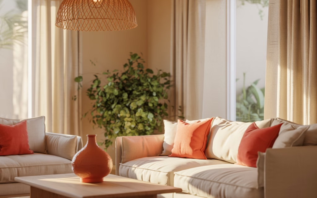
1. Terracotta and Warm Cream
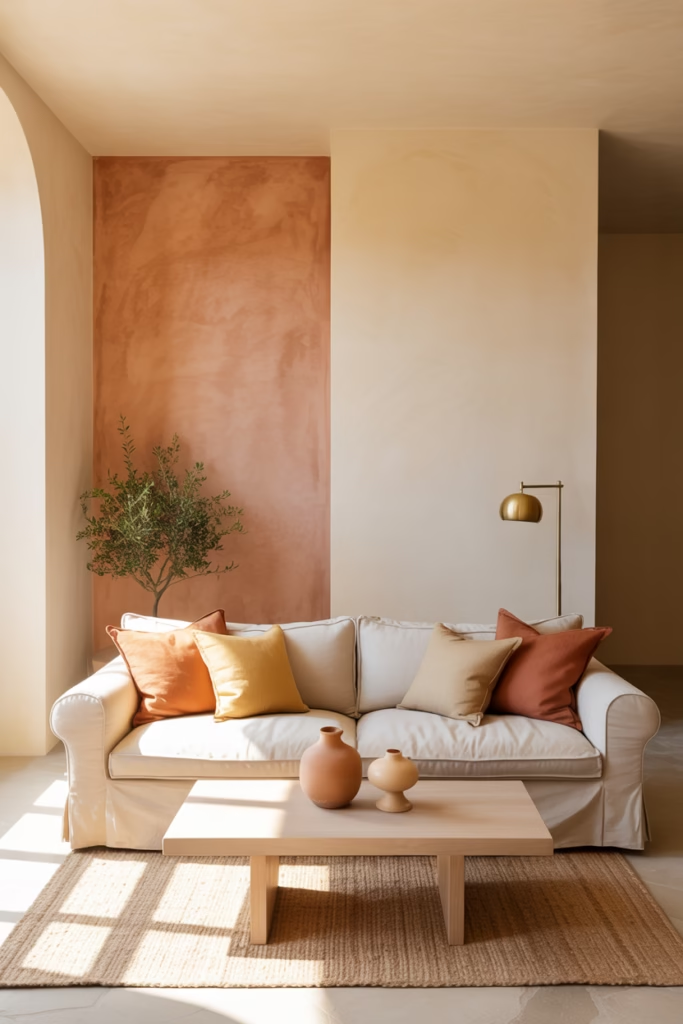
Terracotta is back, and it brought friends. Paired with warm cream or off-white, this combo creates that effortlessly cozy Mediterranean vibe that feels both timeless and very 2026.
Use terracotta on an accent wall and pull the cream into your furniture, curtains, and rugs. The key is keeping your textures rich — think linen, jute, and raw wood — so the palette doesn’t feel flat. IMO, this is the single easiest palette to nail on a budget.
Works best in: Living rooms, dining rooms, entryways
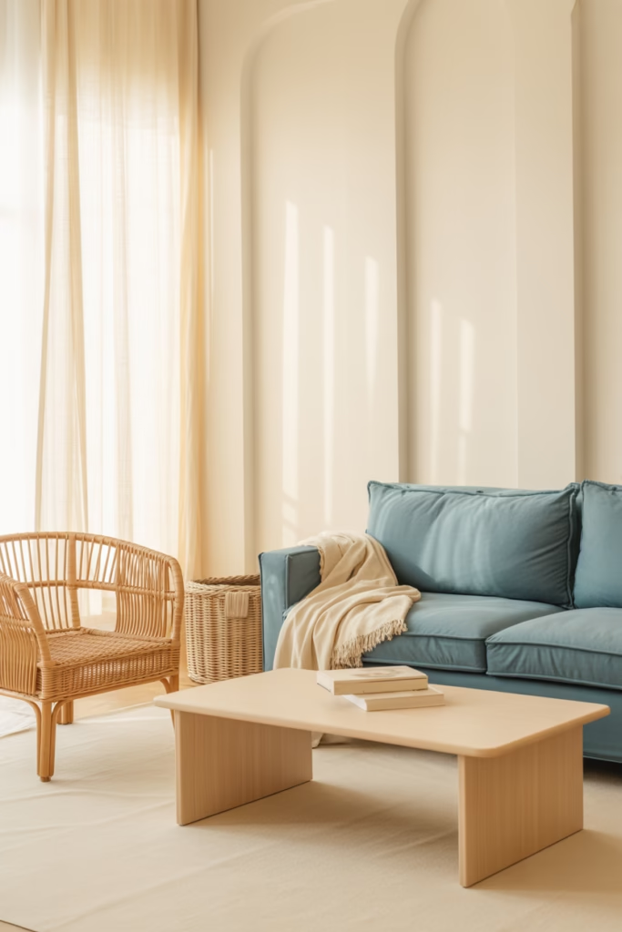
2. Cobalt Blue and Warm Sand
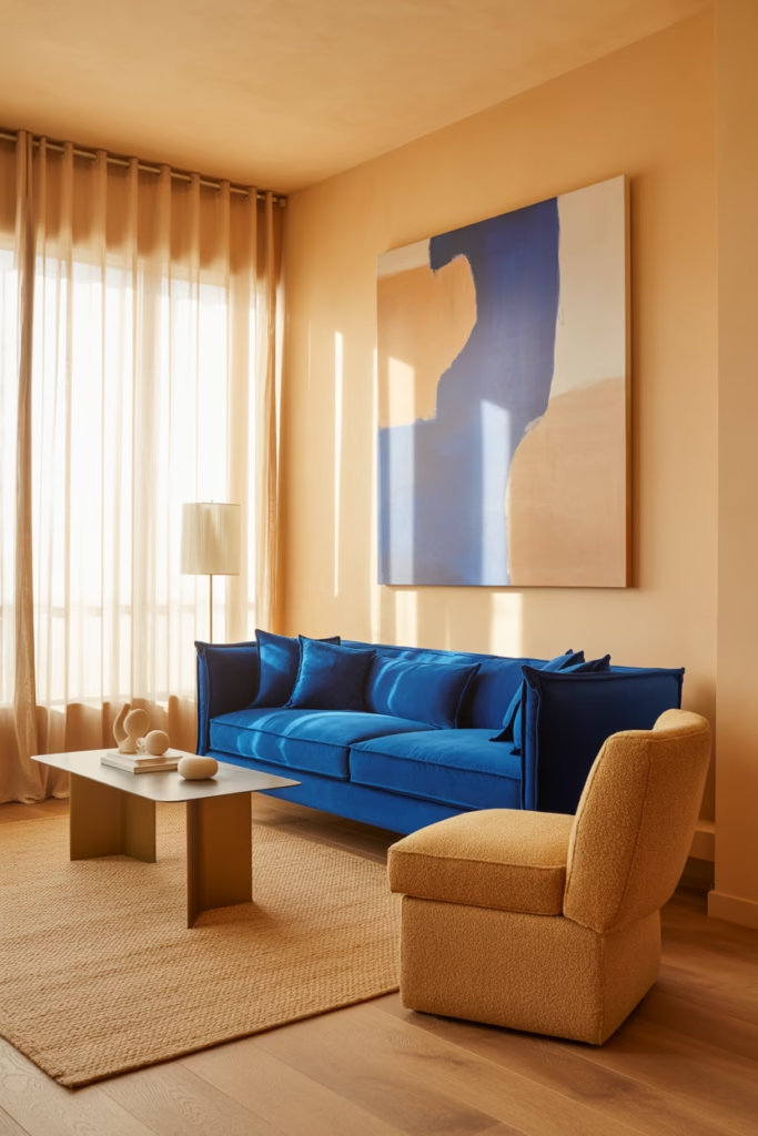
You know that feeling of standing on a sunny beach with the ocean stretching out in front of you? This palette bottles exactly that. Cobalt blue is bold, saturated, and absolutely stunning against warm sandy neutrals.
Use cobalt through cushions, artwork, or a statement sofa. Sand tones ground the look through walls, rugs, and wooden furniture. This pairing works especially well in spaces with good natural light — in a dim room, cobalt can feel a bit heavy.
Pro tip: Add a touch of brass or gold in your fixtures to tie everything together beautifully.
3. Sage Green and Soft White
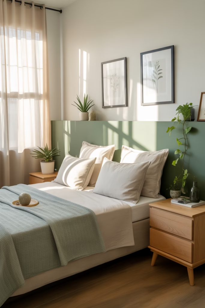
If you’ve been on Pinterest for more than five minutes in the last year, you’ve seen sage green everywhere. And for good reason — it’s calm, airy, and pairs with almost everything. Sage green with soft white walls creates one of the most serene, breathable palettes for summer.
The trick here is choosing the right sage. Go too yellow and it reads mustard. Go too grey and it loses that fresh, organic quality. Look for a sage with slight blue undertones for the most versatile result.
Works best in: Bedrooms, home offices, bathrooms
4. Mango Orange and Ivory
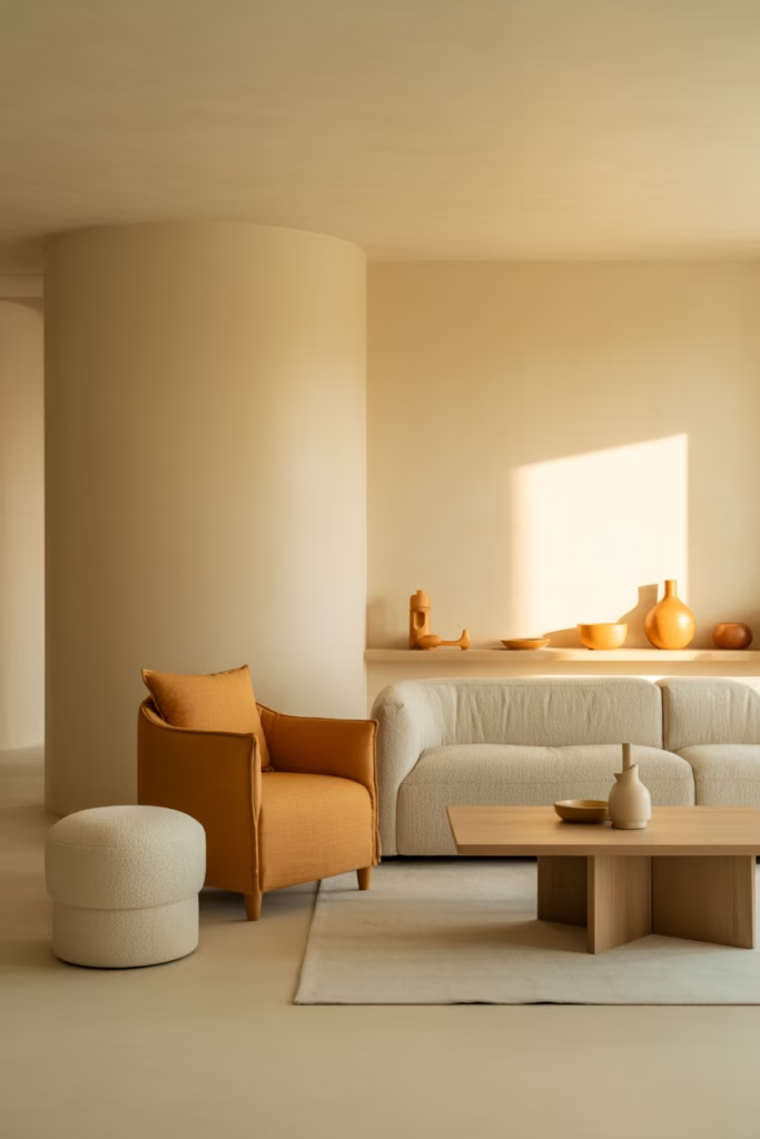
Okay, hear me out before you scroll past this one. Mango orange sounds loud — and yes, used wrong, it absolutely is. But mango orange in small, intentional doses against a creamy ivory backdrop feels luxurious and summer-perfect.
Think an orange linen accent chair, a few ceramic vases, or even just a throw blanket. Keep the rest of the room light and airy, and this warm citrus tone pops without overwhelming. It’s the color equivalent of a great statement earring.
5. Dusty Lavender and Warm Grey
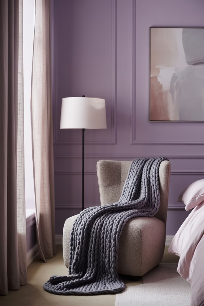
Lavender had a moment a couple of years ago, but dusty lavender in 2026 feels more grown-up and sophisticated. Paired with warm grey, this palette feels like a rainy summer evening — soft, moody, and unexpectedly beautiful.
The dusty quality of the lavender keeps it from feeling too sweet or juvenile. Use it on walls with warm grey furniture and white accents for a polished, editorial look that still feels approachable.
Works best in: Bedrooms, reading nooks, dressing rooms
6. Coral and Linen
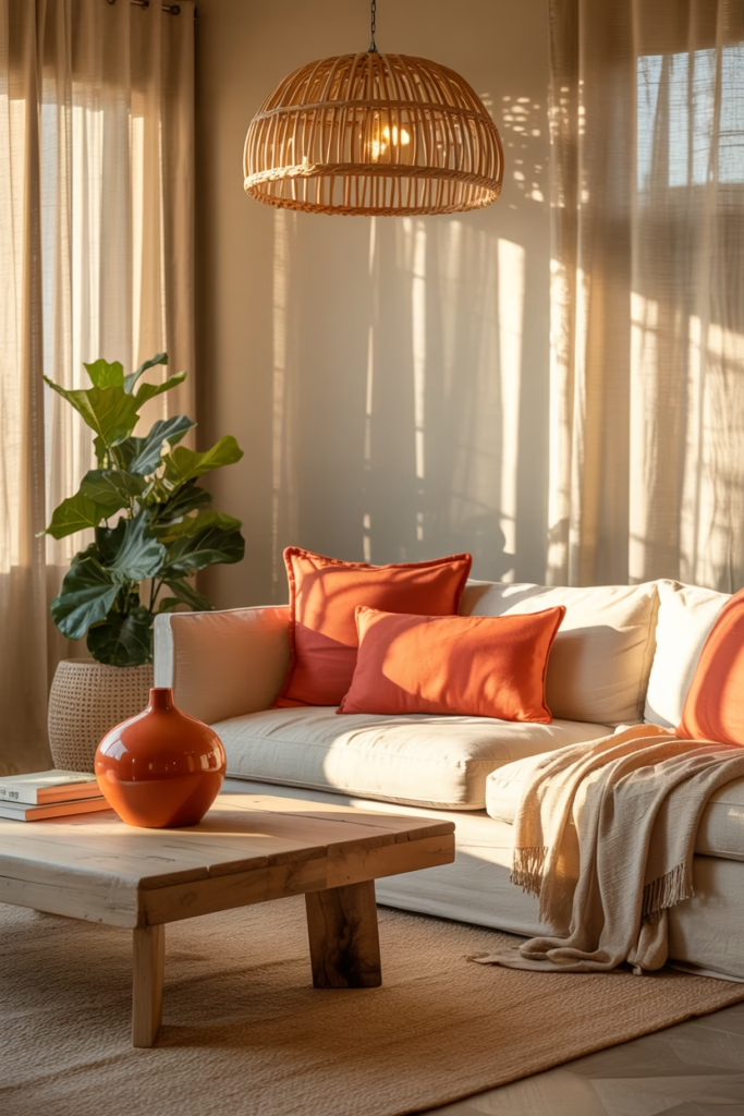
Coral is one of those colors that sounds outdated until you actually see it done well. Warm coral paired with natural linen creates a palette that feels both fresh and deeply inviting. It’s the color of golden hour, basically, and I am fully here for it.
Keep your coral concentrated in soft furnishings — cushions, lampshades, artwork — and let linen textures do the heavy lifting in curtains, upholstery, and rugs. Add plenty of greenery to complete the look and keep it feeling alive and fresh.
7. Ocean Teal and Crisp White
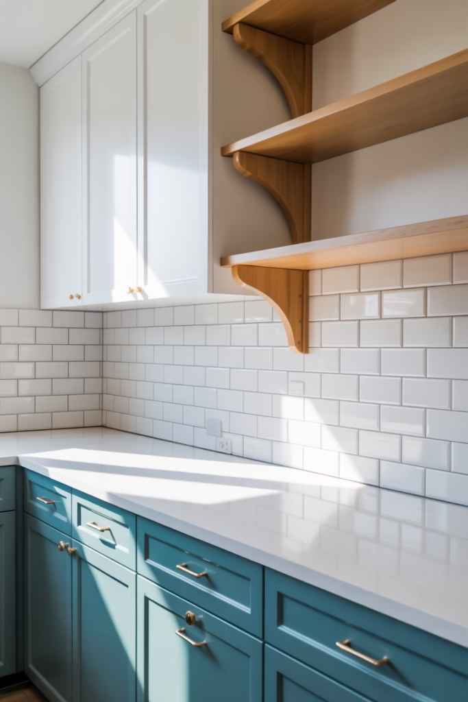
There’s something endlessly refreshing about teal and white together. Ocean teal — that deep, slightly green-leaning blue — with crisp white walls creates a clean, coastal palette that works brilliantly in summer.
This combo is versatile enough for almost any room, but it really shines in kitchens and bathrooms. Teal cabinetry against white subway tiles is chef’s kiss. Add natural wood accents to soften the contrast and stop it from looking too clinical.
Works best in: Kitchens, bathrooms, living rooms
8. Sunshine Yellow and Soft Grey
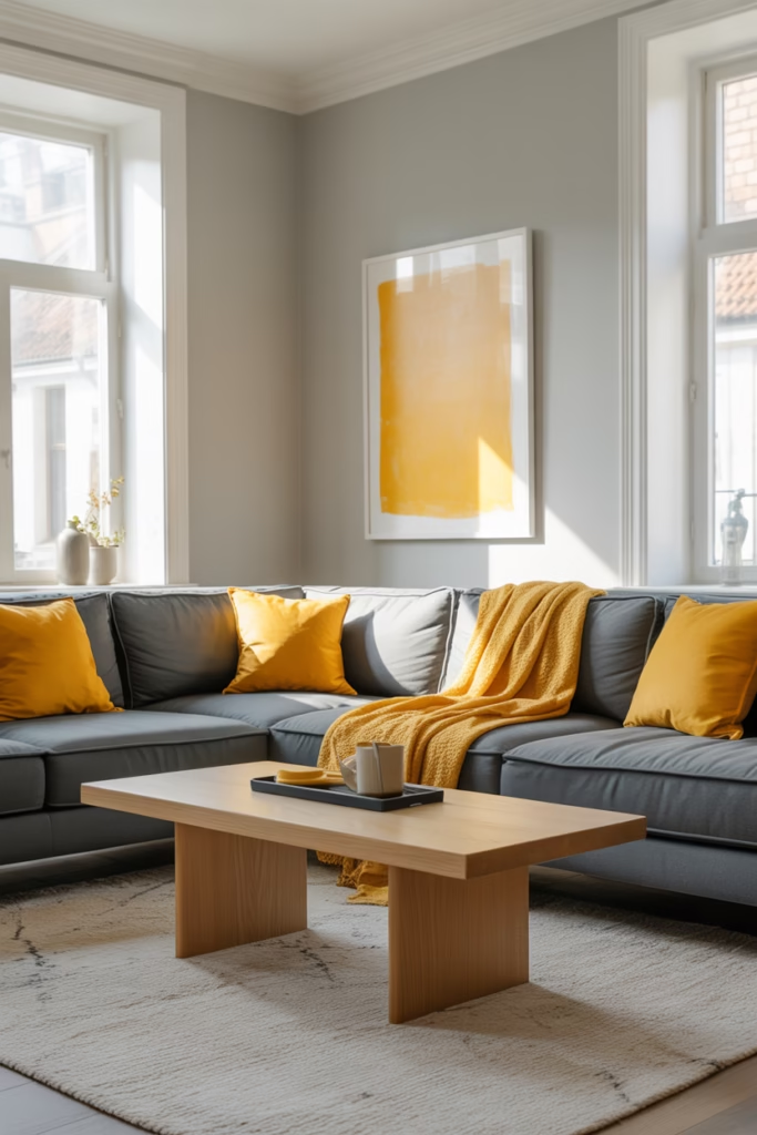
Before you close this tab — sunshine yellow done right is absolutely stunning. The secret is pairing it with a sophisticated soft grey rather than stark white. Grey tempers yellow’s energy, making the whole palette feel intentional rather than chaotic.
Use yellow as an accent through artwork, cushions, or a single painted cabinet, and let grey anchor the space through larger furniture pieces and rugs. The result is a space that feels genuinely happy without tipping into kindergarten-classroom territory.
9. Deep Forest Green and Cream
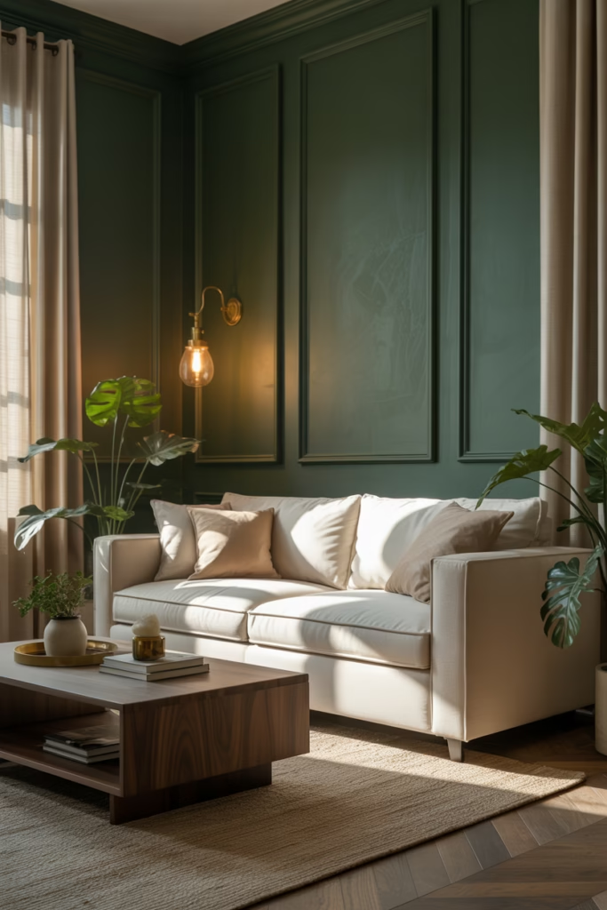
Deep forest green is having a major moment right now, and for summer 2026, it pairs beautifully with warm cream tones. This combination channels that lush, botanical garden energy — think rich velvet sofas, leafy plants, and antique-style fixtures.
This palette works especially well in rooms with high ceilings or period features. The depth of the green adds drama and sophistication, while cream keeps the overall feel warm and inviting rather than dark. FYI, this is one trend I genuinely think has serious staying power beyond 2026.
Works best in: Living rooms, dining rooms, home libraries
10. Blush Pink and Warm Walnut
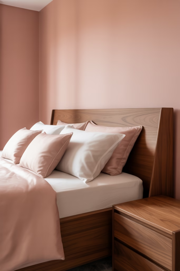
Blush pink in interiors has shifted significantly — in 2026, it’s less millennial pink and more warm, sophisticated rose that pairs beautifully with rich walnut wood tones. The warmth in both elements creates a deeply harmonious palette that feels both feminine and grounded.
Use blush on walls or as a dominant soft furnishing color, and introduce walnut through flooring, furniture legs, or shelving. This pairing works across a wide range of styles, from Japandi to maximalist vintage.
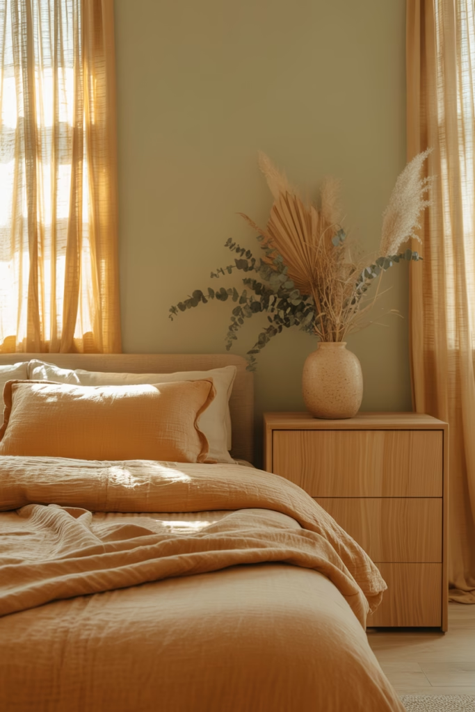
11. Pale Peach and Natural Stone
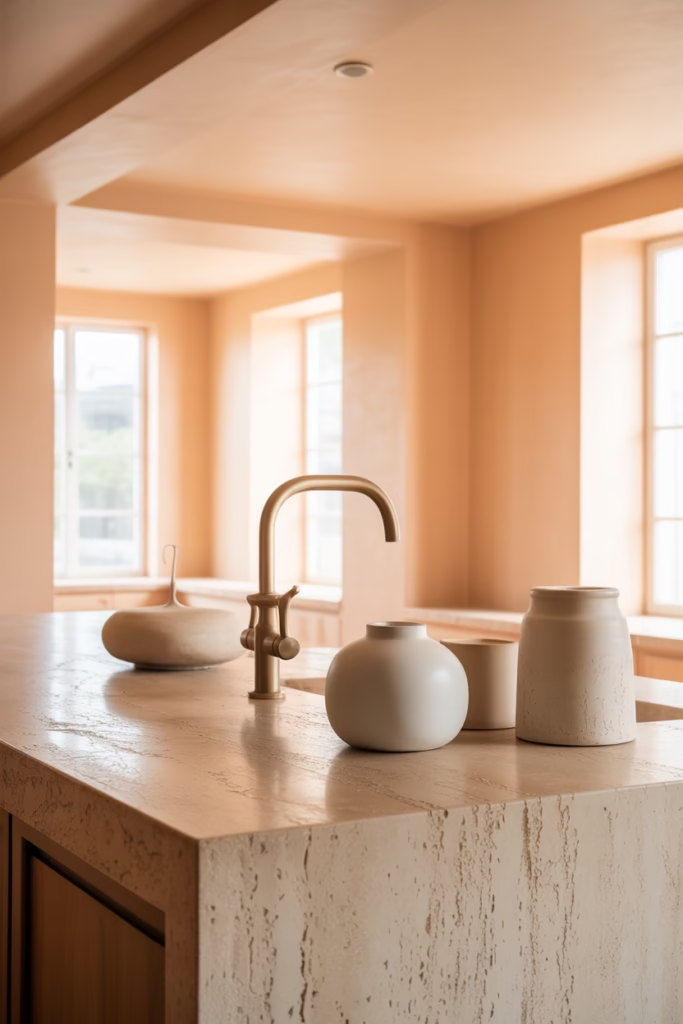
Pale peach might be the most underrated color in the 2026 palette lineup. It has this incredible quality of warming up a space without screaming for attention, and when you pair it with natural stone textures — think marble, travertine, or concrete — the effect is genuinely luxurious.
This palette works especially well in open-plan spaces where you want a sense of warmth and flow without creating visual noise. Keep your metals in brushed gold or bronze to complement the softness of the peach tones.
Works best in: Open-plan living and dining, kitchens, bathrooms
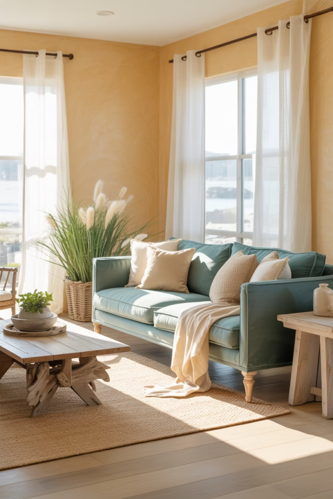
12. Sky Blue and Warm White
Sometimes simple is best, and sky blue with warm white is just one of those eternally fresh, summer-ready palettes that never disappoints. It’s breezy, light-filled, and instantly reminds you of clear summer skies.
The key distinction here is warm white rather than cool or stark white — this small shift prevents the palette from feeling cold or too clinical. Layer in natural textures like rattan, cotton, and wicker to complete the relaxed summer aesthetic.
13. Mustard Yellow and Deep Navy
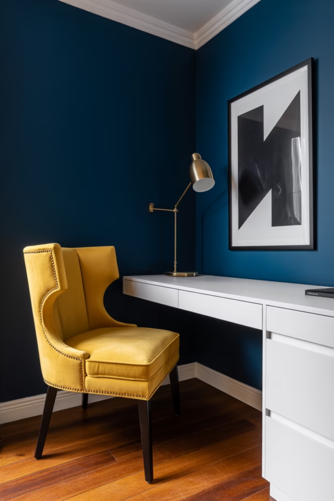
This is the bold palette for people who are serious about making a statement. Mustard yellow and deep navy together feel graphic, confident, and deeply stylish — like a vintage travel poster brought to life in your living room.
Use navy as your dominant wall or furniture color and introduce mustard through cushions, artwork, or a single upholstered piece. Balance both shades with warm wood tones and plenty of white to stop the combination from feeling too heavy.
Works best in: Living rooms, home offices, hallways
14. Warm Rust and Soft Olive
Rust and olive together feel like a late summer afternoon — warm, earthy, and completely at ease. These two nature-inspired tones create a palette that’s grounded, organic, and deeply satisfying to live inside.
This combination suits more rustic or bohemian interior styles brilliantly, but it also works in contemporary spaces when you keep the lines clean and the furniture minimal. Add raw linen textures and dried floral arrangements to really sell the aesthetic.
Works best in: Bedrooms, living rooms, studio spaces
15. Turquoise and Warm Sand
We’re closing out the list with a true summer classic: turquoise and warm sand. This palette is the most overtly vacation-inspired on the list, and honestly, what’s wrong with your home feeling like a gorgeous resort? Nothing, that’s what.
Use turquoise through statement pieces — a sofa, a painted dresser, large-scale artwork — and build the rest of the space in warm sandy and cream tones. Add plenty of natural materials like sisal, rattan, and driftwood to cement the relaxed coastal feel.
How to Choose the Right Summer Palette for Your Space
Picking a color palette can feel overwhelming when there are this many good options. Here’s a quick framework to help you narrow it down:
- Consider your natural light. Dark rooms need warm, lighter palettes. Bright rooms can handle deeper, more saturated colors.
- Think about your existing furniture. You don’t have to replace everything — choose a palette that works with the pieces you already own.
- Start small. Swap cushions, throws, and accessories before committing to a full repaint.
- Test paint samples in context. Colors look completely different on a chip versus on a full wall in your specific lighting.
- Stick to three main tones. A dominant color, a secondary color, and an accent. More than three and things start to feel chaotic.
Ever wondered why some rooms feel instantly cohesive while others feel visually messy even with great individual pieces? Nine times out of ten, it comes down to palette discipline.
Final Thoughts
Summer is genuinely one of the more exciting years for interior color trends the move toward warmth, nature, and personality feels authentic rather than trend-chasing for its own sake. Whether you gravitate toward the bold drama of mustard and navy or the serene calm of sage and soft white, there’s a palette here that can transform your space this season.
Pick one that genuinely excites you, start small, and build from there. Your home should feel like you not like a catalog page. Now go raid those paint swatches and get started. 🙂