
Blue can fix a living room fast, like “why does this room feel flat?” fast. You know that moment when your sofa looks fine, your rug looks fine, your curtains look fine… and somehow the whole space still feels like a waiting room? Yeah, that’s where blue shows up and saves the day.
I’ve played with blue in living rooms more times than I’ll admit (because apparently I enjoy repainting like it’s cardio). I keep coming back to it because blue gives you options: it can feel airy and fresh, dark and dramatic, or cozy and grown-up without trying too hard. And the best part? You don’t need a full renovation to pull it off—sometimes a single wall, a sofa, or even a few textiles does the heavy lifting.
So if you want a living room that feels pulled together, inviting, and a little “wow” when someone walks in, these 17 stunning blue living room design ideas will get you there. Ready to pick your blue personality soft sky, moody navy, or “yes I bought the bold couch”?
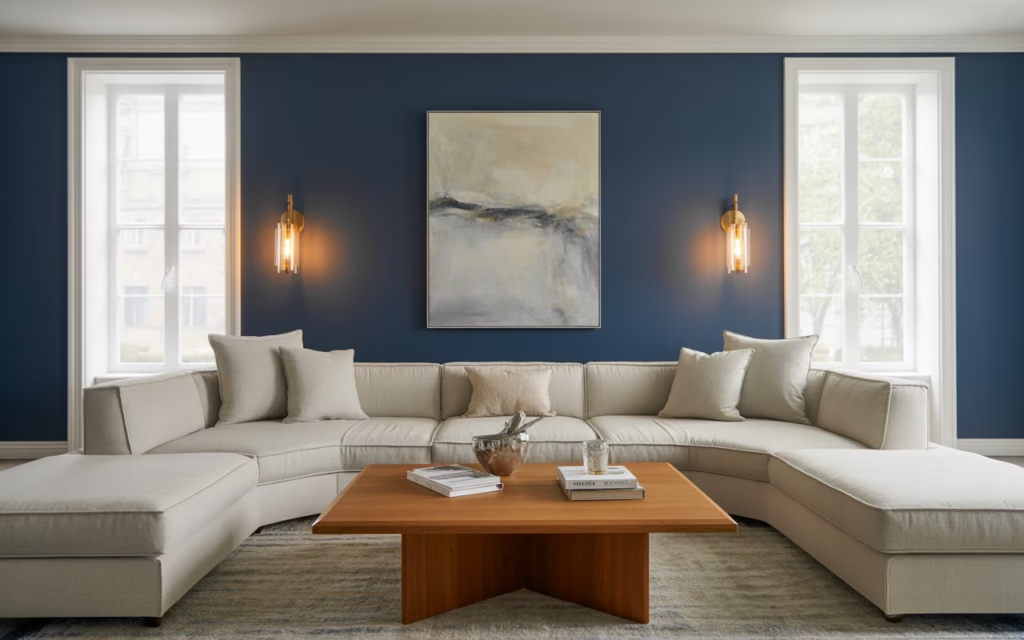
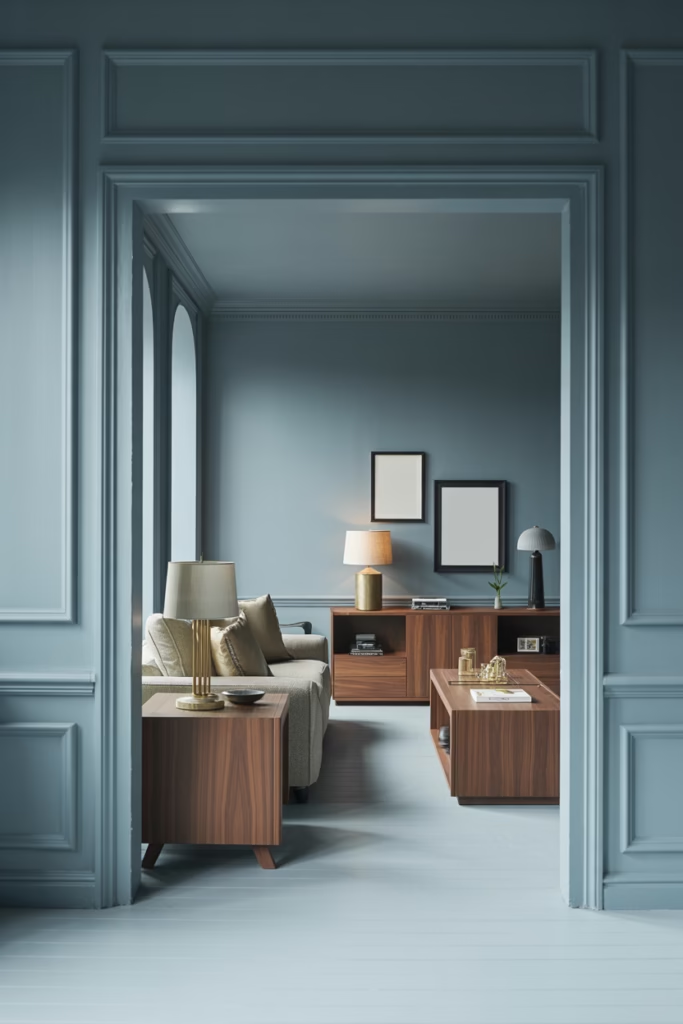
Navy Blue Accent Walls That Command Attention
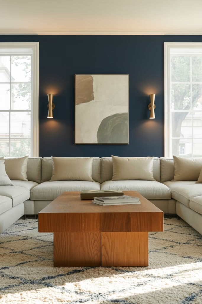
Navy blue isn’t messing around. When you slap a navy accent wall behind your sofa, you’re making a statement that says “I have taste, and I’m not afraid to use it.” This deep, rich shade works like magic because it adds depth without making your room feel like a cave.
Here’s the thing—navy plays incredibly well with metallics. Pair it with gold or brass light fixtures, and suddenly your living room looks like it belongs in a design magazine. I’ve seen this combo work wonders in smaller spaces too, which surprised me at first. The trick is balancing that darkness with plenty of natural light and lighter furniture pieces.
Pro tip: Don’t go full navy on all four walls unless you want your living room to feel like a submarine. One accent wall does the job beautifully.
Powder Blue Serenity for Scandinavian Vibes
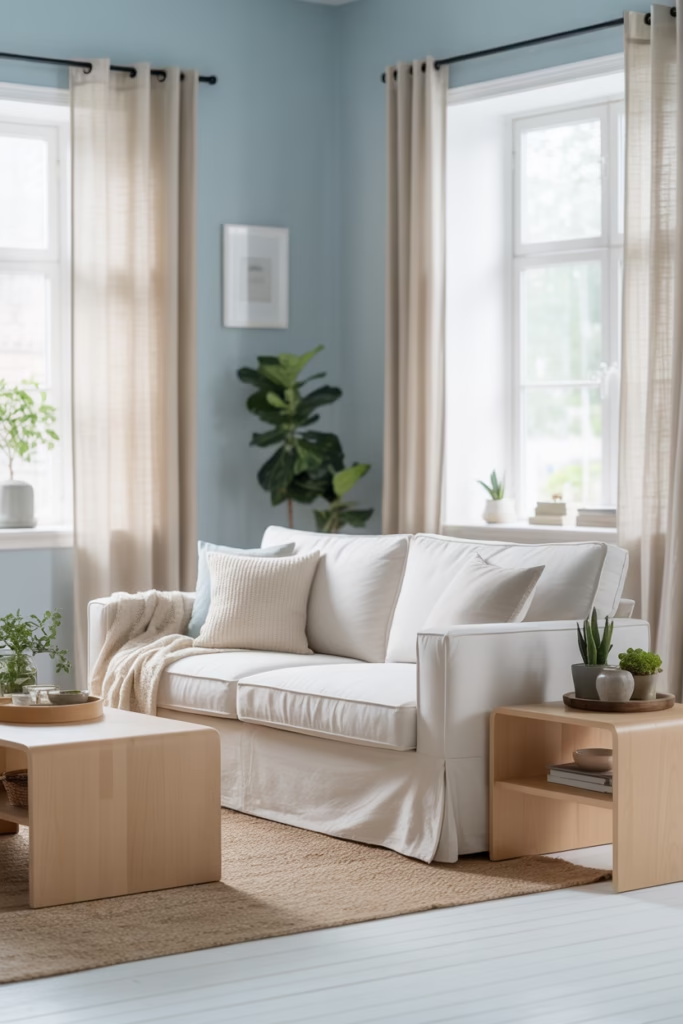
Ever walked into a room and felt instantly relaxed? That’s what powder blue does. This soft, airy shade is perfect if you’re chasing those Scandinavian minimalist vibes that everyone’s obsessed with (and honestly, for good reason).
Powder blue walls create this ethereal backdrop that makes white furniture pop like crazy. Add some light wood elements, a sheepskin throw, and boom—you’ve got yourself a Pinterest-worthy space. The beauty of this shade is its versatility. It works in tiny apartments and sprawling homes alike.
I personally love pairing powder blue with warm textures like woven baskets and linen curtains. It keeps the space from feeling too sterile or cold, which can happen with lighter blues if you’re not careful.
The Bold Cobalt Blue Sofa Statement
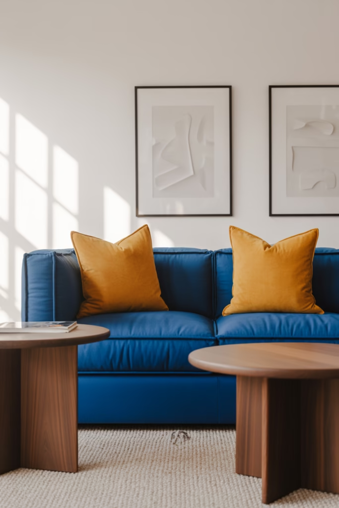
Okay, hear me out on this one. A cobalt blue sofa is that piece that completely transforms your living room from “meh” to “whoa.” It’s bold, it’s vibrant, and it’s the furniture equivalent of wearing red lipstick—instant confidence boost for your space.
The best part? Cobalt blue is surprisingly easy to style around. It pairs beautifully with:
- Crisp white walls for a clean, modern look
- Warm woods that ground the vibrant color
- Neutral carpets and rugs that let the sofa shine
- Pops of yellow or orange in throw pillows for contrast
I’ve tested this in my own space, and the compliments never stop. Just make sure you’re committed because this isn’t a “blend into the background” kind of furniture choice. 🙂
Teal and Turquoise for Coastal Cool
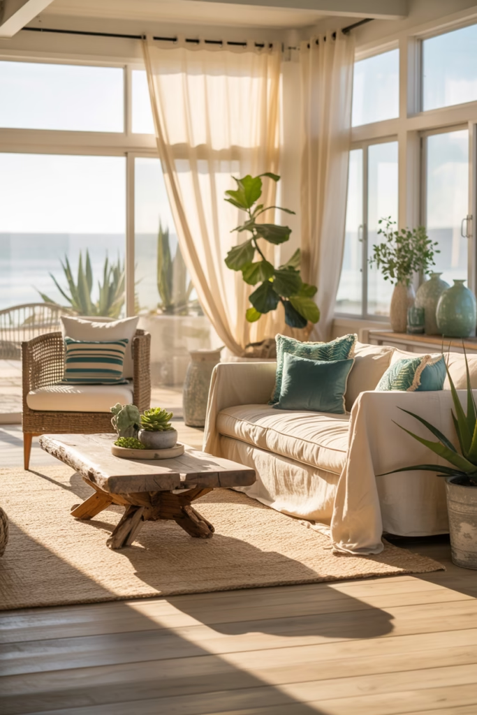
Teal and turquoise bring that beachy, coastal energy without going full nautical theme (you know, the one with anchors and seashells that feels a bit… much). These blue-green hybrids work magic in living rooms that need some personality.
What I love about teal is how it shifts throughout the day. Morning light makes it lean more green, while evening light pulls out those deeper blue tones. It’s like getting two colors for the price of one. FYI, this makes teal incredibly forgiving when you’re trying to match other elements in your room.
Pair teal walls with natural materials like jute rugs, rattan chairs, and plenty of plants. The organic textures complement the water-inspired color perfectly, creating this laid-back vibe that makes you want to kick off your shoes and stay awhile.
Royal Blue Velvet for Maximum Drama
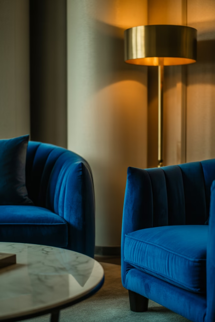
Want to feel like royalty? (Dumb question, of course you do.) Royal blue velvet furniture is your ticket there. This combination of rich color and luxe texture screams elegance without being stuffy.
I’ve seen royal blue velvet chairs transform boring corners into cozy reading nooks. The fabric catches light in this gorgeous way that adds dimension to your space. Plus, velvet is having a major moment right now, so you’re basically being trendy and timeless at the same time.
The key to pulling this off is balancing the opulence. Pair your velvet pieces with simpler elements—think clean-lined coffee tables and understated lighting. You want the blue velvet to be the star, not compete with a bunch of other flashy elements.
Sky Blue Ceilings That Change Everything
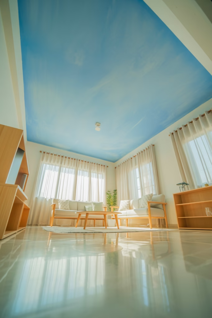
Okay, this one might sound weird at first, but stay with me. Painting your ceiling sky blue is an absolute game-changer. Most people ignore their ceilings (they’re called the “fifth wall” for a reason), but adding blue up there creates this unexpected wow factor.
Sky blue ceilings make rooms feel taller and more open. It’s like bringing the outdoors inside without the bugs or unpredictable weather. I tried this in a room with white walls, and the contrast was stunning. It adds interest without overwhelming the space.
This works especially well in rooms with lots of natural light. The blue reflects the light around the room, making everything feel brighter and more spacious. IMO, it’s one of those design moves that seems risky but pays off big time.
Indigo Boho Chic Vibes
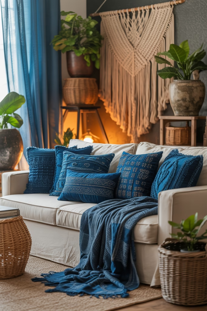
Indigo is that perfect middle ground between navy and royal blue—deep enough to feel substantial but vibrant enough to add energy. It’s also the backbone of boho-style living rooms that don’t look like they’re trying too hard.
Layer different indigo textiles—think throw pillows, curtains, and area rugs with varying patterns. The beauty of boho style is that “more is more,” so you can mix prints without worrying about being too matchy-matchy. Add some macramé wall hangings and potted plants, and you’ve nailed the look.
What makes indigo special is its organic, dye-like quality. It feels artisan and handcrafted, which adds warmth and personality to your living room. It’s the opposite of those sterile, showroom spaces that look pretty but feel cold.
Soft Blue-Gray for Sophisticated Neutrals
Blue-gray is for people who want blue without fully committing to blue (no shade, sometimes we need that safety net). This hybrid color gives you the calming properties of blue while keeping things neutral enough to work with practically any style.
I’ve used blue-gray in spaces where clients wanted something more interesting than standard gray but didn’t want bold color. It’s that perfect compromise that keeps everyone happy. The subtle blue undertones add just enough personality without demanding attention.
Pair blue-gray walls with both warm and cool tones. It’s honestly one of the most forgiving colors I’ve worked with. White trim makes it pop, dark wood furniture grounds it, and metallic accents add glamour. You really can’t mess this one up.
Mediterranean Blue Tile Accents
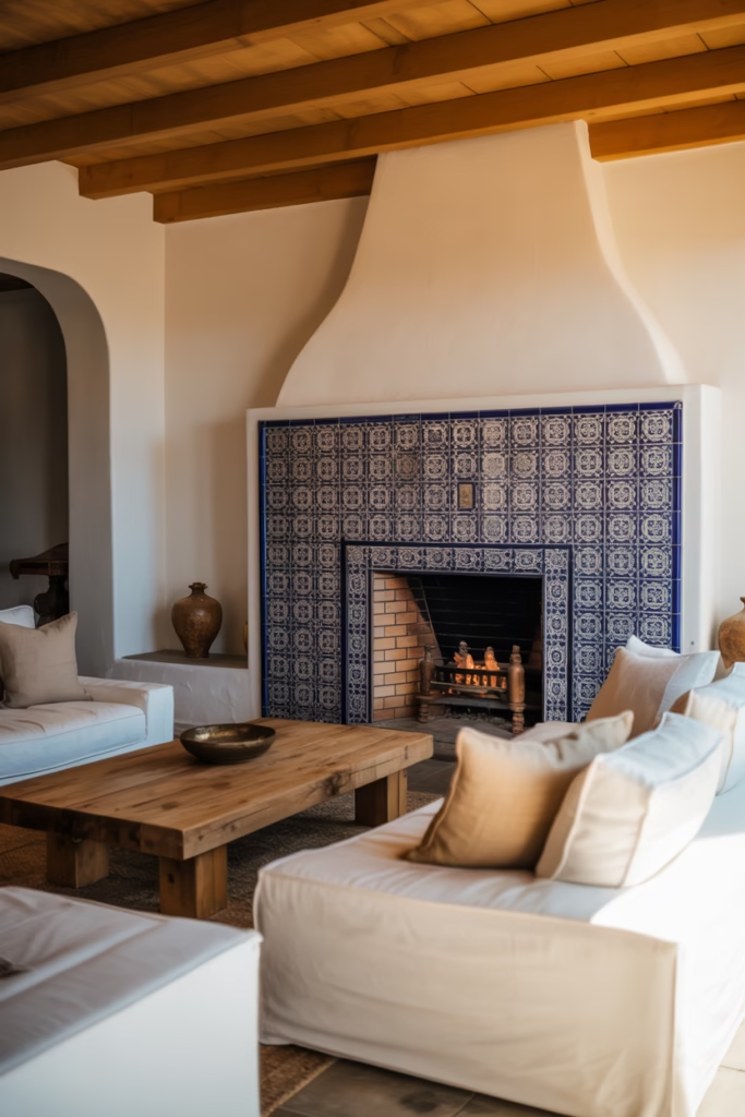
Bringing in Mediterranean blue through tile accents—maybe around a fireplace or as a backsplash if your living room connects to a kitchen—adds this exotic, traveled feel to your space. Those hand-painted tiles with intricate patterns are pure art.
This design choice works particularly well if you’re going for a global or eclectic vibe. The tiles become a focal point that tells a story. I’m obsessed with how the glossy finish reflects light and adds movement to what could otherwise be a static wall.
You don’t need to go crazy with this. Sometimes a small tiled area makes a bigger impact than covering entire walls. It’s about creating visual interest and a conversation starter (because trust me, people will ask about those gorgeous tiles).
Denim Blue Texture Play
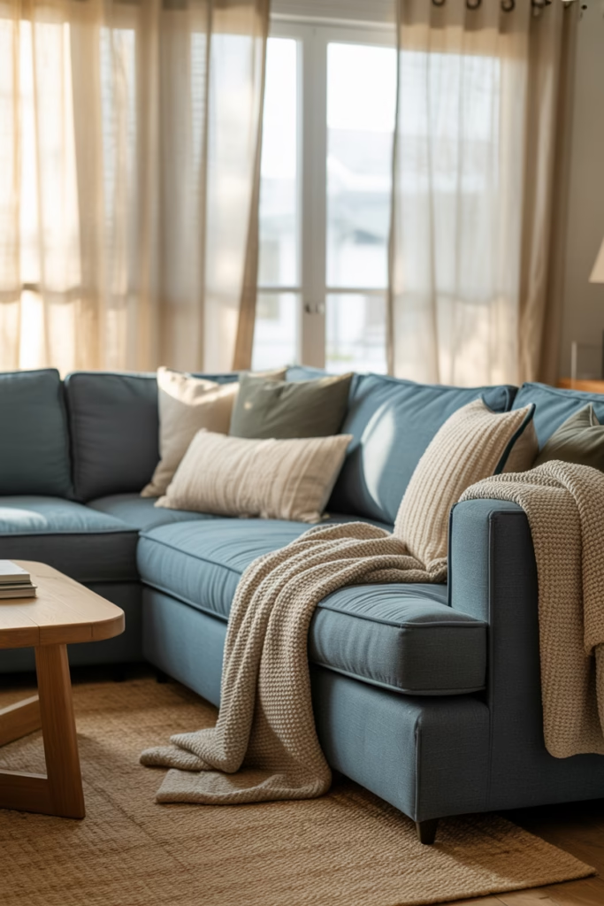
Denim blue isn’t just for your jeans anymore. Using this casual, approachable shade in your living room creates an instantly comfortable atmosphere. Think denim blue upholstery, curtains, or even wallpaper with a subtle texture.
What I love about denim blue is its versatility. It works in modern farmhouse spaces, industrial lofts, and traditional homes. It’s that chameleon color that adapts to whatever style you’re working with. The slightly faded quality keeps things feeling relaxed and lived-in rather than precious.
Layer different textures in denim blue—maybe a smooth velvet pillow next to a nubby linen throw. The tonal variation adds depth while keeping your color palette cohesive. It’s sophisticated without being uptight, which is basically the sweet spot for living room design.
Electric Blue Pops in Modern Spaces
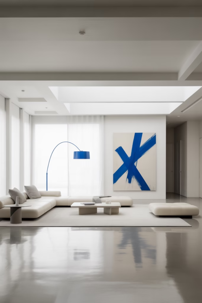
If minimalism is your thing but you don’t want your space to feel sterile, electric blue accents are your answer. We’re talking small doses of this vibrant shade—a piece of artwork, a statement lamp, or a few throw pillows—against a mostly neutral backdrop.
Electric blue is high energy, so a little goes a long way. I’ve seen it used brilliantly in otherwise monochrome spaces where it adds that necessary punch of personality. It’s like the exclamation point at the end of a well-designed sentence.
The trick here is restraint (which I know sounds counterintuitive for such a bold color). Let one or two electric blue pieces be the heroes. Everything else should support them, not compete with them. When done right, this creates a super modern, gallery-like feel.
Baby Blue Vintage Charm
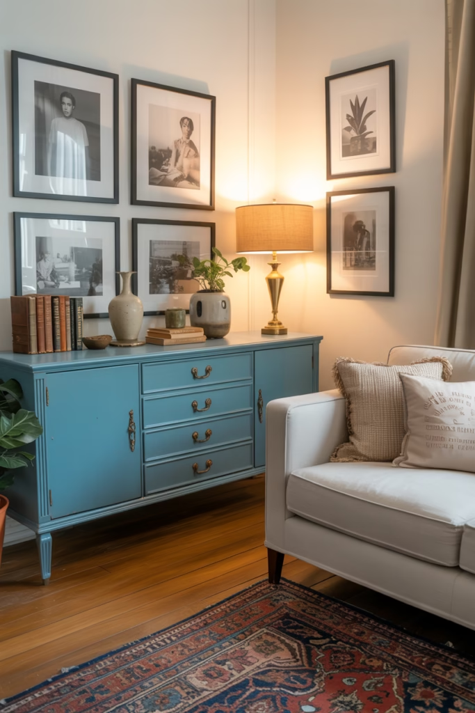
Baby blue furniture, especially vintage pieces, brings this nostalgic sweetness that modern spaces sometimes lack. A baby blue credenza or vintage armchair adds character and a sense of history that new furniture just can’t replicate.
I’m a sucker for this look because it feels personal and curated rather than “I bought everything from the same store.” Hunt for vintage pieces at thrift stores or estate sales and have them reupholstered in baby blue fabric. The payoff is huge—you get a one-of-a-kind piece that becomes a conversation starter.
Pair vintage baby blue pieces with brass hardware and warm wood tones. The combination of old and new, cool and warm, creates this balanced aesthetic that feels collected over time rather than decorated all at once.
Peacock Blue Maximalist Dream
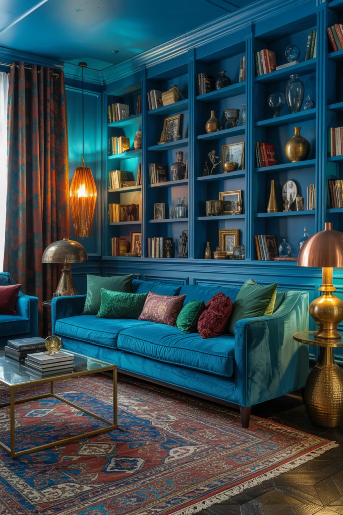
For those of you who think “more is more” (my people), peacock blue is calling your name. This jewel tone is rich, dramatic, and absolutely stunning when you lean into maximalist design principles.
Layer peacock blue with other jewel tones—emerald green, deep purple, ruby red. Add pattern on pattern, mix metals, pile on the throw pillows. The goal here isn’t restraint; it’s creating a space that feels abundant and luxurious. Your living room should feel like a treasure box.
I won’t lie—this look requires confidence and commitment. But when you nail it? Your living room becomes the most interesting room in the house. Every surface tells a story, and the peacock blue ties it all together like a common thread through organized chaos.
Slate Blue Industrial Edge
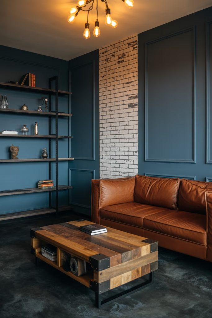
Slate blue brings this moody, sophisticated energy that works perfectly in industrial-style spaces. Pair it with exposed brick, metal accents, and concrete floors for that loft living vibe (even if you’re not actually in a loft).
This darker blue shade has enough gray in it to feel modern and urban. It’s edgy without being aggressive, which is exactly what you want in a living room where you need to actually relax. I’ve used slate blue in spaces with high ceilings and lots of windows, and it handles the drama beautifully.
Add leather furniture, Edison bulb lighting, and maybe some reclaimed wood pieces. The contrast between the cool slate blue and warm industrial elements creates this perfect tension that makes the space feel dynamic and alive.
Cerulean Blue Artistic Flair
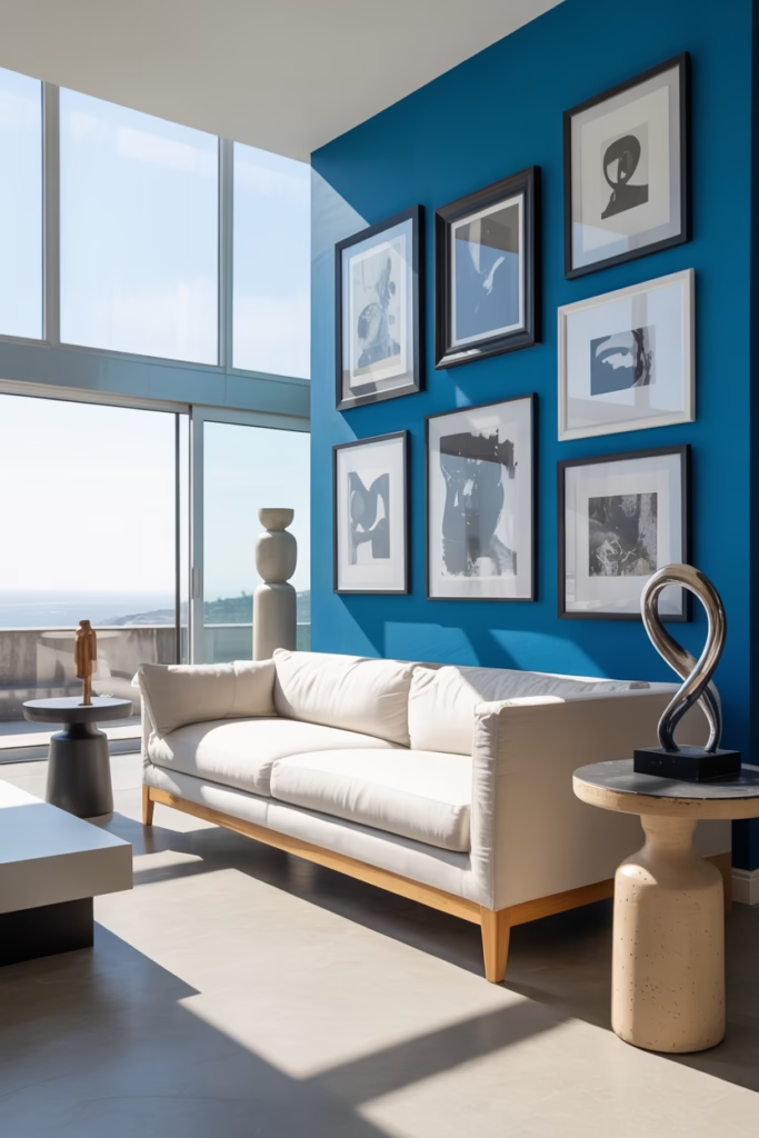
Cerulean blue is that pure, true blue that artists love (there’s literally a famous paint color named this). It’s vibrant without being overwhelming, making it perfect for creative, artsy living rooms.
Use cerulean on a feature wall and hang your art collection against it. The color actually makes artwork pop without competing with it—something about how our eyes process that particular wavelength of blue. It’s basically the ideal backdrop for your gallery wall.
I’ve noticed cerulean works particularly well in rooms with white or natural wood furniture. The contrast is crisp and clean, giving your space that curated, intentional look. Add some sculptural pieces and interesting light fixtures, and you’ve got yourself an art-lover’s paradise.
Periwinkle Blue Whimsy and Charm
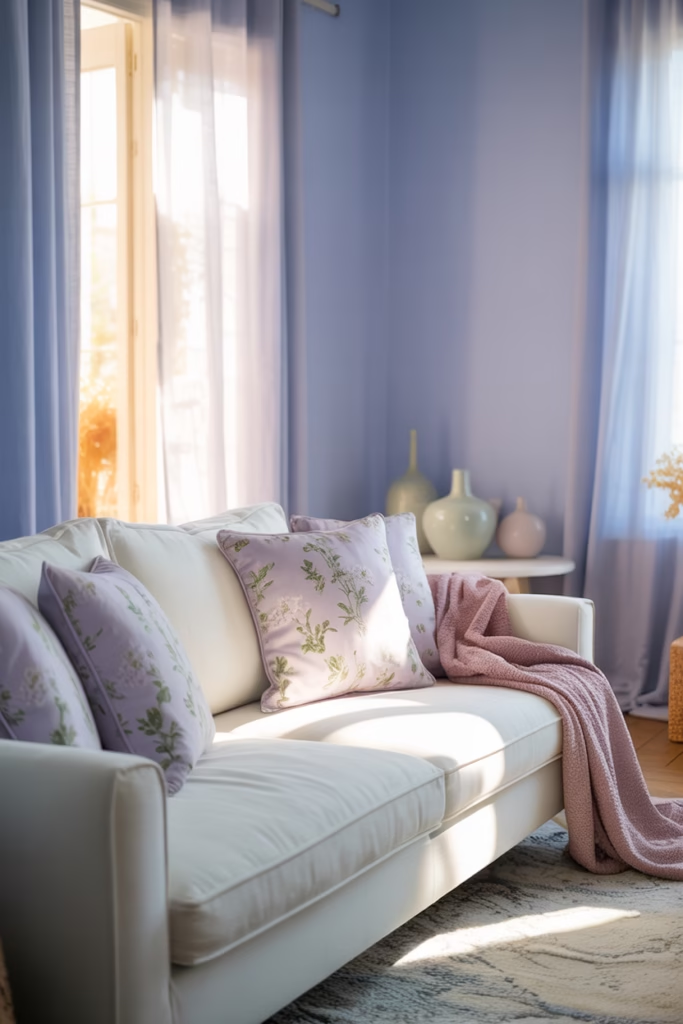
Periwinkle is that sweet spot between blue and purple that brings genuine joy to a space. It’s playful without being childish, feminine without being frilly. If your living room needs a dose of optimism, periwinkle delivers. :/
This shade works beautifully in spaces with lots of white—white trim, white furniture, white rugs. The periwinkle adds just enough color to keep things interesting without overwhelming the airy feeling. I especially love it in rooms with vintage or cottage-style furniture where it enhances that cozy, collected-over-time aesthetic.
Mix periwinkle with soft yellows and greens for a spring garden vibe that works year-round. Add floral patterns (but keep them subtle—we’re not going full grandma’s house here), and suddenly your living room feels like a breath of fresh air.
Ombre Blue Wall Treatment
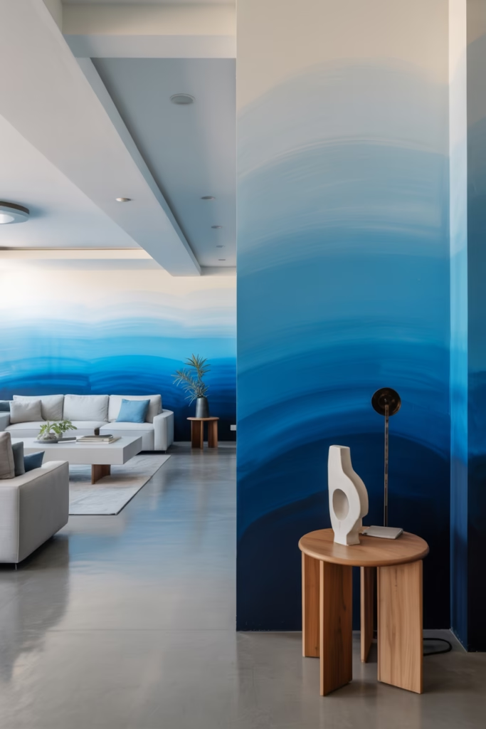
Why commit to just one shade of blue when you can have them all? An ombre wall treatment that transitions from light blue at the ceiling to darker blue at the floor creates this artistic, gradient effect that’s seriously eye-catching.
This technique adds dimension and movement to your walls in a way that flat color just can’t. I’ve seen it done where the darkest blue sits at conversation height, pulling your eye level down and making the space feel cozier. It’s a design trick that’s both beautiful and functional.
The best part? You can customize your ombre to match your existing furniture and decor. Go from sky blue to navy, or from powder blue to teal. The possibilities are endless, and the result always looks intentional and sophisticated (even though it’s actually pretty straightforward to DIY if you’re feeling ambitious).
Final Notes
Committing to blue can feel scary, especially if you’ve been living in neutrals for years. But here’s what I’ve learned from designing countless living rooms: blue is incredibly forgiving, endlessly versatile, and way more livable than you might think.
Whether you go all-in with navy walls or dip your toe in with a blue throw pillow, this color has the power to completely transform how your living room feels. It’s calming yet energizing, classic yet contemporary, bold yet approachable. Not many colors can claim all of that.
So which of these 17 ideas is calling your name? Because I’m willing to bet at least one of them has you reaching for paint swatches or scrolling through furniture sites. And honestly? That’s exactly what should happen. Your living room deserves better than boring, and blue is ready to deliver.