
Alright, let’s talk about neutral living rooms for a second. I know what you’re thinking “neutral” sounds about as exciting as watching paint dry, right? Wrong. So wrong, actually. Here’s the truth: I used to think the same thing until I designed my first neutral living room and realized it was one of the most sophisticated, calming, and downright gorgeous spaces I’d ever created.
The thing is, neutral doesn’t mean boring. It doesn’t mean bland. And it definitely doesn’t mean you’re playing it safe because you lack creativity. Nope. A well-executed neutral living room is actually one of the hardest things to pull off because you’re working with subtlety, layers, and nuance instead of relying on bold colors to do the heavy lifting.
Think about it when you walk into a luxury hotel or a high-end design magazine spread, what do you see? Nine times out of ten, it’s a beautifully curated neutral palette with layers of texture, thoughtful lighting, and just the right amount of visual interest. That’s no accident. Neutral living rooms are timeless, versatile, and create the perfect backdrop for life to happen.
Whether you’re starting from scratch or looking to refresh your existing space, I’m going to walk you through 18 neutral living room design ideas that’ll transform your space from “meh” to “wow.” We’re talking layered textures, strategic color combinations, smart furniture choices, and all those little details that make a room feel intentional and inviting. No boring beige boxes here just sophisticated, livable spaces that you’ll actually want to spend time in. Ready? Let’s get into it.
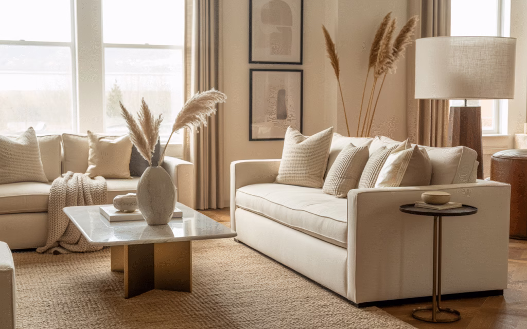
Layering Multiple Shades of Beige
Here’s where most people mess up—they pick one shade of beige and slap it on everything. Don’t do that :/.
The secret sauce? Layer different beige tones to create depth. Think warm taupe walls, sandy throw pillows, creamy ivory rugs, and maybe some ecru curtains. This monochromatic approach adds dimension without introducing competing colors.
I always tell people to grab paint samples and see how they look next to each other. You want a rich, dimensional look that feels intentional, not flat. Mix those warm taupes with sandy hues and off-whites.
Embrace Earthy Neutrals
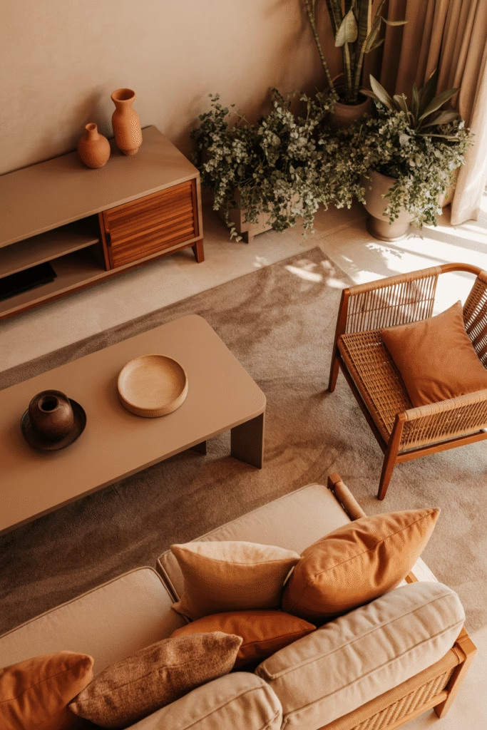
Earthy neutrals are having a major moment in 2025, and for good reason.
We’re talking terracotta, ochre, sage, and warm browns—colors that bring the tranquility of nature right into your living room. These shades create a grounding effect that feels both calming and sophisticated.
Pantone’s Color of the Year for 2025 is Mocha Mousse, which perfectly bridges modern elegance with organic warmth. Pair it with natural wood furniture and rattan accents for that chef’s kiss moment.
Go Full Japandi Style
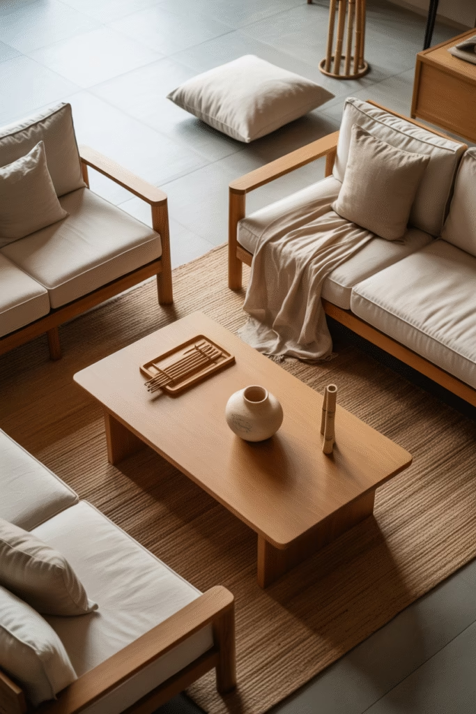
If you haven’t heard of Japandi yet, where have you been? This style combines Scandinavian minimalism with Japanese aesthetics, and it’s absolutely perfect for neutral living rooms.
The formula is simple:
- Minimalist furniture with clean lines
- Natural materials like bamboo and wood
- Neutral color palette (whites, beiges, light grays)
- Cozy textiles for warmth
- Strategic warm lighting
The result? A serene environment that promotes wellbeing while still feeling inviting and livable. Plus, it photographs beautifully for Pinterest—just saying.
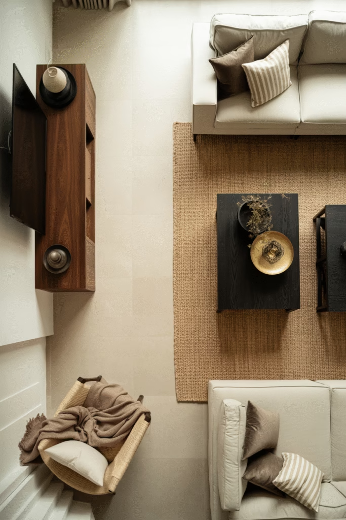
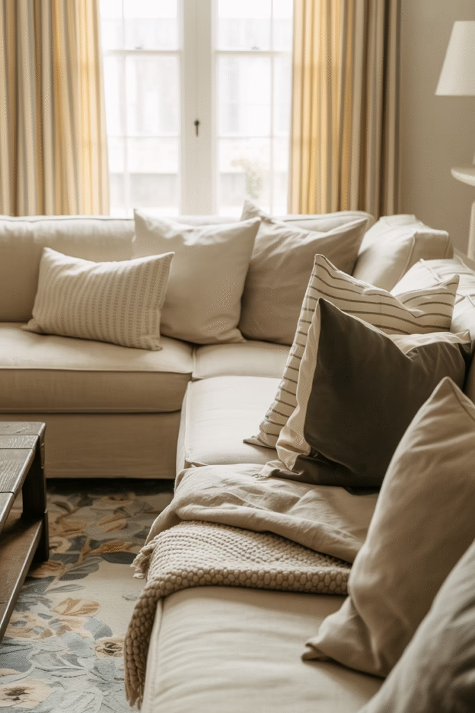
Layer Textures Like Your Life Depends on It
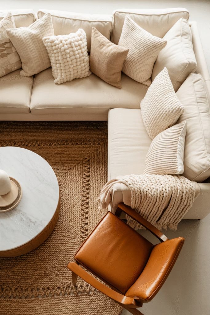
Ever wonder why some neutral rooms feel rich and inviting while others fall flat? Texture, texture, texture.
When you’re working with a limited color palette, you need variety in textures to keep things interesting. I’m talking:
- Boucle pillows on a linen sofa
- Woven jute rugs under a smooth coffee table
- Soft wool throws over leather chairs
- Macrame wall hangings against painted walls
Mix florals with stripes, pair smooth with nubby, and don’t forget natural materials like wood, marble, and clay. These add dimensionality without compromising your neutral scheme.
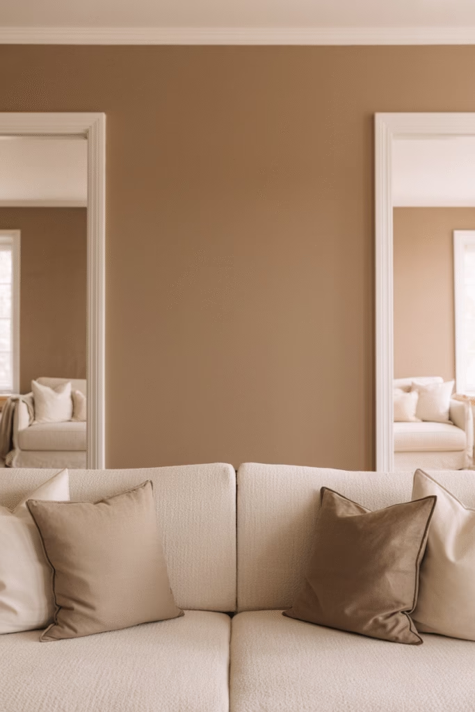
Create a Cream and Grey Palette
Cream and grey is one of my favorite neutral combinations because it works every single time.
Grey brings out the brown undertones in cream for a balanced, sophisticated look. The cool tones of grey perfectly complement the warmth of cream, creating a harmonious space that doesn’t feel too cold or too warm.
Add textured wall finishes, wooden flooring, and cosy textiles to bring in natural toasty colors. Throw in some potted plants and a rattan pouf, and you’ve got yourself a relaxed yet polished living room.
Add Drama with Black Accents
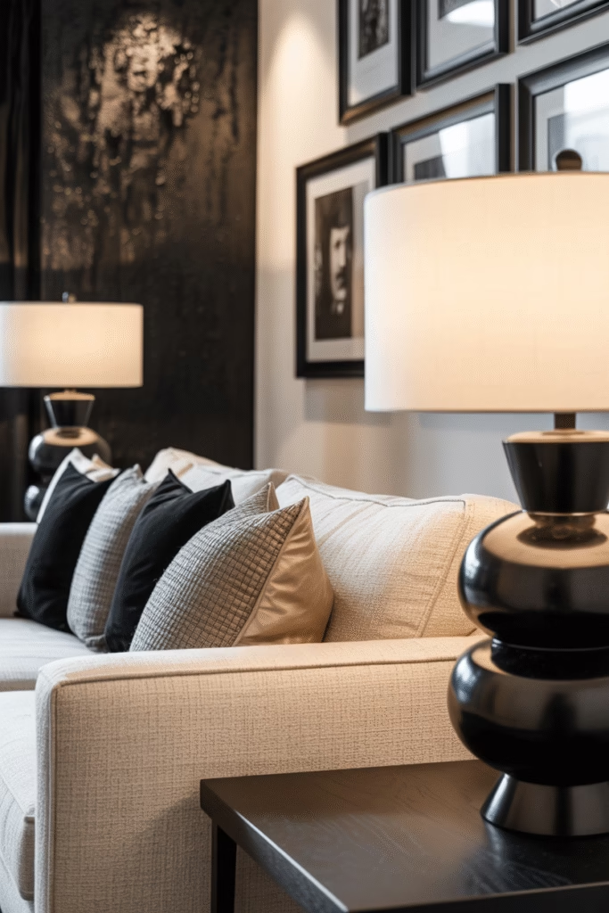
Want to know a secret? Black makes neutral rooms look instantly more expensive.
The black and cream color combination creates warmer contrast and looks highly elegant yet comforting. Use black as an accent—maybe in picture frames, lamp bases, or throw pillows—to add drama without overwhelming the space.
I’ve seen textured accent walls in dark tones paired with cream sofas, and honestly, it’s gorgeous. The contrast creates visual interest while maintaining that neutral foundation we’re going for.
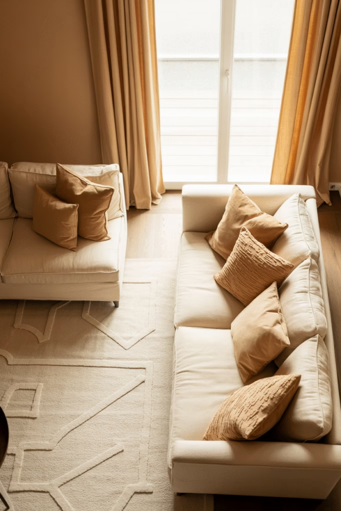
Try a Monochromatic Beige Scheme
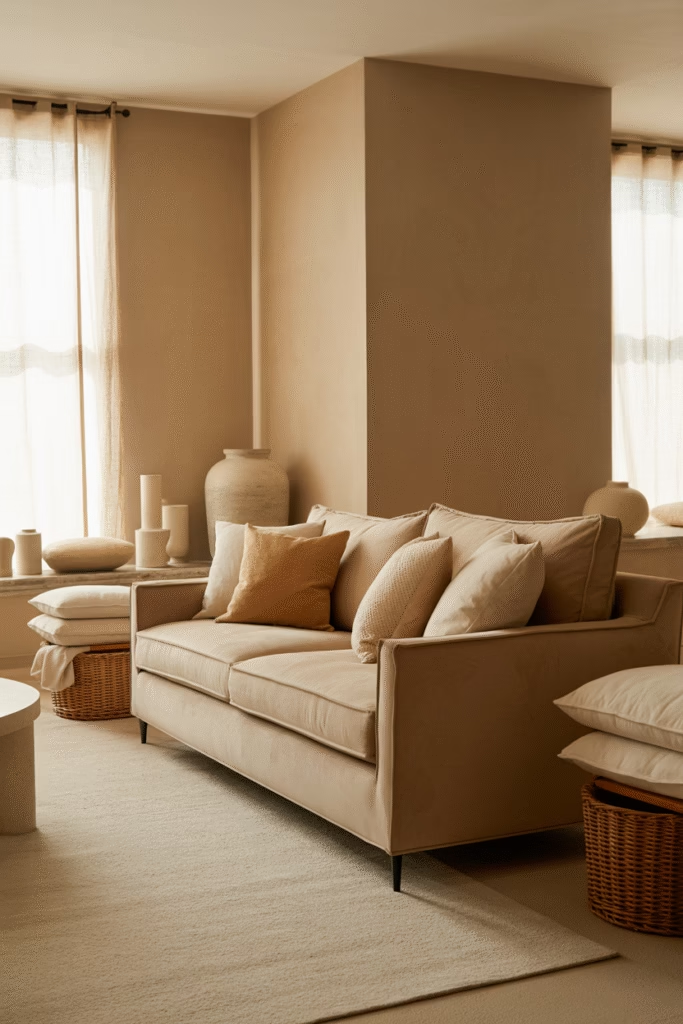
Monochromatic doesn’t mean monotonous, folks.
Create a dynamic beige living room by using various shades and textures all within the beige family. A beige sofa with slightly darker beige throw pillows, a soft ivory rug, and taupe walls creates depth and sophistication without additional colors.
The technique adds visual interest through tonal variation. Just make sure you’re layering those textures—smooth velvet next to rough linen, glossy finishes near matte surfaces.
Incorporate Warm Metallics
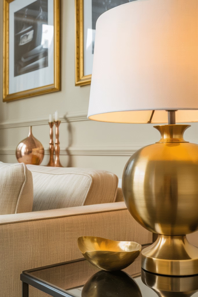
FYI, metallic finishes are trending hard for 2025, and they work beautifully with neutral palettes.
Use warm metallic finishes in lighting fixtures, cabinet hardware, and decorative accessories to create a layered, sophisticated look. Think brushed brass, copper, or gold accents.
These metallics add sophistication and contrast against your neutral backdrop. I particularly love brass table lamps and gold-framed artwork—they catch the light beautifully and add that luxe factor.
Go Greige for Maximum Versatility
Greige (grey + beige) is basically the Swiss Army knife of neutral colors.
This combination brings out the best in both colors—the warmth of beige balanced by the coolness of grey. It’s an ideal canvas for bolder accent colors if you want to introduce pops of color later.
Use a variety of textures to keep a greige room interesting. Add patterned pillows, pouffe, and bring in natural light to brighten everything up. Bold greenery and exposed wood furniture tie the whole look together.
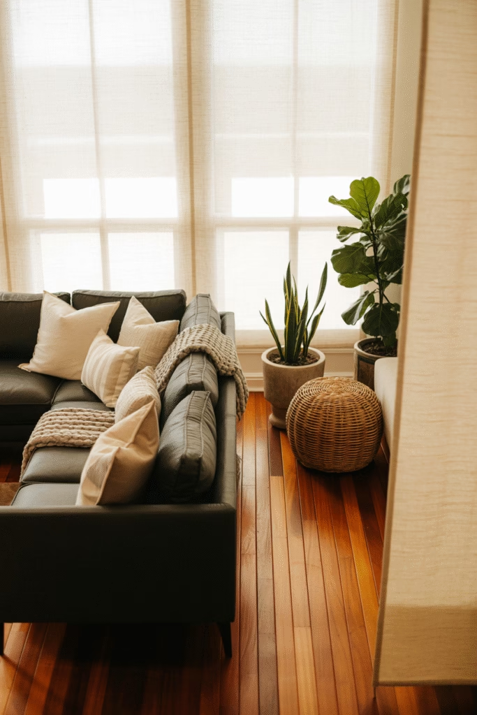
Bring in Natural Materials
Natural materials are non-negotiable in neutral living rooms.
I’m talking about:
- Rattan and cane furniture
- Wooden coffee tables and shelving
- Marble countertops or side tables
- Clay pottery and vases
- Jute or sisal rugs
These materials add organic warmth and visual interest without introducing competing colors. Plus, they align perfectly with that whole bringing-nature-indoors vibe that’s everywhere right now.
Use Taupe as Your Hero Color
Taupe is seriously underrated—it’s warm, inviting, and incredibly versatile.
Described as a “warm hug in a paint can,” taupe delivers comfort and coziness in a world craving exactly that. It’s that perfect blend of gray and beige that adds depth without overpowering your space.
Combine taupe with shades of white, cream, and gray for a beautifully layered, sophisticated look. It complements every room and provides elegant yet understated charm.
Create Zones in Open-Plan Spaces
Open layouts are still trending in 2025, but you need to define different areas.
Use contrasting furniture in rich, dark tones against pale walls to define different zones in your open-plan living room. This clever trick creates visual separation without actual walls.
Anchor each zone with textured soft furnishings—maybe a sisal rug in the seating area and a soft cashmere throw in the reading nook. Keep the color palette neutral throughout to maintain flow and cohesion.
Add Soft Blue Accents
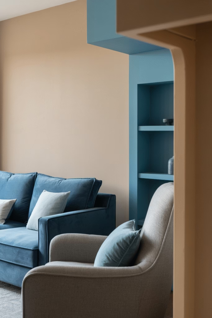
Neutral doesn’t mean you can’t introduce subtle color—soft blue works beautifully.
Balance neutral walls with a coat of soft blue paint in alcove storage, then anchor the look with a deep blue sofa and grey armchair. Throw in light blue cushions to tie everything together.
This creates a fresh, calming palette that feels modern without abandoning your neutral foundation. Blues and neutrals are basically best friends anyway—they complement each other perfectly.
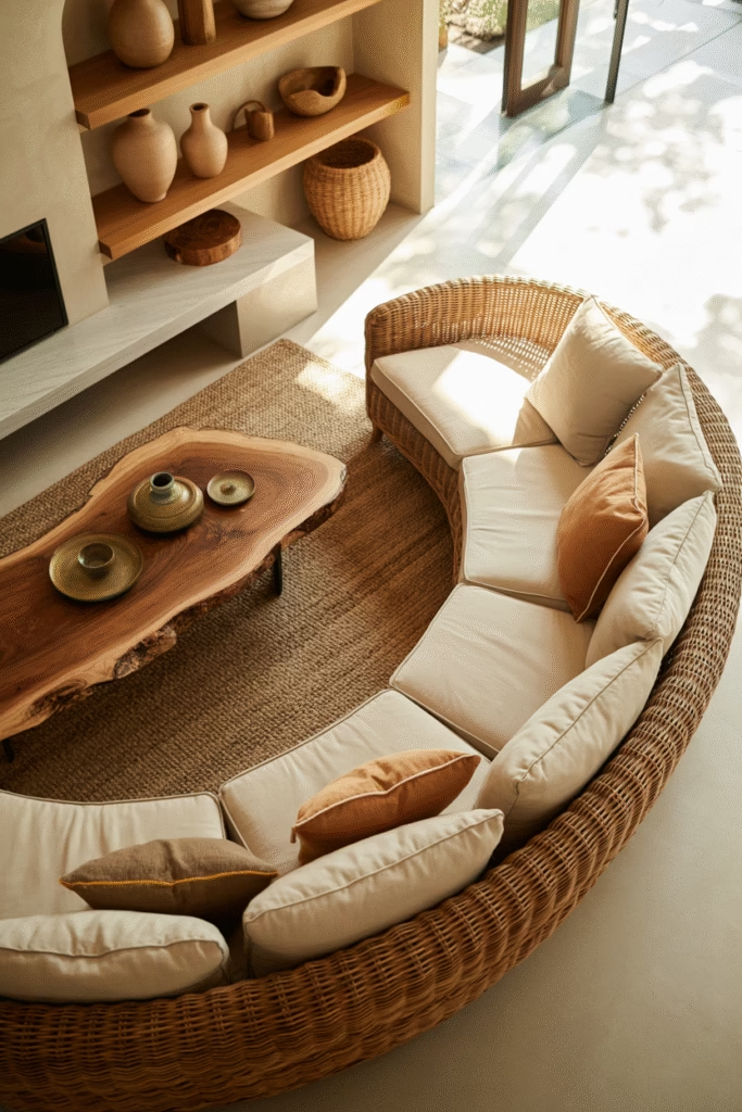
Embrace Curved Furniture
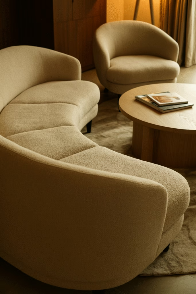
Sharp angles are out, curves are in.
Curved furniture pieces bring softness and sophistication to neutral living rooms. Think crescent-shaped sofas, rounded armchairs, and circular coffee tables.
This trend pairs beautifully with neutral color schemes because the shapes create visual interest without relying on bold colors. A curved beige sofa in a minimalist neutral room? Chef’s kiss.
Layer Your Lighting
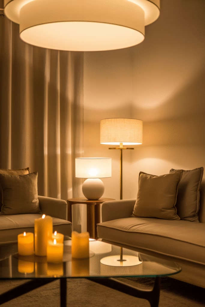
Ever noticed how some rooms just feel warmer? It’s usually the lighting.
Use a mix of warm lighting sources at different levels—overhead fixtures, floor lamps, table lamps, and even candles. Smart lighting is trending for 2025, allowing you to adjust brightness and warmth throughout the day.
In neutral rooms, warm lighting is crucial for preventing that sterile, cold feeling. I always go for warm-toned bulbs (2700-3000K) to complement beige and cream palettes.
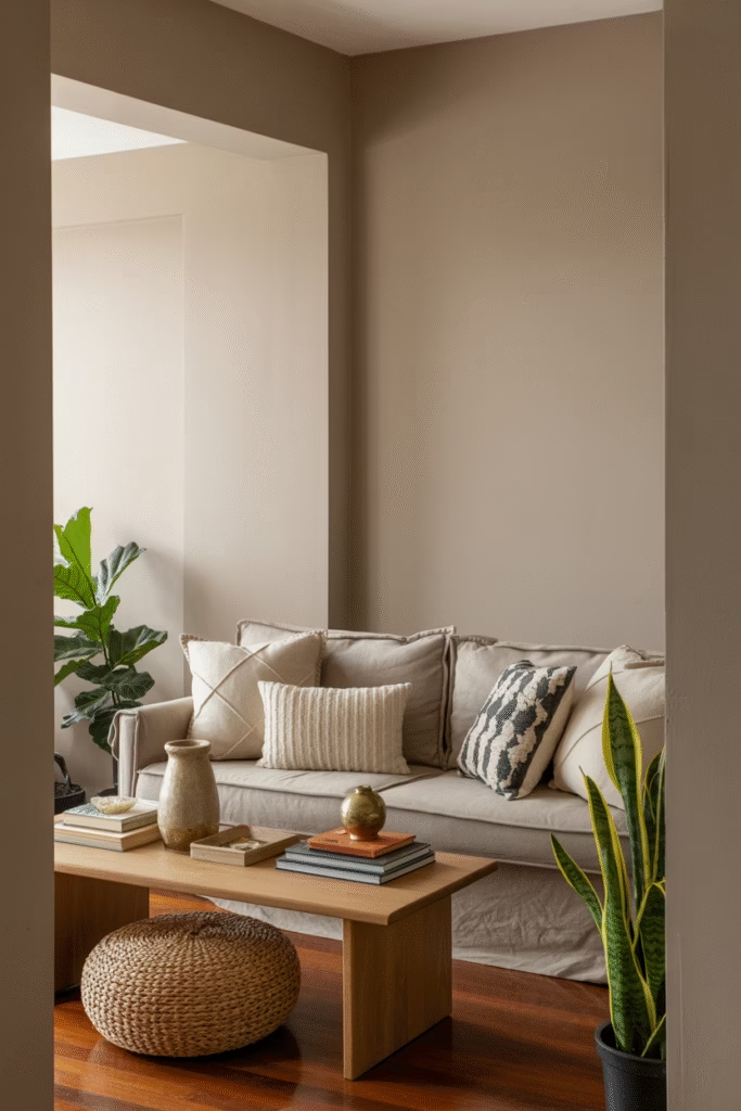
Mix Patterns Thoughtfully
IMO, patterns keep neutral rooms from feeling too serious.
The trick? Choose two or three neutral colors, then incorporate various patterns in those colors. Layer large-scale patterns with small-scale prints—maybe geometric throw pillows with a floral area rug.
Florals, stripes, and small-scale prints in varying materials like linen, cotton, and wool create a cozy, homey feel. Just keep everything within your neutral color family for cohesion.
Incorporate Indoor Plants
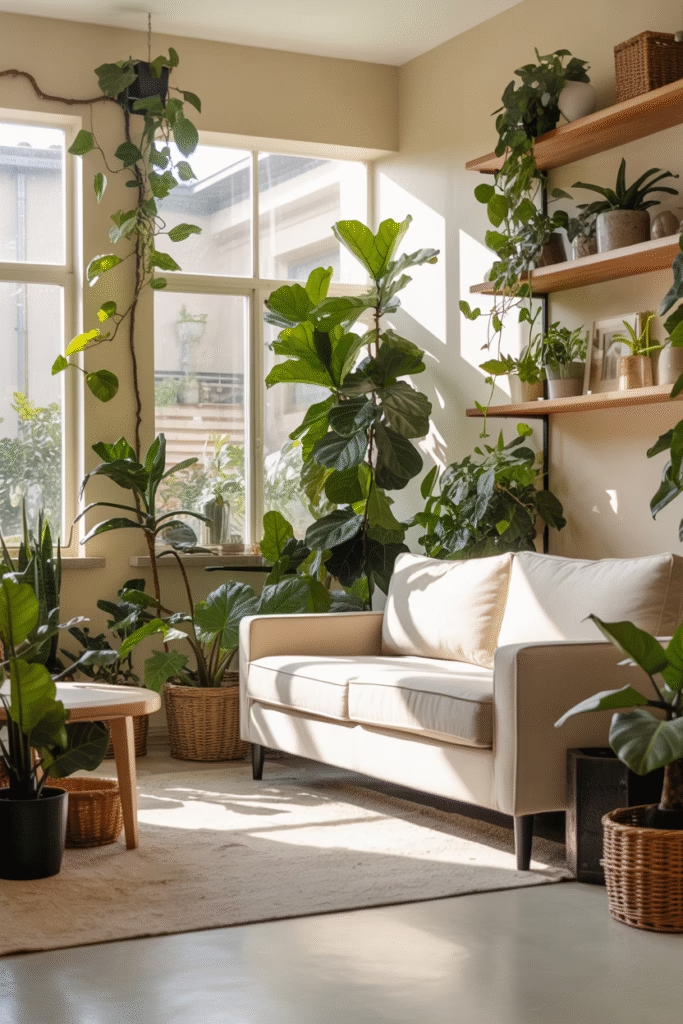
Plants are the easiest way to add life to neutral spaces.
Bring in bold greenery and house plants to inject natural color and freshness. Large potted plants in corners, trailing plants on shelves, or even a fiddle leaf fig as a statement piece work beautifully.
The green creates natural contrast against your neutral backdrop while maintaining that organic, nature-inspired vibe. Plus, they’re great for air quality—double win.
Create a Coastal Calm Vibe
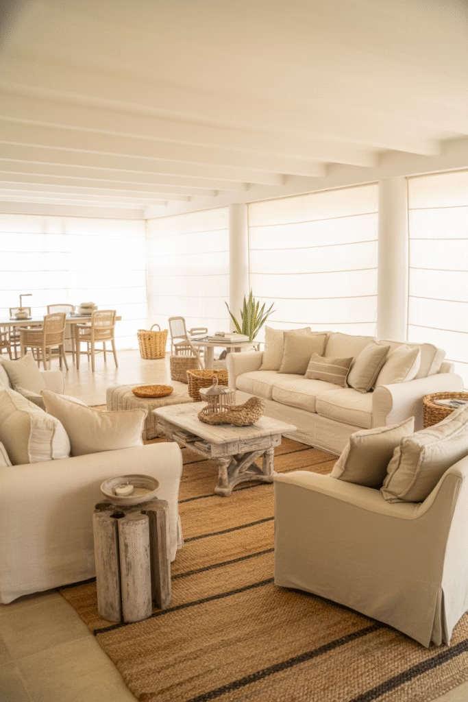
Beach vibes but make it neutral? Absolutely possible.
Layer sandy beiges, soft whites, and pale greys to create a coastal-inspired neutral living room. Add natural textures like driftwood, jute rugs, and linen upholstery.
Keep the palette soft and airy, almost ethereal. This works especially well in rooms with good natural light—let that sunshine pour in and bounce off your light neutral surfaces.
Conclusion
So there you have it 18 solid ways to create a neutral living room that’s anything but basic. If there’s one thing I hope you take away from this, it’s that neutral doesn’t equal boring. Not even close.
The beauty of neutral palettes is that they give you an incredible foundation to work with. You can layer in textures, play with different shades within the same color family, and create depth without overwhelming your space with competing colors. It’s like having a blank canvas that’s already halfway to being a masterpiece you just need to add those thoughtful details.
Here’s what I’ve learned from designing countless neutral living rooms: the magic is in the layering. Mix your beiges with taupes. Pair smooth velvet with chunky knits. Add warm brass next to natural wood. Throw in some greenery. Play with your lighting. These little decisions compound into something really special.
And honestly? Neutral living rooms are forgiving. Made a decorating mistake? It’s way easier to fix when you’re working within a neutral palette. Want to refresh your space seasonally? Swap out a few throw pillows or a blanket, and you’ve got a whole new vibe. Planning to sell your house someday? Neutral spaces appeal to pretty much everyone.
The best part is that you can start small. You don’t need to renovate your entire living room tomorrow. Pick one idea from this list—maybe it’s adding more textured pillows, or introducing some curved furniture, or finally committing to that taupe paint color you’ve been eyeing. Start there and build from it.