
If your shelves, console table, or that sad little corner feel “fine” but never quite done, I get it. Those spots sit right in your line of sight, so even tiny clutter (or one lonely candle trying its best) can make the whole room feel off. I’ve learned this the hard way after styling a shelf, stepping back feeling proud… and then realizing it looked like a clearance aisle tried to tell a story.
The good news? You don’t need a full makeover or a cart full of trendy decor to get that Pinterest-worthy look. You just need a few simple styling moves balance, height, texture, and a little editing courage so your space looks intentional instead of accidental. Ready to make those “in-between” surfaces finally pull their weight?
The Foundation: Why These Spaces Matter More Than You Think
Here’s the thing nobody tells you—shelves, consoles, and corners are the personality hubs of your home. They’re like the accessories of interior design. You could have the most beautiful sofa and perfect paint color, but if your shelving looks like a garage sale exploded, the whole room falls flat.
These spaces do double duty. They’re functional (hello, storage) and decorative, which means styling them right can completely transform how a room feels. Ever walked into someone’s house and immediately felt like it was pulled from a design blog? I’d bet money their shelves were on point.
The best part? You don’t need a huge budget or a degree in interior design to nail this. You just need to understand a few styling principles and trust your instincts a bit.
The Rule of Three (And Why It Actually Works)
Let me introduce you to your new best friend: the rule of three. Designers swear by this because our brains naturally find odd-numbered groupings more interesting and visually appealing than even numbers. Weird, right?
When you’re styling any surface—whether it’s a floating shelf, console table, or that awkward corner everyone ignores—try grouping items in threes. This doesn’t mean you can only have three things total (that would be boring), but rather that you should create clusters of three objects at varying heights.
Here’s how I typically break it down:
- One tall piece (a vase, candlestick, or decorative bottle)
- One medium-height item (a stack of books, small plant, or decorative box)
- One short accent (a candle, small bowl, or sculpture)
Play with the heights and watch the magic happen. The key is creating visual triangles that your eye naturally wants to follow. IMO, this is the single most important styling trick that separates amateur shelves from professional-looking ones.
Layering: Because Flat is Boring
If you’re lining everything up in a single row like soldiers at attention, we need to talk. Layering adds depth and makes your styling feel intentional rather than thrown together. Think of it like dressing—you wouldn’t just wear a t-shirt and call it an outfit, right? You add layers that create interest.
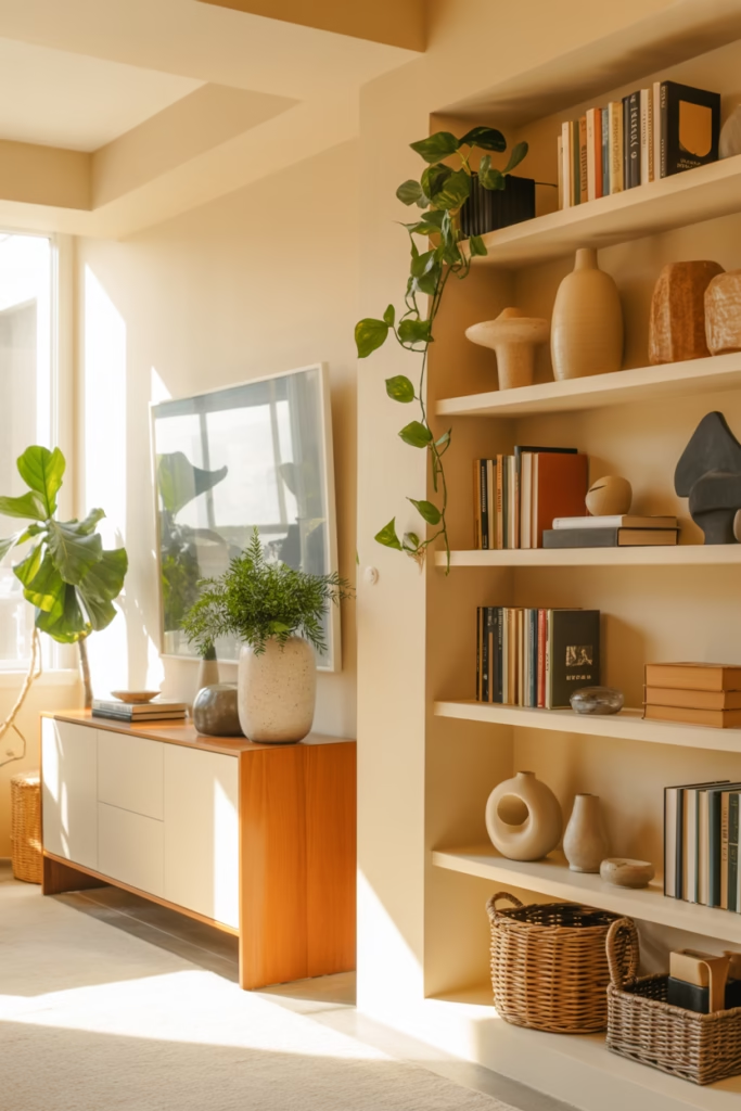
On shelves, this means placing items in front of other items. Lean a framed print against the wall, then place a small plant or object in front of it. Stack books horizontally, then top them with a decorative object. The overlap creates visual interest and makes the space feel curated.
For console tables, try this: place a large piece (like a lamp or tall vase) toward the back, layer in a medium-height item slightly in front, and finish with something small at the very front edge. Your eye travels through the layers, which keeps things interesting.
One warning though—don’t go overboard. You want layers, not clutter. If you can’t see the good stuff because there’s too much competing for attention, scale it back 🙂
Color Theory Without the Headache
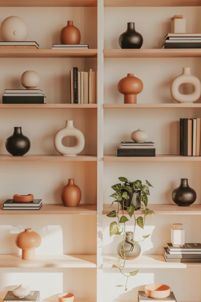
I’m not going to bore you with a full color wheel lesson because honestly? Most of us style by feel anyway. But understanding a few basic color principles will seriously level up your shelf game.
Stick to a cohesive color palette—usually three to four colors max. This doesn’t mean everything has to match (please don’t do that), but the colors should talk to each other nicely. I like to choose one dominant color, one or two accent colors, and then sprinkle in neutrals.
For example, if you’re going for a modern look, you might use:
- White or cream as your base
- Black for contrast
- One pop color (maybe terracotta or sage green)
- Natural wood tones to warm things up
The Pinterest-worthy trick? Repeat your color palette across different shelves or surfaces in the same room. If you have navy blue on your bookshelf, echo it with a navy vase on your console. This creates visual flow that makes your space feel designed rather than randomly decorated.
FYI, metallics count as neutrals, so don’t be afraid to mix gold, brass, or copper accents throughout.
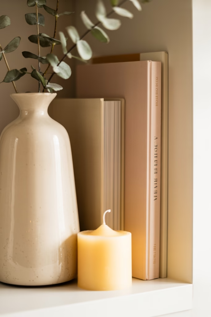
Texture is Your Secret Weapon
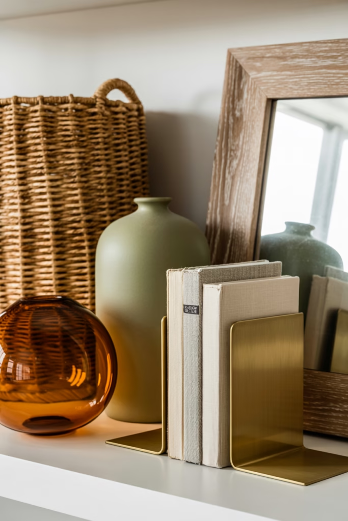
Want to know what makes Pinterest shelves look expensive? Texture. Seriously, mixing different textures instantly elevates your styling game and makes everything feel more luxe.
Think about combining:
- Smooth ceramics with rough woven baskets
- Sleek glass with chunky wood elements
- Shiny metallics with matte finishes
- Soft textiles (like a small throw or tasseled basket) with hard surfaces
I learned this the hard way when my all-white-ceramic phase made my shelves look like a boring minimalist nightmare. The second I added a chunky knit basket and some natural wood pieces? Game changer.
The texture mix also helps when you’re working with a limited color palette. If everything is cream and white, the different textures keep it from feeling flat and one-dimensional.
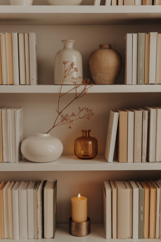
Books: The Styling MVP You Already Own

Can we talk about books for a second? They’re literally the easiest styling prop ever, and you probably have a bunch lying around. Stack them, stand them up, use them as risers—books are incredibly versatile.
Here are my favorite ways to use books in styling:
- Stack 2-3 books horizontally and top with a decorative object
- Mix vertical and horizontal stacks for visual interest
- Remove dust jackets for a cleaner, more cohesive look (or keep them if the spines are pretty)
- Use large coffee table books as pedestals for smaller items
Pro tip: arrange books by color for that ultra-Pinterest look, or keep them in rainbow order if you’re feeling bold. Some people think this is sacrilege, but honestly, it looks amazing and you can always organize by author on your less-visible shelves.
The Power of Empty Space (Yes, Really)
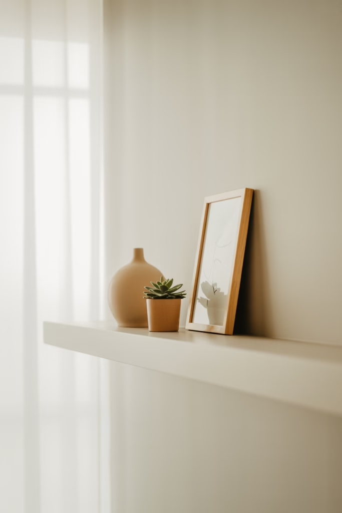
This might be the hardest lesson to learn, but negative space is not wasted space. In fact, it’s what makes everything else shine. Ever notice how the most beautiful styled shelves on Pinterest have breathing room? That’s intentional.
If you cram every inch with stuff, nothing stands out. Your eye doesn’t know where to look. But when you give your objects room to breathe, each piece becomes more impactful.
I usually aim for about 30-40% empty space on any given shelf or surface. This might feel wrong at first—like you’re not “using” the space properly—but trust me, it makes everything look more expensive and intentional.
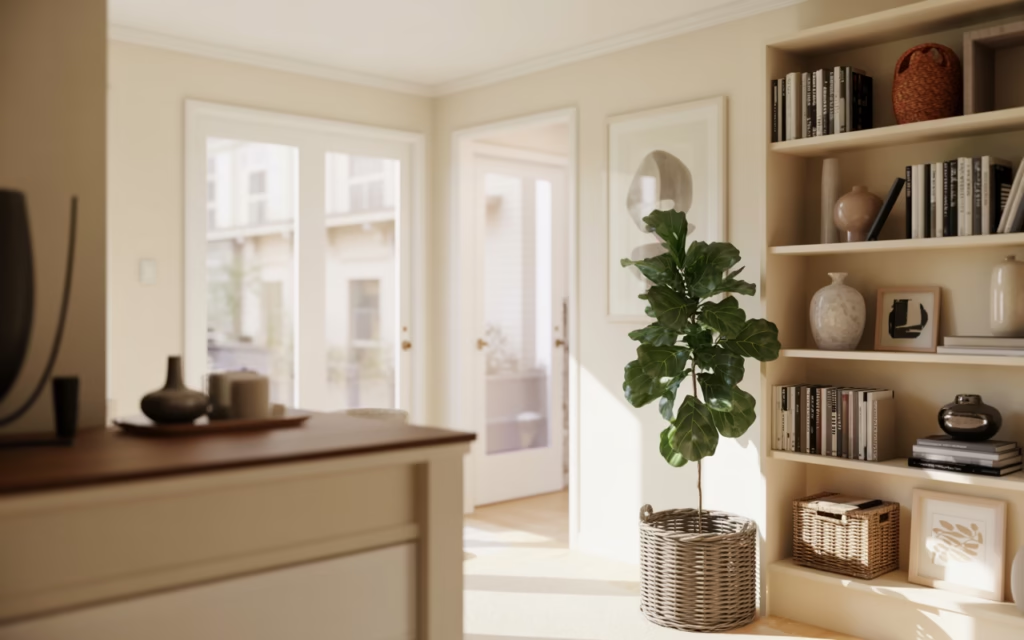
Corners: The Forgotten Styling Opportunity
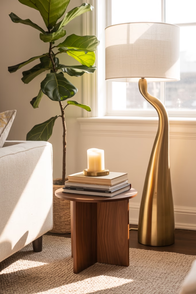
Let’s address the elephant (or rather, the empty corner) in the room. Corners are tricky because they’re three-dimensional spaces that most people ignore. But styled right, they become these amazing focal points.
For floor corners, consider:
- A tall plant (fiddle leaf figs are cliché but effective)
- A floor lamp paired with a small side table
- A decorative ladder leaning against the wall with throws or baskets
- A sculptural floor vase with branches or dried florals
For upper corners (like where walls meet near the ceiling), floating corner shelves are your friend. Style them the same way you’d style any shelf—rule of three, varying heights, mix of textures.
The key is making corners feel intentional rather than just “where stuff ends up.” I used to shove my yoga mat in the corner and call it a day. Now? I have a gorgeous brass floor lamp with a small plant stand, and it’s become one of my favorite spots in the room.
Greenery: The Instant Upgrade
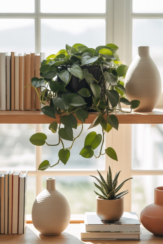
If you take away one thing from this entire article, let it be this: add plants. Real, faux, doesn’t matter—greenery makes everything look better. It adds life (literally), color, texture, and that organic element that keeps styled spaces from feeling too sterile.
I’m team real plants because I like the vibe, but listen, if you’re a plant killer, there’s no shame in high-quality faux greenery. The key is choosing realistic-looking options and mixing different types of plants.
Try these easy styling wins:
- Trailing pothos on upper shelves
- Small succulents grouped together on consoles
- A statement fiddle leaf or monstera in corners
- Herbs in pretty pots (functional and decorative)
Vary the sizes and don’t just line them up. Cluster them in odd numbers, mix with other objects, and remember—you want plants to enhance your styling, not dominate it.
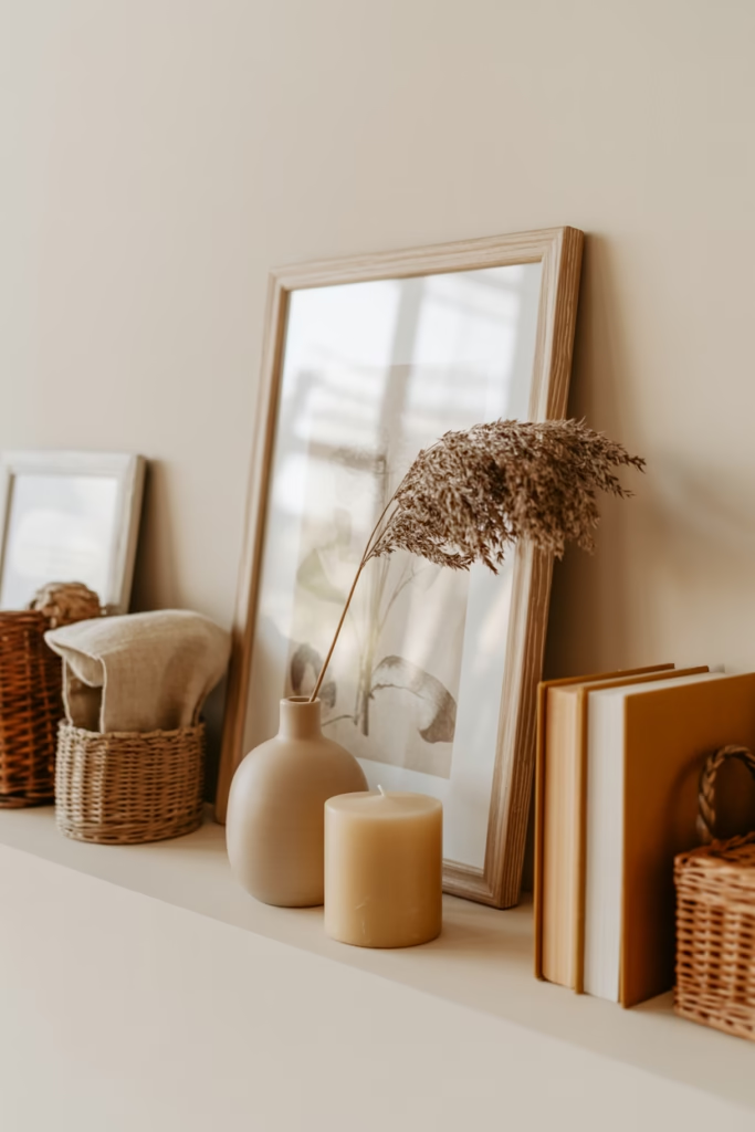
The Art of the Lean
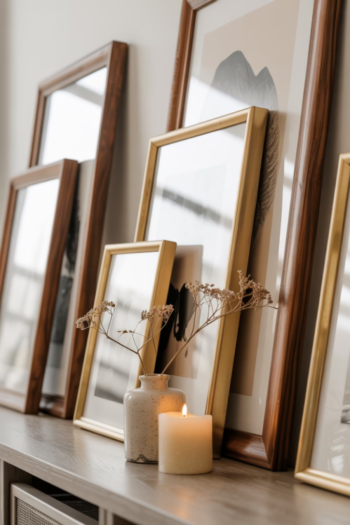
Here’s a styling trick that looks effortless but makes a huge impact: leaning art instead of hanging it. This works especially well on shelves, mantels, and consoles.
Lean a framed print or canvas against the wall, then layer smaller objects in front. It creates that casual, “I just threw this together” vibe that Pinterest loves. Plus, you avoid putting more holes in your walls (my landlord appreciates this).
The secret is varying the sizes of what you lean. Mix a large piece with a smaller one, overlap them slightly, and don’t be afraid to play with different frame styles. Matchy-matchy frames can look uptight—mixing metals and finishes feels more collected and personal.
Functional Meets Beautiful: The Styling Sweet Spot
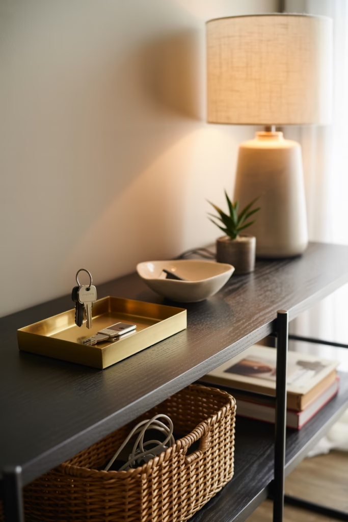
Let me be real with you—the best styling incorporates things you actually use. Those perfectly styled Pinterest shelves that only have decorative objects? Yeah, that’s not real life for most of us.
The goal is making your everyday items look intentional. Store things in pretty containers. Decant products into glass jars. Choose functional items that also happen to be beautiful, like:
- Woven baskets for storage (hides clutter but looks chic)
- Pretty boxes for organizing small items
- Decorative trays to corral daily-use objects
- Attractive containers for office supplies or bathroom essentials
I keep my keys in a small ceramic dish on my console, my charging cables in a woven basket on my shelf, and my reading glasses in a vintage brass tray. Everything is accessible but also contributes to the overall aesthetic.
Theme vs. Eclectic: Finding Your Style
There’s this ongoing debate about whether to theme your styling (all coastal, all modern, all vintage) or go eclectic. Honestly? Do what feels right for you. Both can look amazing when done well.
If you go thematic, make sure you’re not hitting people over the head with it. A coastal shelf doesn’t need shells, coral, rope, anchors, AND a “Beach House” sign. Choose a few subtle nods to your theme and let other elements be neutral.
If you go eclectic, the trick is finding a common thread—whether that’s color, material, or style era. My shelves are pretty eclectic (vintage brass mixed with modern ceramics and natural elements), but I keep everything in my color palette, so it works.
The worst mistake? Being too literal. You don’t need every object to relate to your theme. That’s how you end up with those kitschy, overdone spaces that make people cringe.
Console Table Styling: The Welcome Committee
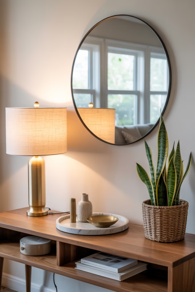
Your console table (whether in the entryway, behind the sofa, or against a hallway wall) is prime real estate. This is often one of the first things people see, so make it count.
I like to think of console styling in zones:
- One side with height (table lamp or tall decorative object)
- Center with interest (tray with smaller grouped items or a centered statement piece)
- Other side with medium-height items (small plant, stack of books, decorative box)
Add a mirror or piece of art above the console to anchor the whole vignette. The reflection from a mirror also makes spaces feel larger and bounces light around, which is always a win.
Don’t forget the practical stuff—if this is your entryway console, incorporate a catch-all tray for keys and a small bowl for change. Function doesn’t have to be ugly.
Seasonal Refresh Without Starting Over
Here’s where styling gets fun—you don’t need to completely redo your shelves every season. Just swap out a few key accent pieces and you’re golden.
I keep my base layers (books, larger vessels, main structural pieces) consistent year-round. Then I rotate in seasonal touches:
- Spring: fresh florals, lighter colors, botanical prints
- Summer: bright pops of color, shells or coastal nods, lighter textures
- Fall: warm metallics, dried foliage, cozy textiles
- Winter: candles, evergreen branches, deeper colors
This approach is way easier than starting from scratch and keeps your styling budget-friendly. Plus, it gives you something to look forward to—I genuinely get excited swapping in my fall styling pieces when September rolls around :/
Common Mistakes (That I’ve Definitely Made)
Let’s talk about what NOT to do, because I’ve done it all and learned the hard way:
Everything the same height – Creates a boring horizontal line that makes your eye want to escape. Mix it up.
Too much symmetry – Unless you’re going for a formal, traditional look, perfect symmetry feels stiff. Asymmetrical balance is more interesting.
Ignoring scale – That tiny candle on your huge console table? It’s getting lost. Make sure objects are appropriately sized for the surface.
Overcrowding – More is not always more. Edit ruthlessly. If something doesn’t serve the overall look, remove it.
Matching everything – This isn’t a furniture showroom. Mix finishes, styles, and eras for a collected look.
Forgetting to dust – Real talk: styled shelves show dust like crazy. If you’re not willing to maintain it, simplify your styling.
The Finishing Touch: Personal Meaningful Items
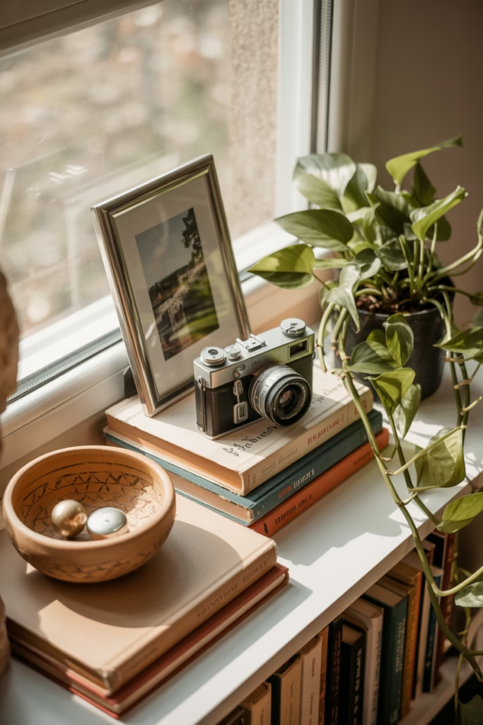
The absolute best way to make your styling uniquely yours? Include personal items that tell your story. This is what separates generic Pinterest copying from spaces that actually feel like homes.
Display your grandmother’s vintage camera, the ceramic bowl you made in that pottery class, the rocks your kids collected on vacation, or the concert poster from your favorite show. These personal touches make your space authentic and give people something to ask about.
Just style them thoughtfully—treat sentimental objects like you would any other decorative piece. Group them with complementary items, give them proper height, and incorporate them into your color scheme.
The goal isn’t creating a museum of your life, but rather sprinkling in enough personal elements that the space feels lived-in and loved.
Look, styling shelves and surfaces is part art, part science, and part just messing around until something clicks. Don’t stress about getting it perfect on the first try I still rearrange my bookshelf basically every month because I get bored or spot something new I want to incorporate.
The Pinterest-worthy homes you admire? They’re usually the result of trial, error, and a lot of moving stuff around. Start with the basics (rule of three, varying heights, cohesive colors), trust your instincts, and don’t be afraid to break rules if something feels right. Your space should make YOU happy first and Pinterest second.