
Right after I nailed the “calm neutral” vibe once, I started noticing something funny: it didn’t happen because I bought fancy stuff. It happened because I stopped trying to make every corner “interesting” and started making every corner feel good. Have you ever walked into a room and instantly relaxed… even though nothing in it screamed for attention?
That’s basically the whole neutral home aesthetic secret. You pick a soft, cohesive palette, then you let texture do the heavy lifting linen, wood, wool, clay, stone, all that good cozy stuff. You keep the shapes simple, the lighting warm, and the clutter on a very strict “we don’t live here anymore” plan.
The Foundation: Understanding Calm Neutral Aesthetics
Before we jump into the specific ideas, let’s get something straight neutral doesn’t mean lifeless. I learned this the hard way after painting my entire living room the color of sadness (also known as “builder’s beige”).
Calm neutral aesthetics are all about creating spaces that feel like a deep breath after a chaotic day. We’re talking soft whites, warm taupes, gentle grays, and those delicious creamy tones that make you want to curl up with a book and forget your phone exists.
The key here? Layering textures and tones. A single flat beige wall is a snooze fest. But that same beige with linen curtains, a chunky knit throw, and some natural wood elements? Now we’re cooking.
1. The Monochromatic Magic Room
Ever wondered why those Instagram-worthy rooms feel so cohesive? They’re usually rocking a monochromatic scheme with different shades of the same neutral.
Pick your base neutral—let’s say a warm greige—and then use it everywhere in varying intensities. Your walls might be the lightest version, your sofa a medium tone, and your accent pillows the deepest shade. This creates depth without chaos, which is exactly what your overwhelmed brain needs.
I tried this in my bedroom, and honestly, it’s like stepping into a cloud. The trick is mixing at least three different shades of your chosen neutral to avoid that “hospital waiting room” vibe.
Making It Work:
- Start with paint swatches and tape them on your wall for at least a week
- Layer your chosen neutral in fabrics, furniture, and decor
- Add warmth with lighting—cold neutrals under harsh lights look sad, trust me
- Don’t match everything perfectly; slight variations add character
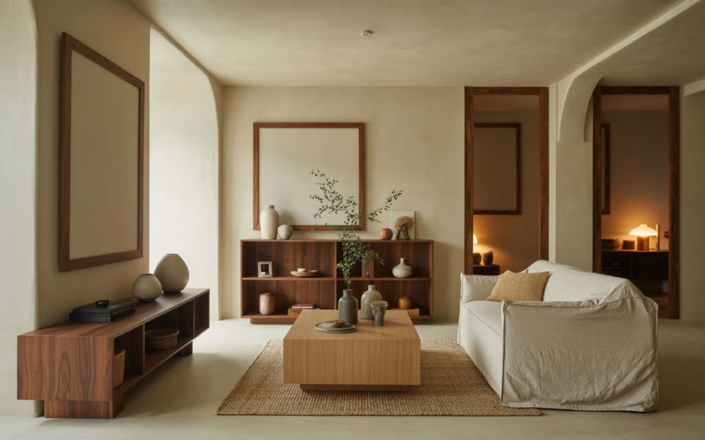
2. Natural Wood Everything (But Make It Classy)
Wood is your best friend in neutral spaces. Period. But here’s where people mess up—they either go too matchy-matchy or create a chaotic lumber yard situation.
I’m talking about intentional wood mixing. A light oak coffee table, medium walnut shelving, and maybe some darker wood picture frames. The varying tones add visual interest while keeping that calm, grounded feeling.
Natural wood brings warmth that pure neutrals sometimes lack. Plus, it connects your indoor space to nature, which apparently does wonders for your mental health. (FYI, I’m not a therapist, but my stress levels definitely dropped after adding more wood elements.)
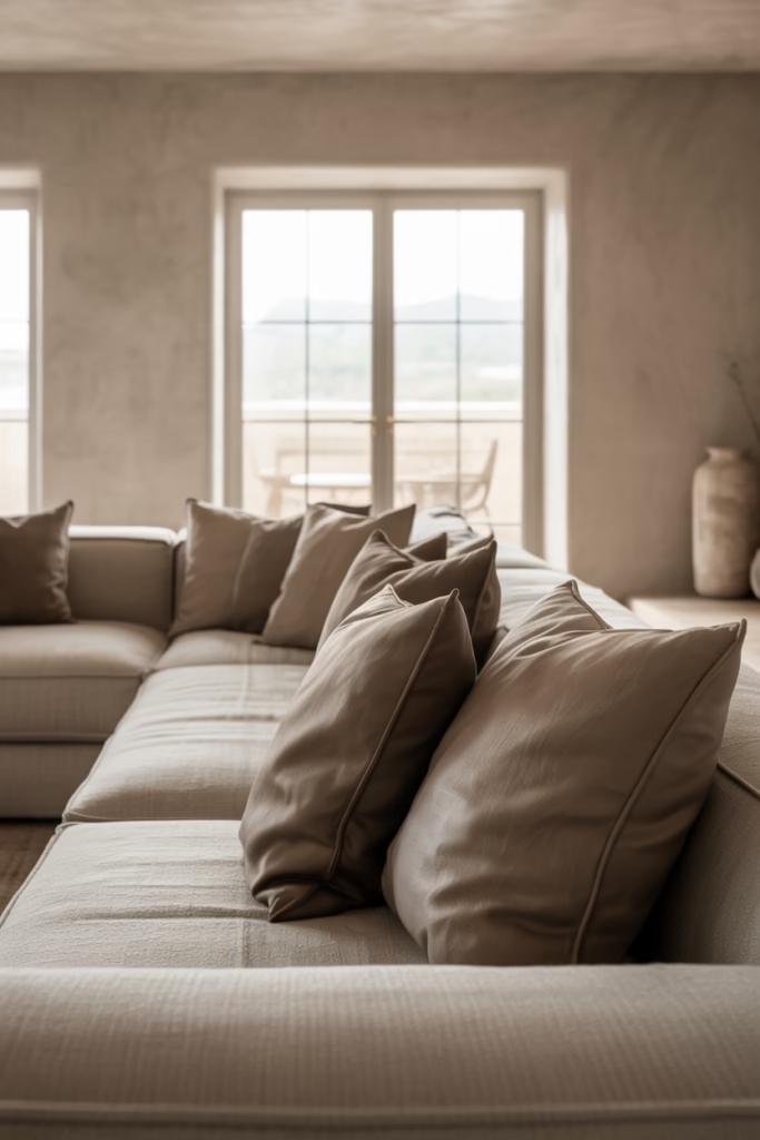
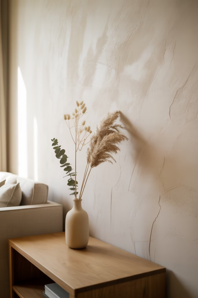
3. The Linen Obsession Is Real
If you’re not incorporating linen into your neutral aesthetic, what are you even doing? This fabric is like the cool, effortless friend who shows up looking perfect without trying.
Linen curtains are my personal obsession. They filter light beautifully, creating this soft, dreamy atmosphere that makes every hour feel like golden hour. Throw in some linen bedding, cushion covers, or even a linen tablecloth, and boom—instant sophistication.
The slightly rumpled texture of linen adds dimension to neutral spaces without overwhelming them. It’s the perfect balance of polished and relaxed.
Linen Lover’s Guide:
- Opt for natural, undyed linen for the most authentic look
- Don’t iron it perfectly—the wrinkles are part of the charm
- Mix linen with other textures like cotton or wool for variety
- Consider linen in unexpected places like lampshades or throw blankets
4. The Art of the Textured Wall
Flat paint on drywall? How very 2010 of you. 🙂
Textured walls are having their moment, and for good reason. Limewash paint, plaster finishes, or even subtle wallpaper textures add depth without adding color. I experimented with limewash in my hallway, and the way it catches light throughout the day is absolutely mesmerizing.
These finishes create organic variation that photographs beautifully and feels intentional rather than sterile. The subtle imperfections are what make neutral spaces feel lived-in and loved.
5. Greenery as Your Pop of “Color”
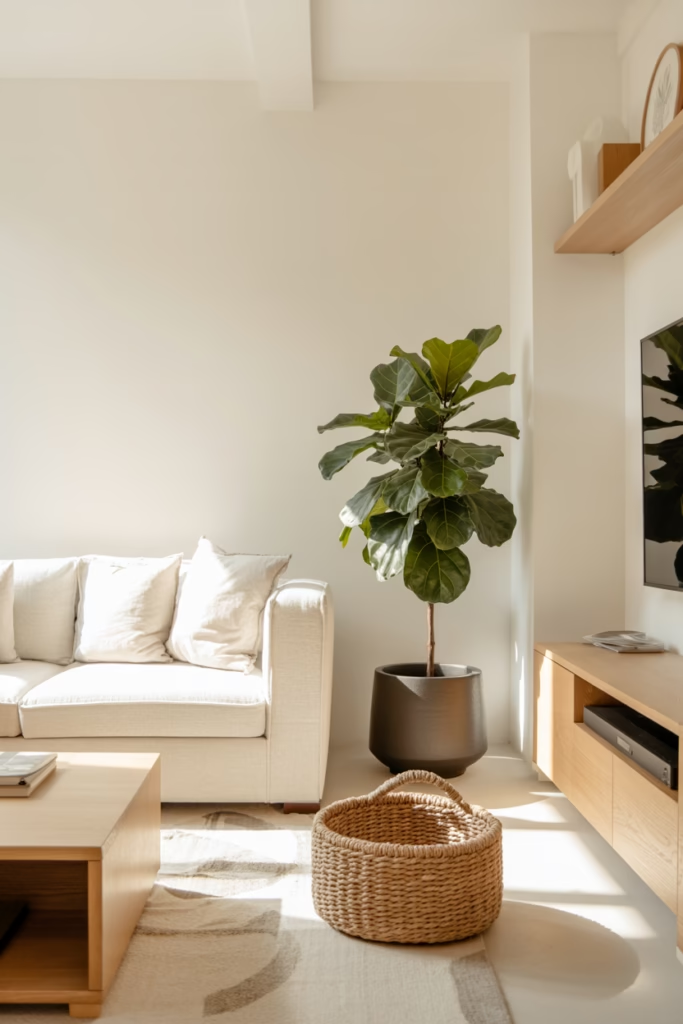
Technically, plants aren’t neutral, but they’re the only non-neutral element you absolutely need in a calm aesthetic space. They bring life without disrupting the peaceful vibe.
I keep my plant selection pretty minimal and intentional. Large leafy plants like monstera or fiddle leaf figs make bold statements, while smaller potted herbs on windowsills add subtle green touches. The key is choosing planters that complement your neutral palette—think terracotta, white ceramic, or natural woven baskets.
Plants also improve air quality, which is a nice bonus when you’re creating your personal sanctuary. IMO, every neutral room needs at least one statement plant to avoid looking too sterile.
6. The Power of Negative Space
Here’s where I see people struggle the most. They fill every corner, every shelf, every surface with stuff. Calm neutral aesthetics thrive on breathing room.
Negative space isn’t wasted space—it’s intentional emptiness that lets your eye rest. That blank wall? It’s not screaming for another gallery wall. That empty corner? It’s perfect as is.
I used to be a maximalist (recovering, thank you very much), and learning to appreciate empty space was tough. But now? I can’t imagine going back to the cluttered chaos. Your space should feel open and airy, not like a well-decorated storage unit.
Creating Breathing Room:
- Follow the “less is more” philosophy—remove one item for every two you add
- Leave surfaces mostly clear with just one or two statement pieces
- Don’t hang art on every wall; some walls deserve to shine solo
- Create visual breaks between furniture groupings
7. Layered Lighting for Atmosphere
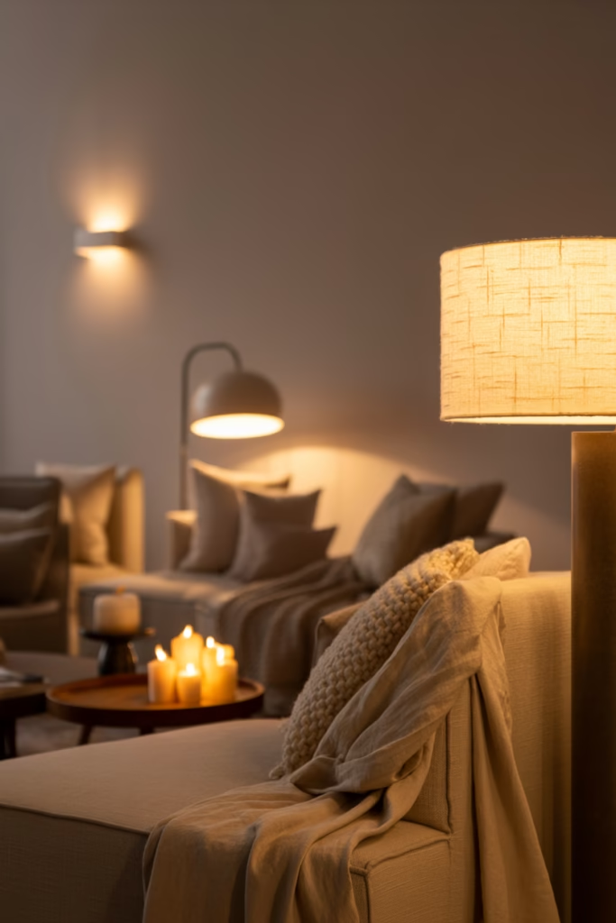
Overhead lighting is the enemy of calm aesthetics. There, I said it.
You need multiple light sources at different heights to create that cozy, layered ambiance. Table lamps, floor lamps, wall sconces, and even candles (lots of candles) work together to create pools of warm light.
I dim or completely avoid harsh overhead lights in my neutral spaces. Instead, I layer 4-5 softer light sources that I can control independently. This lets me adjust the mood based on the time of day or my energy levels.
Warm-toned bulbs (2700K-3000K) are non-negotiable here. Cool white bulbs will make your carefully chosen warm neutrals look gray and depressing. Learn from my expensive mistakes.
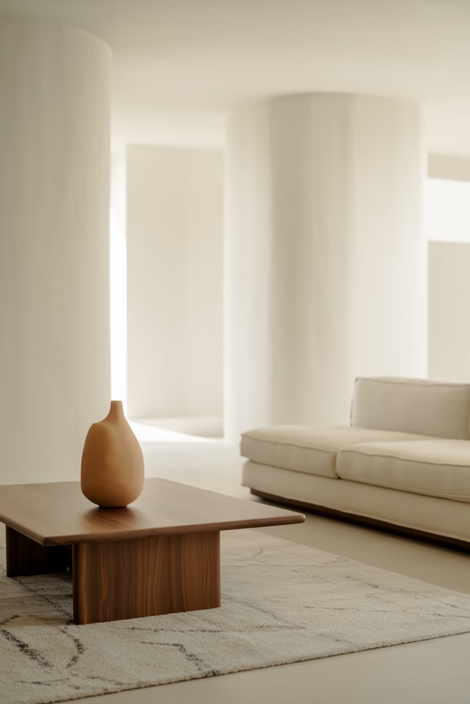
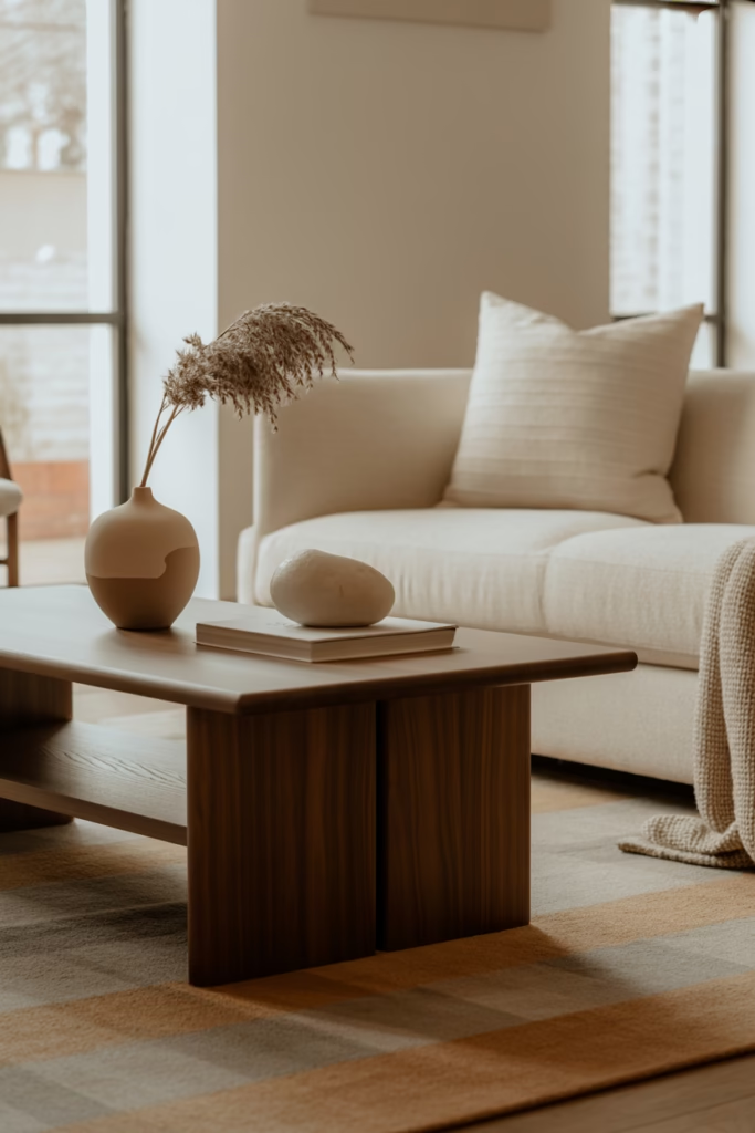
8. Organic Shapes Over Sharp Angles
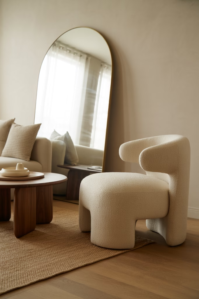
Rectangular furniture lined up against walls like soldiers at attention? That’s not creating calm—that’s creating a waiting room.
Curved furniture and organic shapes soften neutral spaces beautifully. Round coffee tables, arched mirrors, oval side tables, and curved sofas all contribute to that flowing, peaceful feeling.
I swapped my angular coffee table for a round one last year, and the difference in how the room feels is wild. The space flows better, feels more inviting, and honestly looks more expensive. Organic shapes photograph better too, which matters if you’re documenting your design journey (or just want your space to look good on Instagram—no judgment).
9. The Neutral Rug Strategy
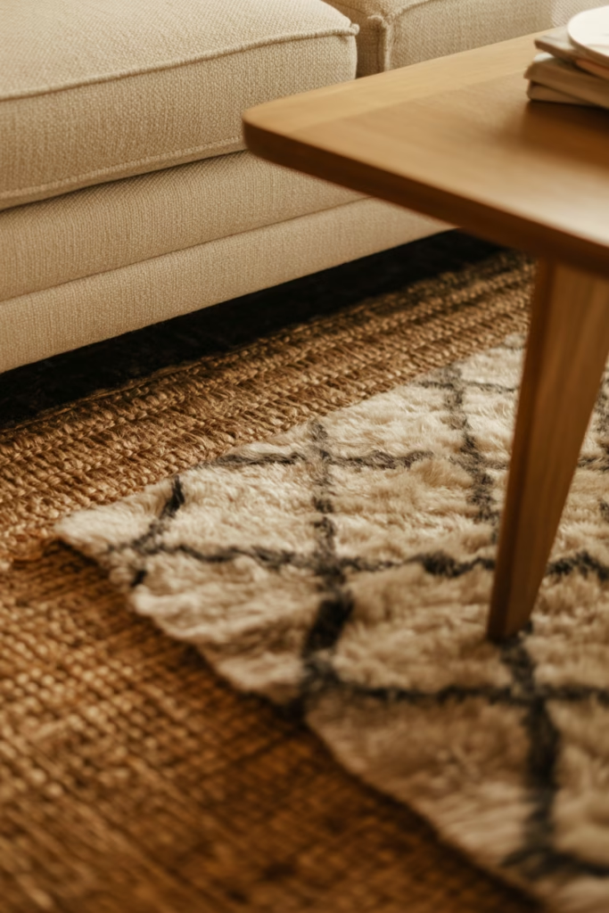
Rugs are where you can really play with texture in neutral spaces. Forget solid, flat rugs—we’re going for dimension and interest.
Jute rugs, wool Berber styles, shag textures, or those gorgeous hand-tufted pieces with subtle patterns all work beautifully. The texture adds visual weight without introducing jarring colors.
I layer rugs sometimes—a larger jute underneath with a smaller, softer rug on top. It’s cozy, looks intentionally designed, and adds warmth to hardwood or tile floors. Just make sure your color palette stays cohesive; we’re not trying to create a patchwork situation here.
10. Open Shelving Done Right
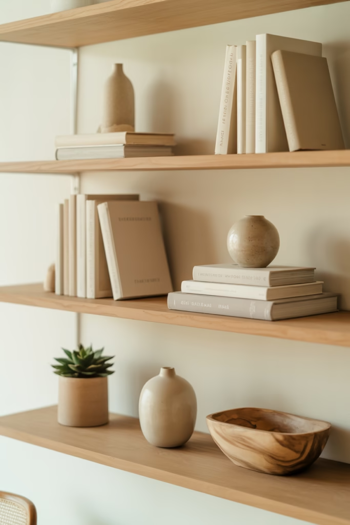
Open shelving can either elevate your neutral aesthetic or destroy it completely. The difference? Curated minimalism.
Display items in odd numbers (groups of three or five), leave plenty of empty space between objects, and stick to a neutral color palette for what you display. Mixing in natural elements like dried flowers, wooden bowls, or ceramic pieces keeps things interesting without chaotic.
I style my open shelves with maybe 40% of the available space actually filled. The rest? Beautiful negative space that lets each displayed item shine. And yes, I rearrange them obsessively until the balance feels right. :/
Shelving Success Tips:
- Use books with neutral spines or turn them backward (controversial, I know)
- Incorporate varied heights and shapes
- Add organic elements like small plants or branches
- Keep everyday clutter elsewhere—open shelves aren’t storage
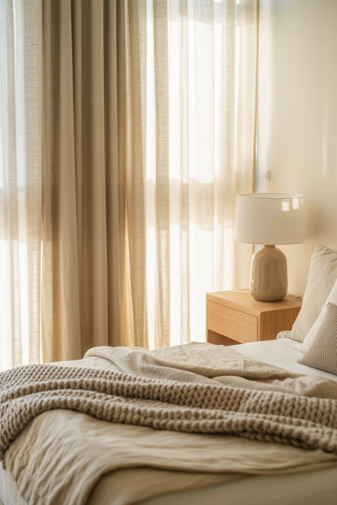
11. Soft, Flowing Window Treatments
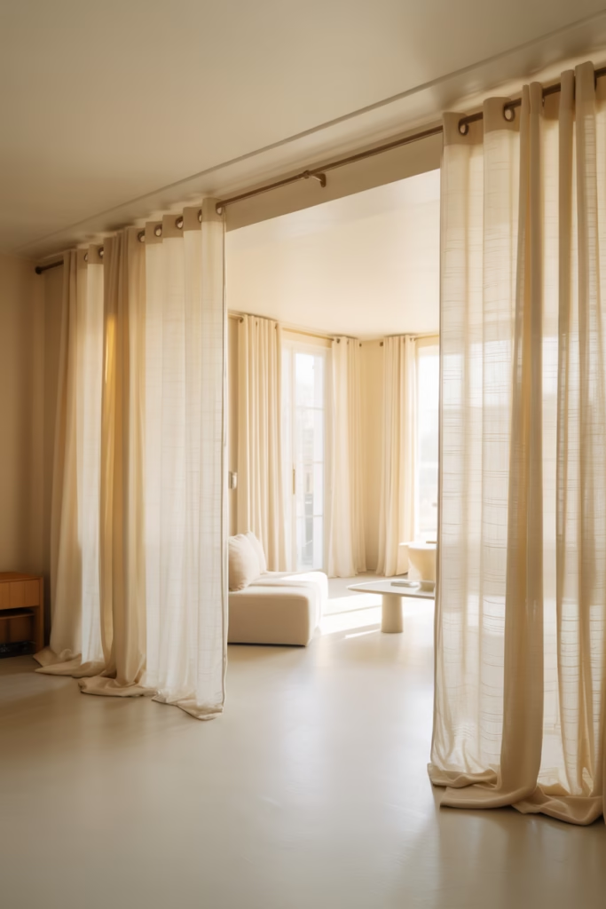
Heavy drapes in neutral spaces? They can work, but you need to be careful. Light, flowing curtains typically serve calm aesthetics better.
Floor-to-ceiling curtains in soft linens or lightweight cottons make your ceilings feel taller and your room feel more open. They should just kiss the floor or puddle slightly—nothing that looks too tailored or stiff.
I hang my curtain rods as close to the ceiling as possible and extend them wider than the actual window. This makes windows appear larger and lets in maximum natural light when curtains are open. Natural light is your best friend in neutral spaces, so don’t block it unnecessarily.
12. The Cozy Corner Concept
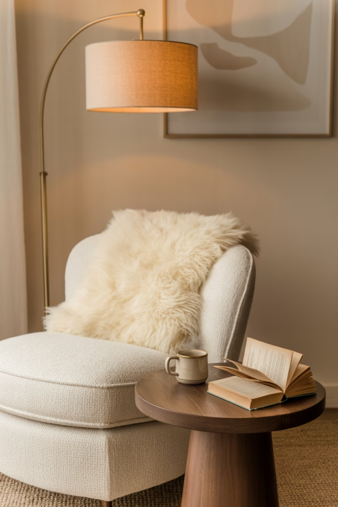
Every calm neutral space needs at least one designated cozy corner. This is your personal retreat within your retreat—a spot specifically designed for relaxation.
Mine includes a comfortable chair (with a sheepskin throw, naturally), a side table for tea or wine (let’s be real), and a reading lamp. The key is making it feel intentional and inviting, not like leftover furniture you shoved in a corner.
This corner should be your favorite spot in the room. If you’re not drawn to sit there regularly, you haven’t nailed the comfort factor yet. Keep adjusting until it feels irresistible.
13. Bringing in Natural Materials
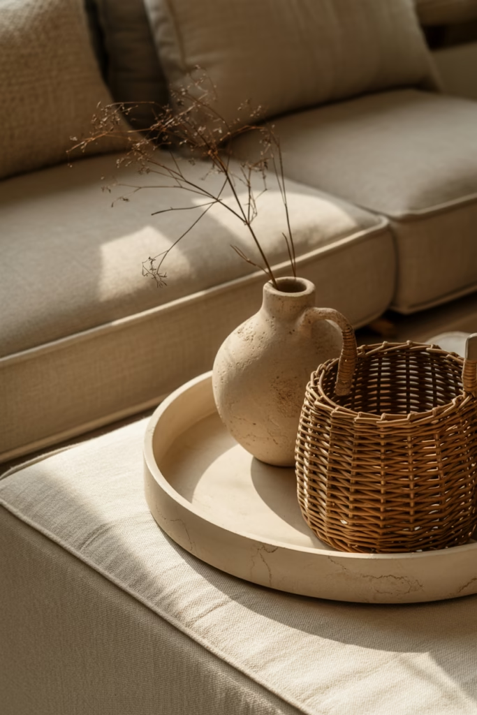
Beyond wood, think about incorporating stone, ceramic, clay, rattan, and woven materials. These natural elements add texture and warmth while maintaining that calm neutral palette.
A ceramic vase here, a woven basket there, maybe a stone tray on your coffee table. These touches connect your space to the natural world and add organic imperfection that makes rooms feel authentically designed rather than catalog-perfect.
I’ve found that mixing materials prevents neutral spaces from feeling one-dimensional. The contrast between smooth ceramic and rough-hewn wood, or soft textiles and cool stone, creates interest without visual chaos.
Material Mixing Ideas:
- Ceramic planters and decorative bowls
- Rattan or wicker baskets for hidden storage
- Stone coasters, trays, or bookends
- Clay or terracotta pots and vessels
- Woven wall hangings or placemats
14. The Edit-And-Refine Mindset
Here’s the truth bomb—creating a calm neutral aesthetic isn’t a one-and-done situation. It’s an ongoing process of editing and refining.
I regularly walk through my spaces and remove things that no longer serve the vibe. That decorative object I loved three months ago? If it’s not sparking joy or contributing to the aesthetic anymore, it’s out. This constant curation keeps your space feeling fresh and intentional.
The calm neutral aesthetic isn’t about perfection—it’s about creating a space that feels peaceful and reflects your personal style within that framework. Some people lean warmer with their neutrals, others go cooler. Some incorporate more texture, others prefer smoother surfaces. There’s room for personal interpretation.
Conclusion
Look, transforming your space into a calm neutral haven won’t happen overnight. I’ve been refining my approach for years, making mistakes (so many beige paint disasters), and learning what actually creates that peaceful, sophisticated vibe versus what just looks boring.
The beauty of neutral aesthetics is their flexibility. You can lean minimalist or add more layers. You can go warm and cozy or cool and crisp. The foundation remains the same: thoughtful color choices, varied textures, natural materials, and plenty of breathing room.
Start with one room or even one corner. Implement a few of these ideas and see how they feel. Your space should support your life, not stress you out with maintenance or clash with your energy. That’s the whole point of creating a calm aesthetic—it should actually make you feel calm.