
When I first heard “earthy pink bedroom,” I rolled my eyes a little. Pink? Earthy? How do those two even work together? But here’s the thing: I was so wrong. Earthy pink isn’t your grandma’s Pepto-Bismol situation or some overly girly nightmare. It’s this gorgeous, grounded color palette that somehow manages to feel both warm and calming at the same time. Think terracotta meets blush, or clay pottery kissed by sunset. It’s become one of my absolute favorite color schemes, and I’m about to show you exactly why it should be yours too.
Why Earthy Pink Is Having Its Moment
Before we jump into the design ideas (because trust me, they’re good), let’s talk about why this color combo actually works. Earthy pink sits right in that sweet spot between trendy and timeless. It’s not screaming “I decorated this in 2026!” but it also doesn’t feel dated or boring.
The magic happens when you combine dusty pinks, terracottas, and mauves with natural materials like wood, linen, and stone. These colors actually exist in nature—think desert sunsets, clay soil, or those gorgeous sandstone formations. Your brain recognizes them as natural, which is probably why they feel so darn soothing.
I tested this theory in my own bedroom last year, and honestly? My sleep improved. Could be placebo, could be the calming vibes. Either way, I’m not complaining 🙂
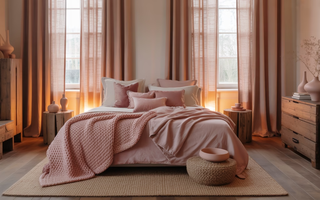
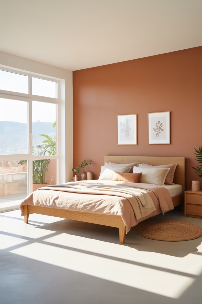
1. The Terracotta and Blush Combo
This is my number-one pick for a reason. Terracotta brings that earthy, grounded feeling while blush pink softens everything up. Here’s how you make it work:
Paint Strategy:
- Go with terracotta on one accent wall (behind your bed is chef’s kiss)
- Keep the other walls in a soft blush or warm white
- Skip the bright white—it’ll look too stark against these warm tones
I paired this combo with crisp white bedding and some woven baskets, and honestly, it transformed my space from “meh” to “magazine-worthy” overnight. The contrast between the bold terracotta and gentle blush creates this dynamic tension that’s somehow still relaxing. Weird, right?
Key Elements to Include:
- Terracotta clay pots with trailing plants
- Blush pink throw pillows in varying textures
- Natural wood nightstands
- Woven wall hangings or macramé
2. Dusty Rose Meets Natural Wood
Ever wondered why Scandinavian design feels so effortlessly cool? They’ve mastered the art of pairing muted colors with gorgeous wood tones. Dusty rose—that grayish, muted pink—is absolutely stunning against light oak or ash wood.
Here’s what makes this work: dusty rose has gray undertones that prevent it from looking too sweet or juvenile. When you pair it with the natural grain of wood furniture, you get this sophisticated, grown-up vibe that still feels warm and inviting.
My Favorite Setup:
- Dusty rose painted walls (I used Benjamin Moore’s “First Light”)
- Light wood platform bed frame
- Floating shelves in matching wood
- Minimal decor to let the color combination shine
FYI, this look is super forgiving if you’re not great at decorating (guilty). The neutral wood grounds everything, so you can’t really mess it up.
3. Mauve and Sage Green Paradise
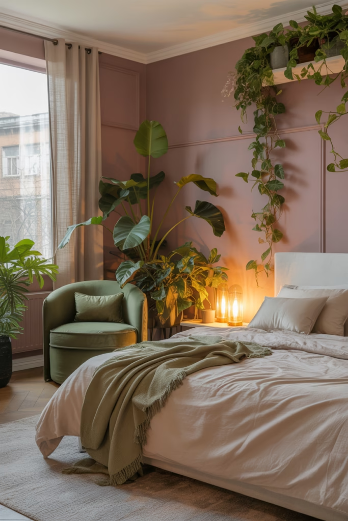
Okay, hear me out on this one. Mauve is basically pink’s cooler, more mysterious cousin. When you pair it with sage green, you’re creating this nature-inspired palette that feels like a walk through a garden at dusk.
I was skeptical about adding green to a pink room at first—seemed risky. But sage green has those same muted, earthy qualities as mauve, so they complement each other perfectly instead of competing.
Color Distribution:
- Mauve walls as your base
- Sage green accents through bedding, curtains, or an upholstered chair
- White or cream ceiling to keep things bright
- Pops of deeper green through plants (obviously)
This combo also photographs incredibly well, which is totally not why I chose it for my guest bedroom… okay, it’s partially why :/
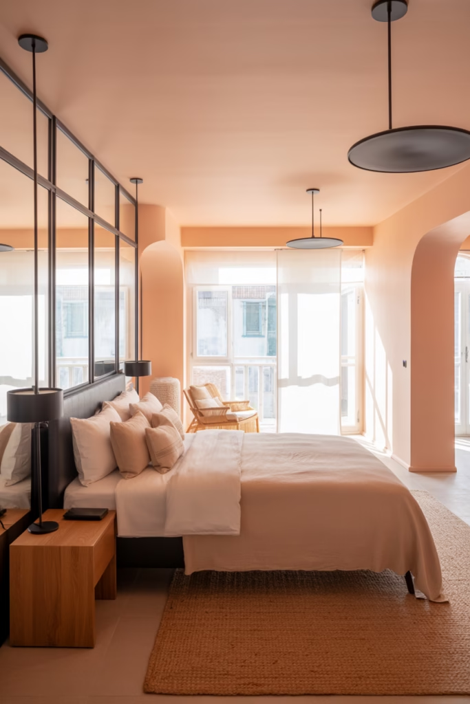
4. Peachy Pink and Rattan Everything
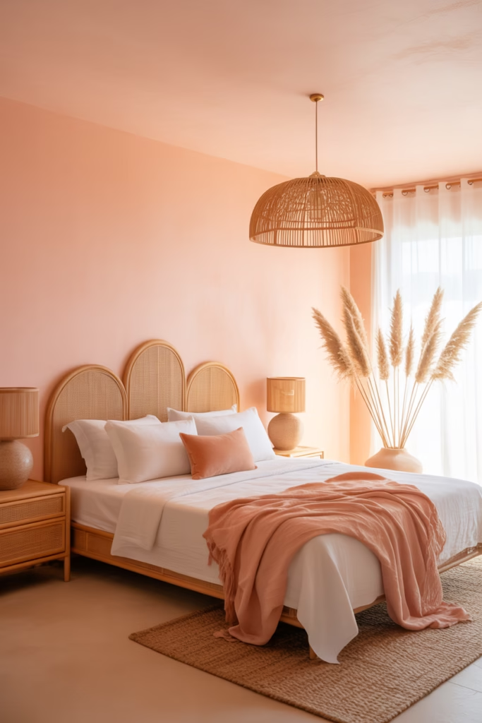
Peachy pink is warmer and more energetic than other earthy pinks, and it pairs like a dream with rattan furniture. This combination screams “coastal boho meets desert chic,” and I’m here for it.
Why Rattan Works So Well:
- Natural texture adds visual interest
- Light color doesn’t overwhelm the pink
- Maintains that earthy, organic vibe
- Super on-trend but has serious staying power
I added a rattan headboard to my daughter’s room with peachy pink walls, and the transformation was insane. The natural texture of the rattan catches light throughout the day, creating these beautiful shadow patterns that make the whole room feel alive.
Must-Have Pieces:
- Rattan headboard or bed frame
- Woven pendant light fixture
- Rattan nightstands or dresser
- Natural fiber area rug
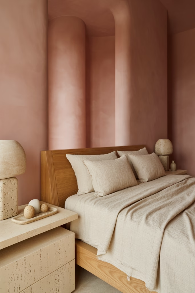
5. The Clay Wall Moment
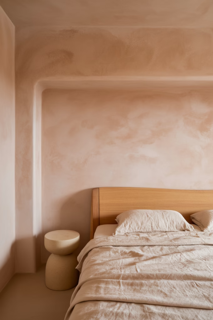
This one’s bold, but stick with me. Instead of painting walls in earthy pink, consider a clay or lime wash finish in a terracotta-pink shade. The texture adds so much depth and character that plain paint just can’t match.
Clay wall finishes have this gorgeous, matte texture that absorbs light instead of reflecting it. The result? A super cozy, intimate atmosphere that’s perfect for bedrooms. Plus, they’re actually pretty forgiving when it comes to imperfections—those variations in texture just add to the artisanal vibe.
Application Tips:
- Hire a professional if you’re not confident (IMO, worth every penny)
- Start with a sample area to test the color
- Layer multiple coats for depth
- Embrace the imperfect, organic finish
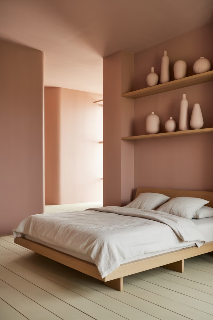
6. Blush Pink Minimalism
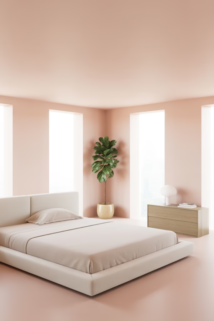
Who says earthy pink has to be layered and textured? Sometimes the most stunning approach is keeping things minimal and letting the color do all the talking.
The Minimal Formula:
- Soft blush pink walls
- White or light gray bedding
- One or two pieces of natural wood furniture
- Single statement plant (fiddle leaf fig, anyone?)
- Absolutely nothing else
This approach works especially well in smaller bedrooms where too much stuff can feel cluttered. The blush acts as a warm neutral, and the minimal furnishings keep things feeling spacious and calm. It’s like visual meditation.
I tried this in my spare bedroom, and guests always comment on how peaceful it feels. Less really is more sometimes.
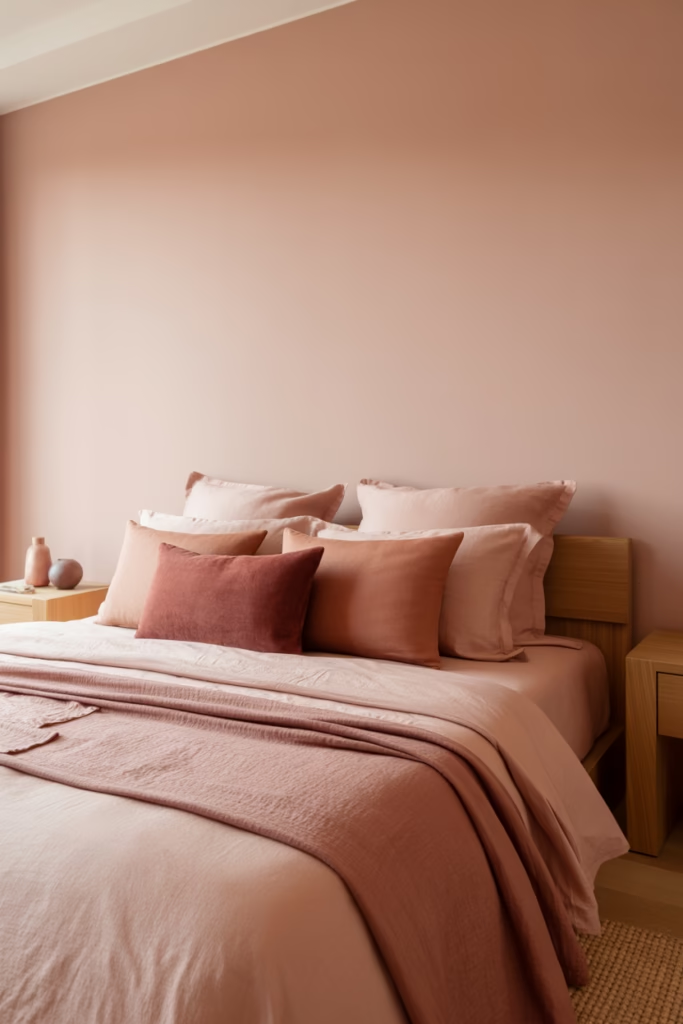
7. Textured Pink Paradise
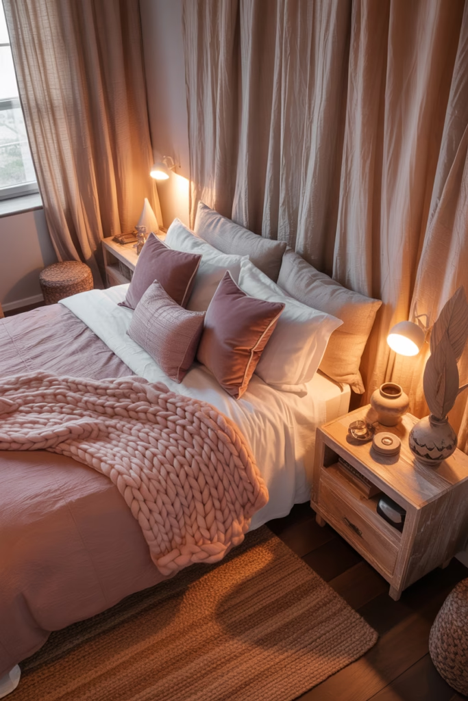
If you’re like me and love layers, this one’s for you. The key here is using different textures in similar earthy pink tones to create depth and interest.
Texture Mix:
- Linen curtains in dusty rose
- Velvet throw pillows in mauve
- Chunky knit blanket in blush
- Jute or sisal rug
- Raw wood furniture
- Ceramic or stone accessories
The variety in textures prevents the monochromatic color scheme from feeling flat or boring. Your eye moves around the room, discovering new details and materials. It’s like a treasure hunt, but make it interior design.
Pro Tip: Mix matte and subtle sheen finishes for even more dimension. A velvet pillow next to matte linen creates this gorgeous contrast.
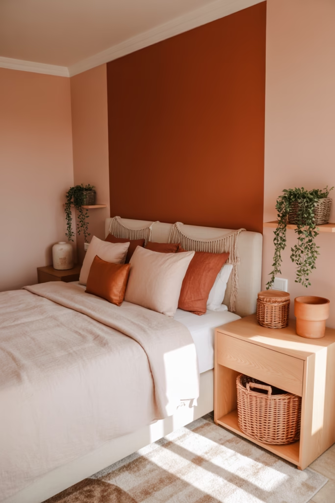
8. Terracotta Accent Wall with Neutral Everything Else
Can’t commit to a full earthy pink bedroom? I get it. This approach lets you dip your toe in without diving headfirst into color.
Paint just one accent wall in a gorgeous terracotta shade and keep everything else neutral—whites, creams, beiges, and natural wood tones. The single wall becomes a stunning focal point that warms up the entire space without overwhelming it.
Strategic Wall Choices:
- Behind the bed (classic for a reason)
- The wall opposite your bed (first thing you see in the morning)
- A wall with interesting architectural features
This was actually my gateway into earthy pink design. Started with one wall, ended up doing three rooms. No regrets.
9. Sunset Gradient Effect
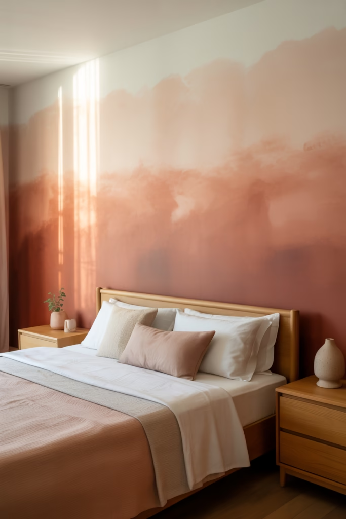
This one’s for the adventurous souls. Create a gradient effect with earthy pinks that mimics a sunset—deeper terracotta at the bottom transitioning to pale blush at the top.
I won’t lie, this takes some skill to execute (or a very patient painter). But when done right? Absolutely breathtaking. The gradient creates movement and drama while maintaining that earthy, natural feeling.
Gradient Application:
- Start with terracotta at the baseboard
- Blend into dusty rose at mid-wall
- Finish with pale blush near the ceiling
- Use a large brush or sponge for blending
- Work in sections while paint is still wet
10. Pink Clay and White Contrast
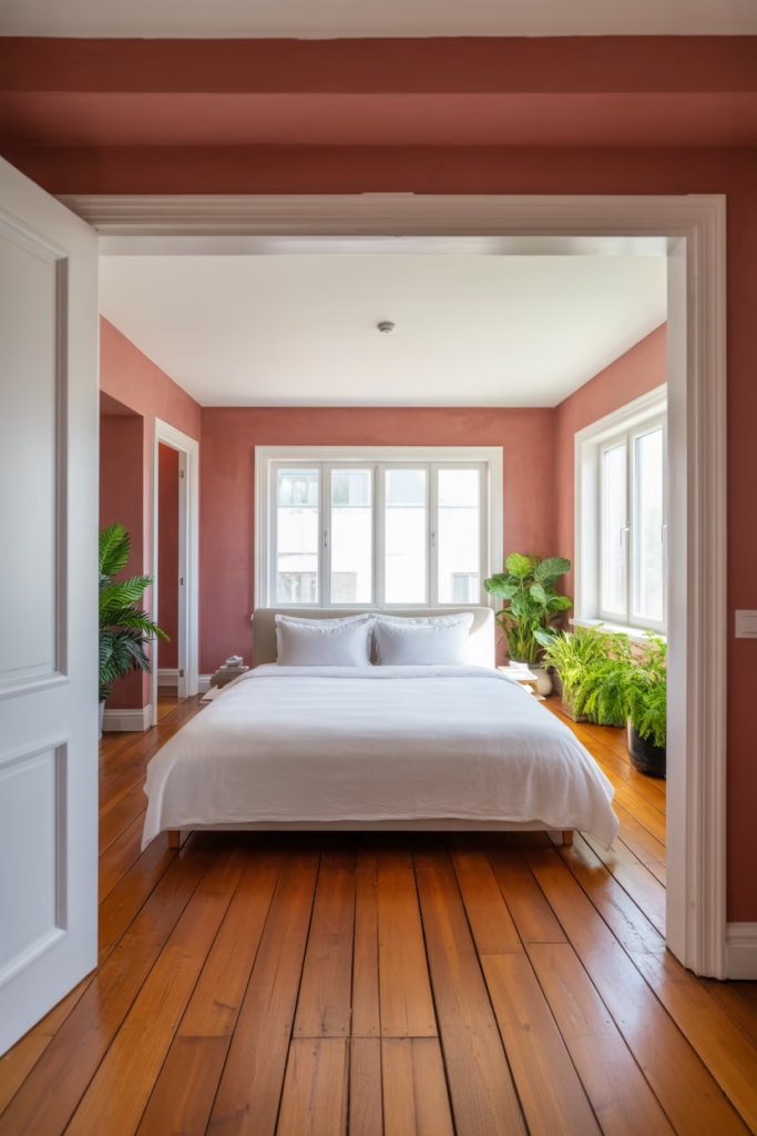
Sometimes you need contrast to make colors pop. Pairing warm, earthy pink walls with crisp white trim, bedding, and furniture creates this fresh, modern look that still feels grounded and warm.
The Contrast Formula:
- Pink clay or terracotta walls
- Bright white ceiling and trim
- White bed frame and bedding
- Natural wood flooring
- Green plants for that extra pop
This combination feels clean and contemporary while still maintaining warmth. The white keeps things from feeling too heavy or dark, especially in rooms without tons of natural light.
I used this approach in a north-facing bedroom, and it totally solved the “cave” problem. The pink adds warmth that the room naturally lacks, while the white bounces light around.
11. Earthy Pink and Brass Accents
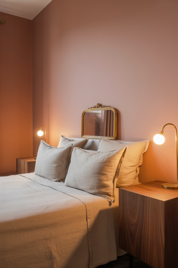
Want to add some glamour to your earthy pink bedroom? Brass is your answer. The warm metallic tones complement the pink beautifully while adding a touch of sophistication.
Brass Element Ideas:
- Bedside lamps with brass bases
- Picture frames and mirrors with brass detailing
- Drawer pulls and cabinet hardware
- Curtain rods
- Decorative objects like bowls or vases
The key here is restraint. You’re not trying to create a gold palace—just adding tasteful metallic accents that catch light and add interest. Think “jewelry for your room” rather than “trophy shop explosion.”
12. Monochromatic Pink Layers
This approach uses different shades of earthy pink throughout the room—from pale peachy tones to deeper terracotta—creating a cohesive, enveloping space.
Shade Distribution:
- Lightest pink on walls (your base)
- Medium pink in bedding and curtains
- Deeper pinks in accent pieces and artwork
- Natural materials to break up the pink
I was worried this might feel overwhelming, but it’s actually incredibly soothing. Your eyes don’t have to work hard to process different color schemes—everything flows together seamlessly.
Balance Tip: Include plenty of natural materials like wood, jute, and linen to prevent pink overload. The neutral textures give your eyes a place to rest.
13. Desert-Inspired Pink Bedroom
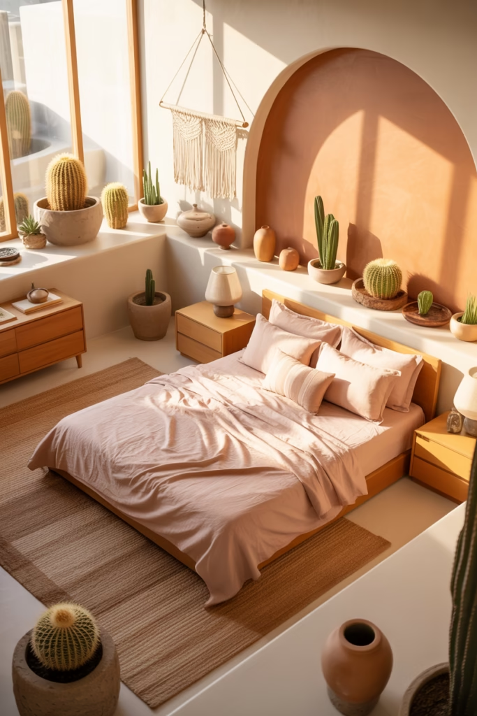
Channel those stunning desert landscapes with a palette of sandy pinks, warm terracottas, and cream tones. This look combines earthy pink with desert-inspired decor for a cohesive theme.
Desert Elements:
- Terracotta or peachy pink walls
- Sand-colored bedding
- Cacti and succulents (real or faux)
- Woven baskets and textiles
- Stone or ceramic accessories
- Minimalist furniture in light woods
This style works especially well in dry, sunny climates where you’re basically bringing the outdoor palette inside. But honestly, it can transport you to the desert no matter where you live.
I added some vintage Southwestern textiles to mine, and the room became this perfect retreat that feels miles away from my suburban reality.
14. Pink and Stone Combination
Natural stone elements paired with earthy pink create this incredibly grounded, luxurious vibe. Think stone accent walls, stone-topped nightstands, or even just stone accessories.
Stone Options:
- Travertine
- Limestone
- Slate
- Marble with warm veining
- River rocks as decorative elements
The cool, solid nature of stone perfectly balances the soft warmth of pink. It’s that yin-yang thing that makes spaces feel complete and harmonious.
Practical Application:
- Stone-topped furniture pieces
- Stone accent wall behind bed
- Stone lamp bases
- Decorative stone bowls or trays
The coolness of stone also helps regulate the temperature visually—important if your pink is on the warmer side and you don’t want the room to feel stuffy.
15. Earthy Pink with Black Accents
Okay, this might sound weird, but adding small doses of matte black to an earthy pink room creates stunning contrast and grounds the sweetness of the pink.
Where to Add Black:
- Picture frames
- Light fixtures
- Drawer pulls and hardware
- Bed frame (if you’re bold)
- Decorative objects
The black needs to be matte, not glossy—you’re going for sophisticated and modern, not stark or harsh. And definitely keep it minimal. We’re talking maybe 5-10% black in the overall scheme.
I added black metal frames to my botanical prints in my peachy pink bedroom, and they instantly made the whole space feel more grown-up and intentional. That little bit of contrast just elevates everything.
Conclusion
Creating an earthy pink bedroom isn’t about following rigid rules—it’s about finding the shades and combinations that make you feel calm, grounded, and happy when you walk into your space. Whether you go full terracotta or keep it subtle with dusty rose accents, this color family has serious staying power.
The best part? Earthy pinks are incredibly forgiving and work with so many different styles, from minimalist to maximalist, modern to bohemian. You really can’t mess this up, which is saying something coming from someone who once accidentally painted a room the color of Pepto-Bismol (we don’t talk about that phase).
So grab some paint samples, play around with textures and materials, and create your own earthy pink sanctuary. Your future self, probably lying in bed, feeling all peaceful and zen will thank you.