
Pastel decor in 2026 feels like the home version of a deep breath. You walk in, your shoulders drop, and suddenly your space looks soft, calm, and weirdly put-together without you buying a truckload of new stuff. That’s the goal, right? You want that “Pinterest, but I actually live here” vibe, not a showroom that makes you scared to sit down.
Pastels don’t have to look childish, sugary, or like you decorated during an ice-cream-induced blackout. You just need the right shades (muted beats neon, always), the right textures (linen, boucle, matte ceramics), and a little restraint so the room stays cozy instead of chaotic. Ever wondered why some pastel rooms look expensive and others look… suspicious? It usually comes down to undertones, lighting, and how you balance soft colors with warm neutrals.
So in this list, I’m giving you 15 pastel aesthetic home decor ideas for 2026 that you can actually pull off whether you rent, you redecorate slowly, or you fully commit like a brave person. I’ll show you where to use color, where to chill, and what swaps deliver the biggest “wow” without the drama. Ready to make your home feel like a calm little candy cloud (in the best way)? 🙂
1. Soft Lavender Walls That Actually Work
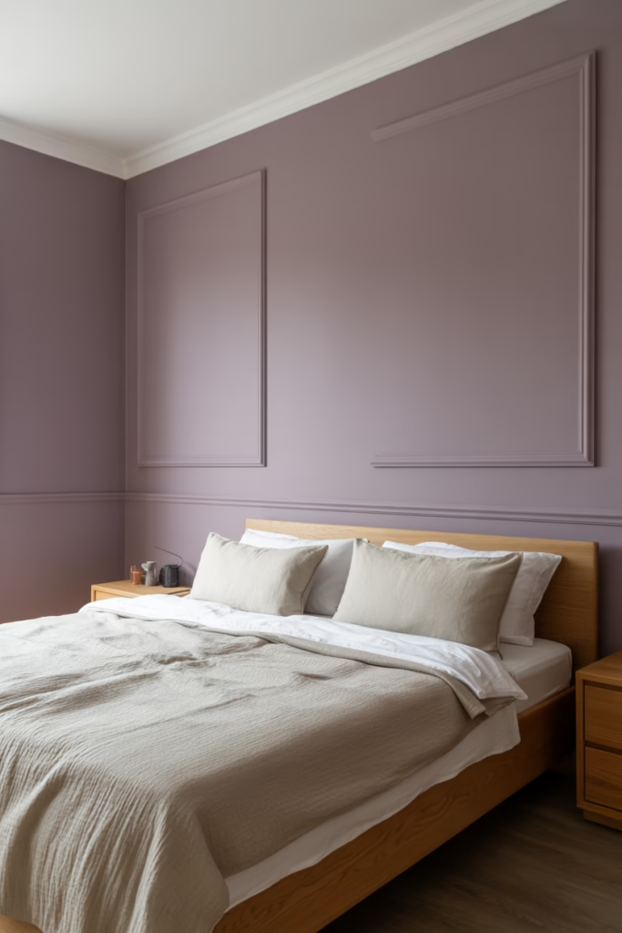
Everyone’s seen the dusty lavender walls trend, but in 2026, it’s less “Easter egg” and more “luxury spa.” The key is choosing muted, grey-toned lavender shades rather than bright purple-adjacent ones.
Pair lavender walls with warm white trim and natural wood furniture, and suddenly your bedroom looks like it costs five times what you paid for it. IMO, this is the single biggest glow-up any room can get for under ₹5,000 in paint.
A flat or eggshell finish works best here — glossy lavender walls will make your room look like a candy wrapper, and not in a cute way :/
Key tip: Test your paint swatch under both natural and artificial light before committing. Lavender shifts dramatically depending on lighting conditions.
2. Sage Green Linen Bedding
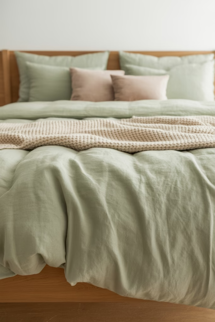
Sage green is basically the “it” color of 2026, and honestly, it earned that title. Linen bedding in sage green hits that perfect balance between calming and stylish — it looks effortless without trying too hard.
What I love most about this combo is that it works with almost every other pastel. Layer sage green linen with blush pink throw pillows or a cream knitted blanket, and you’ve got a bed that looks Pinterest-ready without staging anything.
Linen also gets softer with every wash, so it genuinely improves over time. That’s the kind of investment I can get behind.
- Pair with: warm white walls, rattan headboard, wooden nightstands
- Avoid: pairing with cool-toned greys (it clashes more than you’d think)
- Best for: bedrooms and guest rooms
3. Blush Pink Accent Chairs
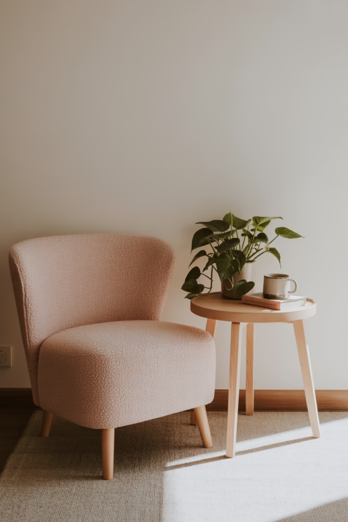
A blush pink accent chair is one of those decor pieces that sounds risky but pays off every single time. In 2026, the trend leans toward structured silhouettes — think boucle fabric, curved armrests, and tapered legs — rather than the oversized, slouchy styles of a few years ago.
Place one in the corner of your living room with a small wooden side table and a trailing pothos plant, and you’ve created a vignette that looks genuinely curated. It’s the kind of corner that makes guests ask, “Did you hire someone?”
The answer is no. You just read this article. 🙂
Bold tip: Go for boucle over velvet in 2026 — boucle hides wear better and photographs beautifully for Pinterest content.
4. Butter Yellow Kitchen Accents
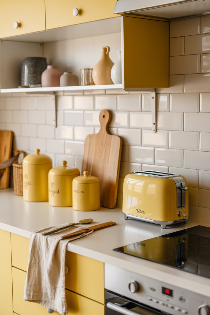
Your kitchen doesn’t need a full renovation to feel fresh. Butter yellow accents — think ceramic canisters, a linen apron, open shelf pottery, or even a small appliance — can completely shift the vibe without touching a single cabinet.
Butter yellow is warmer than mint or lavender, which makes it perfect for kitchens where you want to feel cozy rather than clinical. I swapped out my white canisters for a set of handmade yellow-glazed pots, and I’m still not over it.
This shade pairs especially well with sage green, off-white, and natural wood tones — essentially the holy trinity of 2026 kitchen aesthetics.
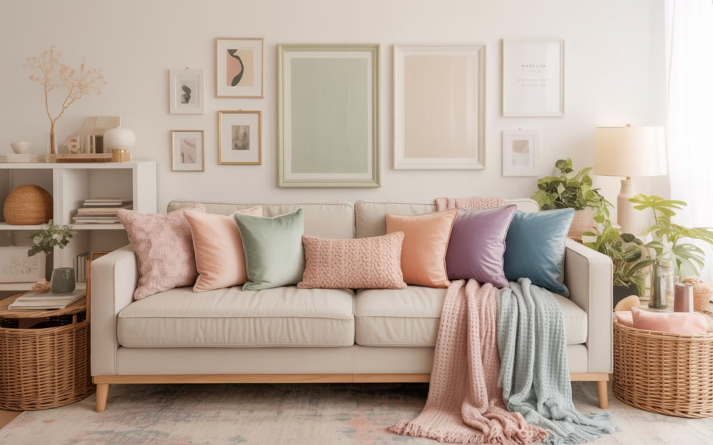
5. Pastel Maximalism — Yes, It’s a Thing
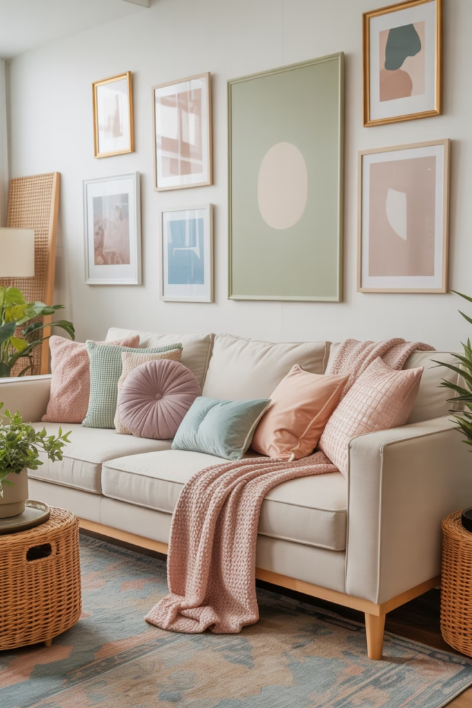
Who said pastels have to be minimal? Not me. Pastel maximalism is one of the most exciting directions this aesthetic has taken, and it’s gaining serious traction in 2026.
The idea is to layer multiple pastels — blush, mint, lilac, peach, sky blue — without worrying too much about “matchy-matchy” rules. The trick is keeping your furniture neutral (cream, white, or natural wood) so the pastel layers read as intentional rather than chaotic.
Think gallery walls with pastel-framed prints, stacked pastel throw pillows, colorful woven baskets, and mismatched pastel ceramics on open shelves. It’s maximalism, but make it soft.
- Ground the space with neutral rugs and white walls
- Use texture (boucle, linen, knit) to add depth without adding more color
- Edit ruthlessly — keep only the pieces that genuinely spark joy (you know the drill)
6. Mint Green Bathroom Tiles
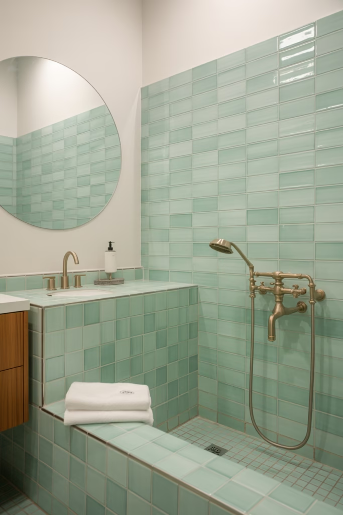
Bathrooms are criminally underrated when it comes to pastel makeovers. Mint green tiles — whether full wall, half wall, or just a backsplash behind the vanity — create that vintage-meets-modern look that’s everywhere right now.
The style works in both large and small bathrooms. In a small space, mint tiles with white grout and a round mirror feel fresh and open. In a larger bathroom, you can go full floor-to-ceiling and create something genuinely stunning.
FYI, zellige-style mint tiles (the handmade, slightly irregular ones) are more expensive but look about 10x more luxurious than standard ceramic.
Pair with: brushed gold fixtures, white towels, wooden bath accessories — this combination is virtually impossible to get wrong.
7. Pastel Sheer Curtains for Dreamy Light
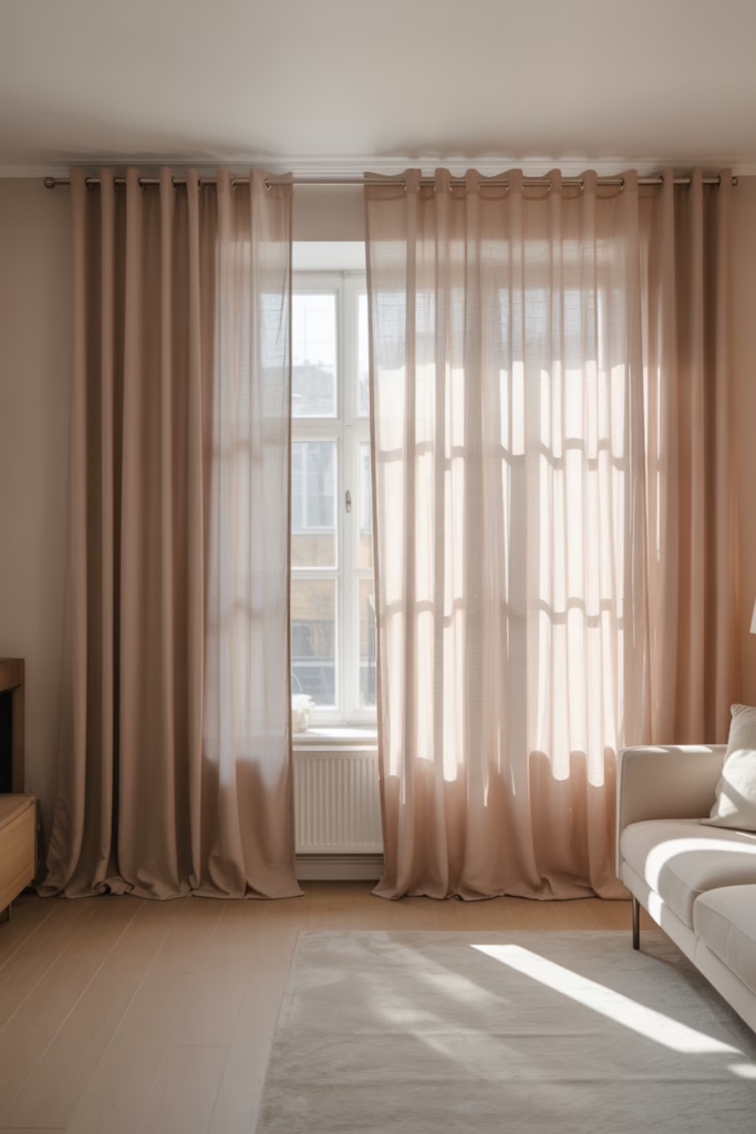
Ever notice how a room with the right curtains feels completely different from one with the wrong ones? Pastel sheer curtains — in blush, sky blue, or soft lilac — filter light in a way that makes any room feel like a soft-focus dream.
They work especially well in bedrooms and living rooms where you want natural light without harsh brightness. The sheer fabric catches the sun and casts the most beautiful warm glow across your walls.
Skip the heavy blackout panels for living spaces and save those for bedrooms where you actually need to sleep in. Sheers are the move for aesthetic and function during daylight hours.
8. Rattan Furniture with Pastel Cushions
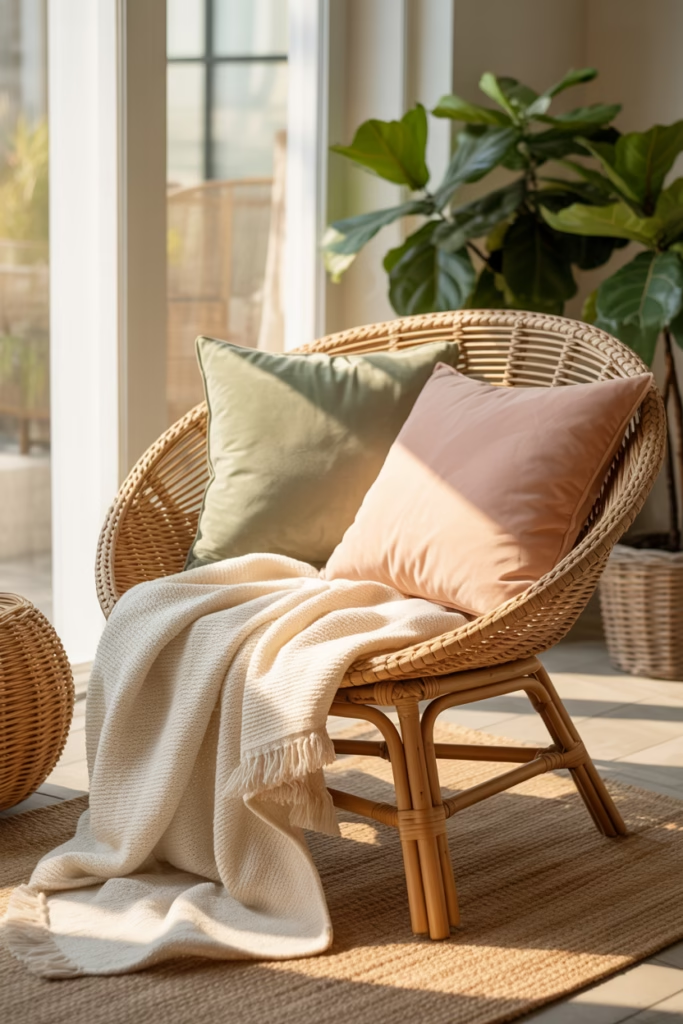
Rattan furniture has been a slow-burn trend for years, but in 2026 it’s fully mainstream — and pairing it with pastel cushions is the update it needed. The natural, warm tone of rattan balances the softness of pastels without making a space feel too sweet.
A rattan sofa or loveseat with sage green or terracotta-blush cushions looks incredible in living rooms, sunrooms, or even covered outdoor spaces. It’s that earthy-meets-dreamy combination that works across essentially every home style.
The other bonus? Rattan ages beautifully. Unlike trendy pieces that look dated in three years, a good rattan chair or side table just gets more character over time.
9. Pastel Art Prints and Gallery Walls
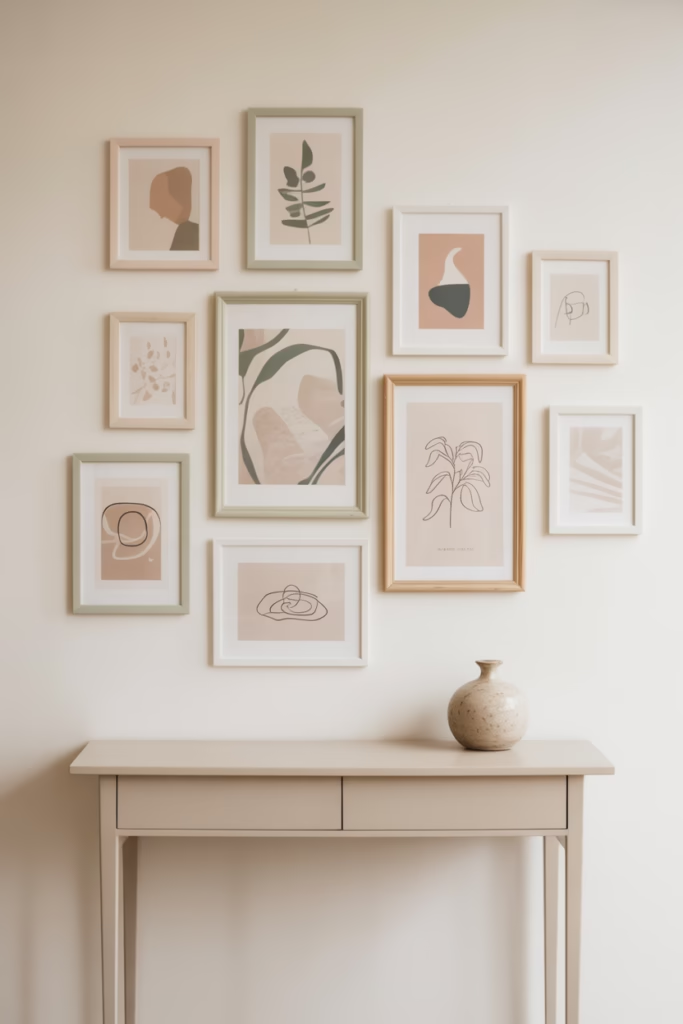
You don’t need to repaint a single wall to shift your room’s color story. A pastel art gallery wall can do all the heavy lifting — and the best part is that it’s completely reversible.
In 2026, the gallery wall trend favors a mix of abstract pastel prints, botanical illustrations, and simple line art in coordinating pastel frames. The frames don’t have to match perfectly — a mix of blush, sage, and cream frames actually looks more considered than a uniform set.
Print your own artwork using Canva or buy affordable digital downloads, frame them, and you’ve got a wall feature that looks like it came from a boutique hotel.
Quick layout tip: Lay your frames on the floor first to test arrangement before committing a single nail to your wall.
10. Pastel Ceramic and Pottery Decor
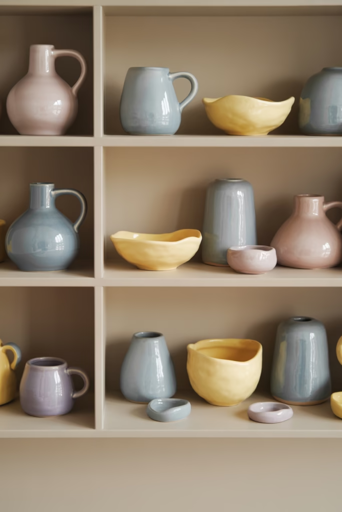
There’s something deeply satisfying about a well-arranged shelf of pastel ceramics. Handmade pottery in soft blues, pinks, and creamy yellows adds texture and warmth to any surface — a bookshelf, a kitchen counter, a bathroom vanity.
In 2026, the trend favors imperfect, organic shapes over polished, uniform sets. A slightly lumpy handmade vase in dusty blush is more interesting than a perfect factory-made one. Embrace the quirks.
Mix heights and shapes for the best visual interest — a tall vase next to a squat bowl next to a small figurine creates natural rhythm on a shelf without looking cluttered.
11. Sky Blue Ceilings
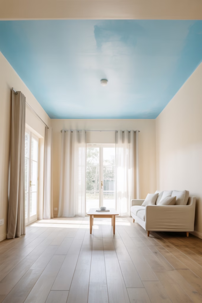
Okay, this one requires a bit more commitment, but the payoff is extraordinary. Painting your ceiling sky blue — especially in living rooms and bedrooms — creates an airy, open feeling that makes the room feel taller and more expansive.
This trick works particularly well in smaller rooms where you want to push the perceived height upward. A soft sky blue overhead with white walls and light wood floors creates a space that feels genuinely uplifting to be in.
If you’re not ready to commit to a full ceiling color, try a canopy bed with a blue fabric panel stretched above the mattress for a similar dreamy effect.
12. Pastel-Toned Rugs as Anchor Pieces
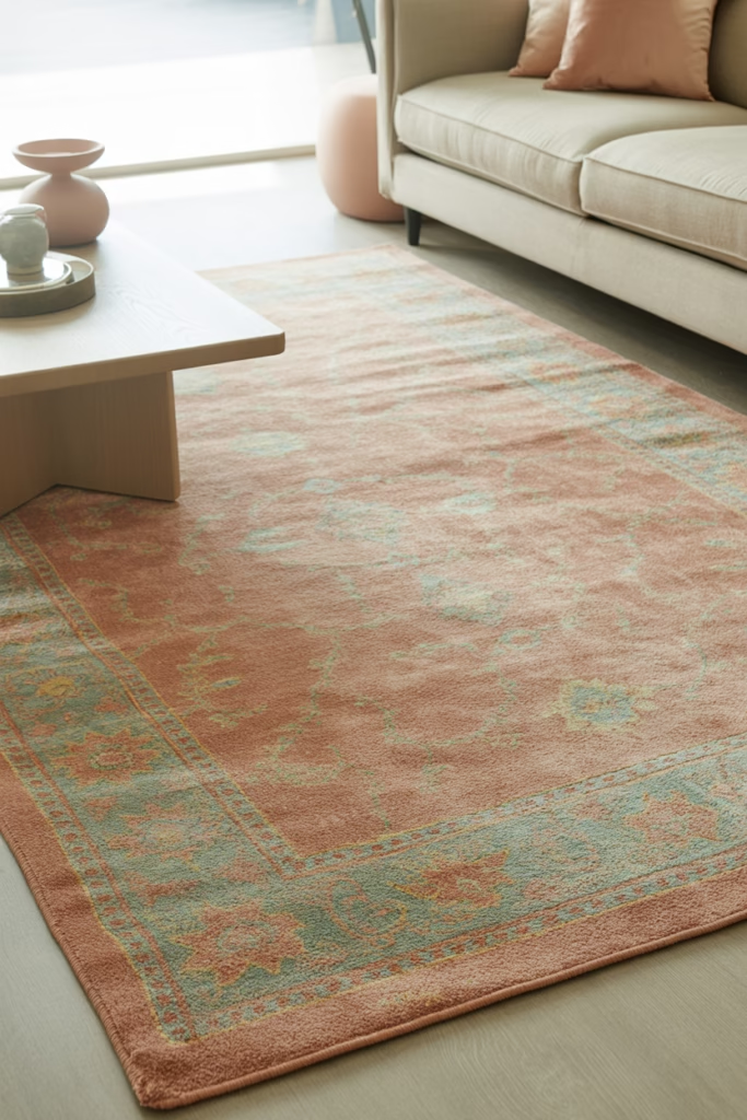
The right rug can completely define a room’s color palette, and pastel rugs are having a serious moment in 2026. Whether it’s a soft terracotta-pink Moroccan-style rug or a muted sage green vintage-look piece, a pastel rug grounds the space while keeping it light.
The trick is choosing a rug that has at least two of your room’s accent colors woven into it — this ties the whole space together without you having to overthink the rest of the decor.
Size matters enormously here. Always go larger than you think you need — a rug that’s too small makes a living room look awkward and unfinished.
13. Pastel Neon — The 2026 Twist
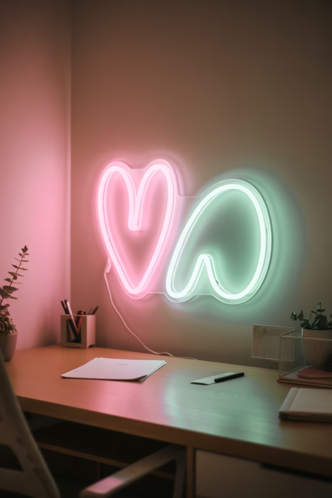
Wait, hear me out. Pastel neon signs — think soft pink or mint LED signs with simple phrases or shapes — are a genuinely fun way to add a modern edge to an otherwise soft pastel aesthetic. They look especially good in home offices, creative spaces, or bedroom corners.
The contrast between the soft surrounding palette and the gentle glow of a pastel neon sign creates depth and a tiny bit of personality. It says “I know what I’m doing” without screaming for attention.
Keep the phrase simple — a single word or a small shape works better than a long quote that makes your wall look like a motivational poster.
14. Peach and Apricot Textiles
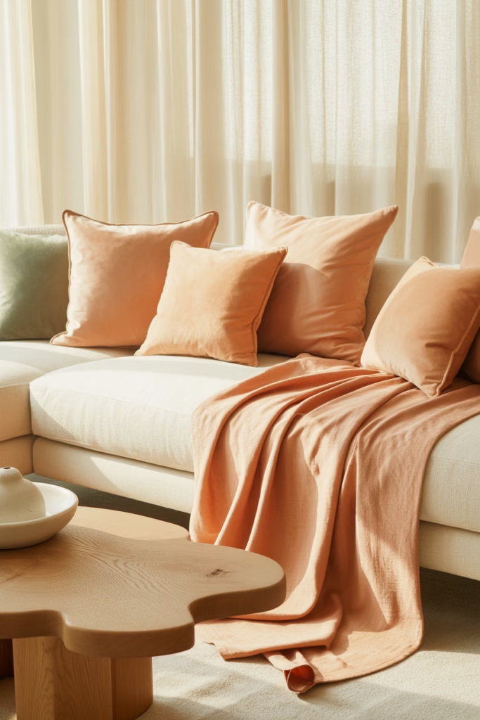
If you’re not already embracing peach and apricot tones in your home, 2026 is the year to start. These warm pastels layer beautifully with sage green, cream, and natural wood, and they photograph incredibly well for content creators.
Think peach linen throw blankets, apricot-toned pillow covers, or even a burnt-apricot velvet ottoman. These tones bring warmth into a pastel palette that can sometimes veer too cool and clinical.
Peach also works surprisingly well in dining spaces — a peach tablecloth with cream dinnerware and natural wood accents creates a table setting that looks effortlessly editorial.
15. Pastel-Painted Furniture for an Easy Refresh
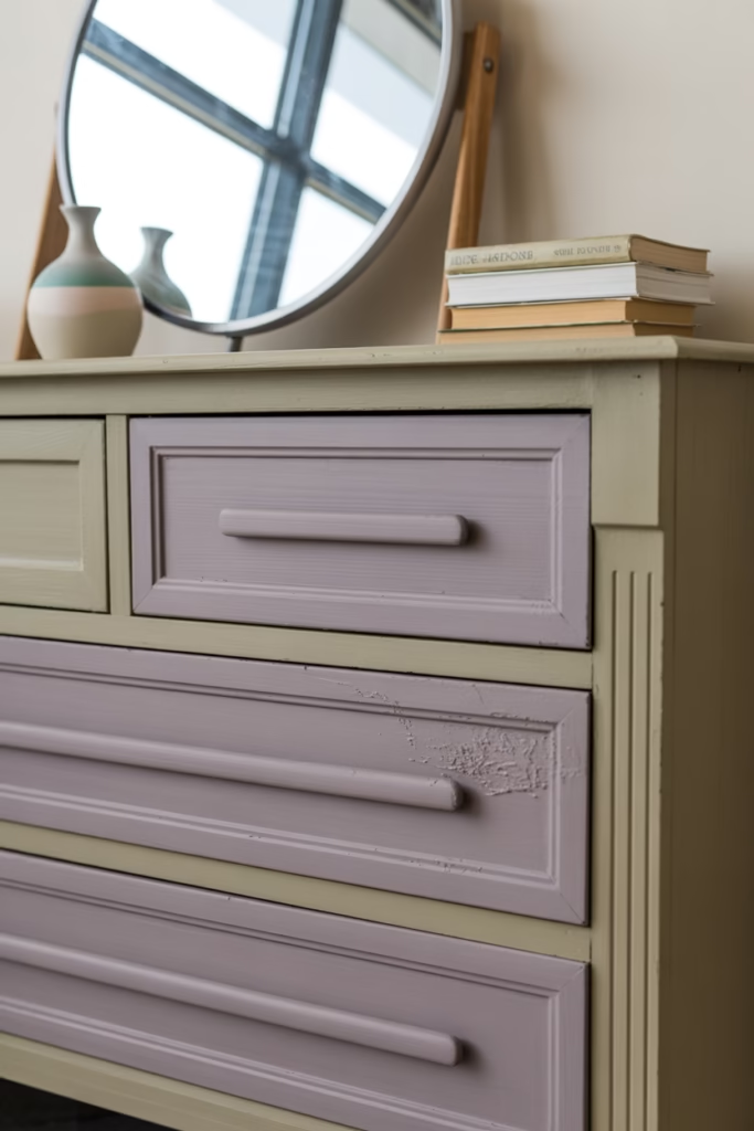
You don’t always need new furniture. Painting existing pieces in pastel shades is one of the most cost-effective ways to refresh your space without starting from scratch. A secondhand dresser in dusty lavender or a wooden coffee table in sage green can become the most interesting piece in your room.
Chalk paint works best for furniture — it adheres without priming, dries matte, and gives that perfect flat, velvety finish that looks both vintage and modern at once.
This is also a great way to experiment with a color before committing to it on your walls. Paint a side table in butter yellow, live with it for a month, and see how you feel about the color in your space.
Wrapping It Up
Pastel home decor in 2026 isn’t about making your space look delicate or precious, it’s about creating an environment that feels calm, considered, and genuinely you. Whether you start small with a set of ceramic vases or go all in with a sage green linen bedroom, every choice adds up to a home that you actually want to spend time in.
Start with one room, one piece, or even one shelf. You’ll be surprised how quickly the whole aesthetic comes together once you give it a starting point. Now go fix that corner you’ve been ignoring for six months — you’ve got the inspo, you’ve got no excuses. 🙂