
White on white. Just reading that probably made half of you think, “That’s either going to look stunning or like a hospital waiting room.” And honestly? You’re not wrong to have that reaction. The white-on-white aesthetic is one of those design choices that lives dangerously on the edge between serene and sterile, and the rooms that get it right are genuinely breathtaking.
So let’s walk through 15 rooms that absolutely crush the white-on-white aesthetic — and I’ll break down exactly why each one works so you can steal the ideas for yourself. 🙂
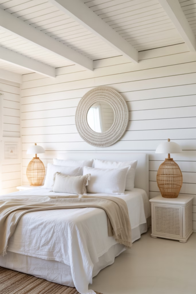
1. The Linen-Layered Bedroom That Feels Like a Cloud
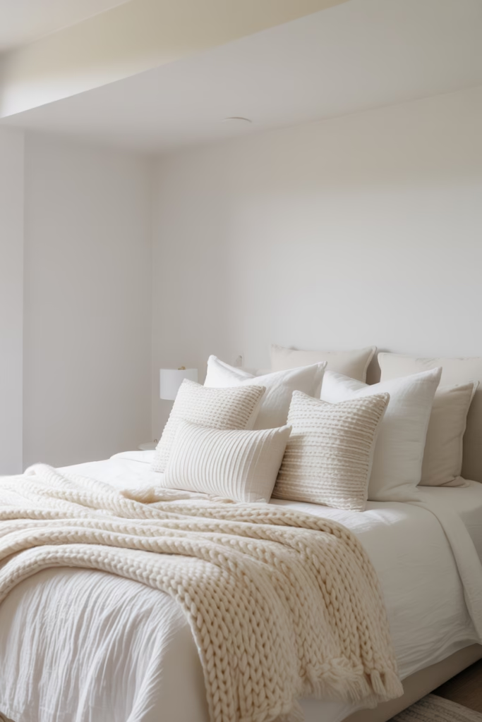
You know that feeling when you walk into a hotel room and everything looks impossibly soft? That’s the energy this bedroom nails.
What makes it work:
- Crisp white duvet layered over chunky ivory knit throws
- White linen pillowcases with subtle texture variation
- Matte white walls against a slightly warm white ceiling
The magic here is tonal variation — not every white is the same white. The duvet reads bright and clean while the throw reads warm and cozy. Together, they create depth without a single drop of color.
Why Texture Is Everything in a White Bedroom
When you remove color from a space, texture becomes your primary design tool. A flat, all-white room with no texture variation looks unfinished. But layer in a waffle-weave coverlet, some linen Euro shams, and a chunky jute rug? Suddenly it reads as intentional and sophisticated.
Pro tip: Aim for at least three different fabric textures in your white bedroom to keep the eye moving and interested.
2. The All-White Kitchen That Actually Looks Lived In
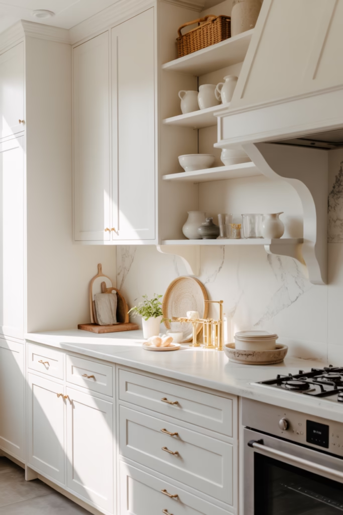
IMO, the all-white kitchen is one of the hardest looks to pull off — because most people make it look cold and untouchable, like a kitchen you’d see in a real estate listing rather than a real home.
The rooms that get it right lean into warmth through material choice. We’re talking:
- White marble countertops with natural veining (not stark white quartz)
- Shaker-style cabinet doors with visible groove detail
- Open shelving displaying white ceramic dishware
That visible veining in the marble does so much heavy lifting. It introduces organic movement into an otherwise uniform palette without introducing color. And those open shelves with stacked white ceramics? Chef’s kiss.
The Hardware Question
Here’s where people get tripped up: do you go white hardware or contrasting hardware in a white-on-white kitchen? The rooms that truly commit to the aesthetic choose hardware in soft brushed nickel or warm brass — not stark chrome, and definitely not matte black. A little warmth in the metals keeps the whole kitchen from feeling like an operating theater.
3. The Minimalist Living Room With One Standout Texture
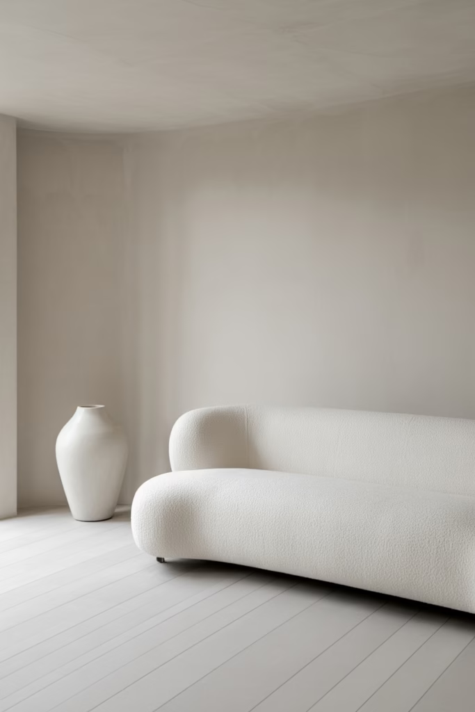
Ever walked into a room and immediately felt calm? This is that room.
White boucle sofa. White plaster walls. White oak floors. A single oversized white ceramic vase on the floor. That’s it. And it’s everything.
What makes it work is the boucle. That loopy, nubby fabric catches light differently at every angle, creating visual interest all on its own. The sofa becomes the focal point not because of color but because of surface complexity.
If you’re building a white-on-white living room, investing in one statement texture piece — a boucle sofa, a chunky knit pouf, a plaster sculpture — pays off more than anything else you can do.
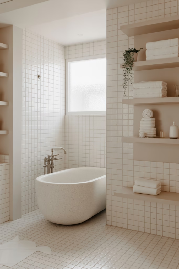
4. The Spa Bathroom With Layered White Stone
Okay, this one is genuinely aspirational and I’m not even a little embarrassed about it.
Picture floor-to-ceiling white marble tile, a freestanding white stone bathtub, and white oak floating shelves holding neatly folded white towels. The grout lines are barely visible — a soft warm white that blends into the marble rather than cutting through it.
The key details:
- Matte white fixtures (not chrome) to maintain the palette
- Natural light amplified by a large frosted window
- A single trailing plant (yes, the one green thing — it earns its place)
That one plant isn’t a concession — it’s a contrast that makes the white feel more intentional rather than accidental.
Grout Color Matters More Than You Think
Most people obsess over the tile and ignore the grout. Big mistake. Choose a grout color that’s slightly warmer than your tile — something in the cream-to-warm-white range — to prevent the joints from looking like a grid drawn in pencil over your beautiful wall.
5. The Nursery That’s Soft and Dreamy Without Being Bland
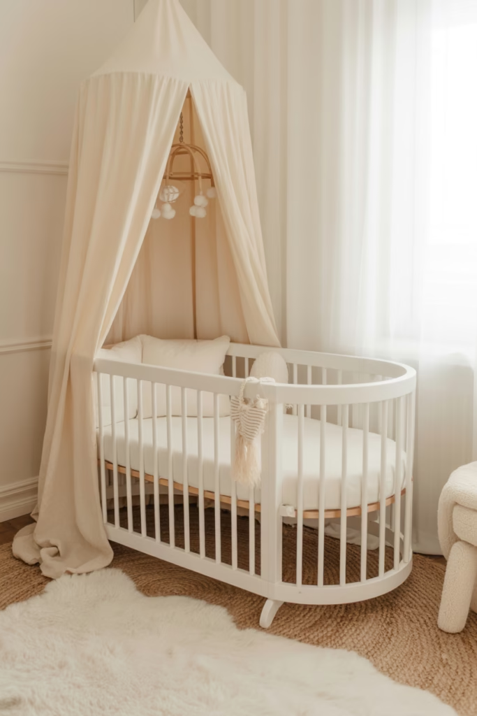
White nurseries get a bad reputation for being boring. But when done well? They’re the most soothing rooms in the house.
The version that works uses layers of white with soft organic shapes:
- A rounded white crib with slatted detail
- A white shaggy rug with long pile
- White muslin curtains that pool slightly on the floor
- A white rattan mobile overhead
Everything is white, but nothing matches exactly — and that’s the point. The slight variations in tone (bright white crib, cream-toned rug, warm white curtains) create a softness that feels intentional and nurturing.
6. The Home Office That Makes You Actually Want to Work
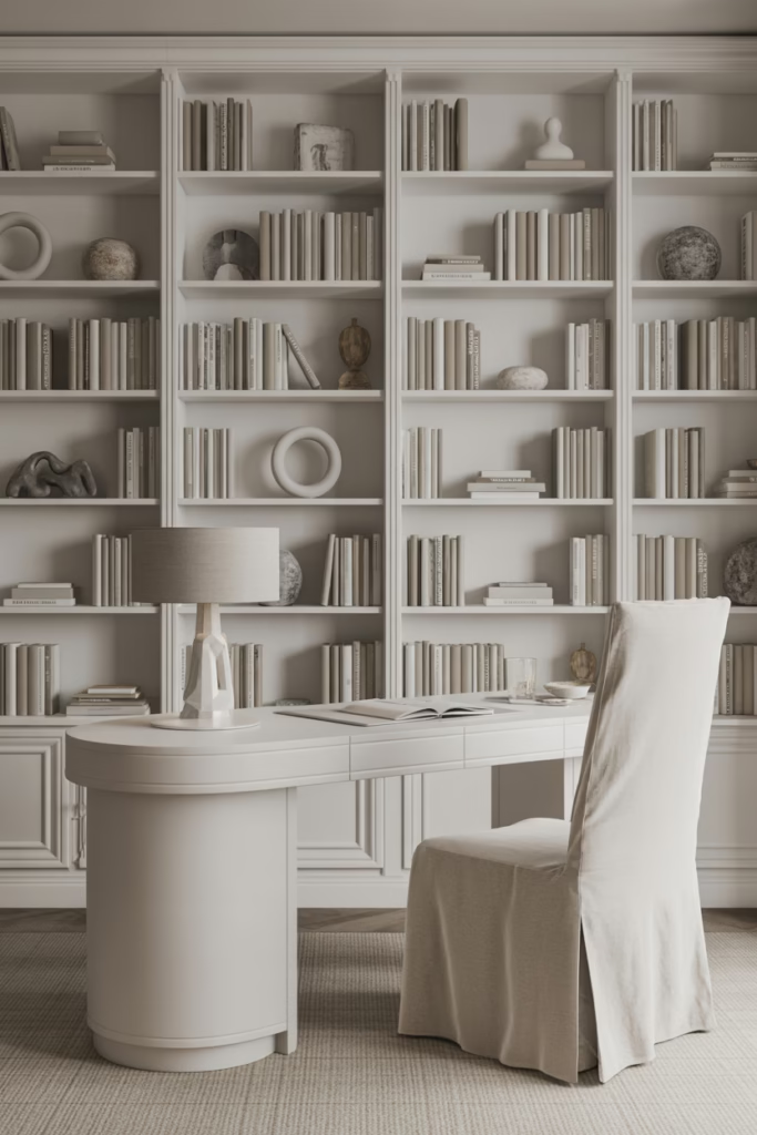
Full disclosure: I would absolutely never get any work done in this room. It’s too pretty.
White built-in shelving from floor to ceiling. A white lacquer desk. A white linen task chair. And every book on those shelves? Faced spine-out or turned backward to show only white pages. (Yes, this is a real design move. Yes, it looks incredible. No, finding a specific book is a nightmare. :/
The room works because of scale and proportion — those floor-to-ceiling built-ins give the space architectural weight that keeps it from feeling empty, even though every surface is white.
The “Book Trick” Explained
Turning books backward or covering them in white paper removes the visual noise of colorful spines. It’s a move that interior designers use specifically to maintain a monochromatic palette on shelves while still keeping the warmth and texture that books provide. FYI, it costs you literally nothing and transforms a bookshelf instantly.
7. The Dining Room With Sculptural White Furniture
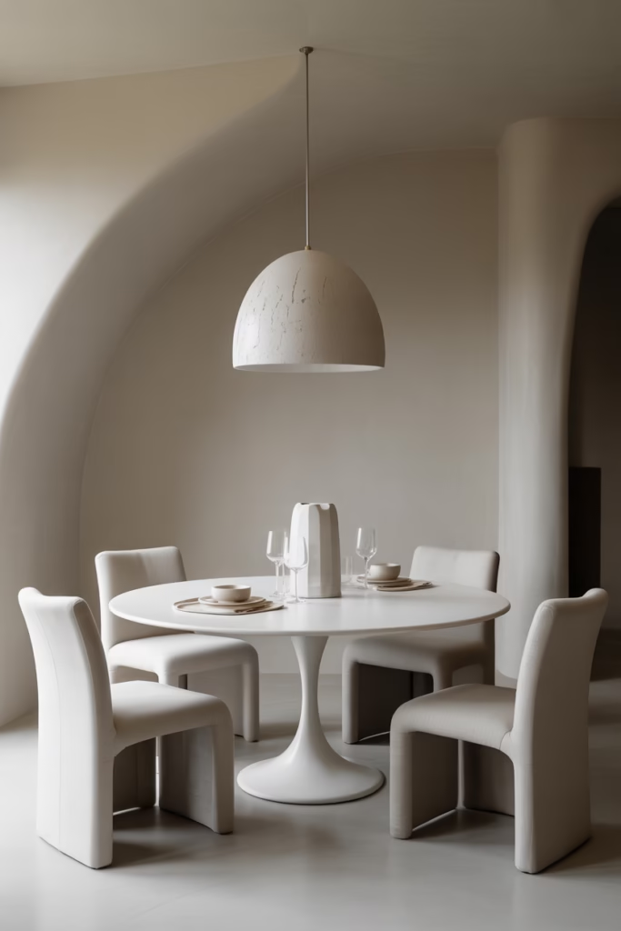
Most white dining rooms look like IKEA showrooms. This one doesn’t, and here’s why:
The furniture has shape. A tulip-style pedestal table in matte white. Curved white resin chairs with organic silhouettes. A plaster-effect white pendant light overhead that looks like it was hand-formed.
The difference between boring and beautiful in a white dining room comes down entirely to furniture silhouette. Boxy, straight-edged white furniture in an all-white room disappears into the walls. Sculptural, curved pieces create shadow and form — they become art objects in their own right.
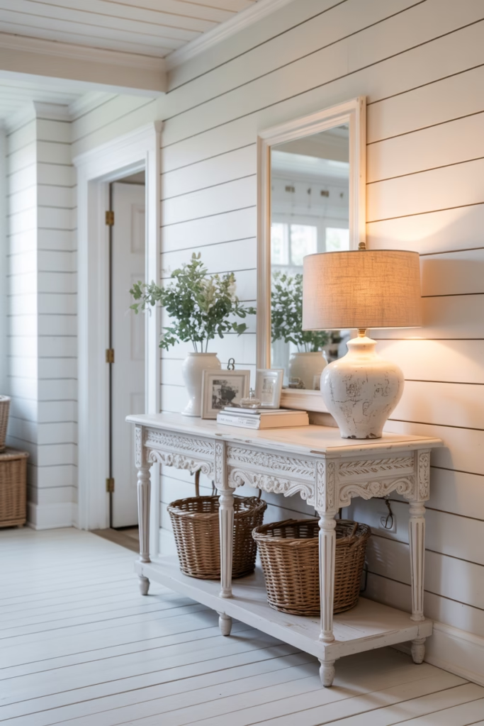
8. The Entryway That Makes a Bold First Impression
Entryways are small, so they’re actually the perfect place to go full white-on-white without commitment anxiety. If it doesn’t work, you’re only dealing with a small space.
This version features:
- White shiplap walls with horizontal planks for subtle texture
- A vintage-style white console table with carved leg detail
- A white ceramic table lamp with a linen shade
- White painted floorboards
The shiplap is doing serious work here. Those horizontal lines give the wall dimension and craftsmanship without adding color. It’s texture through architecture rather than through decor.
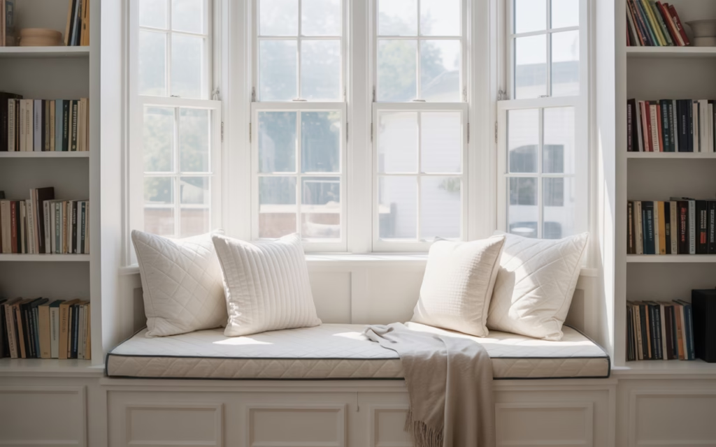
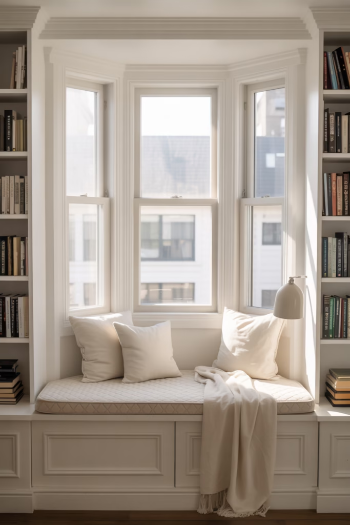
9. The Sunlit Reading Nook Built Into a Bay Window
Okay, this one actually made me audibly sigh the first time I saw it.
A white-painted bay window with built-in bench seating. White cushion with a subtle diamond-quilted pattern. White linen throw. White bookshelf flanking each side of the window. And natural light pouring in, creating shadows in every texture fold.
Natural light is the secret ingredient in any white-on-white space. Without it, white rooms feel flat and institutional. With it, every texture variation casts micro-shadows that bring the whole space to life. If you’re designing a white room, always prioritize your light source first.
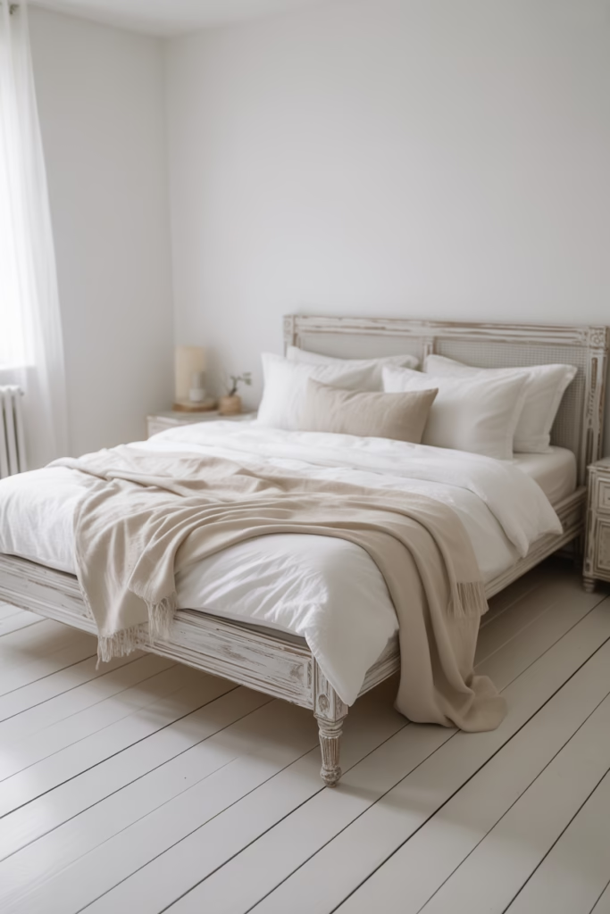
10. The Scandi-Inspired Bedroom With White-Washed Wood
This room proves that white-on-white doesn’t have to mean hard surfaces and clinical precision.
White-washed pine floors. White-washed wood bed frame. White walls. White bedding. And yet — it’s incredibly warm. The wood grain still shows through the white wash, giving every surface an organic quality that breathes life into the space.
What White-Washing Does to Wood
White-washing doesn’t cover wood — it filters it. You still see the grain, the knots, the natural character. The white tone just unifies it and lightens the visual weight. It’s the difference between a room that feels cold and a room that feels like a Swedish forest cabin in the best possible way.
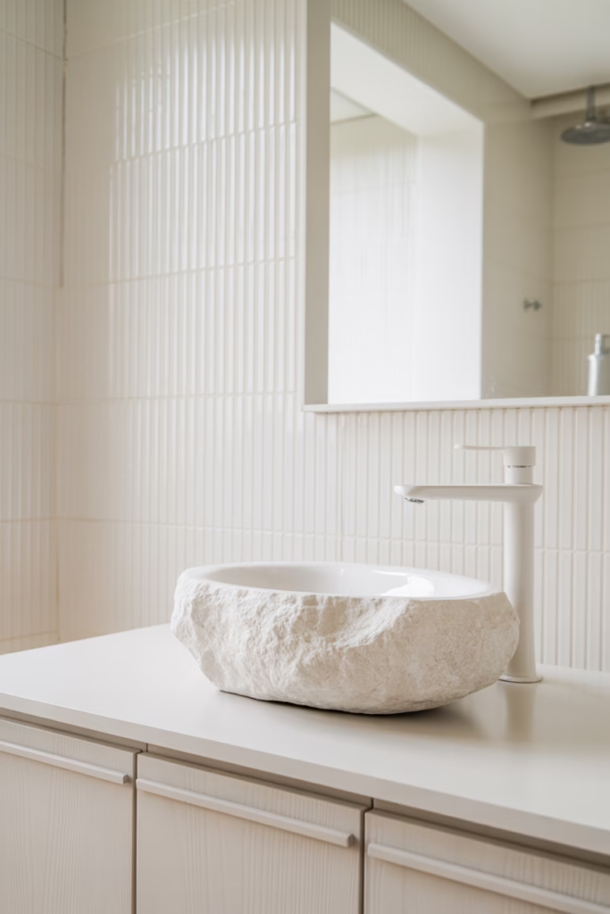
11. The Bathroom With Fluted White Tile
Fluted tile has had its moment (okay, it’s been having its moment for a few years now), and in an all-white bathroom, it’s absolutely the right call.
Vertical fluted white tile on a feature wall behind the vanity creates directional texture that draws the eye upward, making a small bathroom feel taller. Pair it with a white stone vessel sink, white oak vanity in a light tone, and matte white faucet fixtures, and you have a bathroom that looks like it belongs in a high-end boutique hotel.
The fluting creates a repeating pattern of light and shadow across the wall surface — all within a single white palette. No color required.
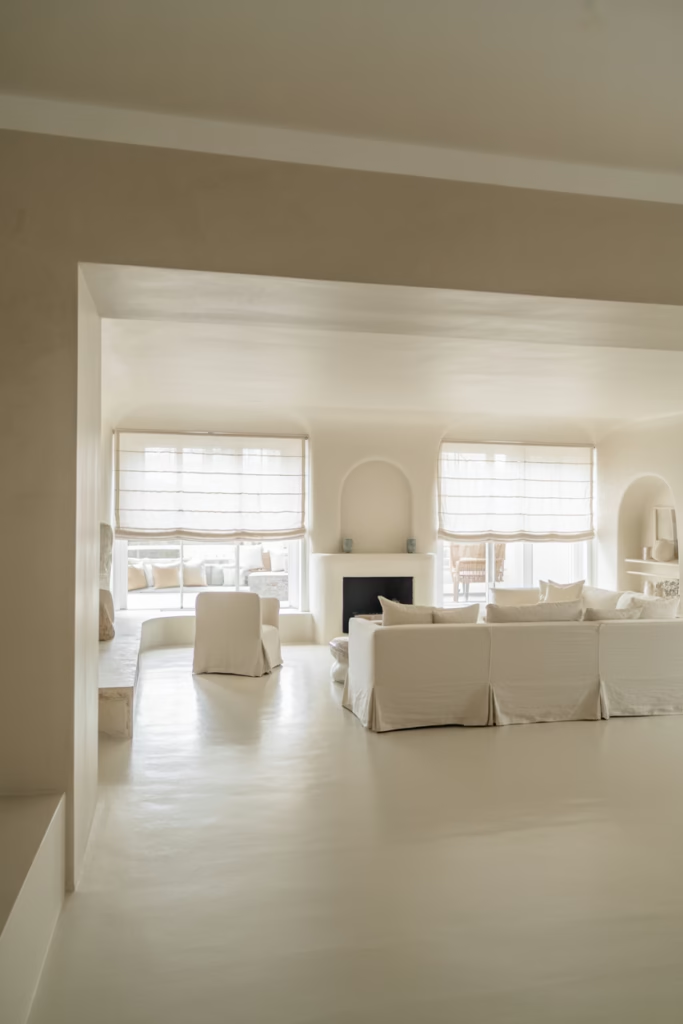
12. The Open-Plan Living and Dining Space That Doesn’t Feel Sterile
Here’s where most people panic: “White-on-white works in small spaces, but what about big open-plan areas? Won’t it feel like a showroom?”
It doesn’t — if you layer intelligently.
This open-plan space uses:
- White plaster walls with a slightly uneven, hand-applied texture
- White concrete-effect flooring with subtle aggregate variation
- White linen Roman blinds at the windows
- A white plaster fireplace surround as the central focal point
- White slipcovered sectional sofa with removable covers
Every surface is white, but no two surfaces are the same white or the same texture. The plaster wall, the concrete floor, the linen blind — each one reads differently in light, creating a rich layered environment despite the singular color story.
13. The Coastal Bedroom That Swaps Blues for All-White
Coastal bedrooms traditionally lean on blue-and-white combinations. But this room proves you can strip out the blue entirely and still feel the beach.
White shiplap ceiling (that classic coastal detail). White washed linen bedding that looks effortlessly rumpled. White rattan bedside tables. White sea glass vases. White rope accent mirror.
The materials do all the coastal storytelling — rattan, rope, linen, shiplap. You don’t need blue to evoke the ocean. You just need materials that feel organic, breezy, and slightly imperfect.
14. The Maximalist White Room
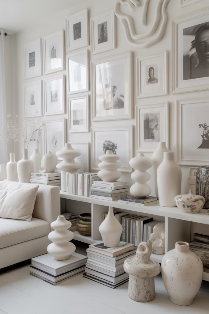
Wait — maximalism in a white-on-white space? Absolutely.
This room layers white decorative objects in abundance: a gallery wall of white-framed prints with white matte boards, clusters of white ceramic vases in varied heights, stacked white books on every surface, white sculptural candle holders, white botanical prints.
The space is full — busy, even — but because everything reads within the same white palette, it doesn’t feel chaotic. It feels curated and intentional, like a sculptor’s studio where every piece earns its place.
The lesson here is that restraint in color doesn’t require restraint in quantity.
15. The Outdoor White-on-White Patio
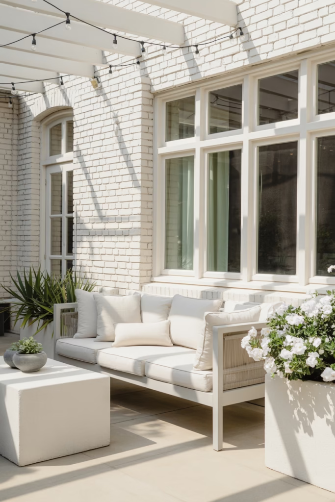
Who says this aesthetic stops at the back door?
A covered patio with white-painted brick walls, white outdoor linen cushions on a white powder-coated metal sofa, white string lights overhead, and white concrete planters holding white-blooming gardenia bushes.
This outdoor space works because the white acts as a canvas for natural variation — the shadows from string lights, the organic shapes of plants, the weathered texture of painted brick. Outside, white-on-white doesn’t feel cold because nature brings its own warmth.
Design tip: For outdoor white spaces, always choose UV-stable, fade-resistant materials. Regular indoor white paint and fabric will yellow and deteriorate quickly in direct sunlight. Look for outdoor-rated fabrics and paints specifically designed to hold their white tone.
What All 15 Rooms Have in Common
After looking at these spaces, a few patterns show up every single time:
- Tonal variation — no two whites are exactly the same temperature or finish
- Texture layering — at least three different material textures in every space
- Strong natural light — the single biggest factor that separates beautiful white rooms from bland ones
- Intentional material choice — marble, linen, plaster, rattan, and stone all hold white differently and contribute warmth
- One anchor piece — every room has one element (a fireplace, a boucle sofa, a fluted tile wall) that grounds the space
The rooms that fail the white-on-white test are the ones that treat “white” as a single flat thing. The rooms that succeed understand that white is a spectrum, a texture, a mood and that mastering it means working within all that variation.
Getting Started With White-on-White in Your Own Home
You don’t have to gut your entire house. Start small:
- Pick one room — a bedroom or bathroom is easiest
- Identify your anchor piece — one statement texture that becomes the focal point
- Layer in at least three different white tones — bright white, warm white, cream
- Prioritize your light source — add a mirror or sheer curtains if natural light is limited
- Resist the urge to add color — if you feel the space needs something, add texture before you add color
White-on-white isn’t a beginner aesthetic, but it’s absolutely an achievable one. And once you get it right? It’s one of the most satisfying design outcomes there is. Rooms that feel calm, timeless, and endlessly photographable without a single colorful throw pillow in sight.