
Picking two colors for your bedroom sounds simple until you’re standing in the paint aisle holding seventeen swatches and questioning every life decision you’ve ever made. :/ Been there. The truth is, a well-chosen two-color palette can transform a boring room into something that feels intentional, cozy, and seriously stylish. You don’t need a designer budget or a Pinterest board with 3,000 pins. You just need the right combos and a little confidence.
Let’s get into it.
1. Navy Blue and Crisp White
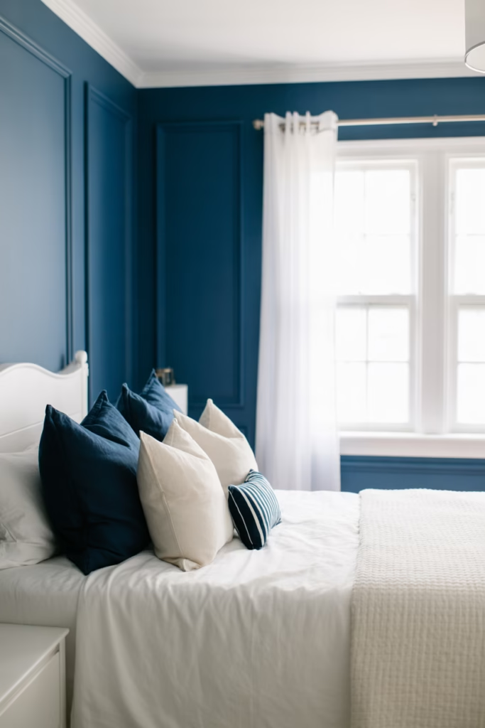
This one’s a classic for a reason. Navy blue brings depth and drama, while white keeps things fresh and airy. Together, they create that clean, nautical-meets-modern vibe that works in literally any bedroom size.
Paint your walls navy and use white for trim, bedding, and furniture. The contrast is sharp without being jarring. IMO, this is the safest “bold” choice you can make — it looks expensive without actually being expensive.
Best for: Minimalist and coastal-style bedrooms.
2. Sage Green and Warm Beige
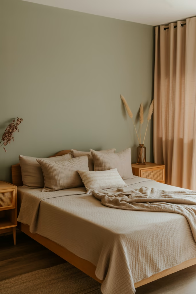
If you want your bedroom to feel like a soft exhale after a long day, go with sage green and warm beige. This combo leans earthy and organic — think linen textures, wooden accents, and morning light.
Sage on the walls with beige bedding and curtains creates a layered, organic look. It’s calming without being boring. And honestly? It photographs beautifully too, which matters if you’re pinning your space anywhere.
Best for: Boho, Scandinavian, and nature-inspired bedrooms.
3. Dusty Rose and Warm Gray
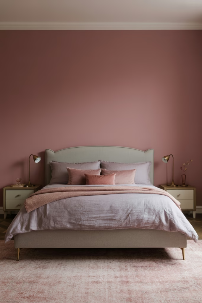
Here’s where things get a little more interesting. Dusty rose isn’t your millennial pink — it’s mature, sophisticated, and pairs perfectly with warm gray tones. Think of it as the “grown-up” version of a pink bedroom.
Use dusty rose as an accent wall and let warm gray do the heavy lifting on furniture and textiles. Add gold or brass hardware to tie it all together. The result? A bedroom that feels romantic without screaming Valentine’s Day.
Best for: Feminine, contemporary, and transitional bedrooms.
4. Charcoal and Terracotta
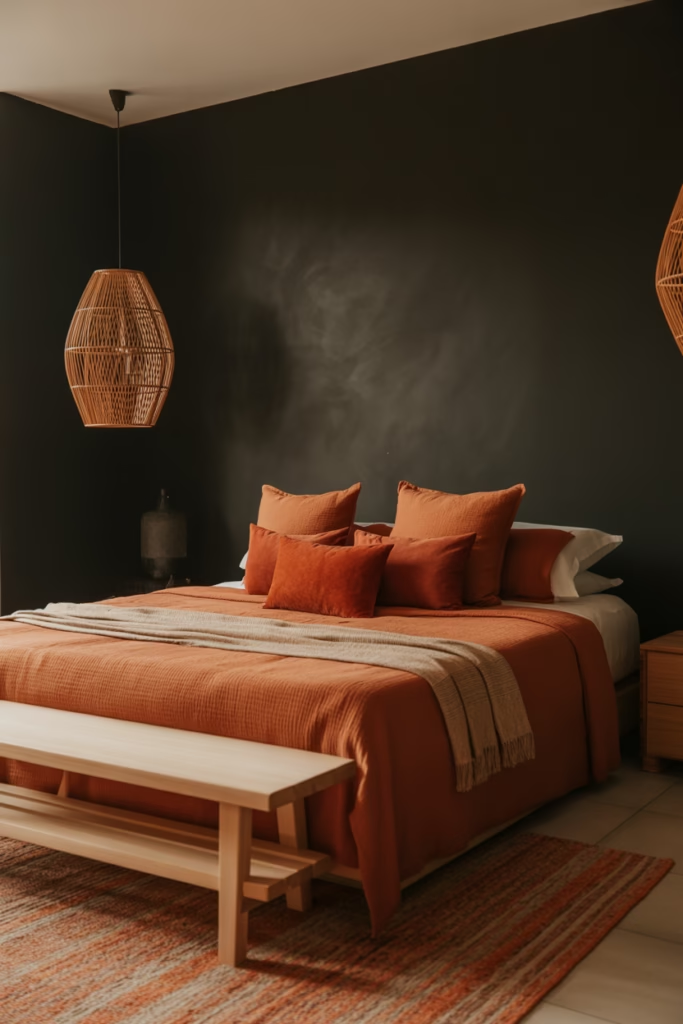
Bold move, but hear me out. Charcoal grounds the space while terracotta adds a warm, earthy punch that stops the room from feeling cave-like. This combo works especially well with rattan furniture and low-hanging pendant lights.
Keep charcoal on the walls and introduce terracotta through pillows, throws, and a statement rug. You don’t need to go overboard — a few well-placed accents do the job. It’s moody without being gloomy.
Best for: Maximalist, bohemian, and mid-century modern bedrooms.
5. Soft Black and Warm White (Off-White)
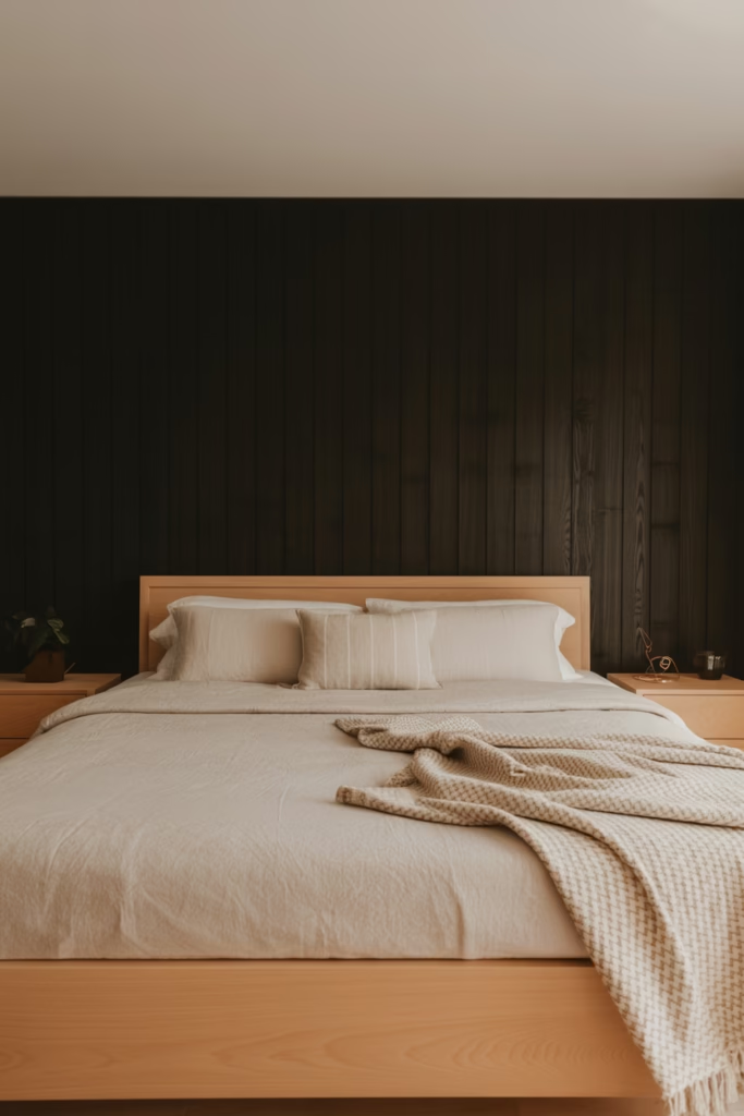
Everyone talks about black-and-white, but the secret is using soft black (not jet black) and off-white instead of pure white. Pure white can feel clinical; off-white feels warm and lived-in.
This combo creates a timeless, high-contrast look that works in both small and large rooms. Use soft black for an accent wall or headboard area, and off-white for everything else. Add texture through woven blankets and wooden elements to soften the contrast.
Best for: Modern, minimalist, and Japandi-style bedrooms.
6. Butter Yellow and Cloud White
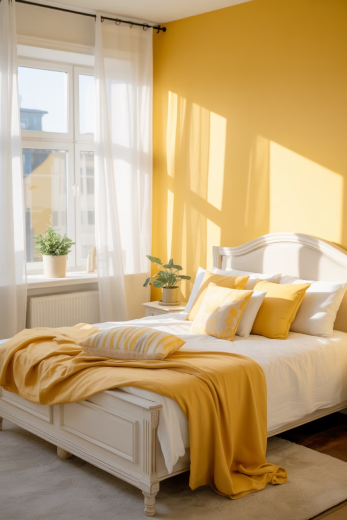
Ever walked into a room and just felt happy? That’s what butter yellow paired with cloud white does. It’s cheerful, bright, and surprisingly easy to style.
Keep it light — yellow as an accent wall or in your bedding, with white for the rest of the room. Avoid going too saturated with the yellow or it starts to look like a school hallway (not the vibe). Soft, muted tones are the move here.
Best for: Kid’s bedrooms, guest rooms, and sunny, uplifting spaces.
7. Forest Green and Deep Brown
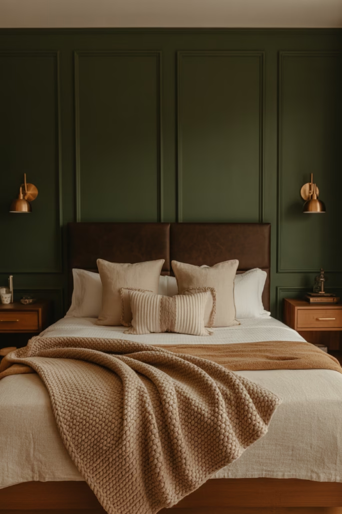
This combo is for people who want their bedroom to feel like a luxury cabin in the woods. Forest green and deep brown are both rich, nature-inspired tones that create an incredibly cozy, grounded space.
Think green walls with brown leather or wooden furniture, layered with cream textiles. It’s warm, moody, and genuinely relaxing. FYI, this combo also pairs incredibly well with brass fixtures if you want to add a touch of glam.
Best for: Rustic, lodge-style, and luxe earthy bedrooms.
8. Lavender and Soft White
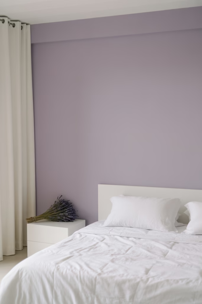
Lavender gets a lot of hate — people think it’s too “little girl’s room.” But muted lavender paired with soft white is actually incredibly sophisticated. It’s calming, airy, and adds just enough color without committing too hard.
Use lavender on a single wall or in your bedding, with soft white everywhere else. Keep the furniture clean-lined and simple. The key is using a desaturated, gray-toned lavender rather than a bright purple — that’s what separates elegant from elementary.
Best for: Serene, spa-like, and transitional bedrooms.
9. Camel and Ivory
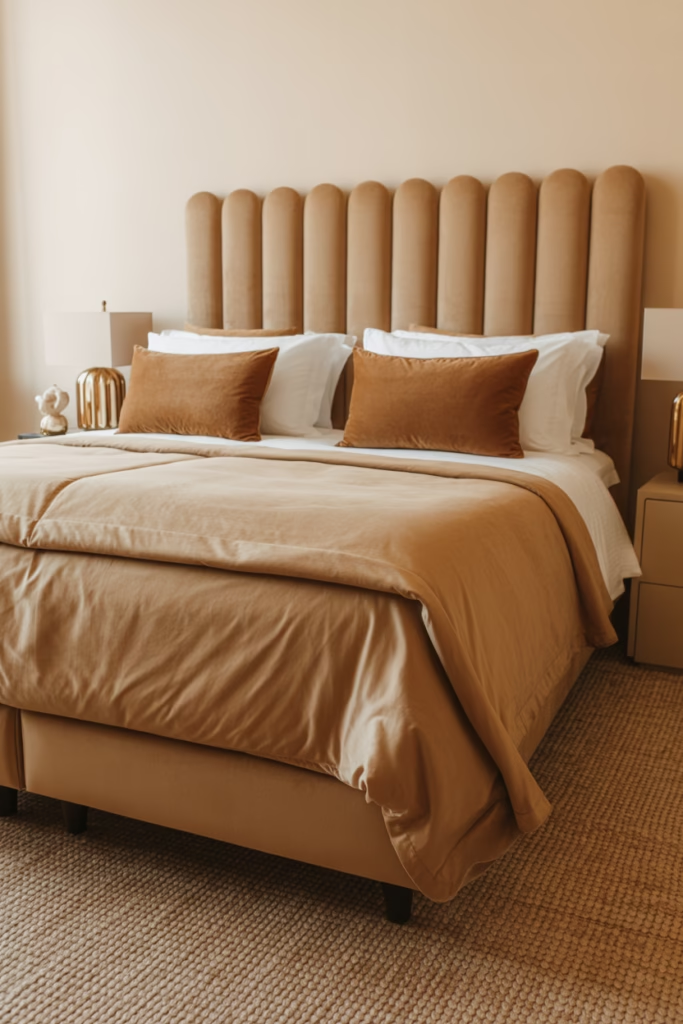
If you want a bedroom that looks like it belongs in an upscale boutique hotel, camel and ivory is your answer. This combo is warm, neutral, and endlessly versatile.
Camel tones work beautifully in textured fabrics — think velvet headboards, suede pillows, and woven throws. Ivory keeps the base clean without being stark white. The result is a space that feels rich and warm without using a single “bold” color.
Best for: Luxe, contemporary, and transitional bedrooms.
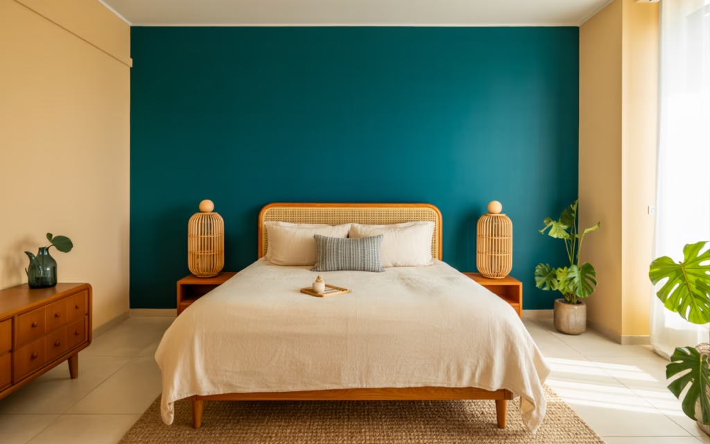
10. Teal and Warm Cream
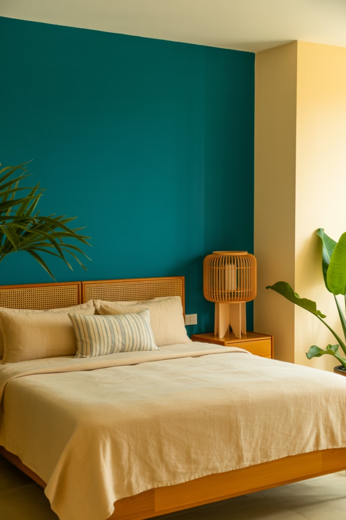
Teal is a powerhouse color — it’s bold enough to make a statement but grounded enough to not overwhelm a space. Paired with warm cream, it creates a vibrant yet balanced look.
Use teal as your accent wall (or even your headboard wall only) and let cream do the rest. Add wood tones and natural textures to keep it from feeling too cool. This combo has real staying power — it doesn’t trend in and out the way brighter colors do.
Best for: Eclectic, coastal, and mid-century modern bedrooms.
11. Blush Pink and Deep Burgundy
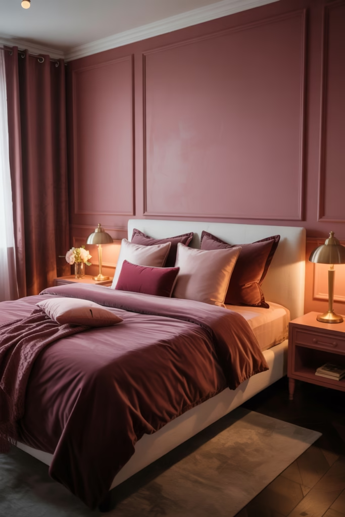
This one’s underrated and wildly elegant. Blush and burgundy sit close on the color wheel, which means they harmonize beautifully without clashing. The result is a rich, romantic, slightly dramatic space.
Use blush on the walls and introduce burgundy through your bedding, curtains, and accent pieces. Keep the rest of the room neutral — white or natural wood works best. This combo shines hardest in bedrooms with good lighting, so don’t sleep on your lamp game (pun intended :)).
Best for: Romantic, moody, and maximalist bedrooms.
12. Slate Blue and Warm Linen
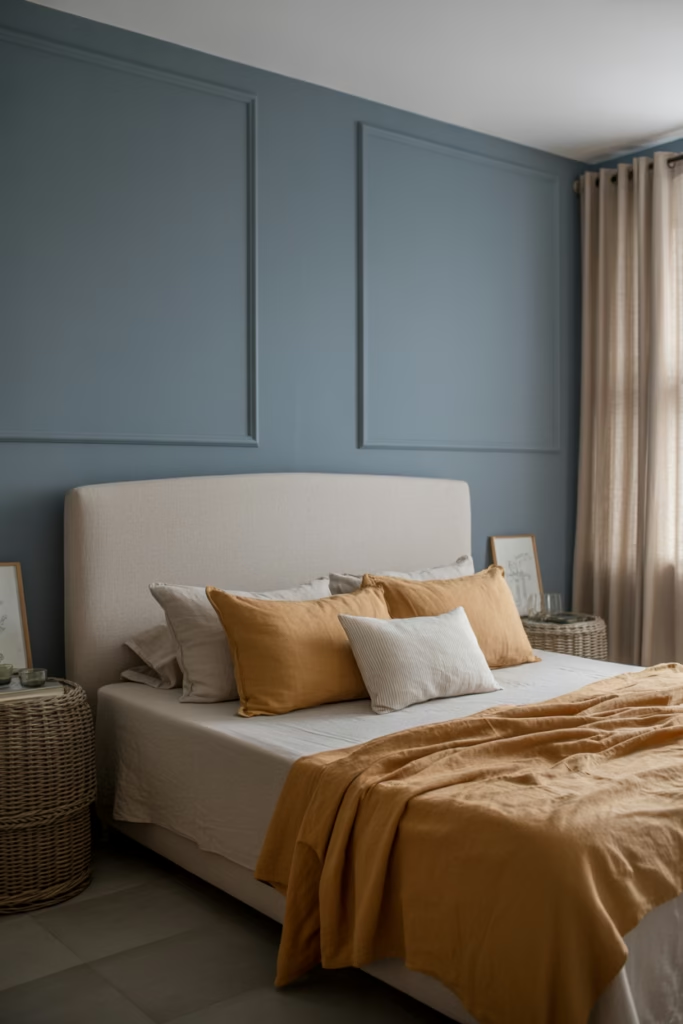
Slate blue is the low-key superstar of bedroom palettes. It’s not as intense as navy, not as airy as sky blue — it sits right in the sweet spot. Paired with warm linen tones, it creates a sophisticated, relaxed space.
Use slate blue on the walls and linen-colored textiles throughout — curtains, bedding, even a linen-upholstered headboard. The warmth of the linen balances the cool of the blue perfectly. Add wicker or rattan accessories and you’ve got a bedroom that looks effortlessly curated.
Best for: Coastal, Scandi, and relaxed modern bedrooms.
13. Olive Green and Rust Orange
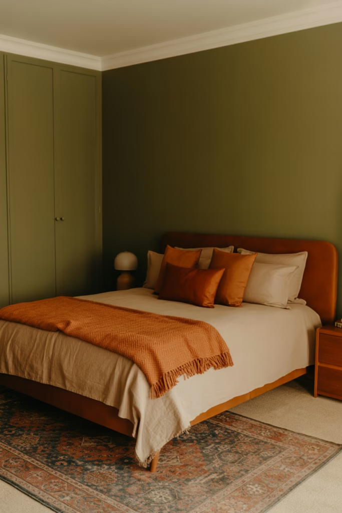
Okay, this combo might raise an eyebrow — but it works. Olive green and rust orange are both earthy, warm tones that feel rooted and authentic. Think 70s-inspired without the shag carpet.
Use olive green as your dominant wall color and rust orange as an accent through throw pillows, a blanket, or a statement rug. Keep furniture neutral and low-to-the-ground for that retro feel. It’s a bold choice that rewards people who commit to it.
Best for: Retro, boho, and earthy eclectic bedrooms.
How to Choose the Right Two-Color Combo for Your Bedroom
Now that you’ve seen all 13, how do you actually pick? Here’s a quick decision framework:
- Consider your room’s natural light. Dark rooms need lighter, warmer combinations. Rooms flooded with sunlight can handle deeper, moodier palettes.
- Think about the feeling you want. Calm and restful? Go sage, lavender, or linen tones. Dramatic and cozy? Navy, forest green, or charcoal combos are your friends.
- Test before you commit. Always paint a large sample swatch (at least 12″x12″) and live with it for 48 hours before rolling it across the whole wall.
- Stick to the 60-30-10 rule. One color takes 60% of the room, the second takes 30%, and a neutral accent fills the remaining 10%.
- Match undertones. Warm colors pair best with warm colors; cool with cool. Mixing undertones is where most people go wrong.
Final Thoughts
Two-color bedroom palettes work because they remove the guesswork. You’re not juggling five different hues, you’re working with two that support each other. The key is balance: one color anchors the space, the other elevates it.
Whether you go bold with charcoal and terracotta or keep it soft with sage and beige, the goal is a bedroom that feels intentionally designed and genuinely restful. Pick the combo that resonates with your gut, not just the one that looked good on someone else’s Pinterest board. Your room, your rules.