
Living in a rental can feel like you’re stuck in design limbo. You can’t knock down walls, paint that hideous beige a moody charcoal, or install the chandelier of your dreams. But here’s the thing: you absolutely can make your rental look like it belongs in a luxury condo spread without losing your security deposit. I’ve transformed enough bland rental boxes to know that high-end vibes are less about what you own and more about how you style what you’ve got.
The secret? It’s all about strategic upgrades, clever styling tricks, and understanding what actually makes a space look expensive. Spoiler alert: it’s rarely the price tag. Ready to turn your cookie-cutter apartment into a space that makes your friends ask, “Wait, you rent this place?” Let’s get into it.
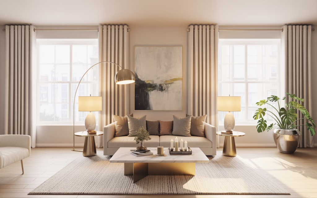
Layer Your Lighting Like Your Life Depends on It
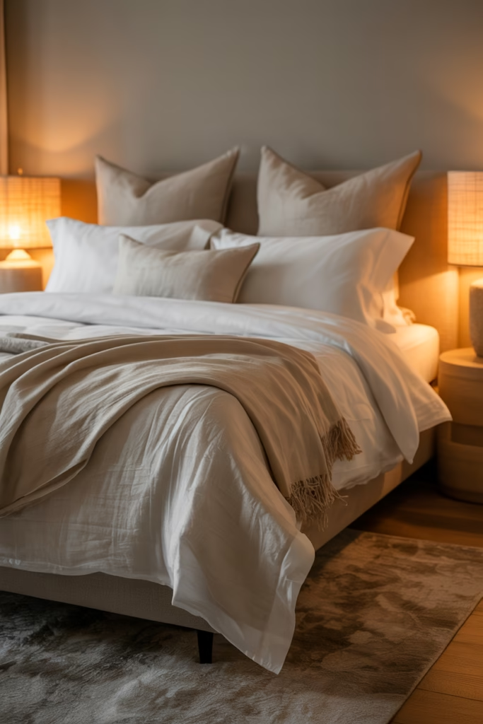
Overhead lighting is the enemy of ambiance. I said what I said. That single ceiling fixture casting harsh shadows everywhere? That’s what’s making your place look like a waiting room instead of a home.
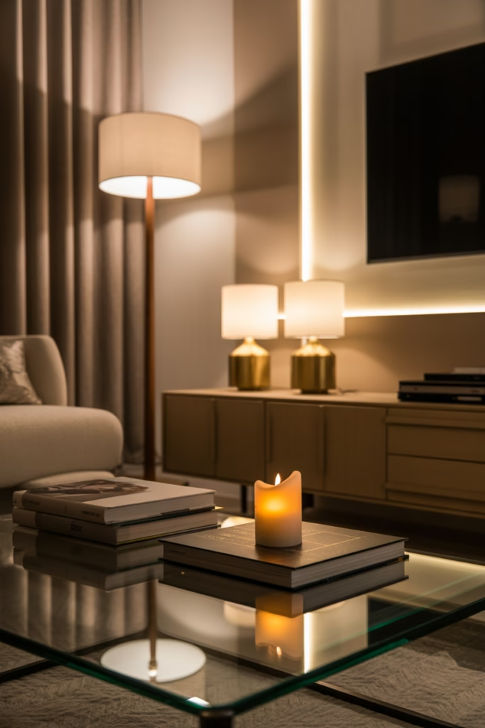
The fastest way to elevate any rental is to add multiple light sources at different heights. I’m talking floor lamps in corners, table lamps on side tables, and maybe even some battery-operated LED strips if you’re feeling fancy. When you layer lighting, you create depth and warmth that instantly reads as “expensive.”
Here’s my lighting formula:
- One statement floor lamp (arc lamps look ridiculously high-end)
- Two matching table lamps for symmetry
- String lights or LED strips for ambient glow
- Candles because nothing says luxury like actual fire 🙂
Dimmer switches are your best friend, but since you probably can’t install them, smart bulbs work just as well. Being able to adjust the brightness transforms the entire mood of your space. Harsh white light screams “budget apartment.” Warm, dimmable lighting whispers “I have my life together.”
And please, for the love of good design, ditch those plastic lampshades. Swap them for linen or textured fabric ones. It’s a $15 upgrade that makes a $200 difference in perceived value.
Invest in Statement Window Treatments
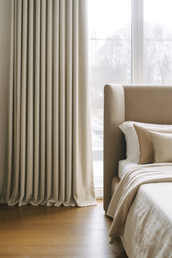
Want to know the fastest way to make any room look cheap? Leave those sad mini blinds alone. Window treatments are non-negotiable if you’re trying to achieve that high-end look.
I know what you’re thinking—curtains seem expensive and complicated. But here’s the hack: you don’t need custom drapes. You need floor-to-ceiling panels hung as high and wide as possible. This one trick makes your ceilings look taller and your windows look bigger. Instant upgrade.
The curtain cheat sheet:
- Hang the rod 2-3 inches below the ceiling, not above the window frame
- Extend the rod 6-8 inches beyond each side of the window
- Choose panels that puddle slightly on the floor (about 1-2 inches)
- Stick with neutral colors like white, cream, or soft gray
Tension rods are your rental-friendly solution for hanging them without drilling. And honestly? Even cheap curtains from Target look expensive when they’re hung correctly. It’s all about the installation, not the price point.
Blackout curtains also serve double duty—they block out that lovely view of the parking lot while making your bedroom feel like a luxury hotel. FYI, the weight of blackout fabric automatically makes them hang better, which adds to that expensive look.
Create a Cohesive Color Palette (And Actually Stick to It)
You know what makes a space look chaotic and cheap? Color confusion. When you’ve got a red couch, blue pillows, green rug, and yellow accents all fighting for attention, your eye doesn’t know where to land. It’s visual noise.
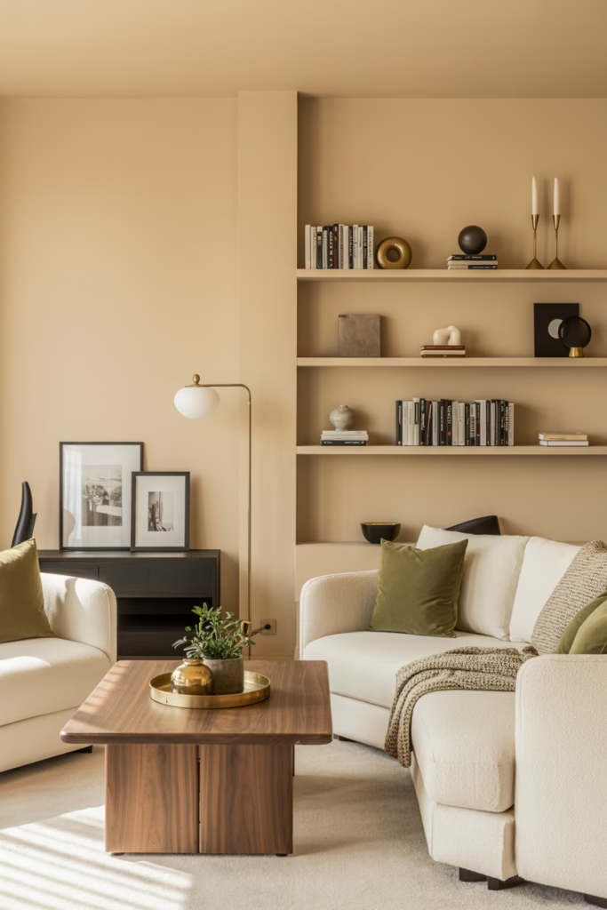
High-end spaces have one thing in common: restraint. Pick a color palette and commit. I usually go with three colors max—a neutral base, one accent color, and metallic accents (gold or silver, never both). This creates a cohesive, intentional look that reads as sophisticated.
For rentals with questionable wall colors or carpeting you can’t change, neutrals are your safety net. Build your palette around what you’re stuck with. Got builder-beige walls? Work with warm tones like terracotta, cream, and natural wood. Stuck with gray carpet? Go cooler with whites, blacks, and maybe some navy or forest green.
Every single item you bring into your space should fit this palette. Throw pillows, artwork, books on your coffee table—if it doesn’t fit the scheme, it doesn’t make the cut. This level of intentionality is what separates “decorated” from “designed.”
And here’s a personal opinion: all-white or all-neutral spaces with minimal color pops always look more expensive than rainbow explosions. Save the color chaos for your closet.
Upgrade Your Hardware (Yes, Really)
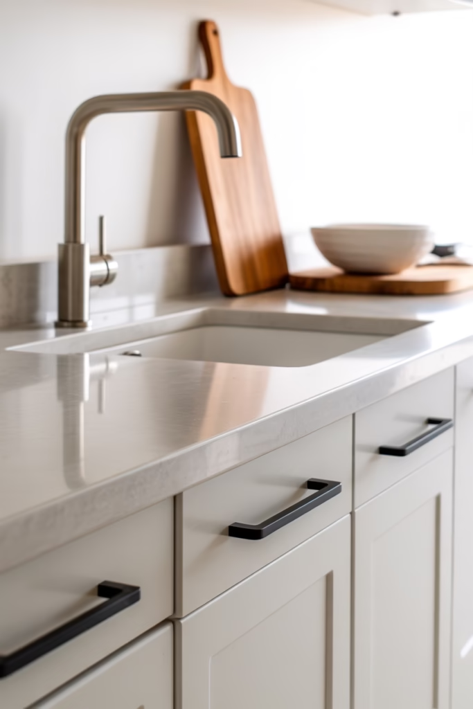
This is going to sound tedious, but swapping out builder-grade hardware is a game-changer. I’m talking about cabinet pulls, drawer knobs, door handles—all those little touchpoints that your hands interact with daily.
Builder-grade hardware is universally terrible. Those brass-toned or chrome fixtures that came with your apartment? They’re screaming “budget rental” to anyone who touches them. Replacing them with matte black, brushed brass, or sleek silver hardware takes maybe an hour and costs around $50-100 for an entire kitchen.
Keep the original hardware in a box and swap them back before you move out. Boom—instant upgrade that’s completely reversible. The same goes for light switch covers and outlet plates. Spending $20 on coordinated covers in a modern finish makes a bigger difference than you’d think.
Door handles are trickier since they’re more permanent, but some come with removable installation options. If you can swing it, upgrading those old brass doorknobs to modern lever handles changes the entire feel of your space.
Ever walked into a place and immediately noticed how nice everything feels to touch? That’s quality hardware at work. It’s one of those subliminal upgrades that makes people think you spent way more than you did.
Add Architectural Interest With Removable Solutions
Rentals notoriously lack architectural character. No crown molding, no wainscoting, no interesting trim work—just flat walls and builder-grade everything. But you can fake architectural interest without your landlord freaking out.
Peel-and-stick wallpaper has come a long way. I’m talking textured designs, geometric patterns, and even faux shiplap that looks surprisingly legit. Use it on an accent wall to create a focal point that draws the eye and adds depth.
Removable architectural upgrades:
- Peel-and-stick crown molding (yes, this exists)
- Command strip picture frame molding for wainscoting effect
- Temporary wall panels for texture
- Adhesive ceiling medallions around light fixtures
I once used stick-on ceiling tiles in a rental bathroom, and people genuinely thought they were original to the building. The texture adds visual interest overhead, which most people completely ignore. Looking up and seeing something beautiful? That’s luxury.
Board and batten walls are another option if you’re handy. You can attach lightweight boards with heavy-duty Command strips or liquid nails that peels away cleanly. The vertical lines make ceilings look taller and add that custom millwork vibe without the custom price tag.
Style Your Surfaces Like a Stylist Would
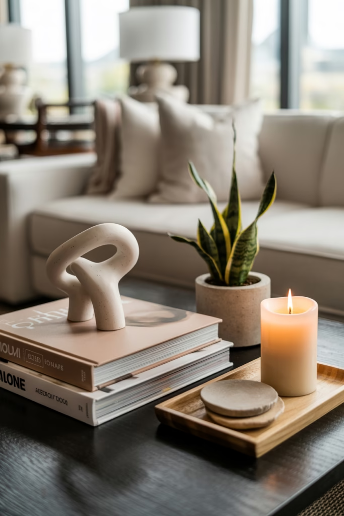
Here’s where most people mess up: they either leave surfaces completely bare or turn them into cluttered dumping grounds. Neither looks expensive. High-end spaces have carefully curated surface styling that looks effortless (but totally isn’t).
The rule of three is your friend here. Group items in odd numbers—three candles, five books, one decorative object. This creates visual interest without overwhelming the space. Everything should serve a purpose, even if that purpose is just looking pretty.
Coffee tables need more than a remote and yesterday’s mail. I typically style mine with a stack of oversized books (art, photography, design—anything that looks good), a decorative object on top, and a small tray to corral remotes or coasters. Maybe a small plant or candle for good measure. That’s it. Less is absolutely more.
Surface styling checklist:
- Clear the clutter first (always step one)
- Add height variation with books, boxes, or small pedestals
- Include something natural—plants, flowers, or natural materials
- Use trays to create zones and contain smaller items
- Leave negative space—surfaces need room to breathe
Nightstands, consoles, shelves—the same principle applies everywhere. Curate, don’t accumulate. Every item should either be beautiful or functional, ideally both. That random souvenir from 2015? Probably doesn’t make the cut, IMO.
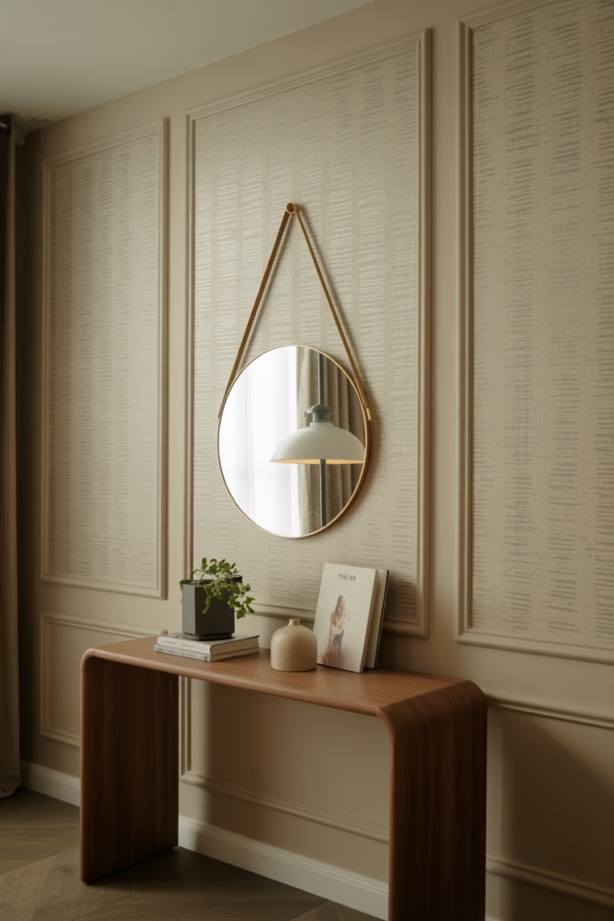
Invest in One Statement Piece Per Room
You don’t need to drop thousands on furniture, but having one standout piece in each room tricks the eye into thinking everything else is equally expensive. It’s the halo effect in action.
In your living room, maybe it’s an oversized piece of art or a sculptural floor lamp. In the bedroom, perhaps a upholstered headboard or a vintage-looking mirror. In the kitchen, it could be a beautiful rug or open shelving with gorgeous dishware. Whatever it is, make it count.
This is where you spend the money you saved by shopping smart everywhere else. One $300 statement piece surrounded by affordable basics will always look better than a room full of $100 mediocre items. Quality over quantity is the oldest rule in the book, but it exists because it works.
I learned this the hard way after buying a bunch of matching furniture sets that looked fine but totally forgettable. Once I swapped in one vintage dresser with real character, suddenly the whole room came together. Everything else could be IKEA, and nobody noticed because their eyes went straight to the showstopper.
Your statement piece should reflect your personality and become the room’s focal point. Don’t play it safe here—this is where you get to show some creative flair while anchoring the entire space.
Upgrade Your Textiles Strategically
Nothing says “expensive” like quality textiles. I’m talking about the fabrics that touch your body—bedding, towels, throw blankets. These don’t have to cost a fortune, but they need to feel substantial and look luxe.
In the bedroom, invest in good sheets. Thread count is overrated (anything above 400 gets diminishing returns), but material matters. Linen and long-staple cotton feel amazing and instantly upgrade your sleep situation. Add a chunky knit throw at the foot of the bed and some oversized Euro pillows against the headboard. Boom—hotel vibes.
Bathroom textiles are criminally overlooked. Swap those thin, sad towels for thick, plush ones in a coordinating color. Roll them in a basket or hang them on matching hooks. Add a bath mat that actually has some weight to it. These small upgrades make your bathroom feel spa-like instead of dorm-like.
Textile upgrade priority list:
- Bed sheets and duvet cover (you spend 8 hours here)
- Throw pillows with textured covers (velvet, linen, boucle)
- Bathroom towels that match
- Area rugs that anchor furniture groupings
- Throw blankets that look good draped over furniture
Here’s a secret: you can mix price points here. Affordable sheets with expensive pillow shams, budget towels with a luxury bath mat. People notice the overall effect, not the individual price tags. Strategic splurging is an art form.
Hide What’s Ugly, Highlight What’s Not
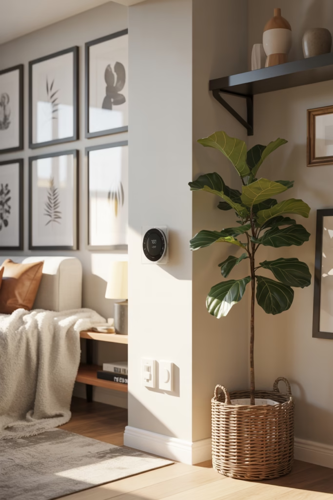
Rentals come with some non-negotiable ugly elements. That thermostat on the wall. The electrical panel. The weird AC unit. The radiator from 1985. You can’t remove them, but you can minimize their visual impact.
I’ve hidden thermostats behind picture frames (that still allow access), covered radiators with custom covers that double as shelves, and strategically placed plants to block unsightly outlets. It’s about directing the eye toward what you want people to see.
On the flip side, highlight your apartment’s best features. Does it have great natural light? Remove heavy window treatments and keep things bright. Exposed brick? Make it the focal point and style around it. Interesting architectural details? Draw attention to them with lighting or contrast.
The goal is to create an environment where people notice the intentional design choices, not the landlord’s questionable decisions from 2003. Sometimes this means literally covering things with fabric, artwork, or furniture placement. No shame in the hiding game when you’re renting :/
Create Zones in Open Spaces
If you’re working with a studio or open-concept layout, creating distinct zones makes the space feel more sophisticated and intentional. Area rugs are your best tool here—they literally define spaces without building walls.
Use one rug to anchor your living area, another for your dining space, and maybe a runner in your entryway. This visual separation creates the illusion of multiple rooms and makes the space feel larger and more purposeful. Each zone should have its own identity while still coordinating with the overall design.
Furniture placement also creates zones. Float your sofa away from the wall to define the living area. Use a bookshelf as a room divider. Position your bed perpendicular to the wall instead of against it to create a bedroom zone in a studio.
Zone-creating strategies:
- Different area rugs for different functions
- Furniture arrangements that face each other
- Lighting specific to each zone
- Color or style variations that still coordinate
I’ve seen tiny studios feel palatial when properly zoned, and spacious apartments feel cramped when everything’s pushed against the walls. The way you arrange your space matters just as much as what you put in it. Create intentional boundaries even when physical ones don’t exist.
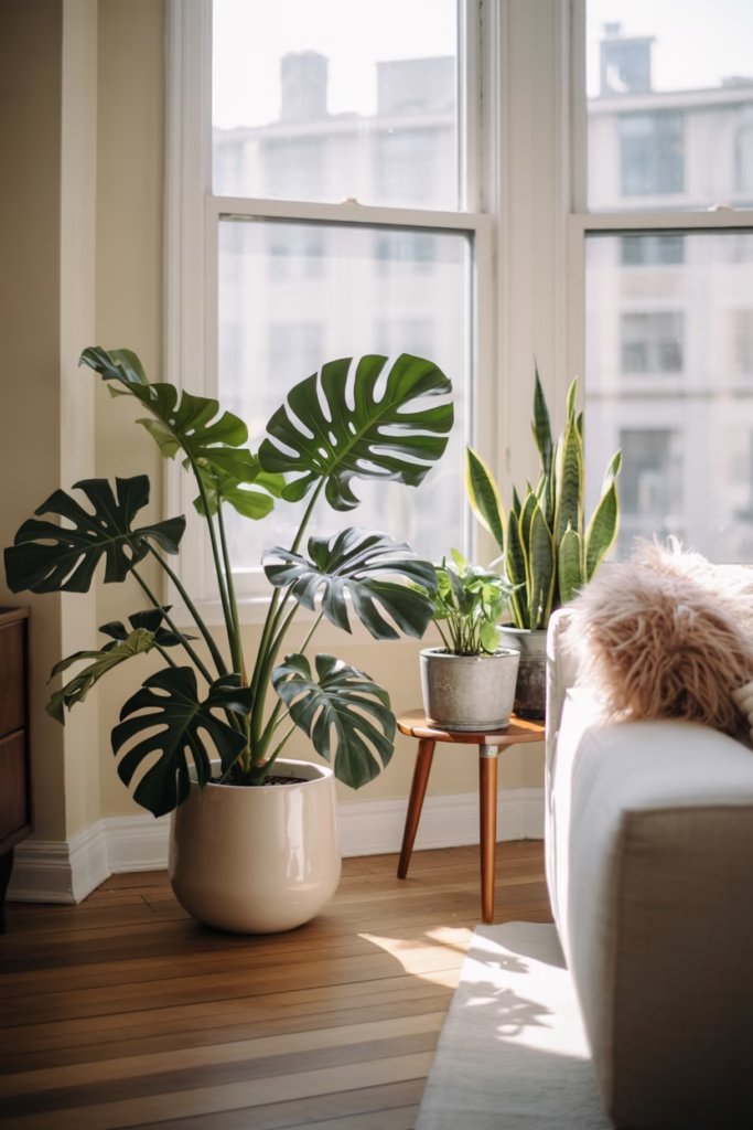
Bring in Real Plants (Not Fake Ones)
I’m going to be controversial here: fake plants almost never look high-end. Real plants bring life, air purification, and that organic element that instantly makes spaces feel more expensive. Plus, they change over time, which adds character.
You don’t need a green thumb to keep a few hardy plants alive. Snake plants, pothos, and ZZ plants are virtually indestructible. Place them in stylish planters (ceramic, concrete, or woven baskets) that fit your color scheme, and suddenly you’ve got that “I casually have my life together” aesthetic.
Fiddle leaf figs and monstera deliciosa are the poster children of high-end interiors for a reason—they make dramatic statements. Position a large plant in an empty corner, and that dead space becomes a designed moment. Cluster smaller plants on surfaces for visual interest at varying heights.
If you genuinely cannot keep plants alive (no judgment), at least get a vase of fresh flowers occasionally. The impermanence is part of the luxury. It shows you care enough about your space to maintain it, which is ultimately what high-end living is about.
Final Thoughts: It’s Not About Money, It’s About Intention
Luxury is a feeling, not a price point. You can absolutely create a high-end looking space on a budget by being strategic, intentional, and willing to put in some effort.
The difference between a basic rental and one that looks expensive comes down to details. It’s the cohesive color palette, the proper curtain installation, the curated surface styling, and the quality of those items you interact with daily. It’s choosing fewer, better things over lots of mediocre things.
Most importantly, it’s about creating a space that reflects your style while implementing these elevated design principles. Don’t copy someone else’s aesthetic use these strategies to enhance your own vision. That authenticity is what ultimately makes a space feel custom and high-end, regardless of your ZIP code or rent payment.
Now stop staring at those builder-grade cabinet pulls and go replace them already. Your high-end rental transformation awaits.