
Blank walls are one of those things that sneak up on you. You spend weeks (sometimes months) pulling a living room together — the right sofa, the right rug, the right lighting — and somehow that one big wall just… never gets addressed. It becomes background noise. Part of the furniture. Completely invisible until a guest points it out and suddenly you can’t stop seeing it.
Here’s the thing though a bare wall is actually the easiest decorating problem to solve once you stop overthinking it. You’ve got more options than you think, and most of them don’t require a huge budget or a design degree.
Start by Understanding Your Wall
Before you hang a single thing, take a hard look at what you’re working with. Not all walls are created equal, and treating them like they are is how you end up with art that looks weirdly small, shelves at awkward heights, and a general sense of “something’s off.”
Measure It — Seriously, Measure It
Get out your tape measure. Note the height and width of the wall, and also identify any architectural features like outlets, vents, light switches, or windows nearby. These details will dictate what you can and can’t do.
A wall that’s 10 feet tall and 8 feet wide needs something with visual weight. A narrow 3-foot wall between two doorways calls for something slim and intentional — a tall mirror, a single piece of vertical art, or even a small floating shelf with one great object on it.
Identify the Lighting
Natural light changes everything. A wall that gets direct afternoon sun will read very differently than a north-facing wall that’s always in shadow. Bright walls can handle darker, more dramatic art, while dim walls benefit from light-colored pieces, mirrors, or warm-toned accents.
Walk past your wall at different times of day before committing to anything. It takes five minutes and saves you from a very expensive mistake.
Consider the Room’s Existing Palette
Your wall styling doesn’t exist in a vacuum. It needs to talk to the rest of the room — the sofa color, the rug pattern, the wood tones in your furniture. If your living room is all neutral linens and warm oak, a neon abstract print is going to look like it teleported in from a different dimension.
Pull out the dominant colors already in your space and use them as a starting point. You don’t need to match everything perfectly, but there should be a visual conversation happening between your wall and the room.
The Classic: A Gallery Wall
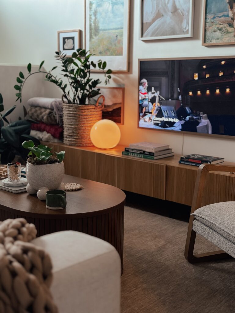
If you want maximum impact without spending a fortune on one large piece, a gallery wall is your best friend. Done right, it looks curated and intentional. Done wrong, it looks like a yard sale exploded on your wall. Let’s make sure it’s the former.
Choose a Cohesive Theme
Pick a thread that ties everything together. That could be:
- A consistent color palette (all black and white, all warm tones, etc.)
- A visual style (vintage botanical prints, abstract shapes, photography)
- A frame finish (all black frames, all natural wood, all gallery-wrapped canvases)
You don’t need every piece to be identical — in fact, variation in size and shape is what makes a gallery wall interesting. But without some kind of cohesion, it just looks chaotic.
Plan It on the Floor First
This is the move that separates people who nail their gallery walls from people who end up with 47 nail holes in their drywall. Lay all your frames on the floor in the arrangement you want, then trace around them on kraft paper or newspaper and cut them out. Tape those paper templates to the wall and live with the arrangement for a day or two before committing.
It sounds like extra work, but trust me — your walls (and your patience) will thank you.
Sizing and Spacing
- Leave 2–3 inches between frames for a tight, editorial look
- Leave 4–6 inches for a more relaxed, airy feel
- Anchor the arrangement with your largest piece slightly off-center
- Make sure the center of your gallery sits at eye level — roughly 57–60 inches from the floor
A gallery wall that’s hung too high is one of the most common decorating mistakes, and honestly, IMO, it makes an entire room feel off without people being able to explain why.
Go Big: The Statement Art Piece
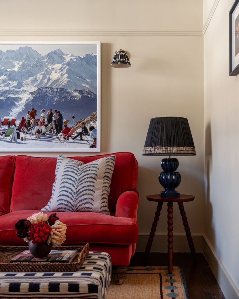
Sometimes the answer to an empty wall is simply one really good large-format piece. This approach is bold, confident, and — when done well — absolutely stunning.
What Counts as “Large Enough”
Here’s a rule of thumb: your art should fill roughly two-thirds to three-quarters of the wall’s width. A 60-inch sofa? You want art that’s somewhere between 40 and 50 inches wide. If the art is too small, it floats awkwardly in the middle of the wall and actually makes the room feel smaller.
Don’t be afraid of scale. People consistently underestimate how big art needs to be to look right on a wall.
Where to Find Large-Format Art Without Breaking the Bank
Big statement pieces don’t have to cost thousands. Some real options:
- Society6, Minted, or Desenio for affordable large prints
- Printable art from Etsy — buy the file, print it locally at a copy shop or Costco
- Thrift stores and estate sales — oversized vintage prints are everywhere if you look
- Canvas prints made from your own travel photos or family photos
- DIY abstract canvases — a stretched canvas, some acrylic paint, and a YouTube tutorial go a long way
The key is that the piece should feel intentional, not like you bought whatever was on sale. Scale and quality over quantity.
Hanging It at the Right Height
Always hang art so that the center of the piece sits at eye level — 57 to 60 inches from the floor. This is the standard used by most art galleries for a reason: it looks natural and balanced to the human eye.
Above a sofa specifically, hang art so there’s 6 to 12 inches of space between the top of the sofa and the bottom of the frame. Any higher and the art starts to look like it’s floating in outer space.
Functional Meets Beautiful: Shelves and Display Ledges
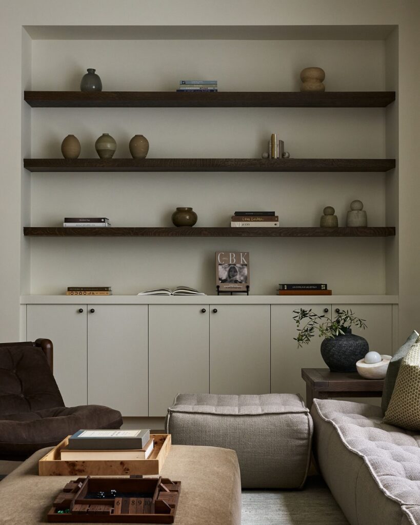
Floating shelves are one of the most versatile wall styling tools out there. They’re functional and decorative, and they let you change up your display whenever you want without putting new holes in the wall. 🙂
The Basic Ledge Shelf Setup
Picture ledges — those narrow shelves that let you lean frames against the wall — are especially great for living rooms because they let you layer art at different depths. You can mix frames, small plants, candles, and objects without any of it feeling cluttered.
A single long ledge shelf running along a wall can hold an entire rotating art collection. Swap pieces out seasonally, add a new print you found, move things around. It stays fresh without any extra effort.
How to Style a Floating Shelf
The classic rule for shelf styling is the rule of three: group items in odd numbers, vary the heights, and mix textures. So instead of three identical objects in a row, you’d do:
- One tall item (a vase, a candlestick, a small plant)
- One medium item (a framed photo, a small sculpture)
- One low item (a stack of books, a small tray, a candle)
Negative space is your friend. Don’t fill every inch of the shelf. Leave some breathing room so individual pieces can stand out.
Mixing Functional and Decorative
Shelves don’t have to be purely decorative. Some ideas for living room shelf displays that actually do something:
- Books organized by color or size, interspersed with objects
- A small trailing plant (pothos, string of pearls) that adds organic texture
- Framed art leaned against the wall, layered with smaller items in front
- A Bluetooth speaker styled as part of the display — because why hide it?
The Mirror Effect
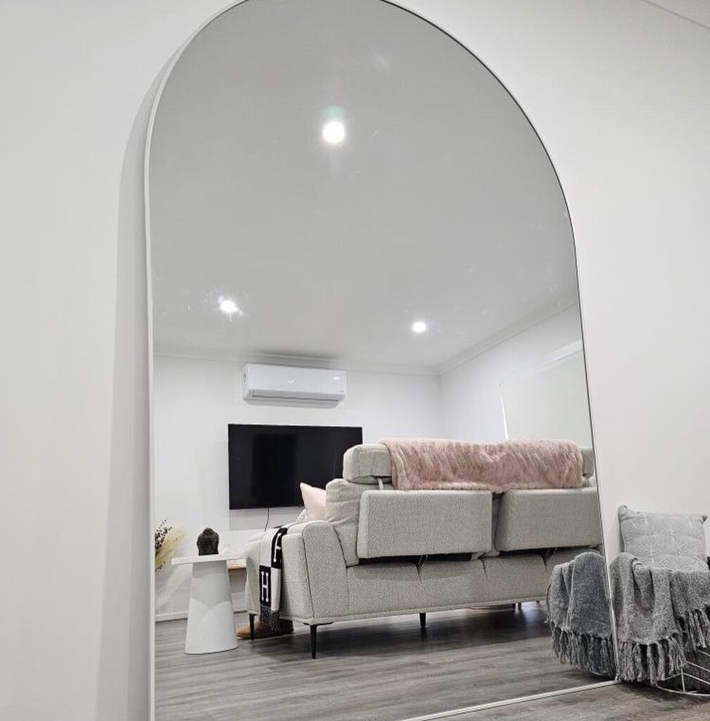
A well-placed mirror is one of the most powerful styling tools in interior design, and dramatically underused in living rooms. Mirrors add light, create the illusion of depth, and make a room feel larger — all without you having to knock down any walls.
Choosing the Right Mirror
Not all mirrors work the same way in a living room context. Some quick guidance:
- Large floor-length or leaning mirrors work beautifully in corners or beside a sofa
- Arched mirrors are having a major moment and add softness to boxy rooms
- Ornate framed mirrors function like art — the frame itself is a design statement
- Round mirrors break up the visual monotony of rectangular furniture
FYI — avoid placing a mirror directly across from something you don’t want amplified, like a cluttered area or a dark corner. Mirrors reflect whatever’s in front of them, so be strategic.
Grouping Mirrors
Who says you can only hang one? A cluster of different-sized mirrors in coordinating finishes makes a stunning wall display. Mix round with rectangular, vary the sizes, and treat the arrangement the same way you’d plan a gallery wall — sketch it out on paper first.
Texture and Dimension: Beyond Flat Art
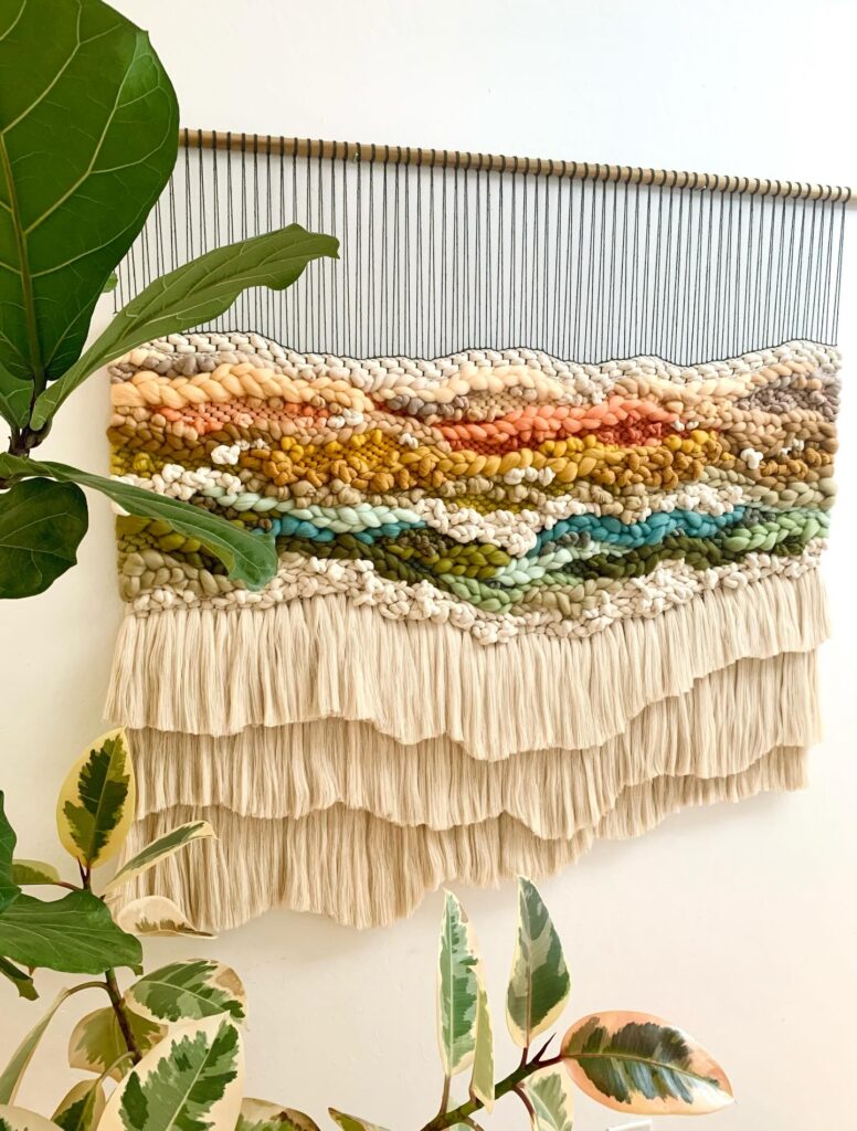
Here’s where things get interesting. Your wall doesn’t have to be a two-dimensional surface. There are so many ways to add texture, depth, and dimension that make a living room wall feel truly special.
Woven Wall Hangings and Macramé
Textile wall art adds warmth and organic texture that no framed print can replicate. A large woven piece above a sofa softens a room instantly, especially in spaces with a lot of hard surfaces like tile floors or glass tables.
Look for pieces with natural fibers — cotton, jute, wool — that feel handmade and artisanal. Mass-produced versions exist, but handmade pieces have an irregularity that makes them feel far more alive on a wall.
3D Wall Panels and Architectural Details
If you really want to make a statement, 3D wall panels made from wood, plaster, or even high-quality PVC can completely transform a wall. These work especially well as an accent behind a TV or sofa.
Wood slat panels are particularly popular right now — they add warmth, visual rhythm, and a very architectural feel to a living room without requiring a full renovation.
Tapestries and Fabric Panels
A large tapestry can serve as both art and texture. It’s also renter-friendly — most tapestries can be hung with minimal hardware. Choose a design that complements your color palette and has enough visual complexity to hold attention as a focal point.
The TV Wall Problem
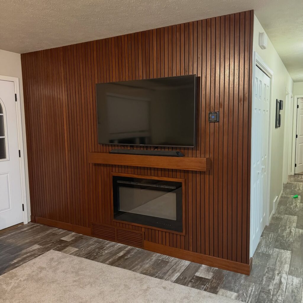
Ah yes. The television. The large black rectangle that dominates modern living rooms and makes decorating feel impossible. Ever wondered why so many people just… give up and leave their TV wall completely bare? Because styling around a TV is genuinely tricky.
But it’s not impossible.
Frame Your TV, Don’t Fight It
Accept the TV as a design element and work with it. Some approaches:
- Mount the TV flush to the wall (no stand, no cable spaghetti) and flank it with symmetrical sconces or plants
- Use a media console below with curated objects on top to anchor the TV visually
- Install a gallery wall around the TV — treat the TV as one element within a larger arrangement
- Wood slat panels as a feature wall behind the TV give it a built-in, intentional look
The Samsung Frame TV Trick
If budget allows, the Samsung Frame TV is specifically designed to look like a framed artwork when not in use. It displays art, photographs, or patterns in art mode and eliminates the “dead black rectangle” problem almost entirely. It’s a genuine game-changer for design-conscious living rooms.
Plants as Wall Styling
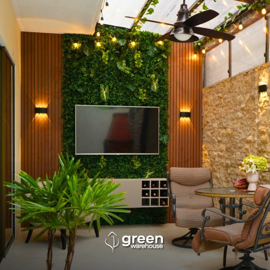
Don’t underestimate the power of plants in a vertical space. Living walls and plant displays bring organic life to a room in a way no inanimate object can.
Mounted Planters and Plant Shelves
Wall-mounted planters work especially well for trailing plants like pothos, string of pearls, or heartleaf philodendron. The trailing vines create natural movement and texture that’s hard to replicate with decor alone.
A simple row of three small mounted planters at staggered heights creates a beautiful botanical display without taking up any floor space — perfect for smaller living rooms.
The Tall Plant as Visual Anchor
Even if you don’t want to mount anything, a tall floor plant like a fiddle leaf fig, monstera, or olive tree placed against a bare wall can do most of the heavy lifting stylistically. Pair it with a simple piece of art above it and you’ve created a complete vignette with minimal effort.
Lighting: The Secret Weapon
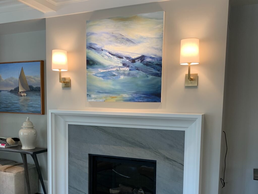
No wall styling conversation is complete without talking about lighting, because lighting can completely change how your wall display reads. A badly lit gallery wall looks flat and forgettable. The same gallery wall with a picture light or track lighting above it looks like a real gallery.
Picture Lights and Sconces
Battery-operated picture lights are a renter-friendly way to add focused illumination to a single art piece without any wiring. They’re surprisingly effective and add an instant museum-quality feel to even a budget print.
Wall sconces flanking a large mirror or art piece serve double duty: they light the space and function as additional decorative elements themselves.
Warm Bulb Temperature
Always use warm white bulbs (2700K–3000K) for living rooms. Cool white lighting makes art look sterile and clinical. Warm light enhances wood tones, art colors, and the overall coziness of your space.
Pulling It All Together
Here’s the honest truth about styling an empty wall: there’s no single right answer. The “correct” approach depends entirely on your space, your style, and how you live in your home. What matters is that you make deliberate choices instead of defaulting to nothing.
A few final principles to keep in mind:
- Start with your largest element (a big art piece, a mirror, a TV) and build outward from there
- Repeat materials and finishes throughout your wall display to create cohesion
- Don’t rush it — it’s completely fine to live with a bare wall for a few weeks while you figure out what you actually want there
- Layer over time — the best-styled walls are usually built piece by piece, not all at once
- Trust your eye — if something looks off to you, it probably is, regardless of what any design rule says
The empty wall that was judging you at the beginning of this article? By the time you implement even two or three of these ideas, it’ll be the first thing guests notice when they walk through your door. And it’ll actually say something about you not just fill space.