
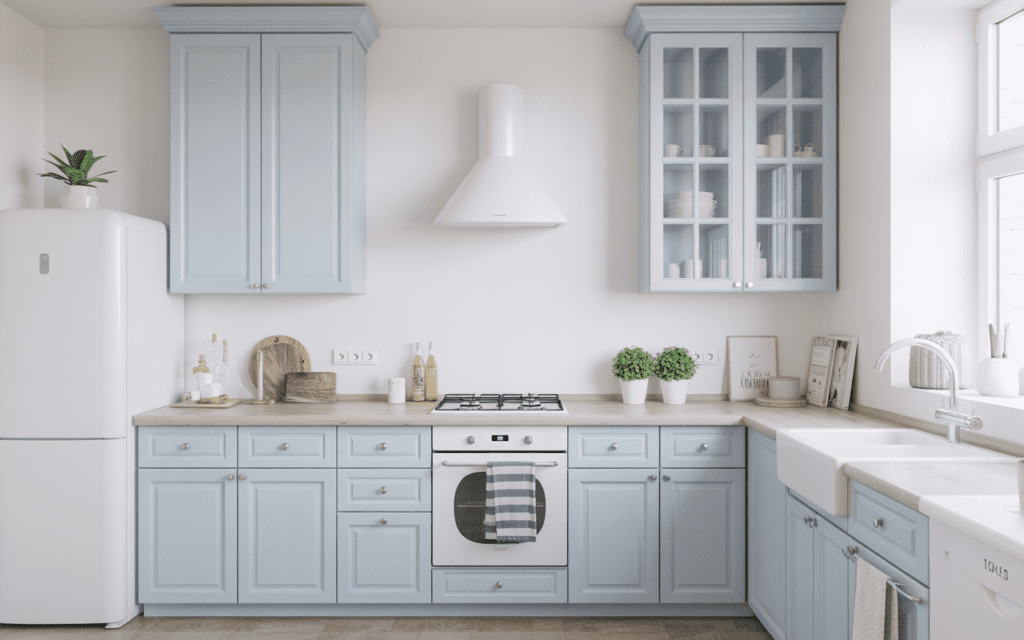
Your kitchen is the most hardworking room in your home. It’s where mornings start, meals come together, and half your best conversations happen leaning against the counter. So why do so many kitchens end up looking like an afterthought painted in whatever neutral came in the biggest tin at the hardware store?
Colour changes everything. The right combination can make a compact kitchen feel twice its size, turn a cold modern space into something genuinely warm, or give a plain builder-grade kitchen an identity it never had. And the best part? You don’t need a full renovation to feel the difference. Sometimes a fresh palette on your cabinets or a bold backsplash is all it takes.
With so many options out there from moody charcoal and forest green to cheerful mustard yellow and everything in between picking the right combination can feel genuinely overwhelming. That’s exactly why we’ve pulled together 15 kitchen colour combination ideas that work across different styles, sizes, and budgets. Whether you’re drawn to timeless classics, earthy tones, or something a little more daring, there’s something here for every kind of kitchen and every kind of homeowner..
1. Classic White and Navy Blue
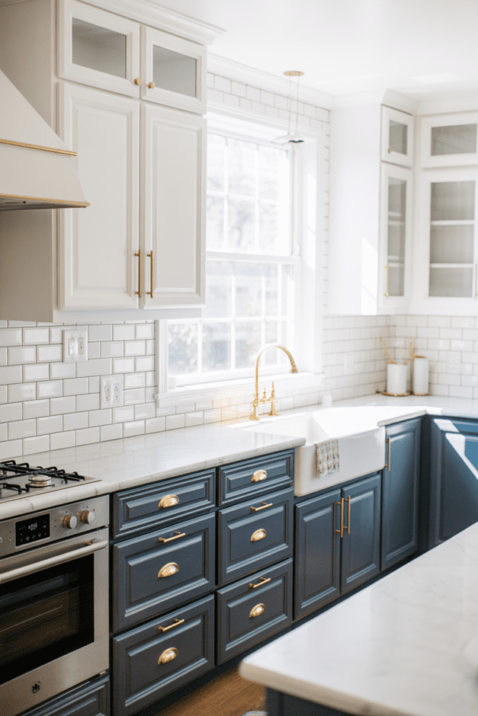
There’s a reason this combo refuses to go out of style — it just works. White upper cabinets paired with navy blue lower cabinets creates a crisp, nautical vibe that feels both timeless and fresh.
- Use matte navy for a sophisticated look or glossy navy to bounce light around smaller kitchens
- Pair with brass or gold hardware to warm up the contrast
- White subway tile backsplash completes the picture perfectly
This combination works especially well in Indian homes where natural light can be strong — the white reflects it beautifully while navy grounds the space.
2. Sage Green and Warm White
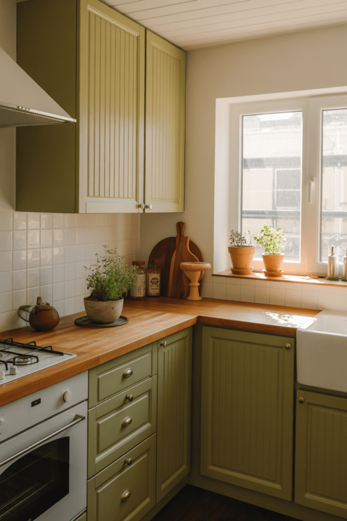
If kitchens could have a personality, sage green and warm white would be that calm, collected friend who always has fresh herbs on the windowsill. Sage green cabinets against warm white or cream walls feel earthy, organic, and wonderfully relaxed.
- Sage green pairs brilliantly with wooden countertops or butcher block surfaces
- Add terracotta accents through small accessories or a pot rack for extra warmth
- This combo suits both traditional and contemporary kitchen styles
IMO, this is one of the most underrated colour combinations out there right now. It photographs beautifully and feels even better in person.
3. Charcoal Grey and Crisp White
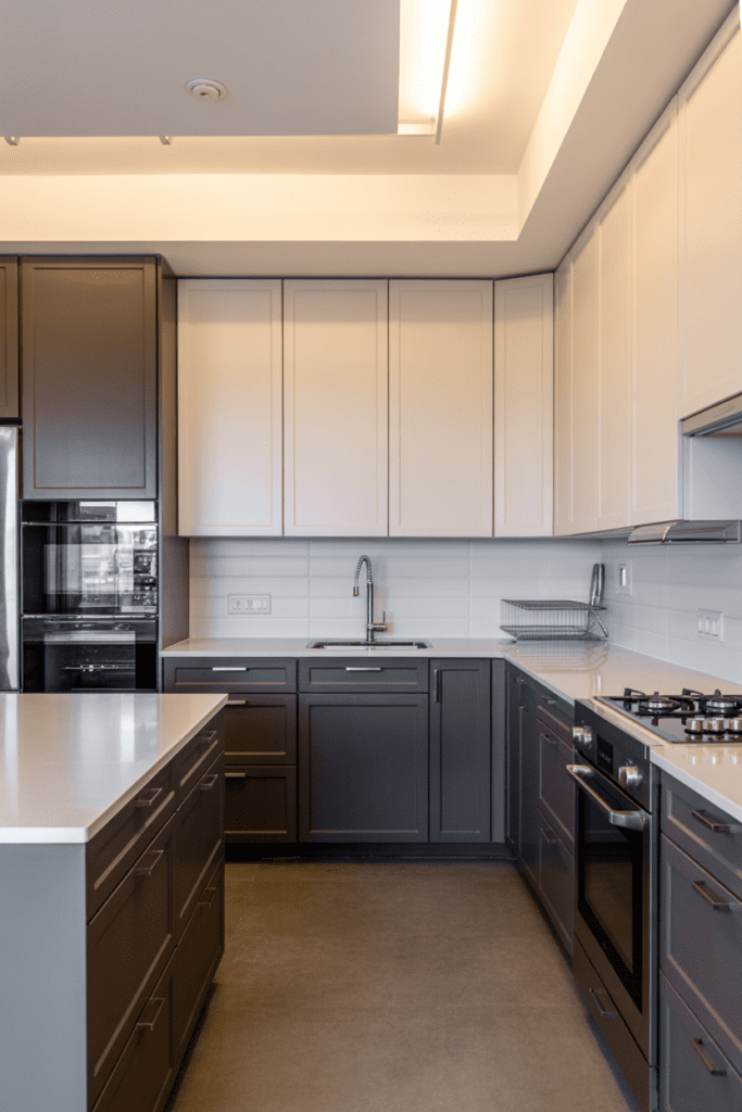
Want to look like you hired a professional designer without actually hiring one? Charcoal grey and white is your answer. It’s bold, sleek, and impossible to get wrong.
- Use charcoal for lower cabinets and island while keeping upper cabinets white to prevent the space from feeling cave-like
- Polished chrome or stainless steel hardware enhances the modern aesthetic
- A white marble or quartz countertop ties everything together flawlessly
This combo works particularly well in urban apartments and modern homes where a clean, contemporary edge is the goal.
4. Terracotta and Cream
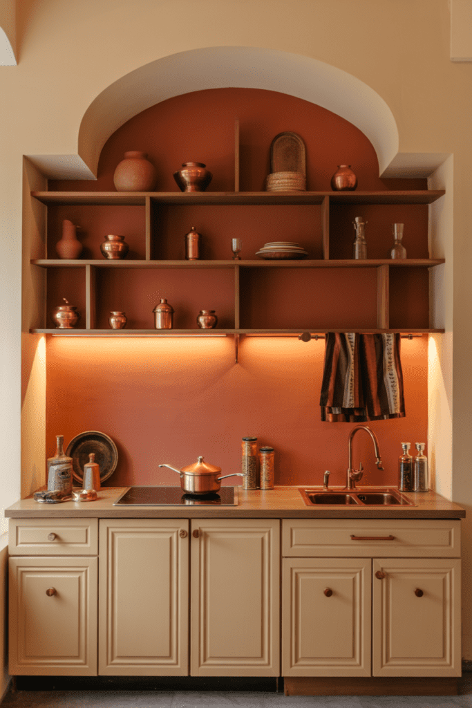
Here’s one that’s deeply rooted in Indian sensibility — terracotta tones paired with creamy whites or warm beige feel genuinely at home in our climate and culture. Terracotta walls with cream cabinets bring warmth and character that no amount of grey can replicate.
- Terracotta works as an accent wall behind open shelving rather than on all four walls
- Pair with natural cane furniture or wooden bar stools for a cohesive earthy look
- Copper or bronze hardware adds that final touch of richness
This is one of those combinations that looks like it walked straight out of a boutique Rajasthani haveli (you’re welcome, fellow Jodhpurites :)).
5. Black and Warm Wood
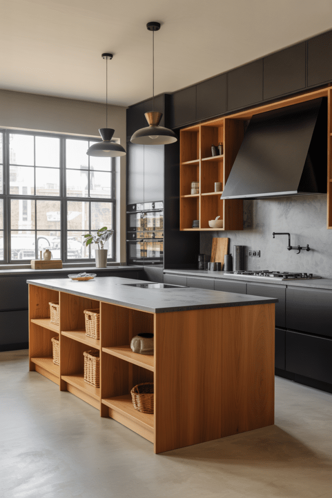
Bold. Dramatic. And surprisingly inviting when done right. Matte black cabinets with warm wood accents — whether through open shelves, a kitchen island, or a wooden ceiling beam — create a kitchen that feels curated and confident.
- Avoid going all black unless your kitchen gets exceptional natural light
- Lighter wood tones like oak or pine balance out the darkness without looking mismatched
- A white or light grey countertop prevents the space from feeling too heavy
Ever walked into a kitchen and thought, “Wow, this is a room that means business”? That’s what black and wood does.
6. Dusty Blue and Soft White
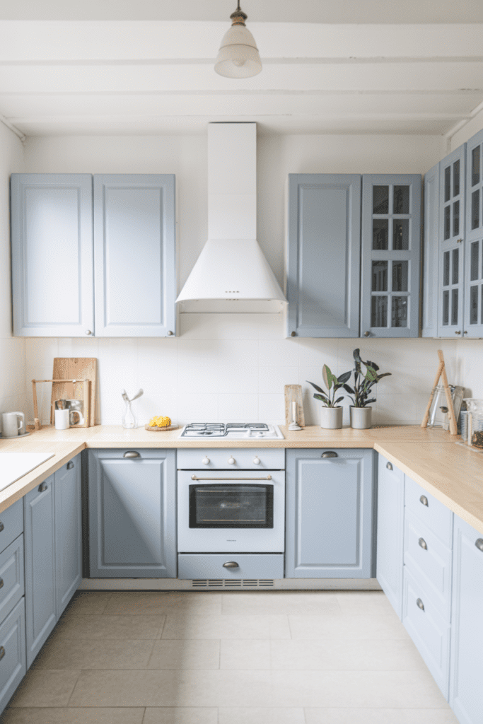
Think of this as navy’s gentler, more approachable cousin. Dusty or powder blue cabinets with soft white walls create a kitchen that feels light, airy, and almost Scandinavian in its simplicity.
- Dusty blue works on all cabinets (upper and lower) without overwhelming the space
- Pair with light stone countertops and minimal hardware for a clean look
- Add a few green plants to bring in life and contrast
This combo is brilliant for smaller kitchens because it keeps things open while still offering personality.
7. Forest Green and Black
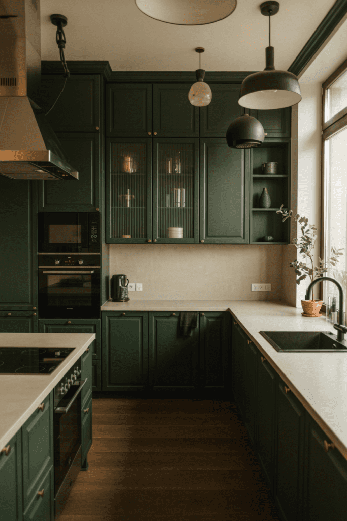
For those who want a kitchen that’s genuinely dramatic — not just “navy and white dramatic” — deep forest green with matte black fixtures is a combination that commands attention.
- Use forest green on all cabinets and let black appear through faucets, handles, and light fixtures
- A light-coloured countertop (white, cream, or pale grey) is essential to balance the depth
- This combination suits larger kitchens with good lighting
FYI — this look requires commitment. But when it’s done well? It’s genuinely jaw-dropping.
8. Yellow and White
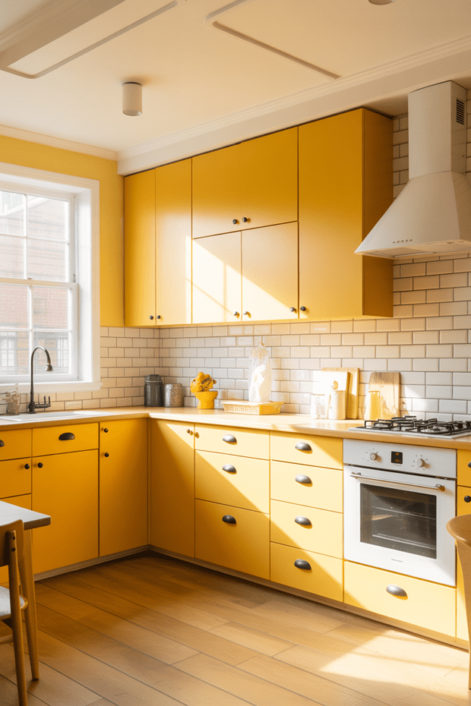
Okay, before you scroll past thinking “yellow kitchen? Hard pass” — hear me out. Soft, muted yellow (think mustard or butter yellow) paired with bright white creates a kitchen that feels like sunshine in solid form. We’re not talking traffic-cone yellow here.
- Mustard yellow on lower cabinets with white uppers is the balanced approach
- Pair with white subway tiles and light wood floors for a retro-inspired, cheerful vibe
- Black or dark grey hardware grounds the colour and stops it from feeling too sweet
If you cook in the morning, a yellow kitchen makes the whole ritual feel 10x more enjoyable. Trust me on this one.
9. Blush Pink and Warm Grey
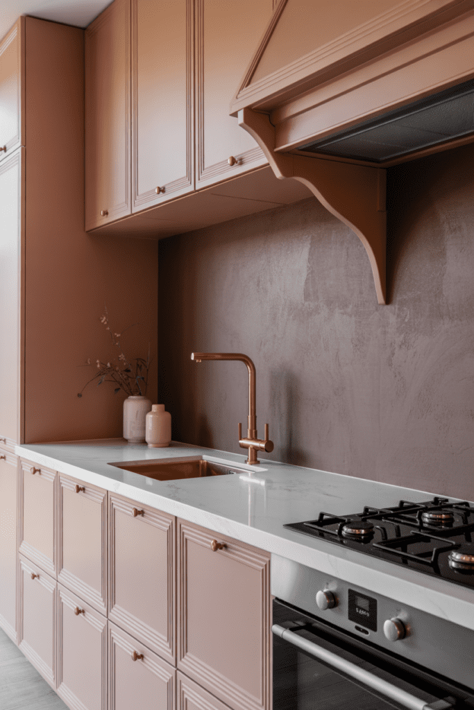
Yes, pink in the kitchen — and no, it doesn’t look like a nursery if you do it right. Blush pink cabinets alongside warm grey walls or countertops create a sophisticated, contemporary look that feels both feminine and modern without being over the top.
- Blush works best as a cabinet colour, not on walls, to keep things grounded
- Rose gold or brushed copper hardware elevates the combination significantly
- Pair with white marble countertops for a luxurious, editorial finish
This combination genuinely surprises people in the best possible way. It’s unexpected, warm, and endlessly photogenic.
10. Two-Tone Neutrals: Greige and White
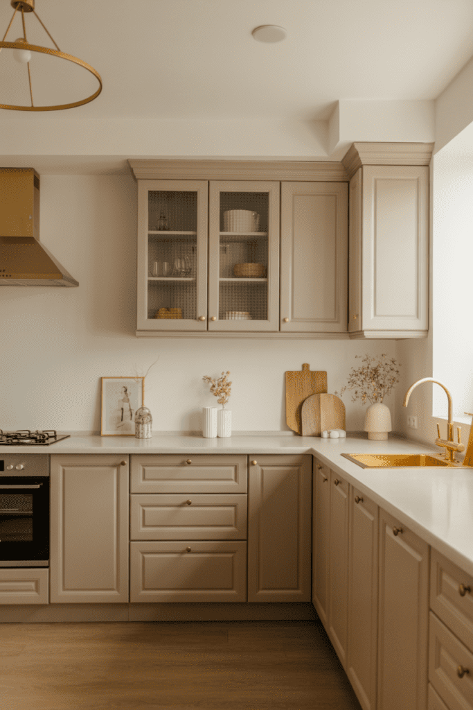
Can’t commit to a strong colour? That’s completely fair. Greige (grey + beige) cabinets with white walls and countertops is the ultimate “I have great taste but also zero interest in risk” kitchen combination. And there’s absolutely nothing wrong with that :/
- Greige reads as sophisticated and warm — unlike pure grey, which can feel cold
- Works with virtually any hardware finish — gold, black, chrome, all of it
- This is the combo that resells homes because everyone likes it
If you’re renting or planning to sell, this neutral pairing keeps future buyers happy while still looking genuinely good.
11. Cobalt Blue and White
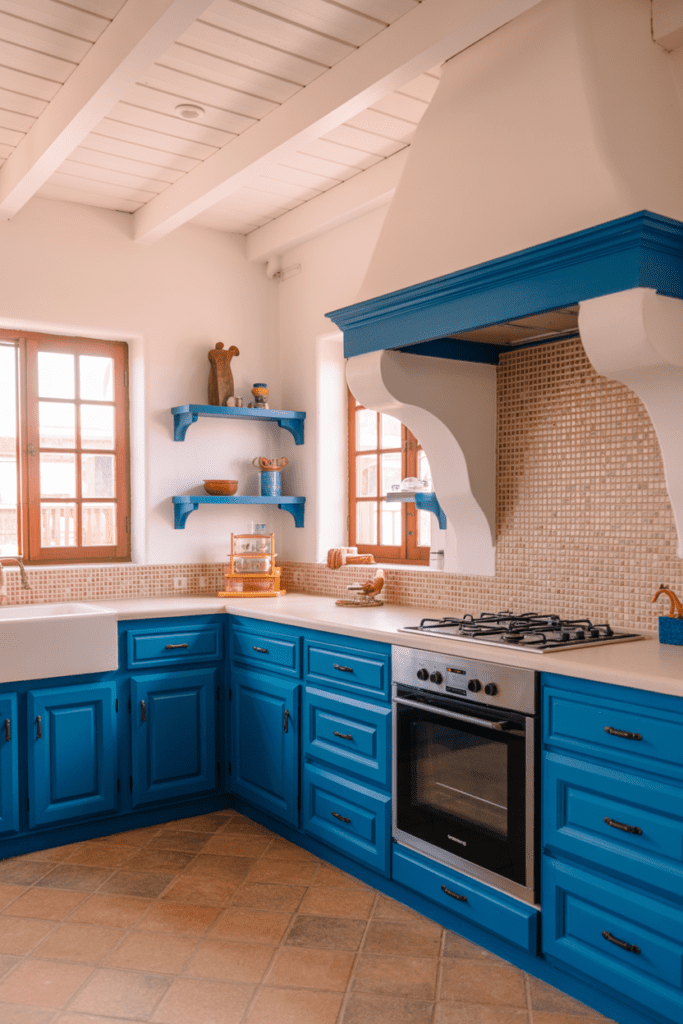
Not navy — cobalt. There’s a difference, and it matters. Cobalt blue is vibrant, punchy, and full of energy. Paired with bright white, it creates a Mediterranean-inspired kitchen that feels like a permanent vacation.
- Use cobalt on a feature island or one run of lower cabinets rather than everywhere
- White walls and ceiling keep the energy from becoming overwhelming
- Pair with terracotta tiles or mosaic backsplash for a more eclectic, global feel
This combination works brilliantly in Indian homes where we aren’t afraid of colour — cobalt actually complements the warm tones of Indian light beautifully.
12. Olive Green and Cream
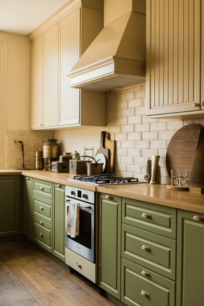
Olive green is having a serious moment, and for good reason. Pair it with warm cream tones and you get a kitchen that feels both vintage-inspired and deeply comfortable — like your grandmother’s house but make it chic.
- Olive green on lower cabinets with cream or linen-toned upper cabinets creates a layered, curated look
- Natural stone countertops (granite or sandstone) complement this palette wonderfully
- Aged brass hardware seals the deal on that warm, antique-inspired vibe
This is one of those combinations that grows on you over time. The longer you live with it, the more you love it.
13. All-White with a Bold Coloured Backsplash
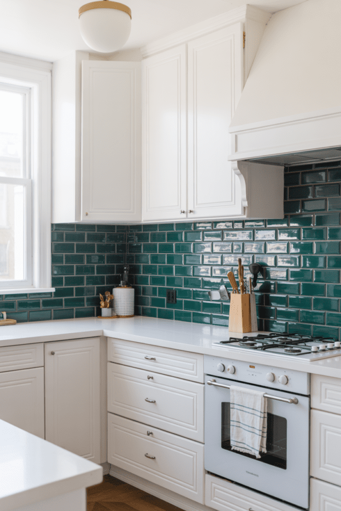
Sometimes the bravest design move is going mostly neutral and letting one element do all the talking. All-white kitchen with a bold, patterned or coloured backsplash — think deep blue zellige tiles, emerald green subway tiles, or even hand-painted Indian motif tiles — creates contrast without chaos.
- The white keeps the space light and easy to maintain visually
- The backsplash becomes the statement piece — swap it out years later for a refresh without repainting everything
- Works in any kitchen size because the white opens up the space
This is honestly one of the most practical approaches for people who want personality but aren’t ready to commit to bold cabinets.
14. Burgundy and Warm Cream
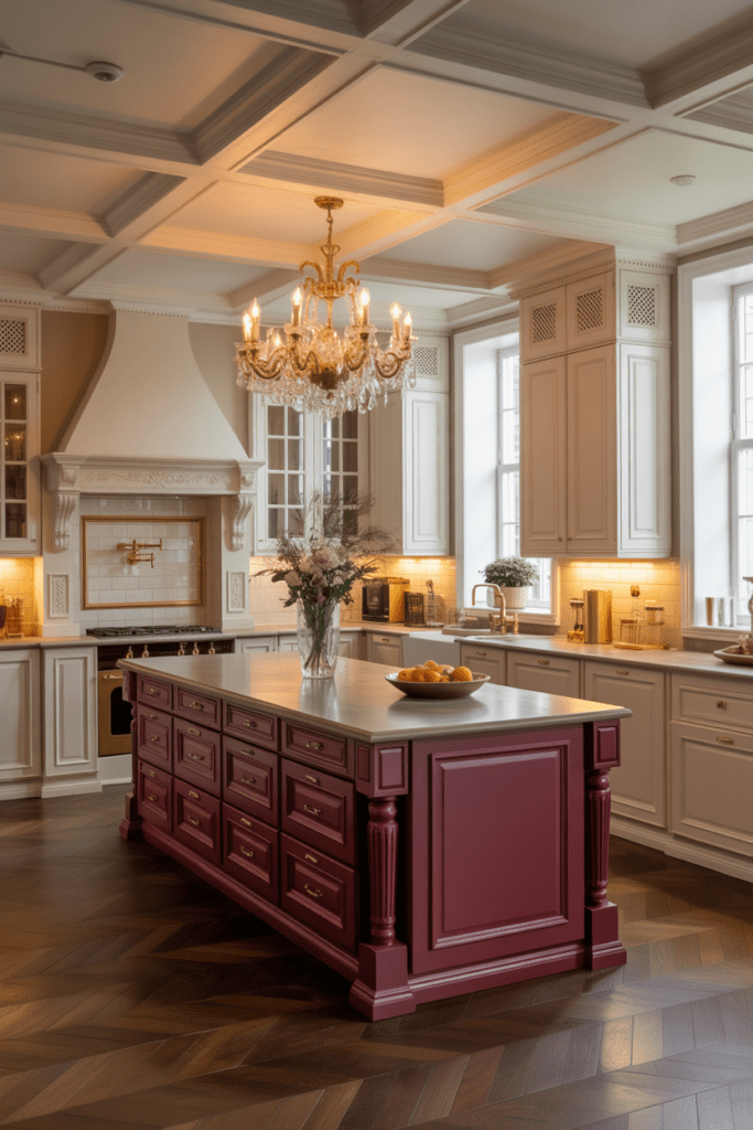
Burgundy (or deep wine red) with warm cream or ivory is one of those rich, opulent combinations that feels like it belongs in a home with a lot of stories to tell. It’s bold but grounded, classic but not boring.
- Use burgundy as an accent colour — on a kitchen island, a single wall, or on lower cabinets only
- Cream or warm white on the remaining surfaces prevents it from feeling too heavy
- Gold or brushed brass hardware is a non-negotiable with this palette
This combination works particularly well in larger, well-lit kitchens. In darker or smaller kitchens, limit the burgundy to one feature element.
15. Monochromatic Grey
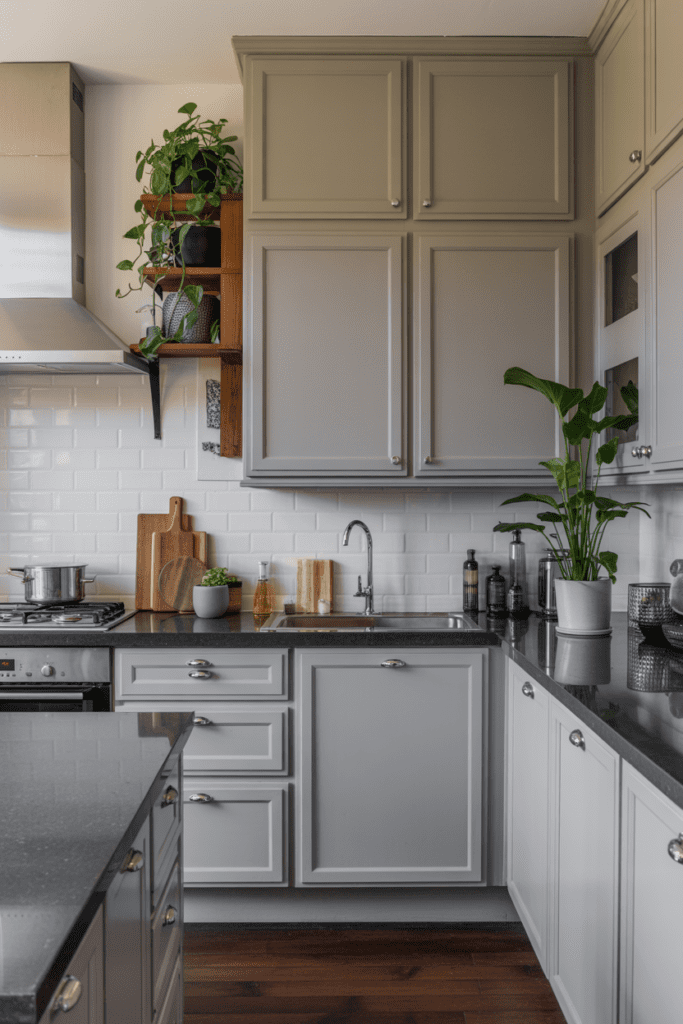
Last but certainly not least — the all-grey kitchen done in varying tones and textures is one of the most elegant approaches to kitchen design. Light grey walls, mid-tone grey cabinets, dark grey countertops — it’s about layering shades rather than matching them exactly.
- Vary the finish — matte walls, satin cabinets, polished countertops — to add dimension
- Introduce warmth through wooden accents, woven textures, or indoor plants
- Chrome or brushed nickel hardware keeps the palette cohesive
The key here is texture. Without it, all-grey reads flat and lifeless. With it? Genuinely stunning.
A Few Things to Keep in Mind Before You Pick Your Palette
Choosing a colour combination isn’t just about what looks good on a screen — your actual kitchen conditions matter enormously.
- Lighting matters most: A colour that looks warm in a north-facing showroom can look completely different in a south-facing Indian kitchen flooded with afternoon sun
- Size of the space: Darker colours work better in larger kitchens; light or mid-toned combinations are safer in compact kitchens
- Your lifestyle: If your kitchen sees heavy daily cooking (and in most Indian households, it absolutely does), consider how colours hide or show grease, steam stains, and everyday wear
- Countertop and flooring already in place: If you can’t change those, your colour combination needs to work with them, not against them
Also — always, always test paint samples on your actual walls in your actual lighting before committing. What looks like a gentle sage green on a website can look like mint toothpaste under your tube light. Don’t ask me how I know :/
Wrapping It Up
There you have it 15 kitchen colour combinations that span everything from bold and dramatic to soft and understated. The right combination for you sits at the intersection of your personal taste, your kitchen’s physical conditions, and a little bit of courage to try something new.
Here’s my honest take: the best kitchen colour combination is the one that makes you actually want to spend time in your kitchen. Whether that’s a punchy cobalt blue island or a quietly elegant greige palette, the goal is a space that feels like you not like a showroom, not like a Pinterest board, but genuinely, comfortably yours.
So pick your palette, grab some paint swatches, and go make your kitchen the best room in the house. It absolutely deserves it.