

Maximalist gallery walls don’t whisper, and honestly, that’s the fun of them. They bring color, personality, texture, and a little beautiful chaos into a room, turning a plain wall into something people actually remember. If you love layered decor, collected art, and spaces that feel personal instead of painfully curated for the internet, this style makes a lot of sense.
I’ve liked gallery walls that feel full and a little fearless. A wall covered corner to corner with art, photos, mirrors, and unexpected pieces has so much more energy than a lonely frame trying to carry the whole room on its back. In this roundup, I’m sharing 15 maximalist gallery wall ideas that cover every inch, along with the styles, details, and decorating angles that make each one worth stealing.
What Even Is a Maximalist Gallery Wall?
Before we get into the good stuff, let’s clear this up. A maximalist gallery wall isn’t just “a lot of frames.” It’s a deliberate, layered, fully-committed design decision that says, I love beautiful things and I refuse to choose just one.
Maximalism is about intentional abundance. Every piece on the wall should feel like it belongs, whether you’re mixing oil paintings with neon signs or vintage botanical prints with modern photography. The goal is coverage, cohesion, and character.
The rule that “less is more”? Maximalists have left that in 2015 where it belongs.
Why Cover Every Inch?
Here’s a question worth asking: Why do we feel so nervous about filling up wall space? Society has spent decades telling us that white walls are “sophisticated” and that restraint equals taste. IMO, that’s just fear in disguise.
Covering every inch of a wall creates visual warmth, personality, and story. A room with a fully loaded gallery wall doesn’t feel cluttered it feels lived in. It tells people who you are the moment they walk through the door.
Plus, let’s be honest: blank walls are just backgrounds for awkward family photos. Fill them with something intentional.
1. The Floor-to-Ceiling Art Explosion
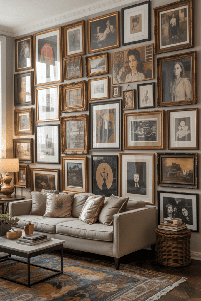
This is the one that stops people in their tracks. You start at the baseboard and work your way up to the crown molding — no gaps, no mercy.
How to pull it off:
- Use frames of wildly different sizes (think 4×6 all the way up to 24×36)
- Mix portraits, landscapes, and abstract pieces freely
- Don’t line them up perfectly — offset rows add energy
The trick here is varying the frame depth so the wall has actual dimension. Thin metal frames next to chunky wood ones create a layered look that photographs beautifully and feels even better in person.
2. The Eclectic Mix: Art Meets Objects
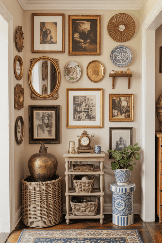
Who said a gallery wall has to be flat? Not me, and definitely not maximalists.
Add three-dimensional objects like small mounted shelves, ceramic wall plates, woven baskets, vintage clocks, or even taxidermy (if that’s your vibe, no judgment) alongside your framed art. The mix of flat and raised pieces gives the wall actual texture.
This approach works especially well in living rooms and entryways where you want an immediate visual impact. Visitors will literally stop mid-conversation to look at it. Worth it.
3. The Monochromatic Madness Wall
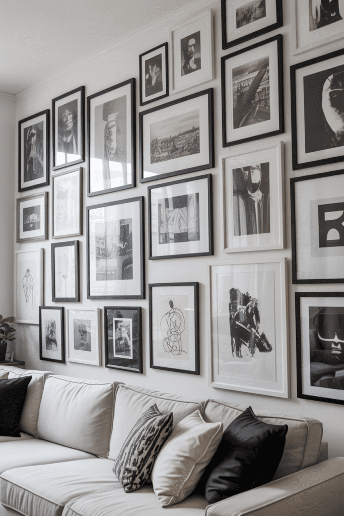
Okay, here’s one for the person who wants maximum density but still likes a sense of order. Pick one color family and go absolutely wild within it.
Example: An all-black-and-white gallery wall with dozens of framed prints, photographs, and sketches. Or an all-warm-terracotta wall covered in earthy botanicals, sunset photography, and rust-toned abstract art.
The monochromatic approach lets you:
- Use mismatched frame styles without visual chaos
- Layer hundreds of pieces without it looking overwhelming
- Create a cohesive story even when the subjects are totally different
It’s the cheat code of maximalist decorating, and it works every single time. 🙂
4. The Vintage Print Overload
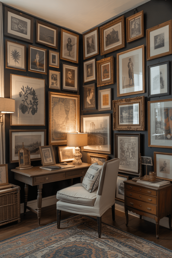
Thrift stores and estate sales are goldmines for this one. Gather every vintage print, old botanical illustration, antique map, and retro advertisement you can find — then cover an entire wall with them.
The beauty of vintage prints is that they already have a unified visual language (slightly faded, warm-toned, textured paper) so even dozens of unrelated subjects feel cohesive together.
Frame them in mismatched gold and wood frames for that “collected over decades” look. Because nothing says maximalist like a wall that looks like a fascinating old library exploded onto it.
5. The Photo-Dense Family Archive Wall
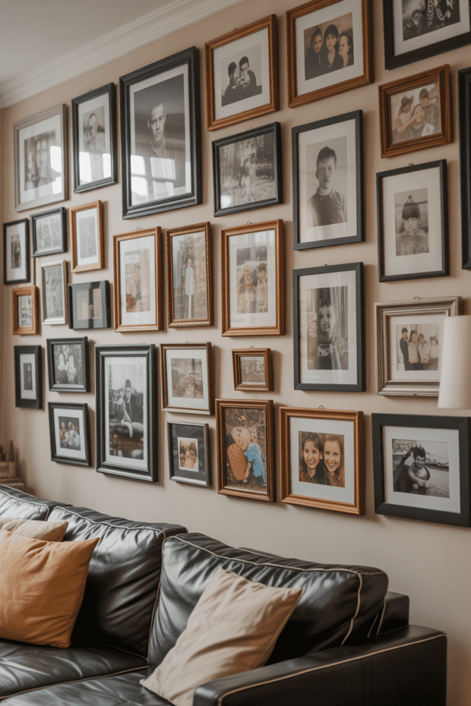
This one’s deeply personal, and that’s exactly the point. Pull together every great family photo you have — school pictures, travel shots, candid moments, old black-and-whites from grandparents — and create a wall that’s basically a living family album.
Tips for making it feel intentional vs. chaotic:
- Stick to one or two frame colors (black or natural wood work best)
- Mix portrait and landscape orientations freely
- Include a few non-photo elements like a small mirror or a child’s framed artwork to break it up
This wall tells a story no gallery could ever replicate. Every time you walk past it, you notice something new.
6. The Neon-and-Art Mashup
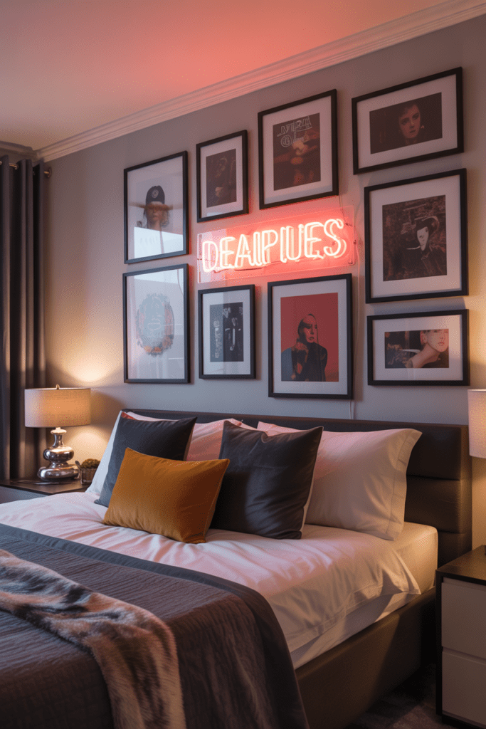
Want a gallery wall that also provides ambiance? Add a neon sign or two into the mix. A glowing “Home Sweet Home” or a custom phrase nestled between framed prints creates a gallery wall that literally lights up the room.
This works best in:
- Bedrooms (especially above a headboard)
- Home offices or creative studios
- Living rooms with low ambient lighting
The neon element becomes an anchor piece that everything else orbits around. FYI, you can get custom neon signs for surprisingly reasonable prices online, which makes this upgrade very achievable.
7. The All-Botanical Maximalist Dream
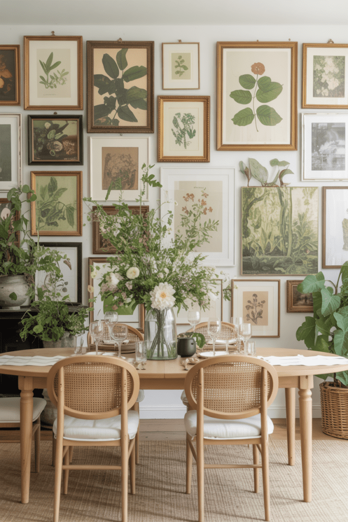
Botanicals are having a major moment, and the maximalist version of this trend is covering an entire accent wall — stem to stem — with framed plant illustrations, pressed flower art, leaf photography, and watercolor florals.
Why botanicals work so well at scale:
- The natural color palette (greens, creams, dusty pinks) is inherently calming even in large quantities
- You can pull from many different art styles (scientific illustration, loose watercolor, photography) and they still feel unified
- They work in literally every room, from bathrooms to dining rooms
Go for floor-to-ceiling coverage and mix large statement pieces with tiny 4×4 prints tucked into corners. The density is the whole point.
8. The Mixed-Media Textile Wall
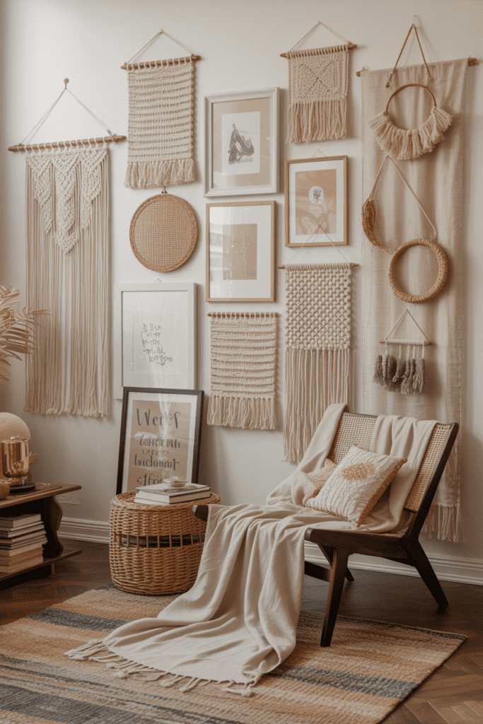
Frames aren’t the only option — not even close. A truly maximalist gallery wall might include woven wall hangings, embroidered hoops, macramé pieces, fabric prints, and tapestry fragments all layered together.
Textiles add warmth and sound absorption that framed art simply can’t — which makes this approach especially smart in rooms that echo or feel cold. Mixing a large macramé anchor piece with smaller framed art and embroidery hoops creates a wall that feels cozy and curated at the same time.
This is especially popular in boho-leaning bedrooms and reading nooks where softness and texture matter.
9. The Dark & Moody Floor-to-Ceiling Drama
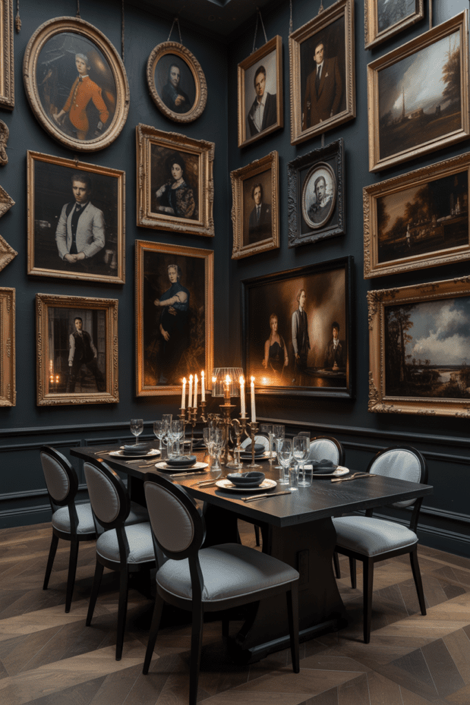
Paint the wall a deep, moody color — think charcoal, forest green, navy, or oxblood — then cover it with dark-framed art, mirrors, and objects. The result is dramatic, rich, and completely unforgettable.
The dark wall trick amplifies maximalism by making the individual pieces pop. Art that might look ordinary on a white wall suddenly looks like it belongs in a gothic mansion in the best possible way.
- Use varied gold and black frames
- Include at least one large mirror to reflect light back
- Mix subjects freely: portraits, abstracts, architectural drawings, anything goes
This approach works especially well in dining rooms and home libraries where you want guests to feel like they’ve entered a different world.
10. The Rainbow Progression Wall
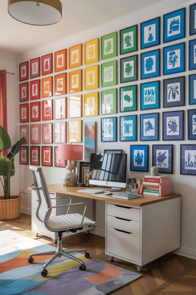
This one requires planning, but the payoff is jaw-dropping. Arrange your art collection by color so the wall flows from one color to the next — red to orange to yellow to green to blue to purple — covering the entire wall in a seamless chromatic progression.
It sounds chaotic, but it’s actually highly organized. The color progression creates an invisible structure that ties completely unrelated artworks together. You could have a cityscape next to an abstract painting next to a food photo, and the color harmony makes it all work.
This is the gallery wall that makes people stop, tilt their head, and say “wait, how did you DO that?”
11. The Collector’s Cabinet Wall
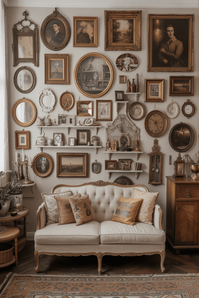
You know how antique stores have those walls of curiosities — clocks, frames, small mirrors, miniature paintings, decorative plates, and odd little objects all crammed together? That’s the vibe here.
Build a wall that looks like a collector’s dream:
- Include small mounted shelves holding tiny objects
- Mix decorative plates with framed prints
- Add wall-mounted specimen boxes or shadow boxes
- Use a small clock or two as visual anchors
Every inch gets covered, but it feels intentional because everything has a collector’s logic to it. Odd, beautiful, interesting things that tell the story of someone who pays attention to the world.
12. The Statement Poster Wall
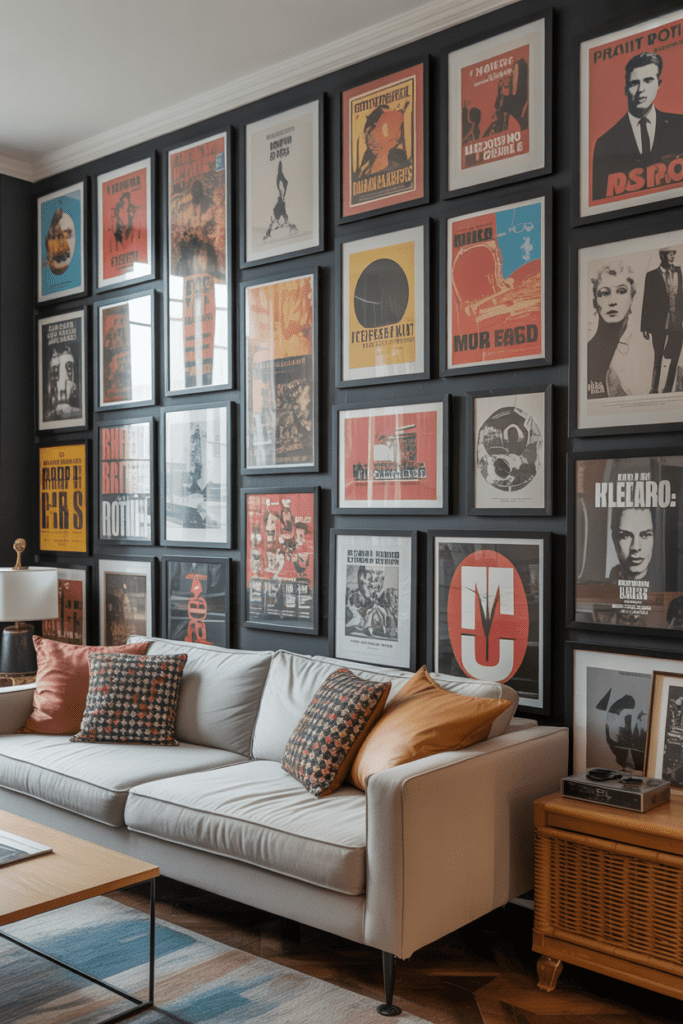
Pop culture, vintage travel posters, movie stills, music artwork — the poster wall is maximalism’s most democratic form. You don’t need expensive original art. You need things you genuinely love, printed big and framed confidently.
What makes a poster wall work at maximalist scale:
- Consistent frame style (all simple black frames, for example) gives cohesion
- Overlapping sizes (mix standard poster size with large-format pieces)
- Leave almost no wall visible between frames
This approach is perfect for home offices, basements, and media rooms where personality matters more than refinement. :/ (Okay, refinement matters too — just frame your posters, please.)
13. The Mirror Mosaic Wall
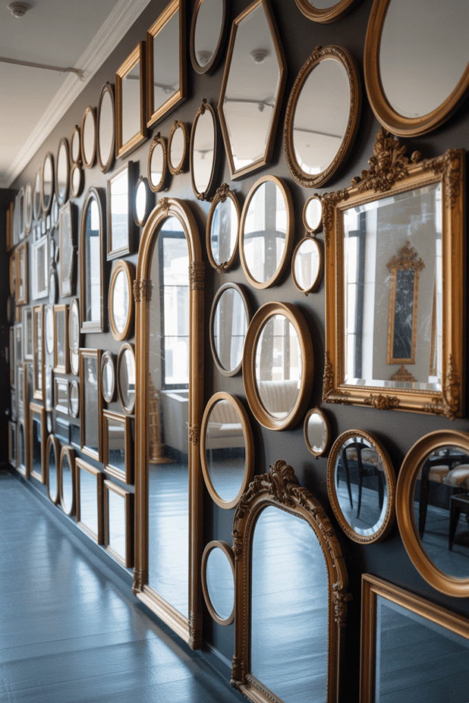
An entire wall covered in mirrors of every shape, size, and frame style — round mirrors, arched mirrors, ornate gold-framed mirrors, plain beveled mirrors — reflects light in every direction and makes a room feel twice as large.
This is maximalism with a functional twist because mirrors actually serve the space while covering every inch. The layered reflections create depth and movement that changes throughout the day as natural light shifts.
Great for small living rooms, dark hallways, and entryways that need a boost of brightness and drama simultaneously.
14. The Children’s Art + Fine Art Mashup
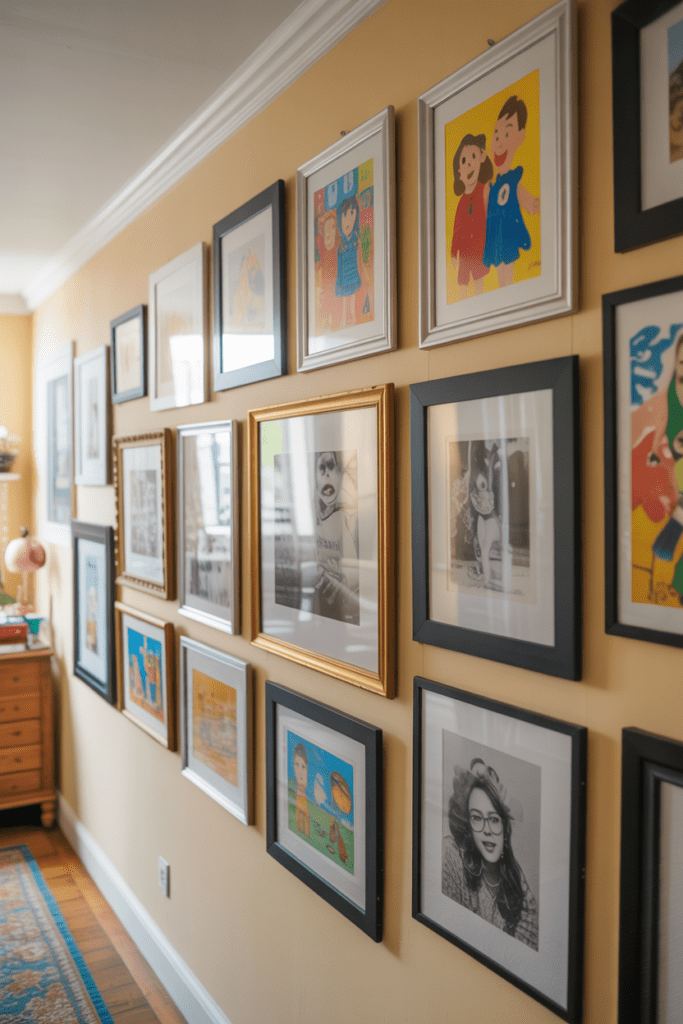
This one is wildly underrated. Frame your kids’ artwork — the finger paintings, the crayon drawings, the wobbly self-portraits — and hang them alongside actual prints and photographs with complete equal status.
Why this works so beautifully:
- The naive style of children’s art creates charming contrast with refined pieces
- It makes the wall deeply personal and completely unique to your family
- It gives kids a sense of pride and belonging in the home
Mix them freely. A child’s crayon drawing in a nice frame next to a professional photograph is maximalism at its most heartfelt. Every gallery wall tells a story — make sure yours includes the most important people in it.
15. The Grid-Gone-Wild
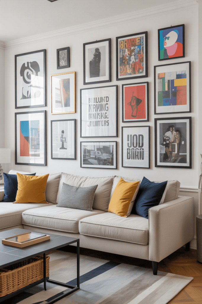
Start with a traditional grid layout — rows and columns, perfectly spaced — then deliberately break every other rule. Different subject matter, clashing frame styles, wildly varying sizes within the grid structure, text pieces mixed with photography mixed with abstract art.
The grid gives structure; the content delivers chaos. It’s the perfect middle ground for someone who loves maximalism but needs just a little bit of order to sleep at night.
- Use painter’s tape to map the grid before hammering anything
- Stick to consistent spacing (2-3 inches between each piece)
- Then fill each slot with absolutely whatever you love most
This approach photographs incredibly well for Pinterest and Instagram, which, let’s be honest, is a legitimate factor in home decorating decisions in 2026.
How to Start Your Own Maximalist Gallery Wall
Feeling inspired but slightly overwhelmed? Here’s a practical approach to getting started without a meltdown.
Step 1: Choose Your Wall
Pick the wall you see most often — the one behind your sofa, above your bed’s headboard, or the first thing you see when you walk in. Maximalist gallery walls deserve prime real estate.
Step 2: Collect More Than You Think You Need
Go to thrift stores, print on-demand sites, estate sales, and your own photo archives. Collect at least 40% more pieces than you think you’ll use. You’ll edit down as you lay things out, but having abundance to choose from is the whole point.
Step 3: Do a Floor Layout First
Before a single nail goes in, lay everything out on the floor in front of the wall. Rearrange until it feels right. Take a photo, live with it for a day, then adjust. This saves you from putting 47 holes in your wall (trust me on this one).
Step 4: Start from the Center and Work Out
Hang your largest, most important anchor piece first — usually near the visual center of the arrangement. Build outward from there. This keeps the composition balanced even when the individual pieces are completely varied.
Step 5: Fill Every Gap Intentionally
When you think you’re done, step back and look for any patches of bare wall that feel empty. Intentional gaps are fine; accidental ones are not. Fill gaps with small prints, decorative objects, or additional frames until you feel satisfied with the coverage.
Common Maximalist Gallery Wall Mistakes to Avoid
Even when going all-out, a few missteps can flatten the impact of your wall.
- Using all same-sized frames: This creates monotony. Vary sizes dramatically.
- Ignoring the floor-to-ceiling potential: Don’t stop at eye level. Go all the way up and down.
- Playing it too safe with color: Maximalism rewards boldness. Pick a palette and commit.
- Forgetting three-dimensional elements: Flat frames only get you so far. Add objects.
- Rushing the layout: The floor layout step is not optional. Do it every time.
Final Thoughts
Look, a maximalist gallery wall isn’t for everyone, and that’s exactly what makes it so great for the people who love it. It’s a declaration. It says you choose abundance over minimalism, personality over convention, and your taste over whatever a design magazine told you was currently acceptable.
The best gallery wall is the one that makes you genuinely happy every time you look at it. Whether you go full floor-to-ceiling vintage print overload or build a carefully curated collector’s cabinet wall, the goal is the same: cover every inch with things that matter to you, and do it without apology.
So pick your wall. Grab your hammer. And go absolutely maximalist on it, you’ve been staring at blank paint long enough.