
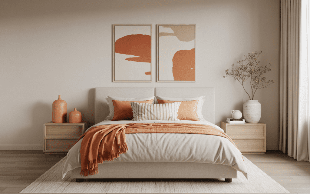
When most people think about bedroom colors, they usually play it safe. They go straight for beige, white, soft gray, or maybe sage if they’re feeling a little wild. But persimmon orange brings something those shades usually don’t: warmth, personality, and that instantly inviting look that makes a bedroom feel designed instead of just decorated.
That’s why I keep coming back to it. Persimmon orange sits in that sweet spot between earthy and energetic. It feels bold, but it doesn’t shout. It feels cozy, but it still adds life to the room. And honestly, if you use it the right way, it can make a bedroom look richer, more stylish, and way more memorable without turning the space into a pumpkin-themed accident.
The best part? You don’t have to commit to a full orange room to make this color work. You can bring it in through an accent wall, bedding, curtains, furniture, or even just a few well-placed accessories. Whether your style leans modern, boho, minimalist, moody, or a little all over the place, which, let’s be honest, happens, persimmon orange can adapt beautifully.
1. The Classic Persimmon Accent Wall

Let’s start with the gateway drug of bold bedroom design — the accent wall. If you’re not ready to go full persimmon, one wall does the trick beautifully without overwhelming the space.
Paint the wall behind your bed in a rich persimmon shade (Benjamin Moore’s Outrageous Orange or Sherwin-Williams Tangerine are chef’s kiss options). Keep the remaining three walls in a soft white or warm cream. The contrast is stunning and makes your bed the natural focal point — which, honestly, is where your focus should be anyway 🙂
Pro tip: Matte or eggshell finishes absorb light softly and give persimmon a more luxurious, moody feel than glossy options.
2. Persimmon + Deep Navy: The Power Couple
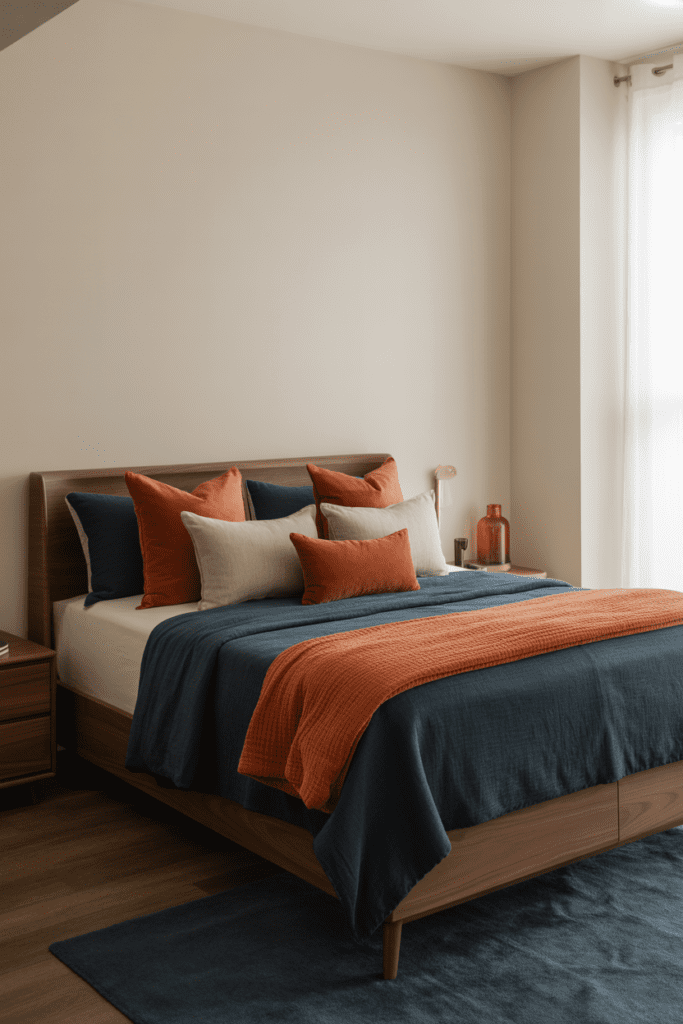
Some color combinations just make sense, and persimmon with deep navy is one of them. Think of it as the design world’s equivalent of a perfect playlist — everything just flows.
Use navy for your bedding, curtains, or a statement rug, and let persimmon pop through accent pillows, a throw blanket, or even a painted nightstand. The cool depth of navy grounds the warmth of persimmon so neither color screams over the other. It’s balance, baby.
This combo works especially well in:
- Modern and contemporary bedrooms
- Maximalist spaces that love bold, saturated palettes
- Small bedrooms where you want depth without visual clutter
3. Warm Minimalist: Persimmon Meets Neutral Linen
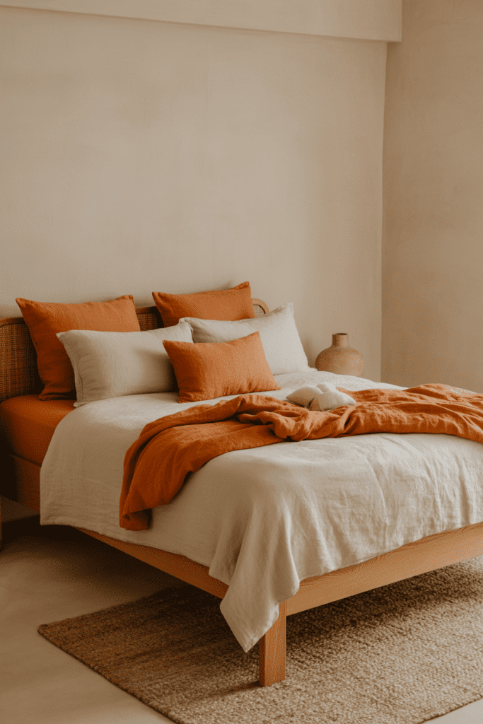
Ever wondered why Scandinavian-inspired rooms always look so effortlessly calm? It’s the linen. And linen absolutely loves persimmon.
Pair a persimmon duvet cover or throw with natural linen pillows, a raw wood bed frame, and white walls. The result is warm minimalism — cozy and intentional without looking like a Pinterest board exploded everywhere. IMO, this is the chicest way to wear persimmon if you’re a “less is more” person.
Key elements for this look:
- Raw or blonde wood furniture
- Off-white or oatmeal linen bedding
- Minimal decor — think one statement vase, a woven basket, a simple lamp
- Natural textures like jute rugs and cotton knit throws
4. Bohemian Persimmon Paradise
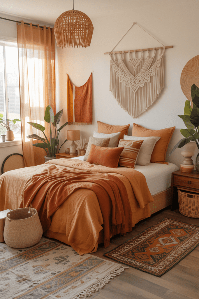
If minimalism makes you yawn, the boho approach is your lane. Persimmon is practically made for bohemian bedrooms — it pairs effortlessly with terracotta, mustard yellow, rust, and warm browns.
Layer patterned textiles in earthy tones, hang some macramé on the wall, toss a persimmon-colored kilim rug on the floor, and call it a day. Actually, don’t call it a day — add some trailing plants and low-wattage Edison bulbs too. The more layered and intentional the chaos, the better.
5. Persimmon Headboard Statement
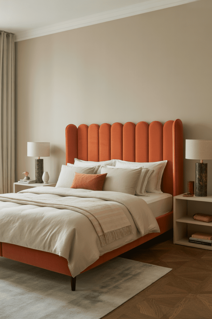
Not ready to paint? No problem. A persimmon upholstered headboard gives you all the drama with zero commitment (well, almost — you did buy a headboard).
Velvet or linen upholstery in persimmon makes a headboard look luxurious and intentional. Keep everything else — bedding, walls, rug — in softer neutrals so the headboard truly commands the room. It’s like giving your bed its own spotlight.
6. Terracotta’s Cooler Cousin: Persimmon + Earthy Tones
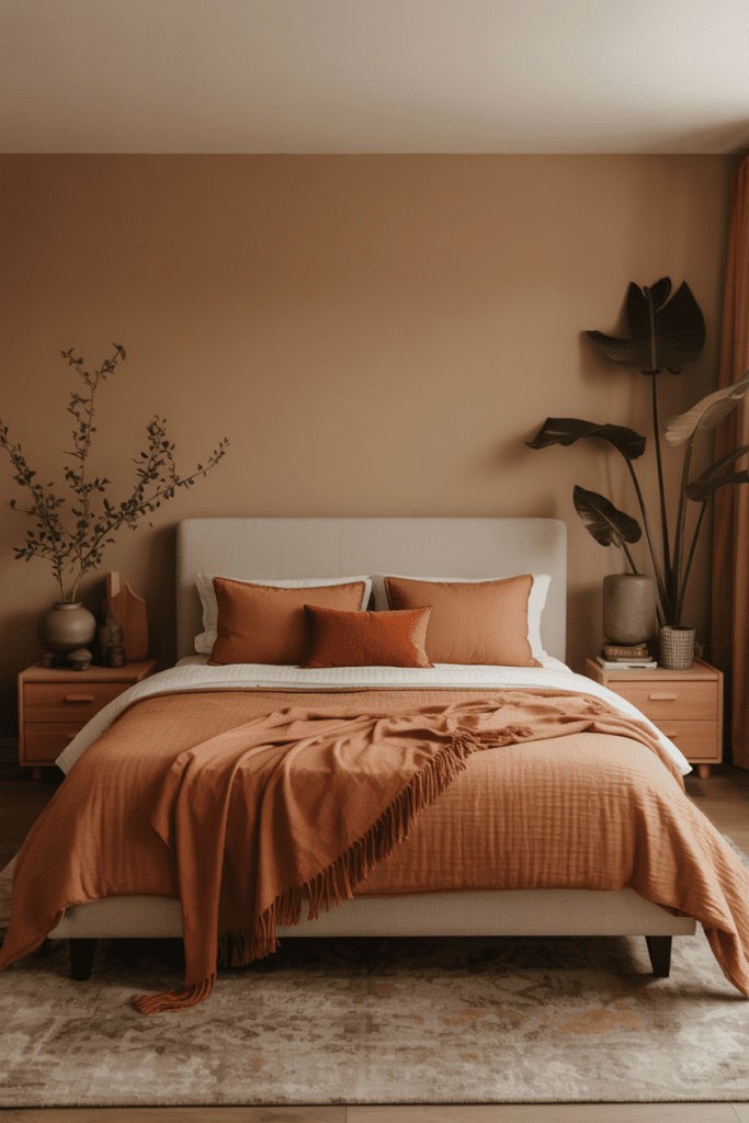
Terracotta had its moment, and it was glorious. But persimmon is the slightly more vibrant, more energetic sibling who just rolled into town.
Combine persimmon accents with earthy browns, warm beiges, and deep olive greens for a nature-inspired palette that feels grounded and rich. Think burnt sienna throw pillows, an olive linen duvet, and a persimmon-painted side table. Add some monstera leaves in a clay pot and you’ve basically created a mood board that would make any interior designer weep with joy.
7. Persimmon in the Kids’ Room
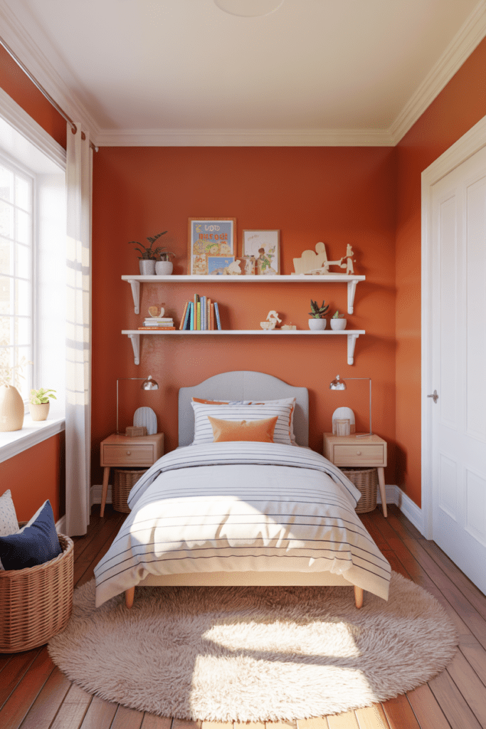
Here’s a hot take — persimmon is fantastic for a kids’ bedroom. It’s energetic and playful without being that blinding shade of yellow that makes you feel like you’re inside a highlighter.
Pair persimmon walls with bright white trim and cheerful accents in teal or cobalt blue. The combination is visually stimulating but not chaotic — great for creative little minds. And honestly, it photographs beautifully, which matters when you’re redesigning the space and want the content to do well on Pinterest 🙂
8. The Moody Persimmon Bedroom
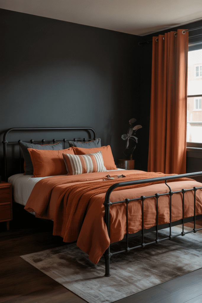
Wait — can persimmon be moody? Absolutely, and it pulls it off better than you’d expect.
Go darker with your supporting palette. Deep charcoal walls, black metal bed frames, dark stained wood furniture — and then bring in persimmon through bedding, curtains, or a statement art piece. The orange pops against the darkness in a way that feels dramatic and intentional. This is the bedroom equivalent of a smoky eye — bold, unexpected, and impossible to forget.
9. Persimmon + Blush Pink: The Unexpected Pairing
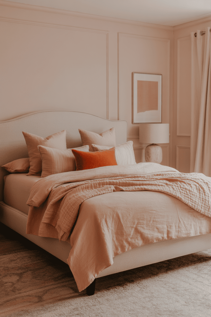
Okay, hear me out. Persimmon and blush pink sounds like it shouldn’t work — but it does, especially in a feminine, romantic bedroom setting.
The key is keeping the blush very soft and desaturated so it reads more as a warm neutral than a competing color. Use persimmon sparingly — a single throw pillow, a small ceramic lamp, or a framed art print — and let blush dominate the room. This creates a layered, warm palette that feels sophisticated rather than overwhelming.
10. Persimmon Curtains as a Color Anchor
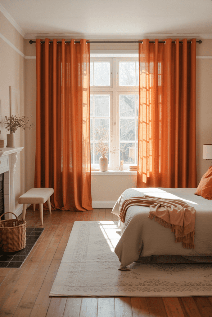
If you love the idea of color but want flexibility, persimmon curtains are your best friend. They frame the window, add vertical visual interest, and flood the room with a warm glow when sunlight hits them.
Pair floor-to-ceiling persimmon linen curtains with:
- White or cream walls for a fresh, airy feel
- Natural wood floors for warmth
- Neutral bedding so the curtains stay the star
This approach works in almost any room size and adds a designer-level touch for surprisingly low effort.
11. Persimmon Through Art and Accessories
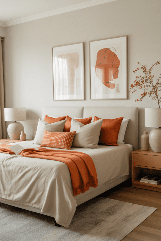
Not everyone wants to commit to furniture or paint — and that’s totally fine. You can still bring persimmon’s warmth into your bedroom through art, accessories, and small decor pieces.
Try:
- A large abstract canvas with persimmon as a dominant color
- A cluster of ceramic vases in varying persimmon and rust shades
- A woven persimmon throw draped over a neutral armchair
- Persimmon-spined books stacked on your nightstand (yes, bookshelf styling is a thing)
FYI, this approach lets you test the color before going all-in — kind of like dating the color before committing :/ But chances are, you’ll love it.
12. Persimmon Meets Sage Green
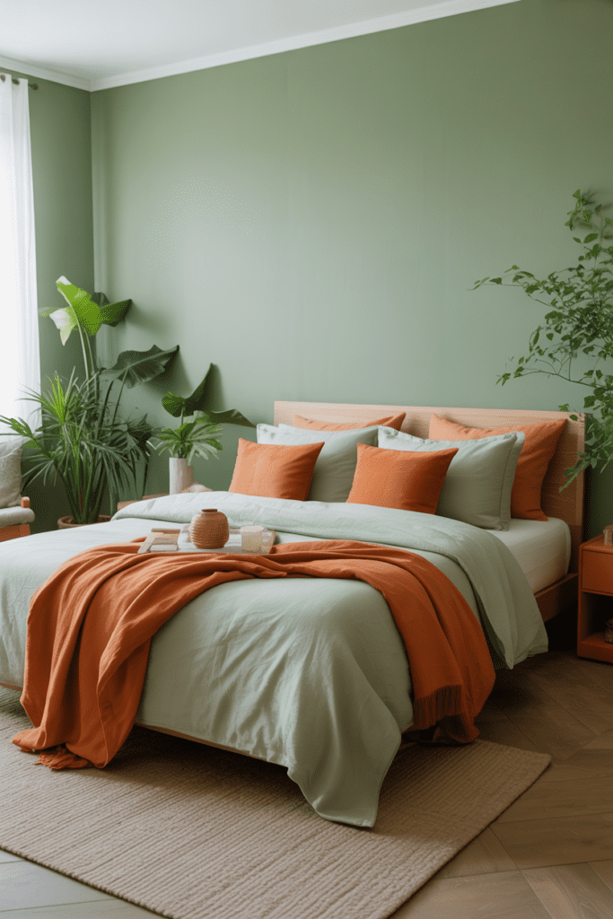
This is one of my personal favorite combinations right now. Sage green and persimmon feel like they belong together — the cool, muted quality of sage perfectly balances persimmon’s warmth.
Use sage as your dominant wall color and bring persimmon in through bedding, lamps, or a throw. Or flip it — persimmon walls with sage green bedding and plant life throughout. Either way, the palette feels organic, calm, and effortlessly stylish.
This combo is especially great for:
- Nature lovers
- Organic and biophilic design enthusiasts
- Anyone who wants a bedroom that feels like a breath of fresh air (literally)
13. Mid-Century Modern with Persimmon Pops
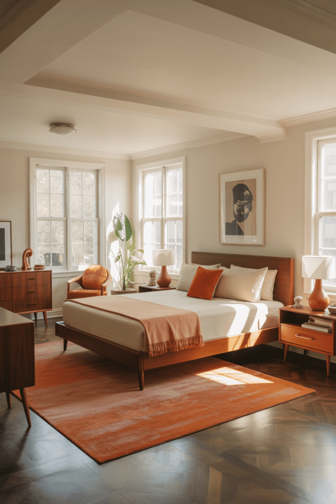
Mid-century modern design was practically invented for persimmon. The clean lines, the warm wood tones, the retro vibe — it all pairs beautifully with this color.
Look for MCM-style furniture in walnut or teak — a low-profile platform bed, tapered-leg nightstands, a tulip-style pendant lamp — and bring in persimmon through a geometric area rug or a vintage-inspired armchair. The result is a room that looks like it stepped straight out of a 1960s design magazine, in the best possible way.
14. Layered Textiles in Persimmon Tones
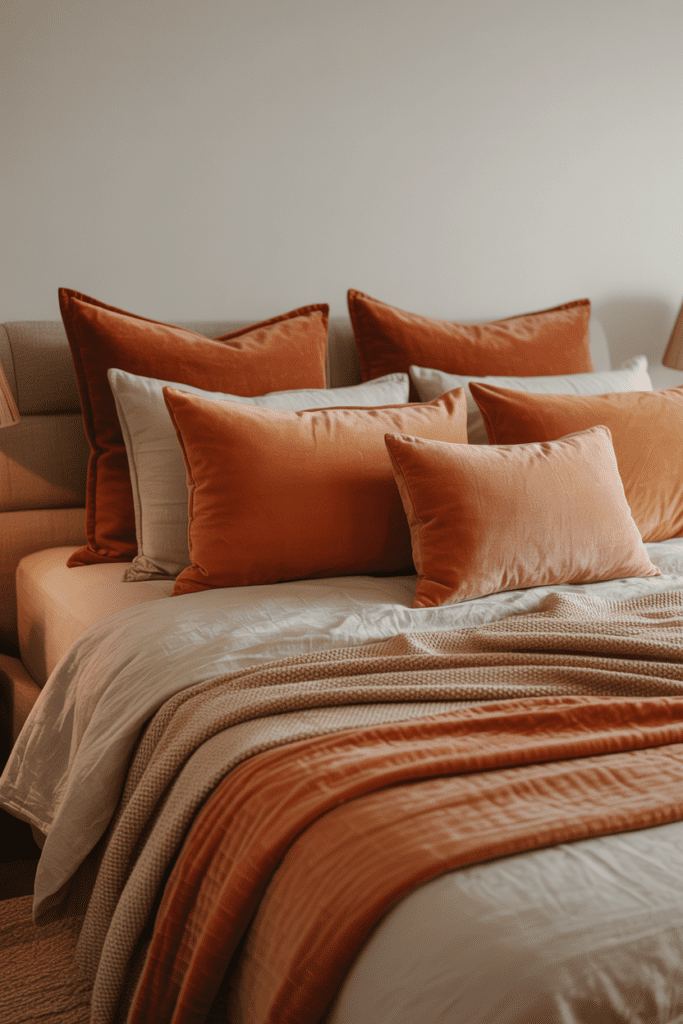
Sometimes the best design move is to commit fully — but through texture rather than one bold splash of color. Layering textiles in varying persimmon-adjacent shades (think burnt orange, rust, apricot, and deep coral) creates a rich, dimensional look that feels curated and luxurious.
Think:
- A deep rust linen duvet as your base layer
- Persimmon velvet throw pillows for contrast
- An apricot-toned knit throw at the foot of the bed
- A terracotta-printed euro sham to tie it together
This creates a bed that looks like it belongs in a high-end boutique hotel — and who doesn’t want that?
15. Persimmon Ceiling: The Design Move Nobody Talks About Enough
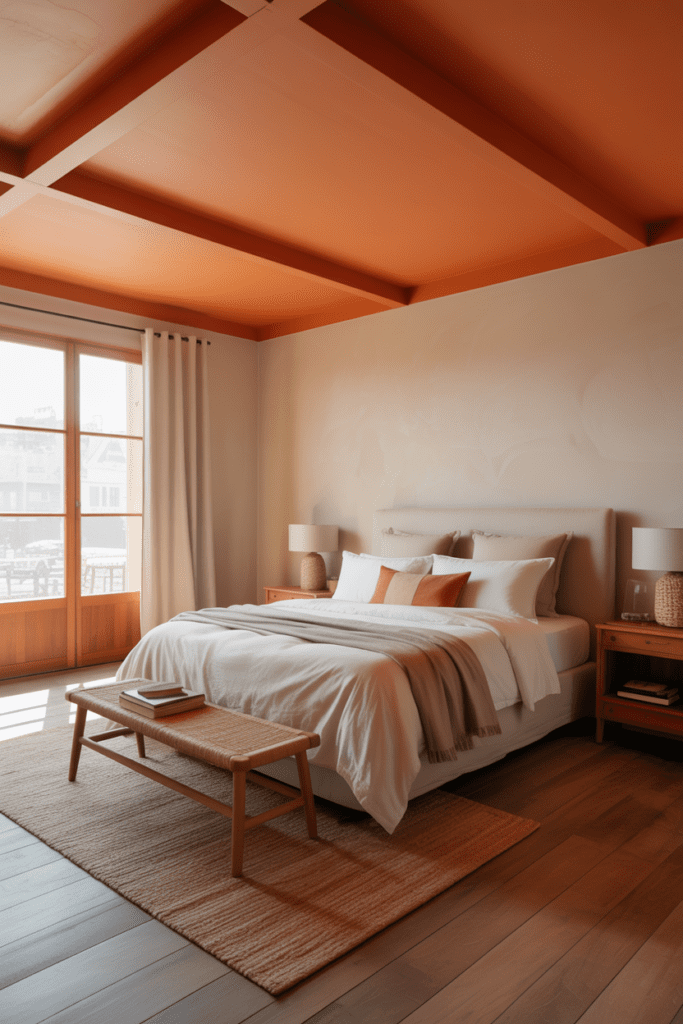
Ready to go full bold? Paint your ceiling persimmon. I know, I know — sounds intense. But a painted ceiling is one of the most impactful and underused design tools out there.
In a bedroom with white or cream walls and natural wood floors, a persimmon ceiling creates a cozy, enveloping atmosphere — like being inside a warm sunset. It works especially well in rooms with lower ceilings, where it brings the space in rather than exposing its limitations. Pair it with muted, neutral everything else and let the ceiling be your art piece.
How to Pull Off Persimmon Without Overdoing It
So you love the color but you’re nervous about going too far — totally valid. Here are some ground rules to keep things balanced:
- Start with one focal element — a wall, curtains, or bedding — before adding more
- Balance warm persimmon with cool or neutral tones — navy, sage, charcoal, or white all work beautifully
- Vary your textures — mixing matte, velvet, linen, and wood prevents the space from feeling flat or one-dimensional
- Use natural light to your advantage — persimmon looks incredible in rooms with good natural light; in darker rooms, go lighter on the saturation
- Don’t match everything — let persimmon be the accent, not the uniform
Final Thoughts
Persimmon orange is one of those colors that rewards boldness. The more intentionally you use it, the better your bedroom looks. Whether you go all-in with a painted ceiling or keep it subtle with a single throw pillow, this color brings warmth, personality, and a sense of life to any space.
So go ahead, be bold, trust your gut, and stop playing it safe with another shade of beige. Your bedroom should make you feel something when you walk in. Persimmon? It delivers every single time.