

If your living room feels a little sleepy, persimmon orange might fix that faster than a new throw pillow addiction. This color brings warmth, personality, and a cheerful kind of confidence that makes a room feel alive. It doesn’t whisper. It says, “Yes, I have taste, and yes, I want this room to feel amazing.”
I’ve always loved warm orange tones in interiors, especially when a space needs energy without going full neon circus. Persimmon orange living rooms hit that sweet spot. They feel rich, sunlit, cozy, and bold all at once. And honestly, when done right, they look a lot more expensive than they are. Nice bonus, right?
In this post, I’ll walk you through 17 persimmon orange living room ideas that energize, plus styling tips to help you use this lively shade without turning your home into a pumpkin-themed panic attack. Let’s get into it.
Why Persimmon Orange Works So Well in Living Rooms
Persimmon orange sits somewhere between classic orange, rust, and red-toned terracotta. That mix gives it depth and warmth, which makes it perfect for a living room. It wakes up a dull space, but it still feels grounded.
Why does it work so well? Because it plays two roles at once. It adds visual energy while also creating a cozy atmosphere. Not every color can pull off that trick.
Here’s what makes persimmon orange so effective:
- It boosts warmth without feeling too dark.
- It energizes the room without the harshness of bright primary orange.
- It pairs beautifully with neutrals, wood tones, brass, cream, olive, and even navy.
- It suits multiple styles, from modern to boho to traditional.
If your space gets limited sunlight, persimmon orange can help fake that warm, golden glow. And if your room already gets plenty of natural light, this color looks even more vibrant. Basically, it wins either way.
1. Persimmon Orange Accent Wall With Cream Furniture
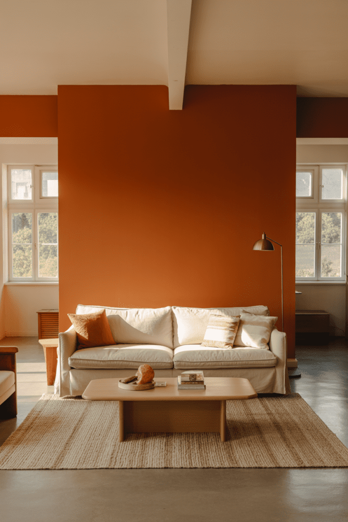
This is one of the easiest ways to try the trend without committing your entire personality to orange. Paint one wall in a rich persimmon orange and keep the rest of the room soft with cream or off-white furniture.
The contrast looks fresh and intentional. The cream tones calm the bold wall, while the orange adds instant life. I love this setup in smaller living rooms because it creates a focal point without overwhelming the space.
Why it works
A single accent wall lets you enjoy the color without bathing every surface in intensity. It also works well behind a sofa, fireplace, or built-in shelving.
Best styling partners
- Cream linen sofas
- Light oak coffee tables
- Warm brass lighting
- Textured beige rugs
2. Burnished Persimmon Velvet Sofa
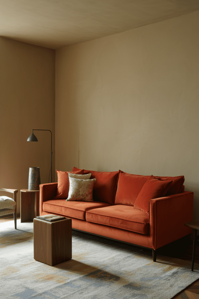
Want a dramatic move? Choose a persimmon orange velvet sofa. It instantly becomes the star of the room, and honestly, it deserves the attention.
Velvet adds depth and softness, so the orange feels luxurious instead of loud. I’ve seen this look in both modern and vintage-inspired spaces, and it almost always works. Ever notice how some sofas just sit there while others practically host the room? This is the second kind.
How to keep it balanced
Pair the sofa with neutral walls and a simple rug. Let the sofa do the heavy lifting while the rest of the room supports it.
Good pairings include:
- White or soft greige walls
- Black metal accents
- Walnut wood furniture
- Muted patterned pillows
3. Persimmon Orange and Walnut Mid-Century Mix
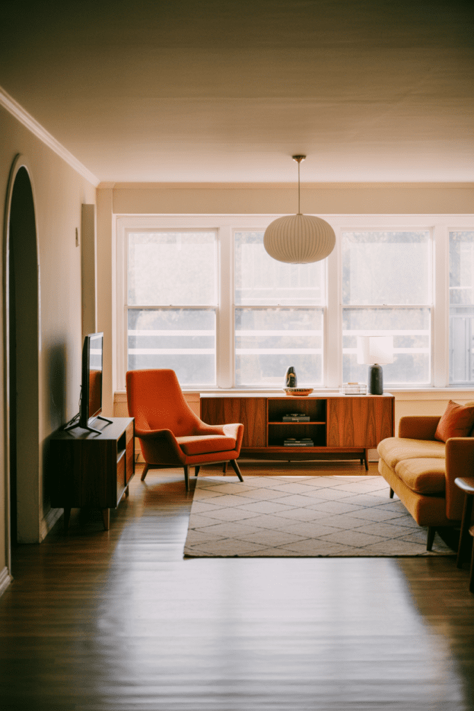
This combo feels timeless. Persimmon orange and walnut wood create a warm, retro-inspired look that feels stylish instead of theme-y.
Mid-century modern furniture already leans warm, so persimmon fits right in. Think sleek walnut legs, low-profile chairs, and clean-lined storage pieces. Add orange through upholstery, art, or a painted wall, and the whole room wakes up.
Key elements to include
- Walnut media console
- Persimmon lounge chair
- Geometric rug
- Simple globe lighting
This look feels polished but approachable. No museum vibes. No “please don’t sit there” energy.
4. Soft Persimmon Walls With White Trim
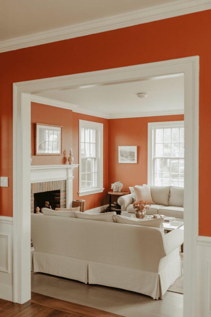
If a deep orange accent wall feels too bold, go softer. Choose a muted persimmon wall color and add crisp white trim. This approach keeps the room bright while still adding plenty of warmth.
White trim sharpens the color and makes it feel clean. It also gives traditional or transitional living rooms a fresh update. I like this especially in older homes where trim already adds character.
Why homeowners love this look
- It feels colorful without looking chaotic
- It works in classic and modern homes
- It brightens gloomy spaces
- It highlights architectural details
If you want orange but fear regret, this option gives you a safer entry point. Very practical. Very pretty. Minimal drama.
5. Persimmon Orange Curtains That Frame the Light
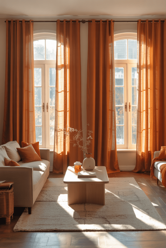
Not ready to paint? Bring in persimmon orange curtains instead. This trick adds color at eye level, which makes a room feel lively and pulled together fast.
Curtains in this shade catch natural light beautifully. During the day, they glow. In the evening, they add warmth and softness. It’s one of those simple upgrades that looks surprisingly thoughtful.
Best fabrics for this idea
- Linen for an airy look
- Velvet for a richer feel
- Cotton blends for easy care
Keep the surrounding furniture neutral so the curtains stand out. Or echo the orange in a pillow or piece of wall art to make the color feel intentional.
6. Layered Persimmon and Rust Tones
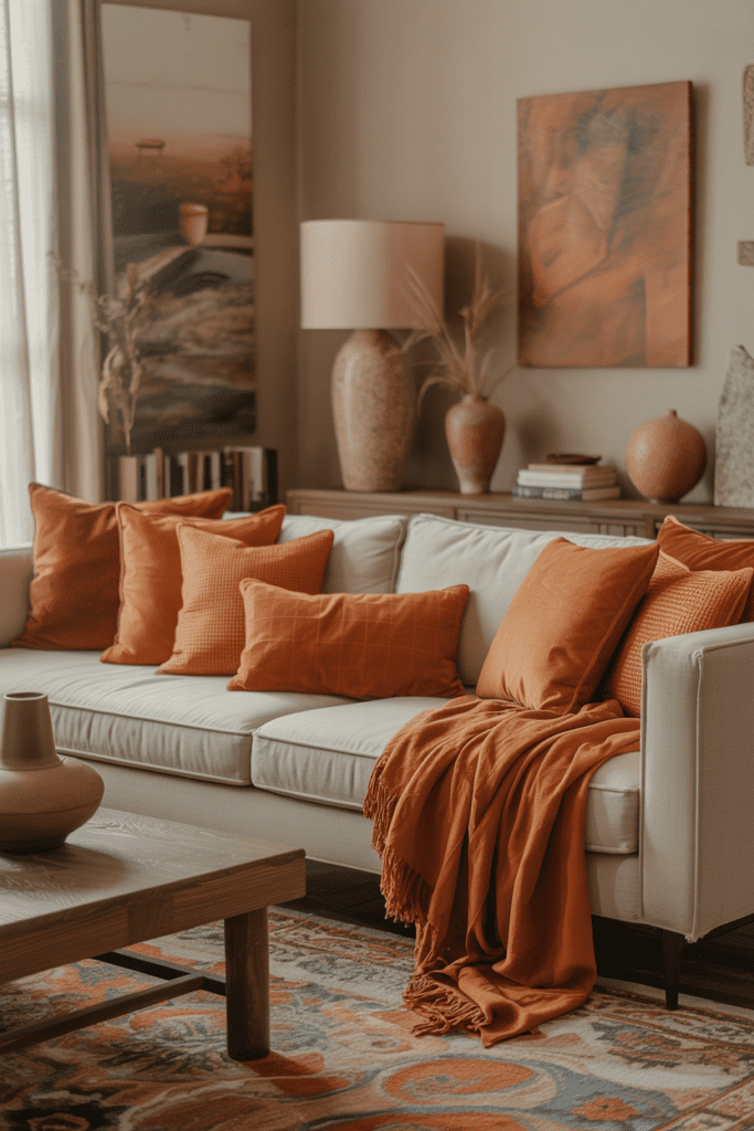
If you love warm interiors, layer persimmon orange with rust, clay, cinnamon, and terracotta. The room will feel rich, cozy, and deeply inviting.
This approach works because all the colors belong to the same warm family. They create depth without fighting each other. Think of it like building a room around sunset tones. Hard to hate that, right?
Easy ways to layer the palette
- Persimmon pillows
- Rust throw blankets
- Terracotta pottery
- Clay-toned artwork
Just keep one or two grounding neutrals in the room, like cream or warm taupe. Otherwise, things can get a bit too baked-sweet-potato very quickly.
7. Persimmon Orange Fireplace Surround
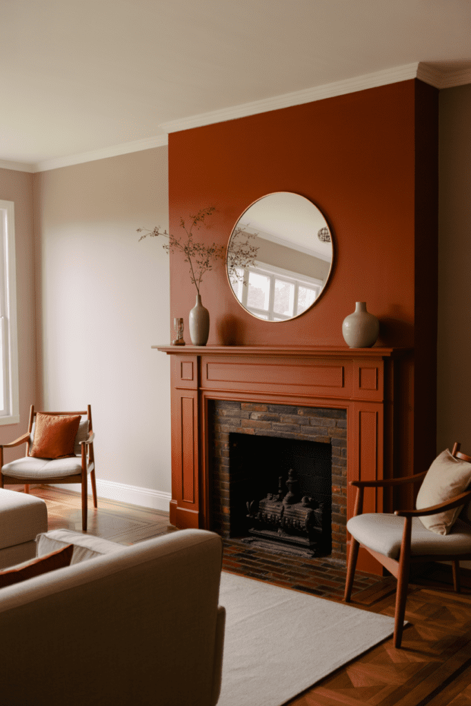
A fireplace already anchors a living room, so why not make it unforgettable? Paint the surround or mantel in persimmon orange to turn it into a bold focal point.
This works especially well in living rooms with simple architecture. The color adds personality without requiring a full renovation. And compared to replacing tile or stone, paint costs a whole lot less.
Styling tip
Balance the fireplace with understated décor. A round mirror, a few ceramic vases, and subtle seating usually do the trick.
8. Neutral Living Room With Persimmon Accessories
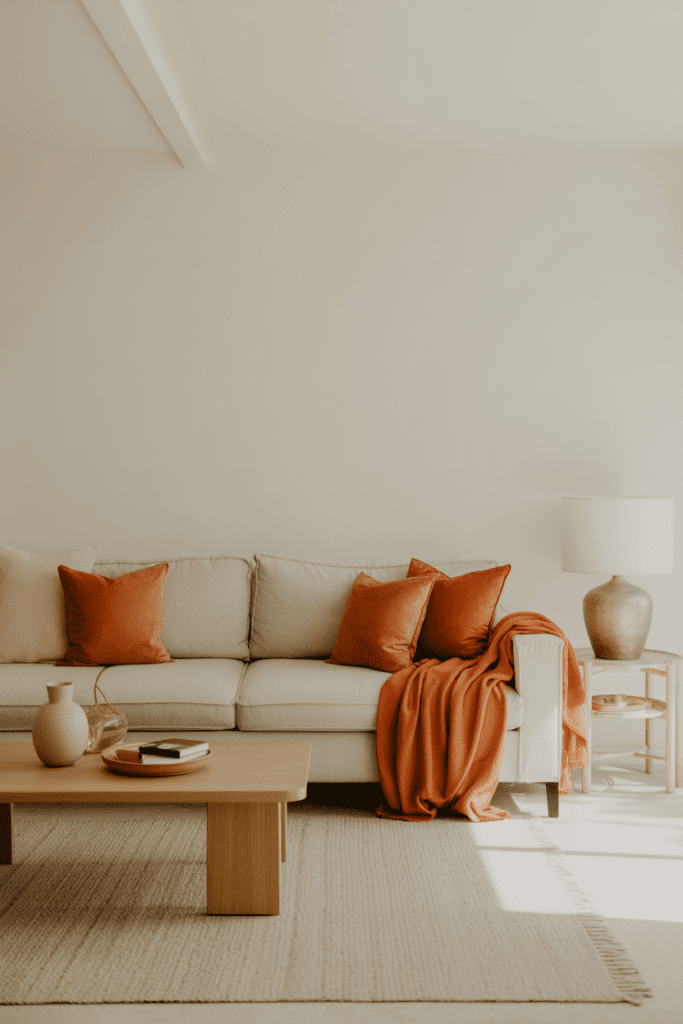
If you like color in small doses, keep the room neutral and add persimmon orange accents. This works beautifully in minimalist or Scandinavian-inspired spaces where every item matters.
Accessories give you flexibility. You can test the color, adjust the intensity, and swap pieces out by season if you want. Very low-risk. Very commitment-phobe friendly 🙂
Accessories that make the biggest impact
- Throw pillows
- Blankets
- Artwork
- Ceramic lamps
- Decorative vases
IMO, this is the best option for anyone who likes trends but hates repainting walls.
9. Persimmon Orange Artwork as a Focal Point
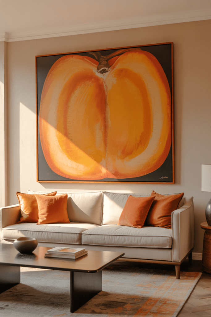
A large art piece with strong persimmon orange tones can energize the whole room without requiring a color overhaul. This works especially well if your walls, sofa, and rug already lean neutral.
Art helps the color feel curated instead of random. It also gives you a reference point for adding smaller orange accents throughout the room.
What to pair with it
- Neutral upholstery
- Simple black or wood frames
- A few matching accessories
- Soft natural textures
You don’t need ten orange objects. You need one strong piece and a few supporting players.
10. Persimmon and Olive Green for Earthy Energy
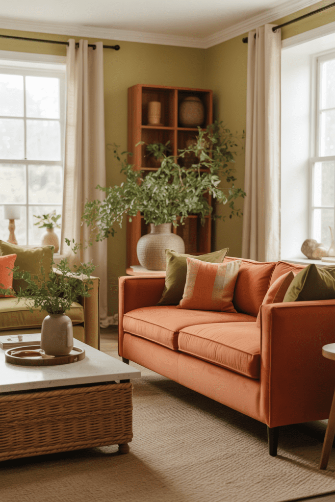
This pairing feels fresh, earthy, and a little unexpected. Persimmon orange and olive green balance each other beautifully because one brings warmth while the other brings calm.
I genuinely love this combo. It feels grounded but still lively, like a room that drinks coffee and also owns plants that stay alive. Rare, admirable energy.
Ways to use the pairing
- Persimmon sofa with olive pillows
- Olive accent chair with orange art
- Green plants against orange walls
- Patterned textiles that mix both shades
Add wood and cream to soften the contrast. The result feels layered and designer-worthy without trying too hard.
11. Modern Living Room With Persimmon and Black Accents
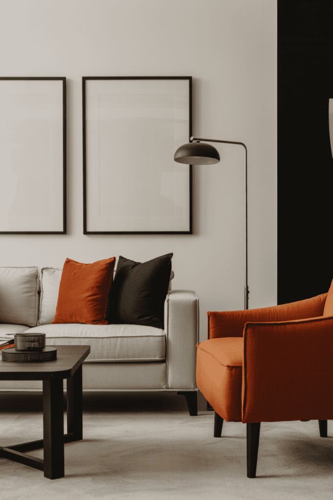
If you want a sharper, more modern look, pair persimmon orange with black accents. Black adds structure and edge, which keeps the orange feeling intentional and grown-up.
This combination works best when the room has clean lines. Think modern sofas, simple lighting, and uncluttered surfaces. The orange adds warmth; the black adds discipline. Teamwork.
Best black accents to use
- Metal floor lamps
- Picture frames
- Coffee table legs
- Cabinet hardware
A little black goes a long way here. You want contrast, not a color wrestling match.
12. Persimmon Orange in a Boho Living Room
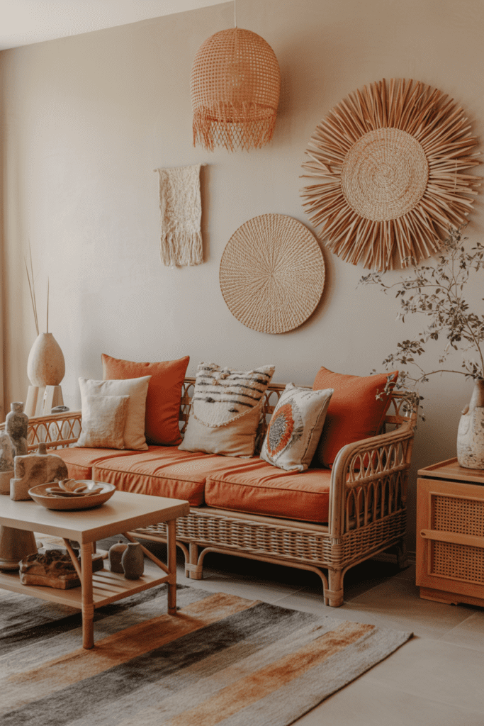
Boho spaces already love warmth, texture, and collected charm, so persimmon orange feels right at home. Add it through cushions, rugs, wall hangings, or even a painted cabinet.
The key here involves texture. Mix woven materials, soft fabrics, wood, leather, and handmade ceramics. That variety keeps the orange feeling soulful instead of flat.
Essential boho-friendly textures
- Rattan
- Macramé
- Aged wood
- Layered textiles
- Hand-thrown pottery
This style gives you permission to be a little playful. Not chaotic, though. We want “curated traveler,” not “yard sale exploded.”
13. Persimmon Orange and Beige for Soft Warmth
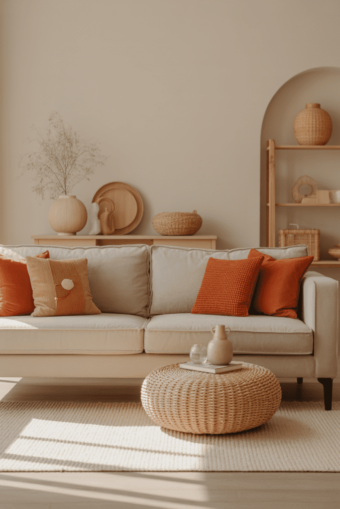
Some people want color without drama. Fair. Pair persimmon orange with beige for a softer, more understated look.
Beige tones down the intensity and lets the orange feel mellow and elegant. This combo works especially well in relaxed family rooms or homes with a lot of natural textures.
Why this palette feels easy to live with
- It feels warm but not loud
- It works year-round
- It suits casual and polished spaces
- It layers well with wood and woven accents
If bright color schemes make you nervous, start here. It feels welcoming, calm, and still far from boring.
14. Persimmon Built-Ins Around a Fireplace or TV
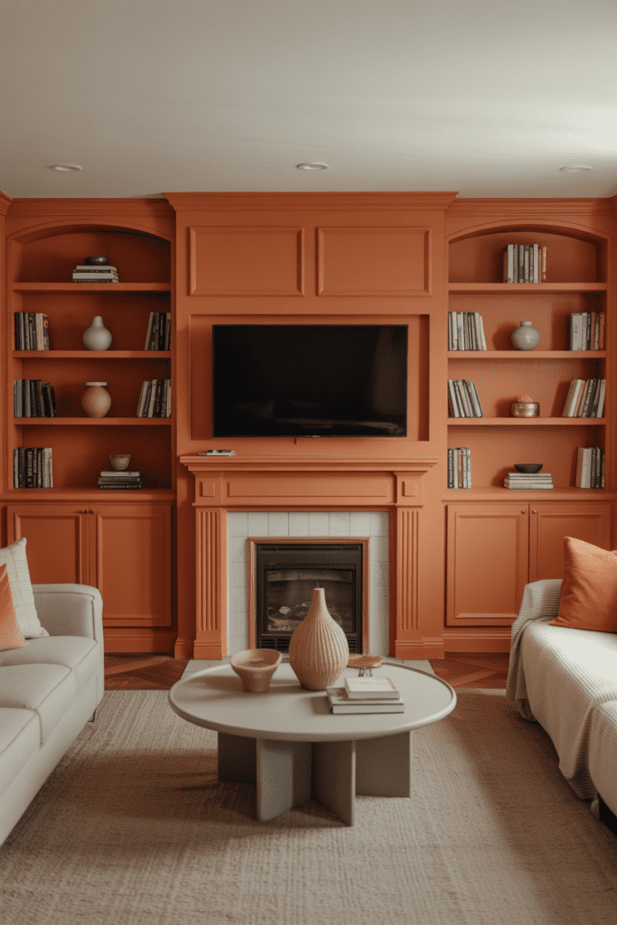
Built-ins give you a huge opportunity to use color in a way that feels architectural. Paint bookshelves or cabinets in persimmon orange and let them frame your fireplace or television wall.
This idea looks custom and bold. It also helps everyday objects like books and décor stand out more clearly. I love this option for homes that need personality but already have neutral furniture.
What makes it successful
- Keep nearby walls lighter
- Use edited styling on the shelves
- Repeat the color elsewhere in small doses
- Add warm lighting for extra depth
Too much shelf clutter will sabotage the whole effect. The orange deserves better.
15. Persimmon Orange Rug That Grounds the Room
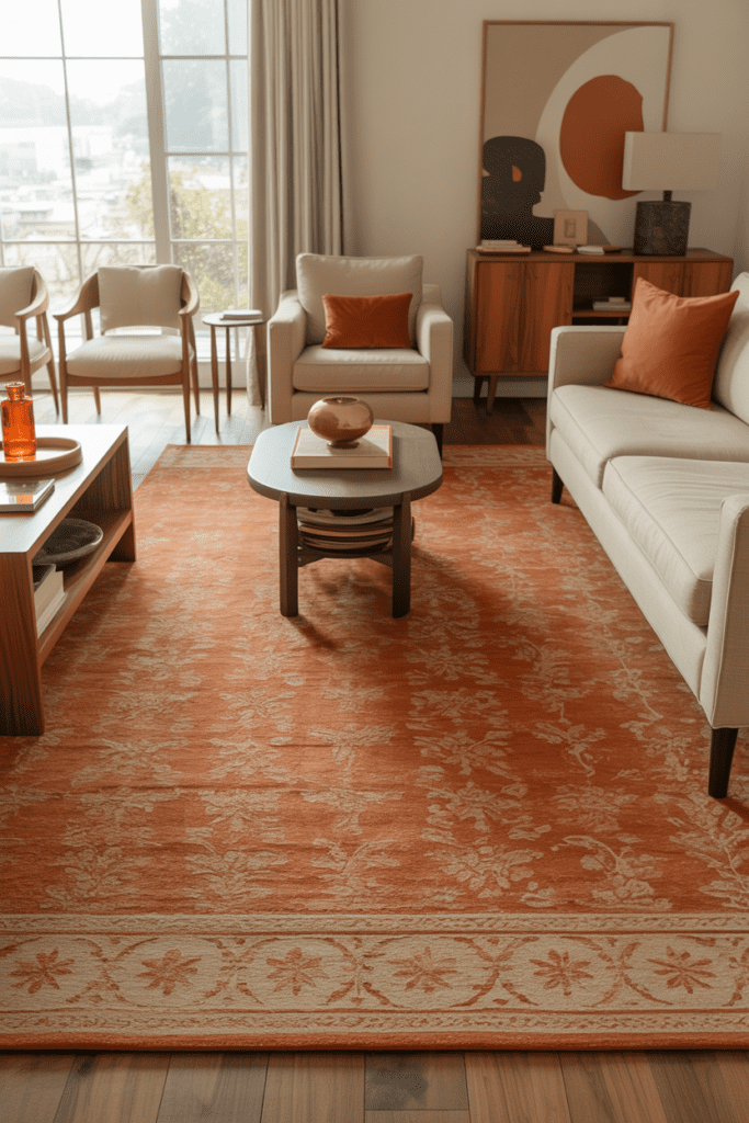
A rug in persimmon orange tones can anchor your seating area and energize the whole space from the ground up. This works especially well if you already own neutral furniture and don’t want to replace major pieces.
Look for Persian-style rugs, geometric designs, or abstract prints with orange, rust, cream, and brown mixed together. The pattern helps distribute the color and makes it easier to style.
Why a rug works so well
- It adds color without painting
- It connects the furniture visually
- It introduces pattern and warmth
- It softens wood or tile floors
FYI, a rug often gives you more impact than a handful of random accent pillows ever will.
16. Persimmon Orange Ceiling Detail for a Bold Twist
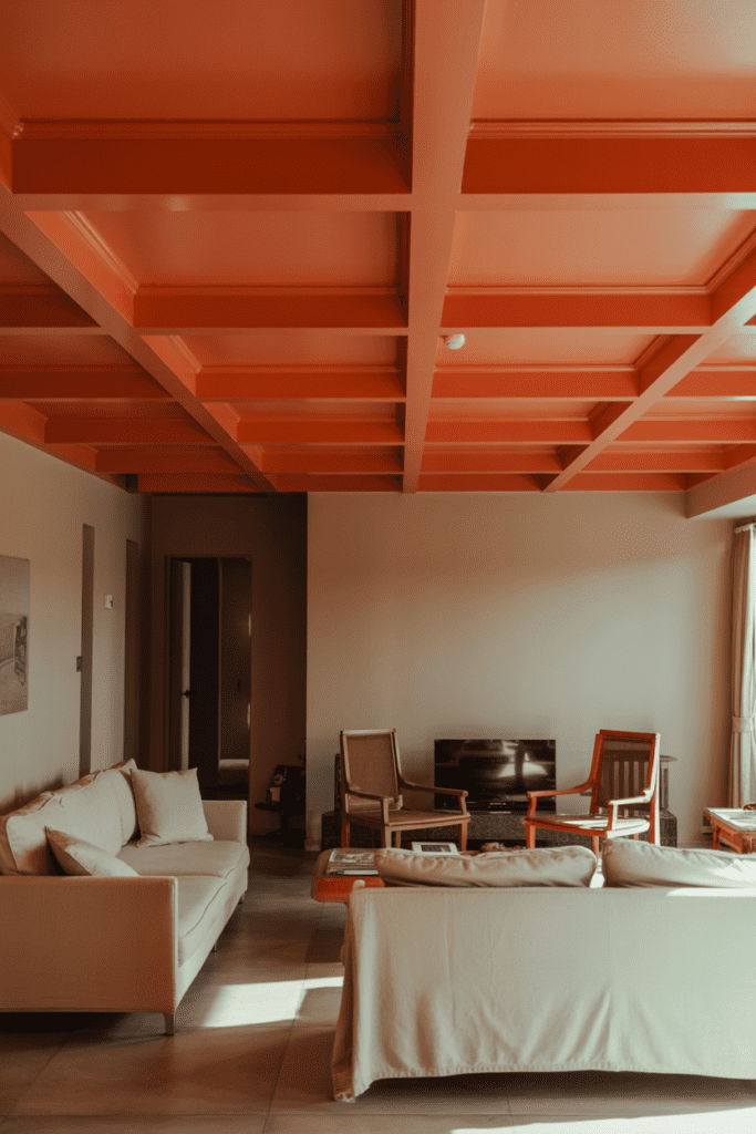
This one isn’t for the faint of heart, but wow, it looks good when done right. Paint the ceiling in a muted persimmon orange or use the color inside ceiling beams, trays, or molding details.
The eye naturally travels upward, so this move makes the room feel more designed. It also leaves the walls free for neutral art and furniture. Ever walk into a room and instantly feel that something looks special, even if you can’t explain it? A painted ceiling often creates that effect.
Keep this idea polished
Use this in rooms with:
- Good natural light
- Tall or medium-height ceilings
- Simple wall colors
- Minimal clutter
A dark or overly saturated ceiling can feel heavy, so choose a balanced persimmon tone with warmth, not too much intensity.
17. Persimmon Orange Mixed With Brass and Marble
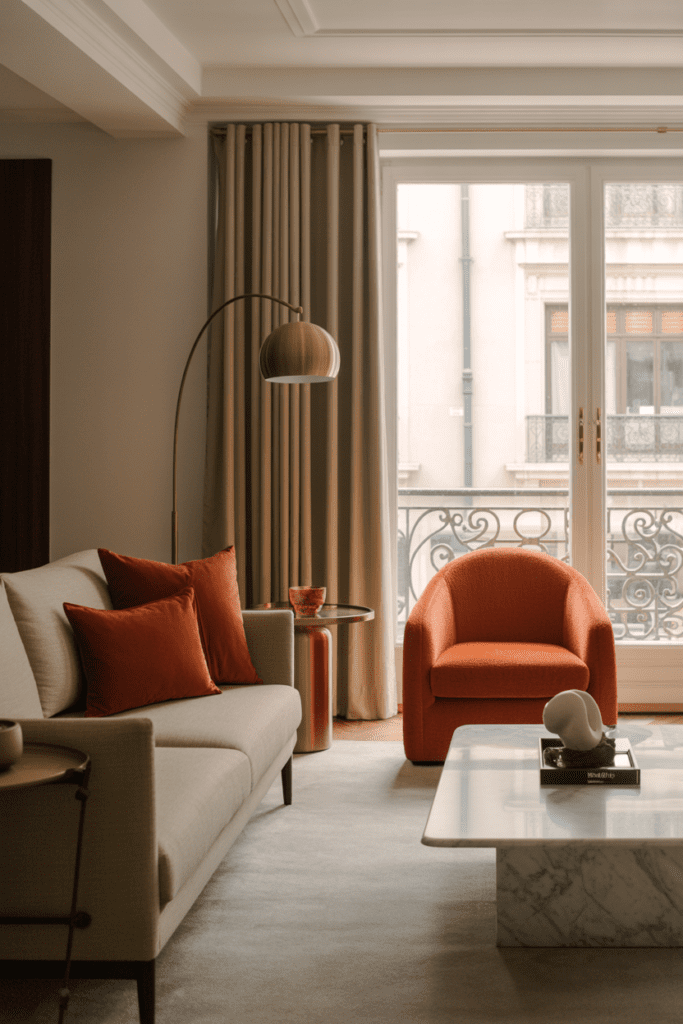
If you want a slightly glam version of this trend, combine persimmon orange, brass, and marble. This trio feels warm, polished, and quietly luxurious.
Brass brings shine, marble adds cool contrast, and persimmon keeps the whole room from feeling stiff. I love this mix in apartments and smaller living rooms because it delivers personality without relying on lots of extra décor.
Best ways to use the trio
- Persimmon accent chairs
- Brass floor lamp or side table
- Marble coffee table
- Cream or taupe sofa
The result feels elevated without trying to audition for a hotel lobby.
How to Choose the Right Persimmon Shade
Not every persimmon orange paint color or fabric tone looks the same. Some lean red, some lean brown, and some look almost peachy in bright light. That’s why testing matters.
I always suggest checking the color in morning light, afternoon light, and evening light. Annoying? Yes. Necessary? Also yes.
Quick shade guide
- Red-based persimmon feels richer and more dramatic.
- Brown-based persimmon feels earthier and more grounded.
- Muted persimmon feels softer and easier to live with.
- Bright persimmon feels playful and high-energy.
If your room already has strong warm tones, a muted version usually works best. If the space feels flat or cool, a richer shade can wake it right up.
What Colors Go Best With Persimmon Orange?
Persimmon orange plays surprisingly well with a lot of colors. You just need the right supporting cast.
Best color pairings
- Cream and ivory for softness
- Beige and taupe for subtle warmth
- Walnut and oak for natural richness
- Olive green for earthy contrast
- Black for modern definition
- Brass and gold for warmth and shine
- Navy for bold contrast
- Terracotta and rust for tonal layering
If you want a safe combination, start with cream and wood. If you want something moodier, try olive or navy. Easy.
Easy Styling Tips for a Persimmon Orange Living Room
Once you choose your main persimmon element, style the room around it with intention. You don’t need to match everything exactly. In fact, please don’t. That usually makes a room look stiff.
Smart styling rules
- Choose one main feature
Use the color on a sofa, wall, rug, or built-ins first. - Repeat it two or three times
Echo the tone in smaller accents like pillows, art, or ceramics. - Add grounding neutrals
Use cream, beige, wood, black, or soft gray to balance the warmth. - Mix textures
Bring in linen, velvet, leather, rattan, wool, or wood to add depth. - Watch the lighting
Warm bulbs make persimmon glow. Cool bulbs can make it look a bit off :/
That last point matters more than people think. A beautiful paint color can look weird under bad lighting, and then everyone blames the paint. Tragic and unfair.
Common Mistakes to Avoid
Persimmon orange looks amazing, but it still needs some restraint. Too much of it can overwhelm a room fast.
Avoid these mistakes
- Using too many competing warm colors without a neutral break
- Choosing an overly bright shade in a small dark room
- Forgetting texture, which can make the room look flat
- Adding too many bold accessories, which creates visual chaos
- Ignoring undertones in your flooring, furniture, or walls
If the room starts feeling busy, remove a few items before you assume the color failed. Most of the time, the problem comes from clutter, not the orange.
Conclusion
Persimmon orange living rooms feel warm, lively, and full of personality. They energize a space without making it harsh, and they pair beautifully with everything from cream and beige to walnut, black, olive, and brass. Whether you go big with a velvet sofa or keep things simple with accents and art, this color can completely change the mood of your room.
The best part? You don’t need a perfect designer home to make it work. You just need a little confidence, a good eye for balance, and the willingness to let your living room have some actual fun. So if your space feels flat, maybe it’s time to give persimmon orange a shot. Worst case, you buy a pillow. Best case, your whole room comes alive.