
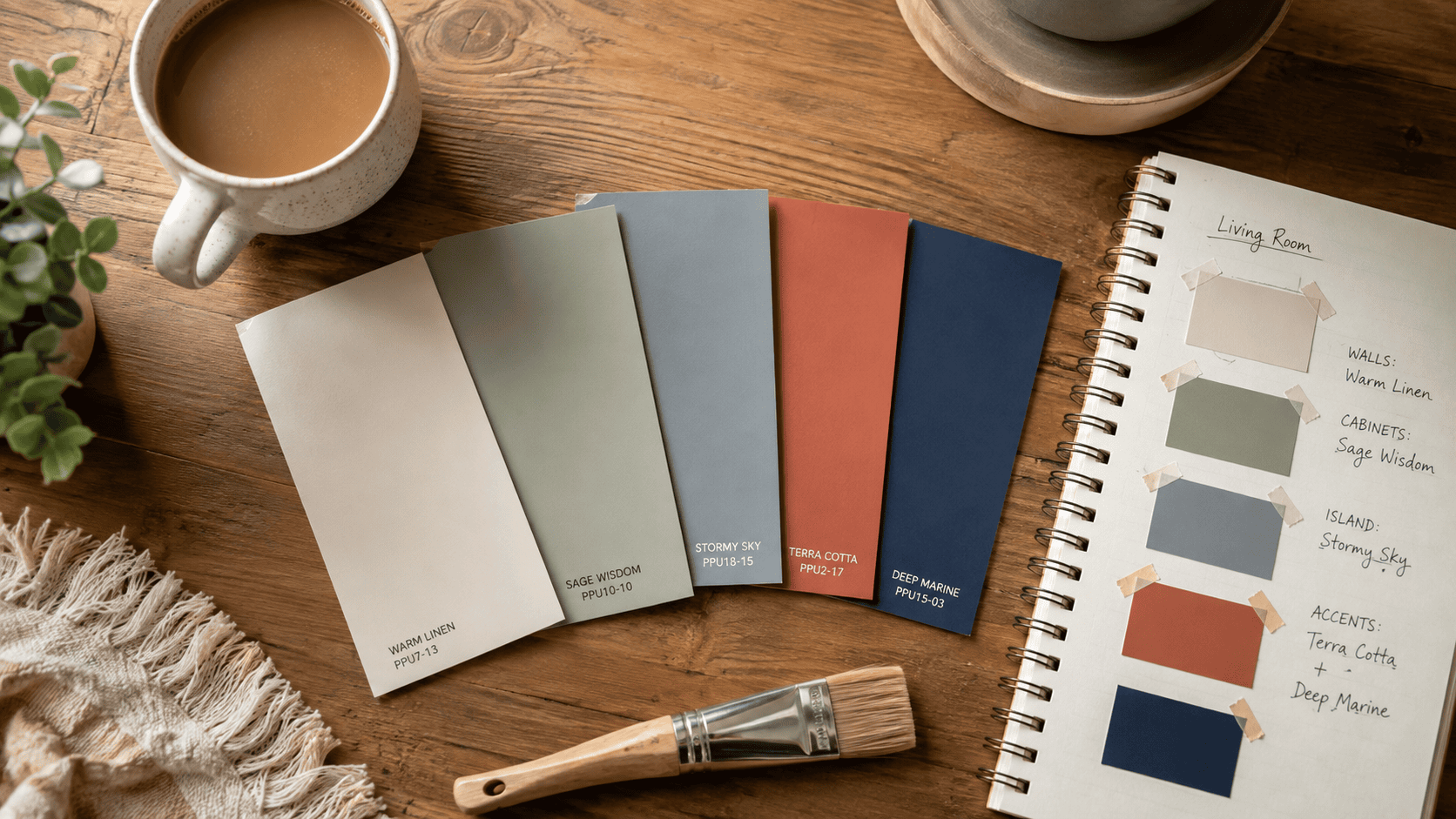
For years I thought I just didn’t have an eye for this stuff. My buddies would come over and every room looked fine on its own. Solid, even. But the second I stood in my hallway and could see my living room and bedroom at the same time, something felt off. Like two different guys decorated the place and never once talked to each other.
Turns out that’s exactly what happens when you pick colors room by room instead of thinking about the whole house at once. Nobody warns you about this part. You get pretty good at picking a color you like for one space, then completely forget your house isn’t a bunch of separate boxes it’s one thing you walk through every single day.
So I started paying closer attention to what actually makes a home feel put-together instead of thrown together. And honestly, it’s way simpler than I thought. It’s not about matching every single thing. It’s about a handful of colors showing up again and again, in different amounts, so your eye isn’t hitting the brakes every time you walk into a new room. Let me walk you through what actually worked.
Why Most Whole-Home Color Palettes Fall Apart
Mistake #1: Treating Each Room Like Its Own Project
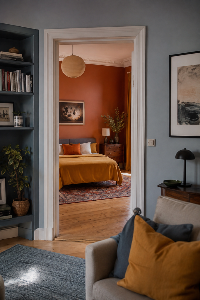
This is the big one. Most people decorate room by room — they finish the living room, feel great about it, move to the bedroom, fall in love with a totally different mood board, and repeat. Each room looks good in isolation. Photographed alone for Instagram? Gorgeous. Standing in the hallway looking at both at once? It’s chaos.
The problem is that a house isn’t a series of separate boxes. You experience it in motion — glancing from the kitchen into the dining room, catching the hallway color from your bedroom doorway. When there’s no shared thread between rooms, your brain has to “reset” every time you change spaces, and that reset reads as visual tension, even if you can’t name why.
Mistake #2: Picking Colors You Like Instead of Colors That Relate
Loving a color in a vacuum is very different from that color working with the other colors in your home. I can’t tell you how many times someone has three or four favorite paint colors picked out — a sage green, a navy blue, a warm terracotta, a soft blush — and each one is genuinely beautiful. But thrown together across a floor plan with no relationship to each other, they compete instead of complement.
What actually works is picking colors based on their undertones, not just their names or their swatch appeal. A sage green with a yellow undertone and a navy with a cool blue-grey undertone will fight each other, even though “green and blue” sounds like a safe combo on paper.
Mistake #3: Ignoring Your Fixed Elements
Most people get this wrong: they pick paint colors first and then panic when it clashes with the kitchen countertops, the wood floors, the brick fireplace, or the bathroom tile that isn’t going anywhere. Your fixed, expensive-to-change elements should be the starting point of your palette, not an afterthought you’re trying to work around later.
The Core Principle: Flow Comes From Repetition, Not Matching
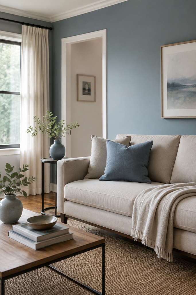
If you take one thing away from this post, let it be this: flow is created by repeating a small set of colors at different intensities throughout the house — not by making every room the same color, and not by picking a completely unrelated scheme for each space.
Think of your palette like a song with a few recurring notes. The notes might show up loud in one room (an accent wall, a bold rug) and quiet in another (a throw pillow, a vase), but because they repeat, the whole house feels like it’s playing the same melody.
The 60-30-10 Rule, Applied to a Whole House (Not Just One Room)
You’ve probably heard the 60-30-10 rule for a single room — 60% dominant color, 30% secondary, 10% accent. Here’s the upgrade almost nobody talks about: apply this ratio across your entire home, not room by room.
That means your dominant color (the 60%) should be consistent in spirit through most of your main living spaces — usually your wall color or a close family of neutrals. Your secondary color shows up in furniture and larger textiles. Your accent color is your “fun” color that can shift slightly room to room but always pulls from the same general family.
Why this works: when the dominant tone stays consistent, your brain doesn’t have to recalibrate as you move through the house. The secondary and accent colors give you room to keep things interesting without breaking that continuity.
Warm and Cool Undertones Can’t Be Mixed Carelessly
This is the part that trips up even people with genuinely good taste. Every “neutral” has an undertone — warm (yellow, red, orange based) or cool (blue, green, grey based). A warm greige next to a cool white doesn’t read as “neutral and neutral, no problem.” It reads as slightly dingy, or slightly cold, depending on which one wins.
Practical example: if your kitchen has warm oak cabinets, and you paint the adjoining dining room a cool, blue-grey, you’ll get a subtle but real clash every time you look between the two spaces. Swap that dining room color for a warm greige or soft warm white instead, and suddenly the transition feels intentional instead of accidental.
The Step-by-Step Approach That Actually Works
Step 1: Audit Your Fixed Elements First
Before you touch a paint swatch, walk your entire home and list every element you’re not planning to change — flooring, countertops, cabinetry, tile, brick, stair railings, big furniture pieces you’re keeping. Note the undertone of each. This becomes your non-negotiable foundation.
Step 2: Choose One “Whole-Home Neutral” Family
Pick one neutral undertone — warm or cool — and commit to it as your throughline. This doesn’t mean every wall is the same color. It means every wall color you choose comes from the same temperature family. If your fixed elements skew warm, don’t fight it with a cool white just because you saw it on a design blog. Work with what’s already expensive and permanent in your home.
Step 3: Build a 3-5 Color Palette, Not a Different Scheme Per Room
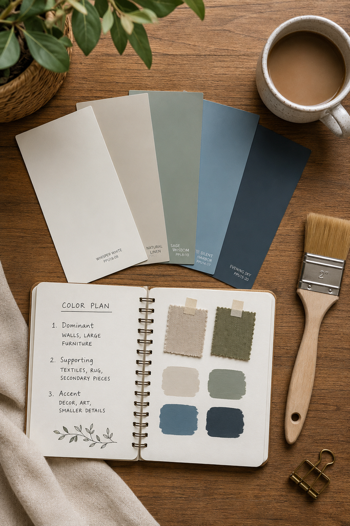
Land on three to five colors total for your entire home: one dominant neutral, one or two supporting colors, and one or two accents. Write them down. Literally keep a small paint chip card or a note on your phone. Every future decorating decision — pillows, art, a rug, a new chair — gets checked against this card.
Step 4: Let Color Intensity Shift by Room, Not the Color Family Itself
This is where people get scared they’ll end up with a boring house. You don’t have to paint every room the exact same shade. A “flow” palette lets your dusty blue show up as a full wall in the primary bedroom, a stripe on a runner rug in the hallway, and a single vase in the living room. Same color family, wildly different intensity. That’s what creates depth without creating chaos.
Step 5: Use Your Sightlines as a Testing Ground
Stand in every doorway and hallway in your house and look both directions. Whatever two colors you see at the same time need to relate to each other. This is honestly the most underused trick in home design — most people pick colors while standing in the center of a single room, completely ignoring what’s visible from the doorway. Sightline testing catches 90% of flow problems before you ever buy a can of paint.
Practical Tips That Make the Difference
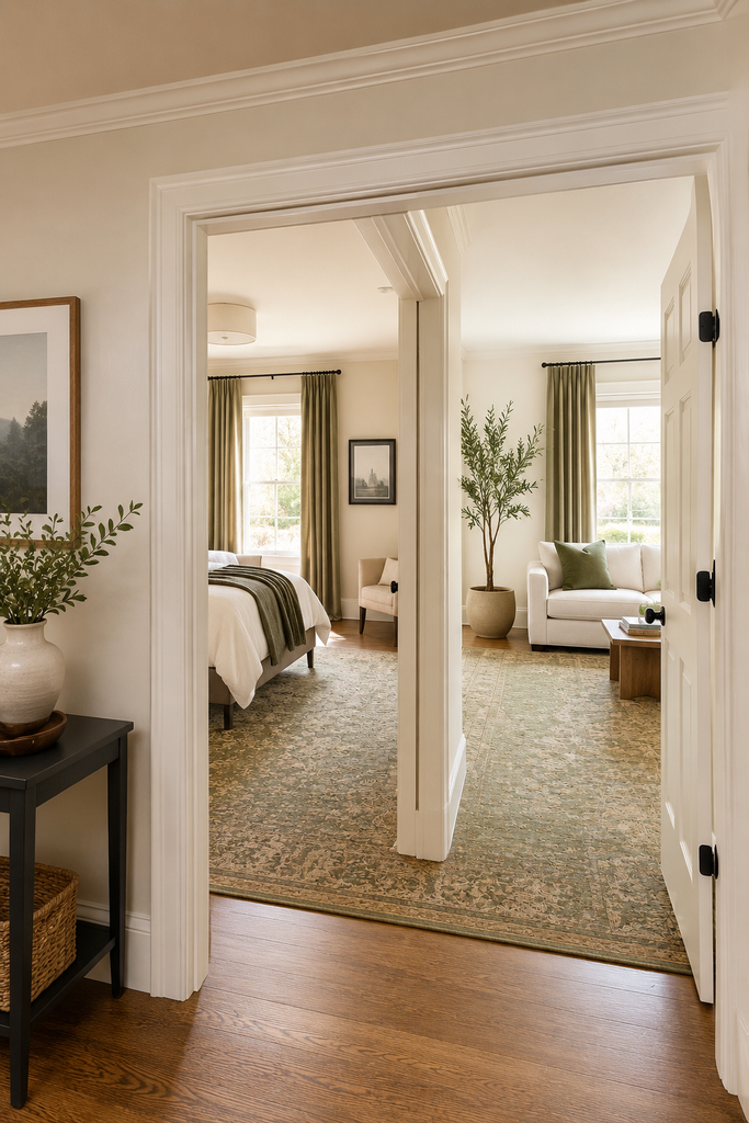
Test paint in the actual transition zones, not just room centers. Paint a swatch near the doorway between two rooms, not just in the middle of each wall. This is where clashes actually show up.
Trim and ceiling color matter more than people think. If you’re using the same white trim throughout the house, make sure it’s consistent — switching between a warm white and a stark white trim from room to room undercuts your whole-home cohesion even if your wall colors are perfect.
Big rugs and large furniture are your best flow tools. These are large enough to carry color visually but flexible enough to move if something’s not working. Lean on them before committing to permanent finishes.
Don’t forget the ceiling as the “fifth wall.” A slightly warm white ceiling paired with cool wall colors is a classic, subtle source of clash that most people never diagnose.
If you’ve already painted rooms in unrelated colors, you don’t need to repaint everything. Often you can fix 70% of the disconnect just by swapping out textiles — rugs, curtains, pillows — to pull in a shared accent color that bridges the gap.
Putting It All Together
A home color palette that flows isn’t about playing it safe or painting everything the same shade of beige. It’s about picking a handful of colors that genuinely relate to each other in undertone and intensity, anchoring them to the fixed elements you already have, and repeating them loud in some rooms, quiet in others so your whole house reads like one cohesive story instead of five separate ones.
Start with your fixed elements. Commit to one undertone family. Build a small palette and actually write it down. Then go test it at your doorways, where the real flow either happens or falls apart.
Your house doesn’t need more colors. It needs the right few, used on purpose.