
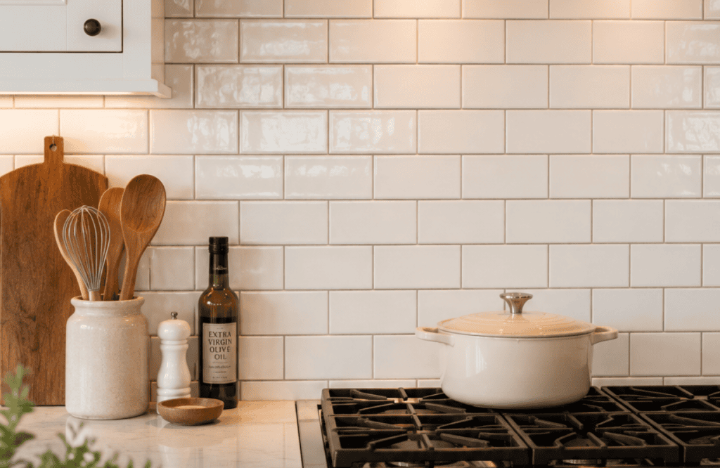
Subway tile gets a bad rap as the “safe” choice, and I get why. You’ve seen it in a thousand kitchens, a thousand rental listings, a thousand Pinterest boards that all start to blur together. But here’s the thing I learned after redoing my own backsplash three times (yes, three — I’m stubborn): subway tile is only boring if you let it be. The magic isn’t in the tile itself. It’s in the grout color and the layout you pick.
I’ve spent way too many weekends staring at tile samples under my kitchen lights, comparing grout swatches like I was picking paint for a nursery. So let me save you that trouble. Below are 14 real, workable ways to make subway tile feel intentional instead of like you grabbed the first box at the hardware store.
1. Classic White Tile with Bright White Grout
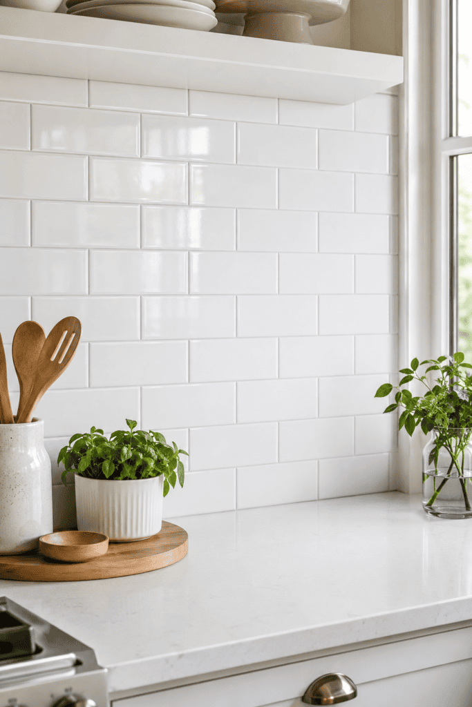
This is the look everyone pictures when they hear “subway tile,” and there’s a reason it’s stuck around for over a century. White tile with matching white grout creates a seamless, almost sculptural wall that bounces light around a small kitchen beautifully.
Is it exciting? Not really. Does it work in almost any kitchen style? Absolutely. If you’re renovating to sell, this combo is about as close to a sure bet as you’ll find.
2. White Tile with Charcoal Grout for High Contrast
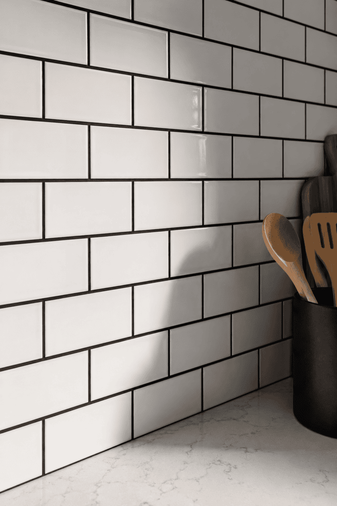
Now flip the script. Swap that white grout for a dark charcoal or black grout, and suddenly your subway tile has personality. Every single tile edge pops, and the grid pattern becomes the star of the show instead of an afterthought.
I did this in my own kitchen and honestly? IMO it’s the single best upgrade I made to that room. The contrast makes the tile look almost architectural, like you hired someone way fancier than a guy with a wet saw and a YouTube tutorial.
Why the Contrast Trick Works
- Draws the eye to the pattern, not just the color of the tile
- Hides minor stains or grime better than bright white grout (a real win if you cook a lot)
- Pairs well with both modern and industrial kitchen styles
3. Soft Gray Tile with Gray Grout for a Monochrome Look
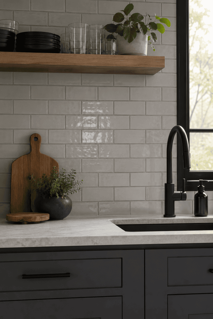
If stark contrast feels too bold for you, try staying in the same color family. Light gray subway tile with a slightly darker gray grout gives you dimension without screaming for attention. It’s the quiet cousin of the black-grout look.
This works especially well in kitchens with a lot going on already — busy countertops, patterned floors, whatever. The tile recedes just enough to let everything else breathe.
4. Herringbone Layout for Instant Drama
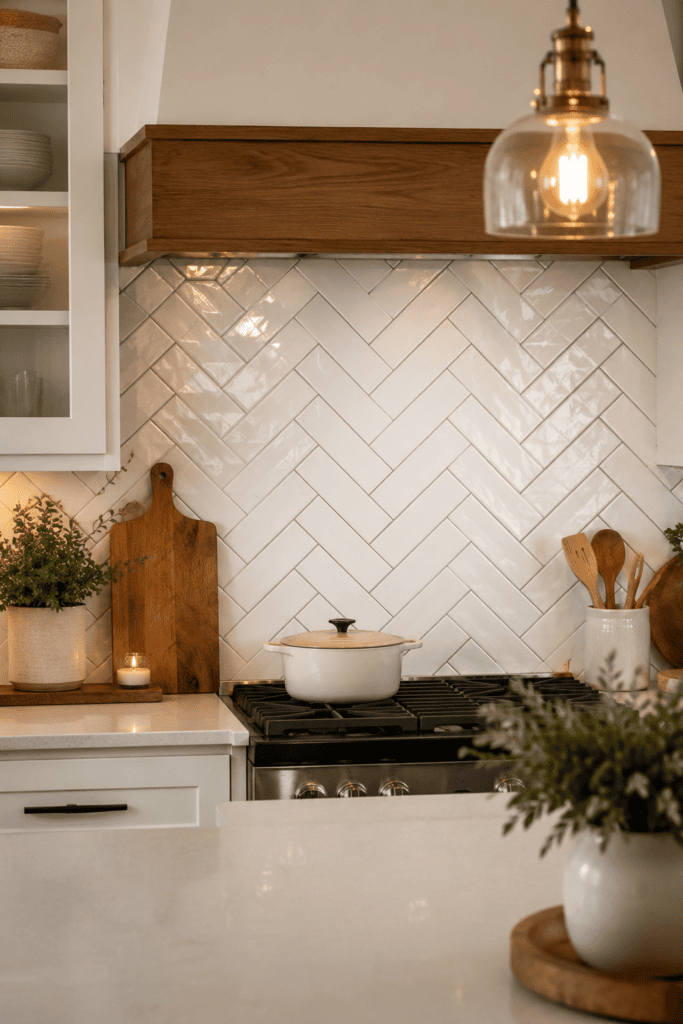
Ever wondered why herringbone shows up in every “elevated kitchen” article? It’s because the diagonal, zigzagging pattern does something a straight grid simply can’t: it makes a flat wall feel like it has movement.
Herringbone layout takes more cuts, more time, and yes, more tile waste, so budget accordingly. But the payoff is a backsplash that looks custom even if you used the cheapest tile in the store.
Things to Know Before You Commit to Herringbone
- Plan your center point first so the pattern is symmetrical
- Expect roughly 15% extra tile for cuts and waste
- Hire a pro if you’ve never done angled cuts — this is not the project to learn on
5. Vertical Stack (Grid) Layout for a Modern Edge
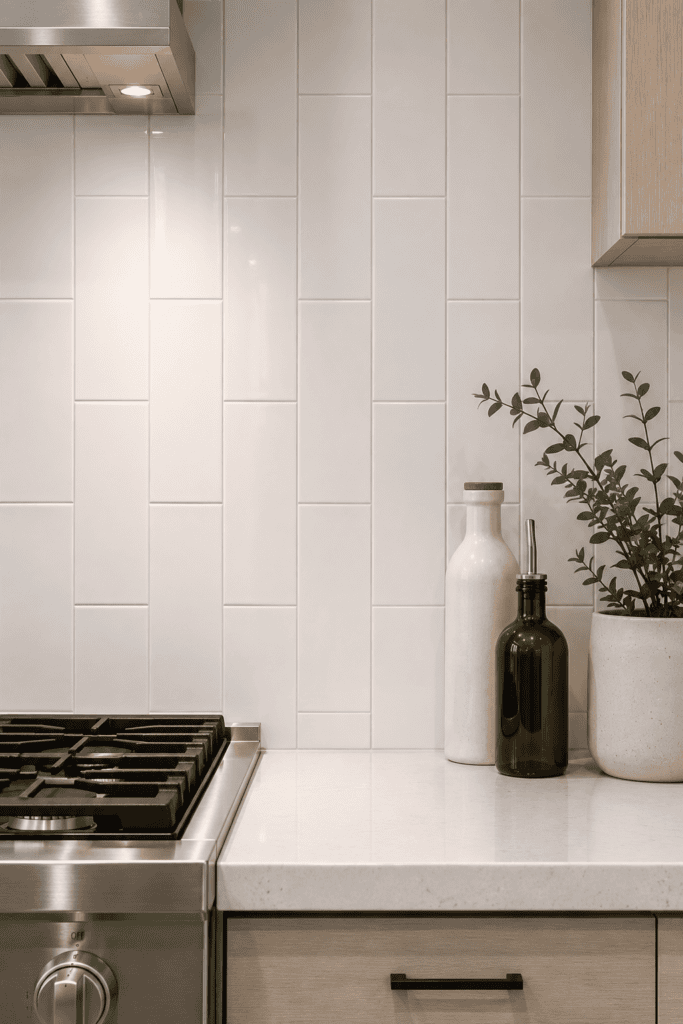
Skip the classic offset brick pattern entirely and go straight vertical stack, where every tile lines up directly above the one below it. This layout is having a real moment in modern kitchens right now, and I can see why — it reads clean, orderly, and a little architectural.
The catch? Any wonky cuts or uneven grout lines show up immediately since there’s no offset to camouflage mistakes. Precision matters a lot more here than in a standard running bond pattern.
6. Horizontal Stack Layout to Widen a Narrow Kitchen
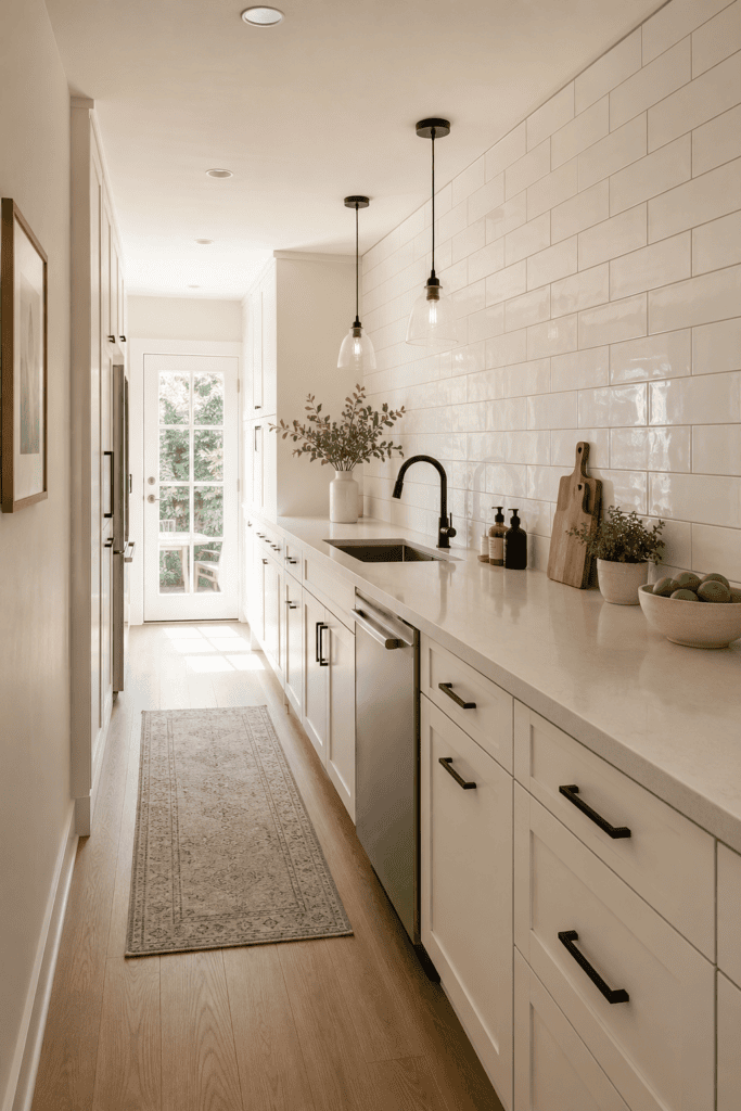
Got a galley kitchen that feels like a hallway with a stove in it? A horizontal stacked layout, where tiles line up in straight rows without the brick offset, can visually stretch the walls sideways. It’s a simple trick, but it genuinely works.
I’ve recommended this to a couple of friends with narrow kitchens, and both said the room felt bigger the second the tile went up. Sometimes the cheapest renovation fix really is just picking the right pattern.
7. Classic 1/3 Offset (Traditional Brick Bond)
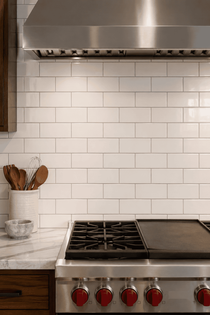
This is the original subway tile layout, straight out of early 1900s New York subway stations (hence the name). Each row shifts over by one-third of a tile length. It’s traditional, it’s proven, and honestly, there’s nothing wrong with sticking to the classics.
The 1/3 offset works especially well with rectangular tiles in the 3×6 or 4×8 range. If you’re not trying to reinvent the wheel, this layout is basically foolproof.
8. Bold 1/2 Offset for a Cleaner Grid Look
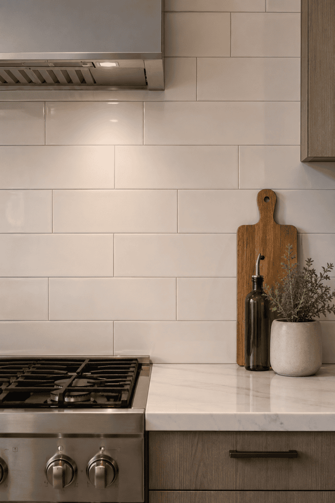
The 1/2 offset (where each row shifts exactly half a tile length, instead of a third) gives you a slightly more uniform, grid-like appearance. It’s subtle, but if you line up two kitchens side by side, you’ll notice the difference immediately.
I actually prefer this over the traditional 1/3 offset for larger tiles — anything over 4×12 inches tends to look more balanced with the half offset. Smaller classic subway sizes usually look better with the traditional third.
9. Colored Tile with Contrasting Grout
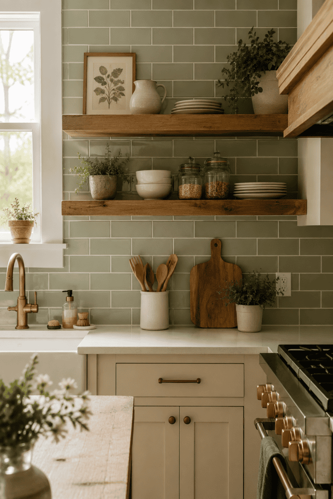
Who says subway tile has to be white or gray? Sage green, soft blue, or even a warm terracotta subway tile can completely change the mood of a kitchen. Pair a colored tile with a contrasting grout, and you get texture and color in one move.
- Sage green tile + white grout — fresh, farmhouse-adjacent, doesn’t feel dated
- Navy tile + white grout — bold but still classic thanks to the subway shape
- Terracotta tile + cream grout — warm, earthy, great with wood cabinetry
FYI, colored tile costs more than plain white in most cases, so factor that into your budget before you fall in love with a specific shade.
10. Vertical Herringbone Behind the Range
Want to make your stove wall the focal point of the entire kitchen? Try a vertical herringbone pattern just behind the range, while keeping the rest of the backsplash in a simple running bond. This creates a built-in accent zone without needing a completely different tile.
It’s a smart trick because it gives you drama exactly where the eye naturally lands — right above your cooktop — without the expense of covering the whole kitchen in a labor-intensive pattern.
11. Basketweave Layout for Subtle Texture
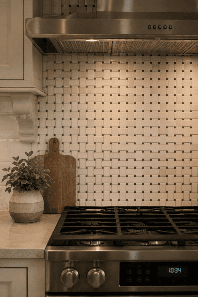
Basketweave alternates pairs of vertical and horizontal tiles to create a woven, textured look. It’s less common than a straight grid, which honestly makes it feel more custom the moment guests walk in.
This layout tends to work best with smaller subway tiles, typically in the 2×4 or 3×6 range. Larger tiles can make the woven effect look chunky instead of elegant.
When Basketweave Makes Sense
- You want texture without adding color
- Your kitchen leans traditional or transitional
- You’re working with a smaller accent area, like behind a range or a small wet bar
12. Mixed Grout Colors for a Two-Tone Effect
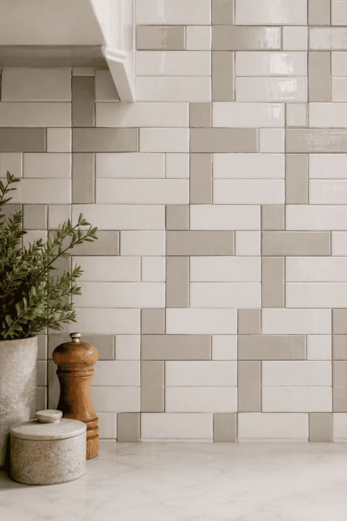
This one’s a little unconventional, but stick with me. Some homeowners are using two grout colors within the same tile layout — say, a darker grout on the horizontal lines and a lighter one on the vertical lines — to create a subtle plaid-like texture.
Is this a lot of extra work for the tile setter? Yes. Does it look genuinely unique? Also yes. I wouldn’t recommend this for your first DIY project, but if you’re hiring a pro who’s up for it, it’s a striking option almost nobody else has.
13. Large-Format Subway Tile for Fewer Grout Lines
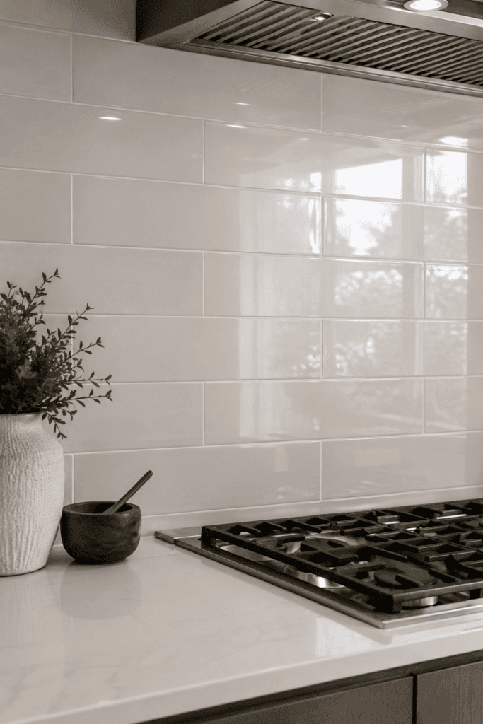
Standard subway tile runs about 3×6 inches, but large-format subway tile in sizes like 4×12 or 4×16 gives you the same rectangular shape with way fewer grout lines overall. Fewer grout lines means less cleaning and a sleeker, more modern look.
I’ll admit I was skeptical of the bigger sizes at first — I figured they’d lose that classic subway charm. They don’t. They just feel a little more grown-up.
14. Full-Height Tile from Counter to Ceiling
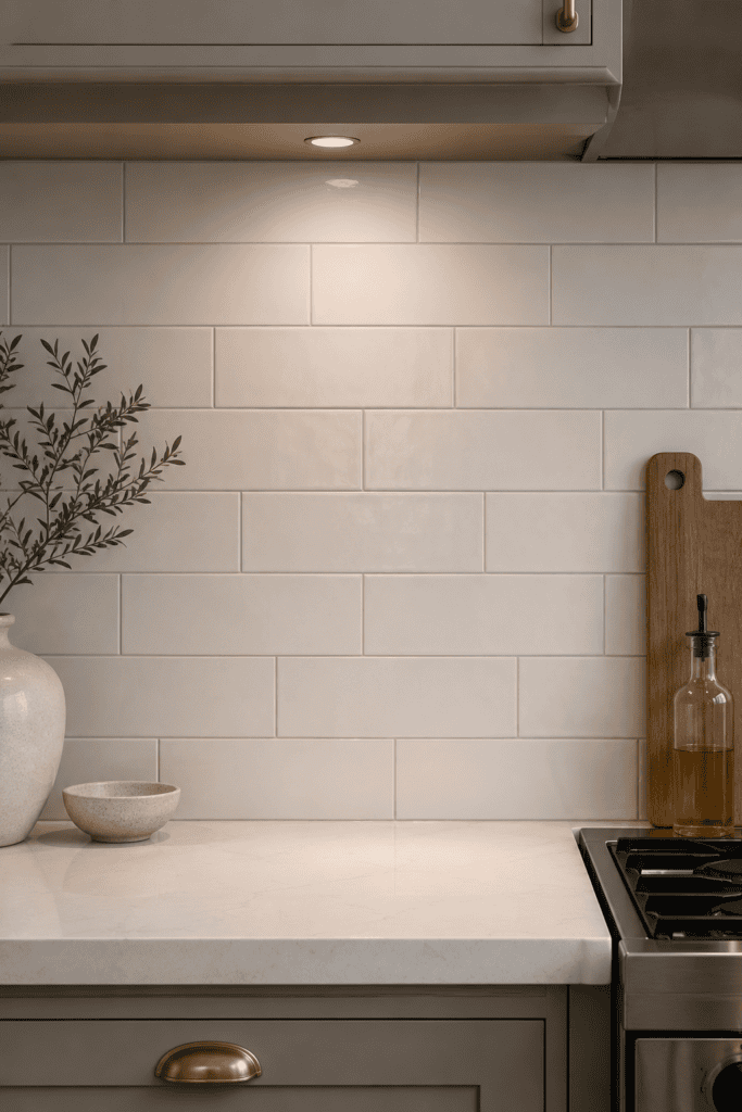
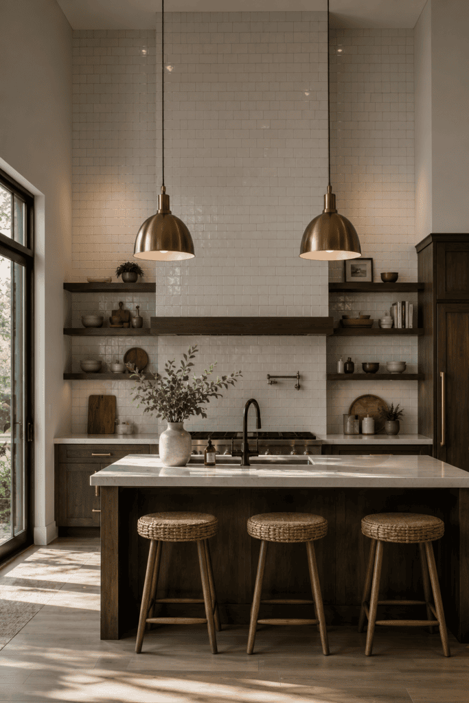
Instead of stopping your subway tile a foot or two above the counter, take it all the way up to the ceiling. This layout choice isn’t about the pattern itself so much as the sheer scale, and it makes a serious visual statement.
Full-height tile costs more, sure, and it takes longer to install. But in kitchens with tall ceilings, it can be the difference between a backsplash that looks like an afterthought and one that looks like a design decision.
Grout Color: The Detail Everyone Skips (and Shouldn’t)
I know grout feels like the boring part. It’s just the stuff between the tiles, right? Wrong. Grout color changes the entire personality of a backsplash more than the tile color does in a lot of cases.
Here’s a quick cheat sheet for picking grout that actually works with your tile:
- Matching grout (same color as tile): seamless, calm, makes a small kitchen feel bigger
- Contrasting grout (opposite end of the color wheel or just darker/lighter): bold, graphic, shows off the layout pattern
- Warm-toned grout (beige, greige): softens white tile so it doesn’t feel clinical
- Colored grout (yes, it exists — blues, greens, even black): a genuine style statement, not for the faint of heart
Also, a practical note: darker grout hides grime way better than white grout does. If you’re someone who cooks with a lot of oil or sauce splatter (guilty), that’s not a small consideration. 🙂
Choosing the Right Layout for Your Kitchen Size
Not every layout suits every kitchen, and that’s IMO the part most articles skip over. A few quick rules of thumb:
- Small galley kitchens — stick with horizontal stack or classic 1/3 offset to avoid visual clutter
- Open-concept kitchens with a big backsplash wall — herringbone or basketweave can handle the extra square footage without looking busy
- Kitchens with lots of upper cabinets — go simple; the classic offset won’t compete with cabinet hardware and trim
- Statement range walls — vertical herringbone or a bold contrasting grout draws the eye exactly where you want it
Final Thoughts
Subway tile has earned its reputation as a kitchen classic, but “classic” doesn’t have to mean “predictable.” Change the grout color, tweak the layout, or scale up the tile size, and you get a completely different feel out of the same basic shape that’s been around for over a hundred years.
My advice? Don’t just copy whatever’s trending on your feed this week. Grab a few sample tiles, hold up some grout swatches under your actual kitchen lighting, and see what genuinely makes you happy to walk into that room every morning. That’s the whole point of a renovation anyway not chasing a trend, but building a kitchen you actually like living in.