
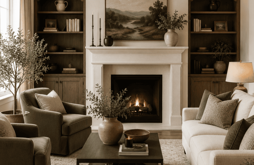
Your living room looks… fine. Just fine. Not “wow, who designed this?” fine, more like “I bought furniture and arranged it in a room” fine. I spent three years redoing my own space (twice, because I made every mistake in this article before I learned better), and I picked up a stack of tricks from designer friends along the way.
Here’s the part that used to drive me nuts: I’d buy nice things, arrange them the “obvious” way, and the room would still feel like a waiting room instead of a home. Turns out the furniture was never the problem. The placement, the lighting, the tiny 5% details were the problem — and nobody tells you about them until you’re already three Pinterest boards deep and questioning your life choices.
So consider this the cheat sheet I wish someone had handed me back then. No fluffy theory, no “consider your aesthetic journey” nonsense — just fifteen concrete moves that actually change how a room feels the second you walk in. Ready to steal them? Let’s get into it.
1. Stop Pushing Every Piece of Furniture Against the Wall
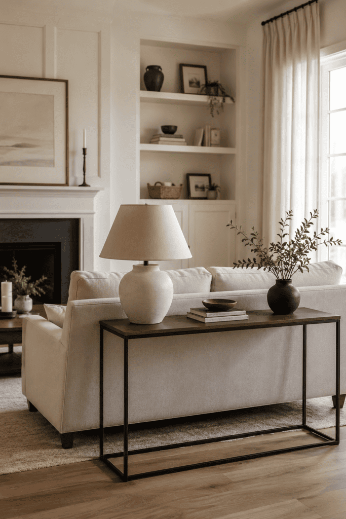
I get it — it feels safer. More space in the middle, right? Wrong. Floating your furniture away from the walls actually makes a room feel bigger and more intentional.
Pull your sofa a few inches off the wall. Add a console table behind it. Suddenly your room has layers instead of a perimeter of chairs staring at each other across a wasteland of empty carpet.
This trick works even in small apartments, which is the part people never believe. You don’t need a mansion to float furniture — you just need six to twelve inches of clearance. Try it with one piece first if you’re skeptical. Pull the sofa out, stand in the doorway, and look at how much more dimension the room suddenly has.
And if you’re worried about “wasting” floor space behind the sofa, that’s exactly where a console table, a plant, or a stack of baskets earns its keep. Empty space isn’t wasted — it’s what makes the furniture feel like it was placed on purpose instead of shoved wherever it fit.
2. The Rug Rule Nobody Told You About
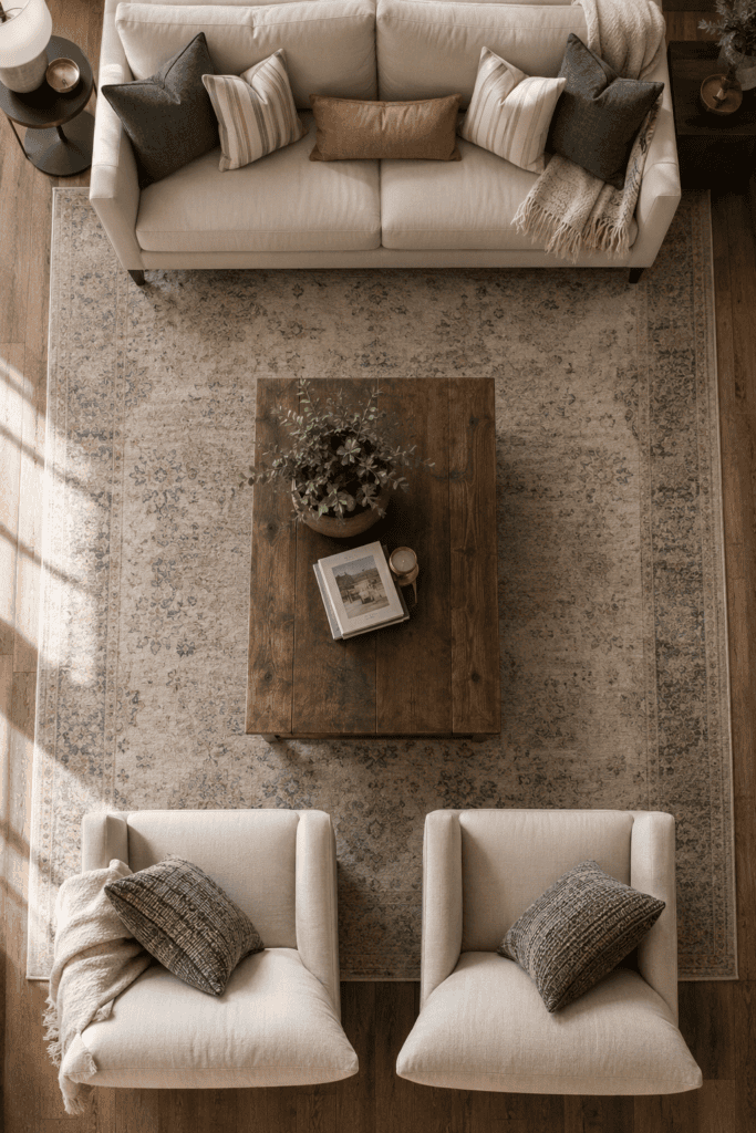
Ever walked into a room and felt like something was “off” but couldn’t name it? IMO it’s almost always the rug. A too-small rug makes furniture look like it’s floating on a raft in the middle of the ocean.
Your rug should be big enough that at least the front legs of your major furniture sit on it. That’s the designer secret. No more postage-stamp rugs under your coffee table.
- Small living room: rug should still touch the front legs of the sofa and chairs
- Large living room: go bigger than you think you need — err on the side of “too much”
- Never, ever center a tiny rug in a huge room and call it done
I made this exact mistake in my first apartment. I bought a rug that seemed “big enough” in the store, got it home, and watched my entire seating area look like it was perched on a floating island in a sea of hardwood. Swapped it for one size up and the whole room instantly felt grounded and pulled together — same furniture, same layout, completely different vibe.
If budget is the issue (and honestly, when isn’t it?), a slightly cheaper large rug almost always beats a slightly nicer small one. Room size wins over rug quality every time.
3. Layer Your Lighting Like You Mean It
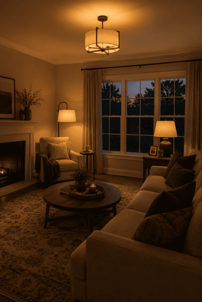
One overhead light is not a lighting plan. It’s a compromise you made because you didn’t know better yet. Real designers use at least three light sources in a living room: ambient, task, and accent.
Think ceiling fixture, a floor lamp by the reading chair, and a couple of table lamps with warm bulbs. This layering creates mood instead of that harsh “operating room” vibe so many living rooms accidentally have.
Why Warm Bulbs Matter
Cool white bulbs make your beautiful living room look like a DMV waiting area. Warm white (2700K–3000K) makes everything — including you — look better. Trust me on this one; I learned it the hard way after wondering why my “cozy” room felt clinical.
Dimmer switches are the other piece of this puzzle nobody mentions enough. Being able to dial your overhead light down for movie night versus cranking it up for cleaning day changes how flexible your room feels throughout the day. It’s a small upgrade, but IMO it’s one of the highest-value changes you can make for the money.
And don’t sleep on lamp placement, either. A floor lamp shoved into a corner does almost nothing. Move it next to a chair where someone would actually read, and it suddenly has a job to do instead of just existing.
4. Odd Numbers Win, Every Time
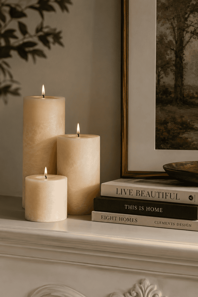
Designers group objects in odd numbers — threes, fives — because the eye finds them more interesting than pairs. Two matching vases on a shelf? Boring. Three candles at varying heights? Suddenly it looks curated.
This applies to throw pillows, decorative objects, and even your gallery wall groupings. Symmetry feels safe. Asymmetry feels designed.
Try it on your bookshelf. Instead of lining books up like soldiers, group them in stacks of three with a small object — a candle, a little sculpture, a framed photo — leaning against the spines. It reads as intentional instead of accidental, and it takes about ninety seconds to rearrange.
The same logic applies to your throw pillow situation. Five pillows in three different (but coordinating) patterns beats four identical ones every time. It sounds like a small thing, but it’s genuinely one of those details that separates a “decorated” room from a “furnished” one.
5. Your Coffee Table Needs Breathing Room
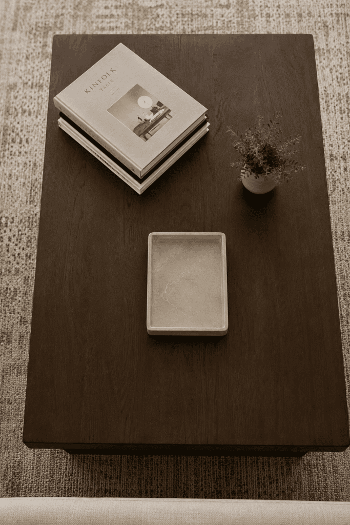
Here’s a rhetorical question for you: why do so many coffee tables look like a clearance sale at a candle store? Less is more. Stick to a stack of books, one tray, and maybe a small plant.
Leave negative space on purpose. A cluttered coffee table reads as chaos, not personality, and it makes the whole room feel smaller than it is.
6. Paint Your Trim a Different Shade Than Your Walls
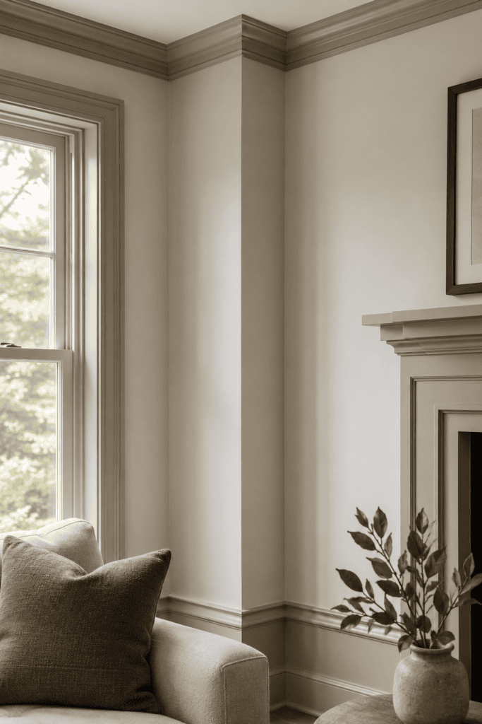
This one’s sneaky but it works every time. Most people paint the trim stark white and call it a day. Designers use a slightly warmer or cooler off-white on trim versus walls to create subtle depth.
- Try trim two shades lighter than your wall color for a soft, cohesive look
- Or go bold and paint trim darker than walls for a moody, architectural feel
- Avoid matching trim and wall exactly — it flattens the whole room visually
7. Curtains Should Almost Touch the Ceiling
This is the single biggest “aha” moment I’ve had in years of obsessing over interiors. Hang your curtain rod as close to the ceiling as possible, not right above the window frame.
Doing this tricks the eye into thinking your ceilings are taller than they actually are. It’s basically a free renovation. Skip this step and your windows will always look a little stunted, no matter how nice the fabric is.
8. Mix Textures Like You’re Building a Sandwich
A room full of smooth surfaces — leather sofa, glass table, hardwood floor — feels cold, even with great color choices. FYI, texture is what makes a space feel touchable and lived-in.
Combine at least four different textures: something woven (rattan, jute), something soft (velvet, wool), something hard (wood, stone), and something with a bit of shine (metal, glass). This is the difference between a showroom and a home.
A Quick Texture Checklist
- A chunky knit throw draped over the sofa arm
- A jute or wool rug underfoot
- A leather or velvet accent chair
- Brass or matte black hardware somewhere in the room
9. Ditch the Matching Furniture Set
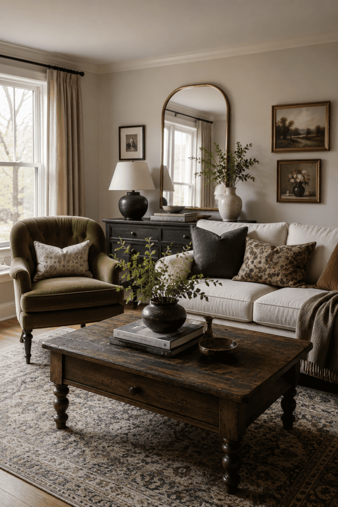
Buying the entire living room set from one showroom is the fastest way to make your space look like a hotel lobby. Designers mix eras, finishes, and sources on purpose.
Pair a vintage-inspired coffee table with a modern sofa. Add a chair that doesn’t “match” but complements the color palette. A room with one source looks staged; a room with many sources looks collected.
Ever notice how the nicest living rooms you’ve seen never look like they came from a single catalog page? That’s not an accident. Designers deliberately source pieces from different eras and price points — a splurge sofa next to a thrifted side table next to a hand-me-down lamp — because the mix is what reads as “collected over time” instead of “purchased in one Saturday afternoon trip.”
You don’t need to hit an estate sale to pull this off, either. Even swapping just one piece from your matching set — say, trading the matching armchair for something with a totally different silhouette — breaks up the showroom effect immediately.
10. Art Should Hang at Eye Level — Not Sofa Level
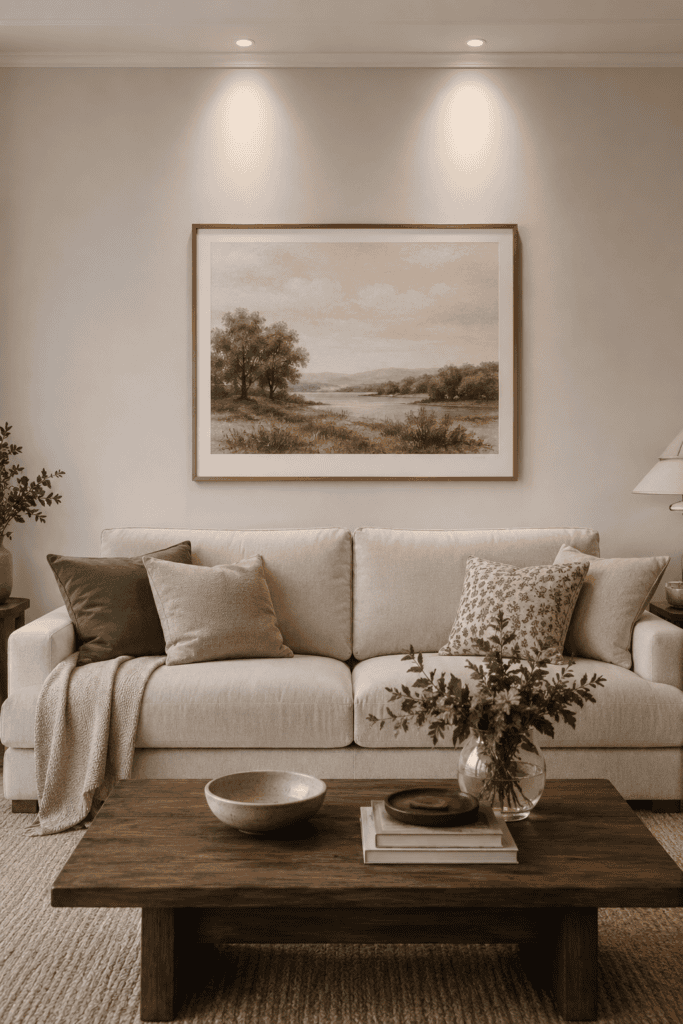
I know, I know, hanging art above the sofa feels intuitive. But most people hang it too high because they’re eyeballing it from the doorway instead of the seating area.
The center of your artwork should sit around 57–60 inches from the floor, or about 6–8 inches above the back of your sofa if it’s hanging there specifically. Any higher and it floats awkwardly; any lower and it looks like an afterthought.
11. Plants Aren’t Optional, They’re Structural
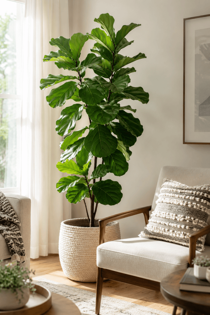
A living room without a single plant always feels a little unfinished — even if you can’t articulate why. Greenery softens hard edges and adds a shot of color that paint and fabric can’t replicate.
Can’t keep anything alive? IMO a high-quality faux fiddle leaf fig beats an empty corner every single time. No judgment here — I’ve killed more plants than I’d like to admit 🙂
12. Create a Focal Point (and Design Around It)
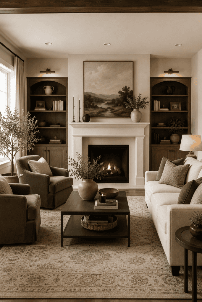
Every great living room has a “hero” element the whole space orbits around — a fireplace, a statement piece of art, a gorgeous window view. Arrange your furniture to acknowledge that focal point, not to face a blank wall or, worse, the TV exclusively.
If your room genuinely has no natural focal point, make one. A bold piece of art or an oversized mirror can absolutely do the job.
I know the TV wants to be the star of the show — it practically demands it — but a room designed entirely around a television screen rarely feels warm. Angle your seating so conversation is still possible without craning necks toward the wall. Your future dinner-party self will thank you.
If you’re stuck picking a focal point from scratch, oversized mirrors are the easy win. They bounce light around the room, make the space feel bigger, and give your eye somewhere intentional to land the second you walk in.
13. Don’t Be Afraid of a Dark Wall
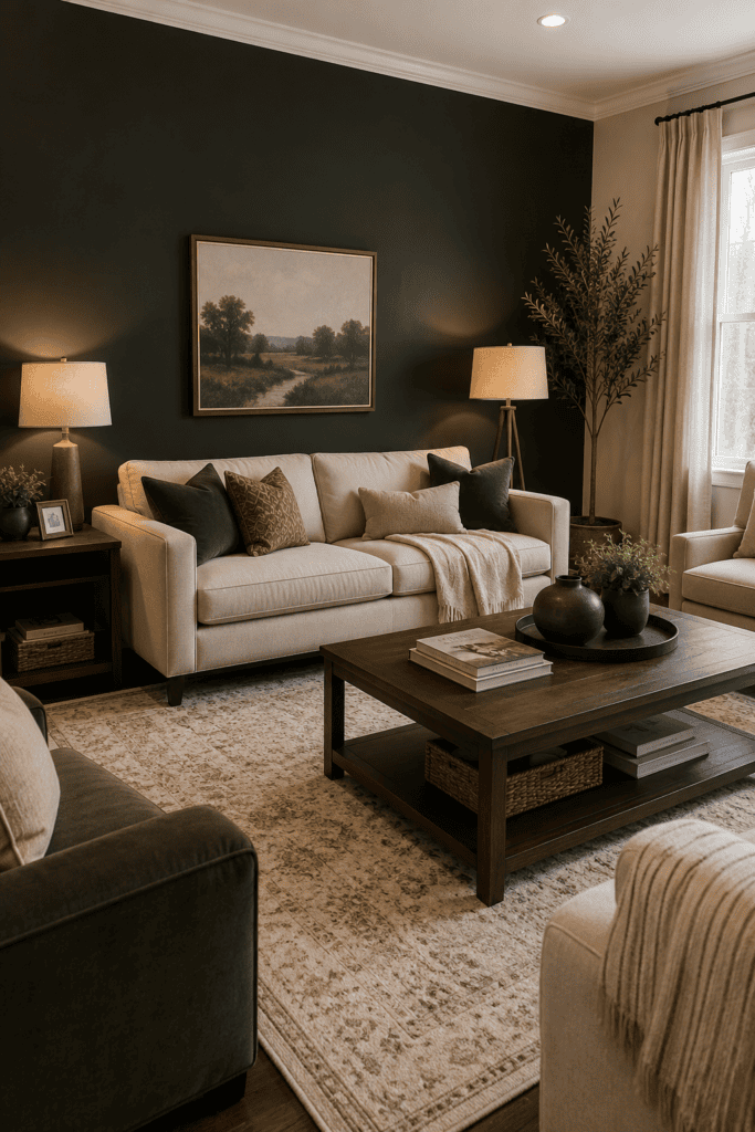
Painting one wall a deep, saturated color — forest green, navy, charcoal — is one of those designer moves that terrifies people until they actually try it. Dark walls add drama and make your other design choices pop harder.
- Best candidates: the wall behind your sofa or the wall with your fireplace
- Pair dark walls with warm lighting so the room doesn’t feel like a cave
- Keep at least one lighter surface (ceiling, trim, or rug) to balance the weight
14. Scale Matters More Than Style
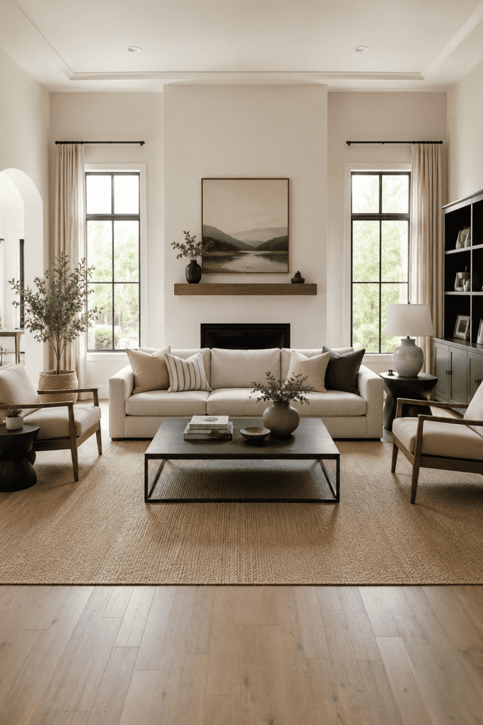
You can have the most beautiful furniture on earth and still end up with a room that feels wrong if the scale is off. A tiny loveseat in a huge room looks lost. An oversized sectional in a small room feels like it’s eating the space alive.
Measure your room before you fall in love with anything. Ever bought a couch online because it looked perfect in the photo, only to have it swallow your entire living room whole? Yeah. Ask me how I know.
15. Leave Room for Imperfection
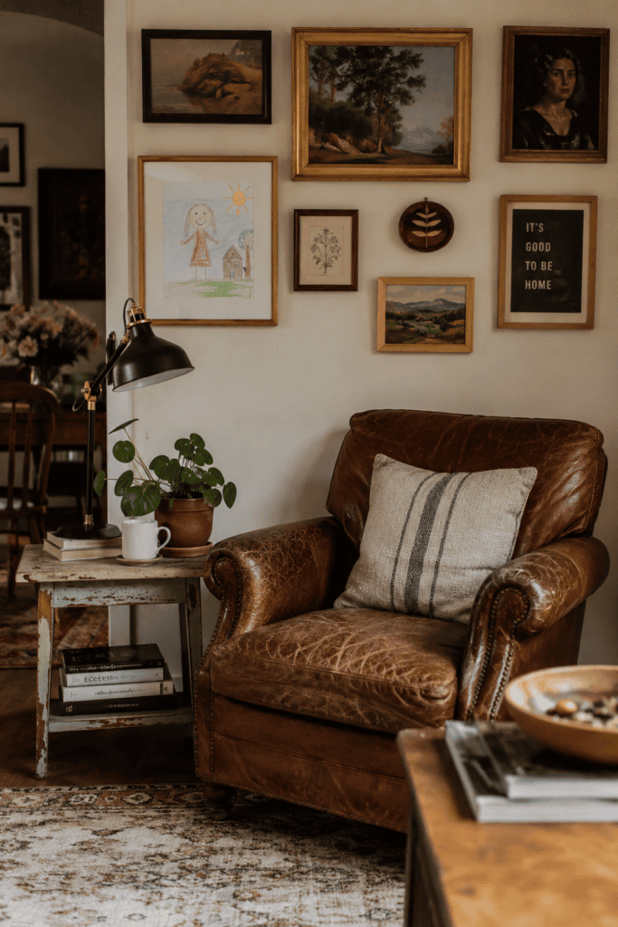
Here’s the secret nobody puts in the glossy magazine spreads: the most “designed” rooms usually have one slightly imperfect, deeply personal element in them. A worn leather chair. A quirky flea market find. A gallery wall with a kid’s drawing mixed into the frames.
Perfectly matched, catalog-perfect rooms often feel the least like home. The tiny imperfections are what make a space feel like real people actually live there — because they do.
Bonus: Sofas Should Be Comfortable First, Photogenic Second
Quick gut check: have you ever sat on a “designer” sofa and immediately understood why nobody actually sits on it? Style-first sofas are everywhere on social media, and they photograph beautifully. They’re also, frequently, miserable to actually live on.
Test any sofa the way you’ll actually use it — slouched, feet up, in the position you’ll be in during a three-hour movie marathon, not perched politely on the edge like you’re at a job interview. Deep seats, a medium-firm cushion, and decent back support beat a stunning silhouette that leaves your lower back filing a formal complaint.
- Sit for at least ten minutes in the store if you can — not thirty seconds
- Check the seat depth against your own height; taller people often need deeper seats
- Down-blend cushions look amazing in photos but need constant fluffing in real life
A gorgeous sofa nobody wants to sit on isn’t a design win. It’s an expensive decoration.
Wrapping It Up
None of these secrets require a full renovation or a designer’s budget. Float your furniture, size your rug correctly, layer your lighting, and let a few “imperfect” pieces sneak in. Small, intentional shifts add up to a living room that finally looks like the one in your head.
The best part? You don’t have to tackle all fifteen this weekend. Pick two or three that jump out at you, make those changes, and live with them for a week. You’ll notice the difference before you even get to the rest of the list — and honestly, that momentum is what gets most people to actually finish the room instead of abandoning it halfway through, like that one accent wall you started painting last spring and never finished (no judgment, we’ve all been there).