
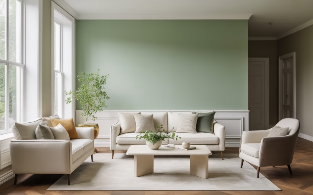
Your walls might not be talking, but they’re definitely saying something. If your home feels flat, dull, or a little too “builder beige,” a fresh coat of paint can fix that fast. I’ve seen rooms go from tired to seriously beautiful with nothing more than the right color choice, and honestly, it still feels a bit like cheating.
Paint changes everything. It shifts the mood, brightens dark corners, and makes old spaces feel new again without demanding a full renovation or your entire savings account. So if you’ve stared at your walls lately and thought, “Yeah… we need help,” you’re in the right place.
Why Cool Paint Colors Work So Well
Cool paint colors create a calm, clean, and airy feel that works in almost any home. They usually sit in the blue, green, gray, and soft lavender families, and they tend to make rooms feel larger and more relaxing. That matters a lot when you want a refreshing home makeover instead of a space that feels heavy or chaotic.
I reach for cool tones when I want a room to breathe a little. Warm colors can feel cozy, sure, but cool shades often look more polished and modern. Ever walked into a room and instantly felt your shoulders drop? That’s the power of the right cool paint color.
What Makes a Paint Color Feel “Cool”?
A cool color carries blue, green, or gray undertones. Even some whites and neutrals lean cool, and those subtle undertones make a huge difference once the paint lands on the wall.
Here’s the quick version:
- Blue undertones feel crisp and serene.
- Green undertones feel fresh and natural.
- Gray undertones feel modern and balanced.
- Lavender undertones feel soft and slightly unexpected.
If you ignore undertones, paint can betray you in daylight. One minute you think you picked a soft gray, and the next minute your wall looks suspiciously purple. Fun times.
How to Choose the Right Cool Paint Color
Before you commit to a color, look at your lighting. Natural light, warm bulbs, cool LEDs, and even flooring can change how paint looks. I’ve tested colors that looked dreamy on a sample card and weirdly icy on an actual wall, so yes, samples matter.
Keep these things in mind before you paint:
- North-facing rooms often make colors look cooler and darker.
- South-facing rooms usually bring out warmth and soften cool shades.
- Small rooms benefit from light cool colors that open up the space.
- Large rooms can handle deeper cool tones without feeling cramped.
- Existing decor should guide your choice, especially rugs, cabinets, and upholstery.
My Go-To Rule
I always test paint in at least two spots. I check it in the morning, in the afternoon, and at night like a mildly obsessed person. IMO, that tiny bit of extra effort saves you from repainting an entire room while questioning your life choices.
1. Icy Blue
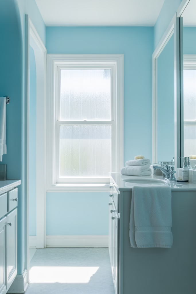
Icy blue feels crisp, airy, and clean without looking too childish. It brings that fresh-sky energy into a room and works especially well in bedrooms, bathrooms, and laundry rooms. If you want a color that feels peaceful but still has personality, this one delivers.
I like icy blue in smaller spaces because it reflects light beautifully. It can make a tight room feel less boxed in and more open. Ever wanted your bathroom to feel a little more spa-like and a little less “get in, get out”? This shade helps.
Best Ways to Use Icy Blue
- Pair it with bright white trim for a clean, sharp contrast.
- Add light wood tones to keep the room warm and welcoming.
- Use silver or chrome accents for a crisp, modern finish.
2. Soft Sage Green
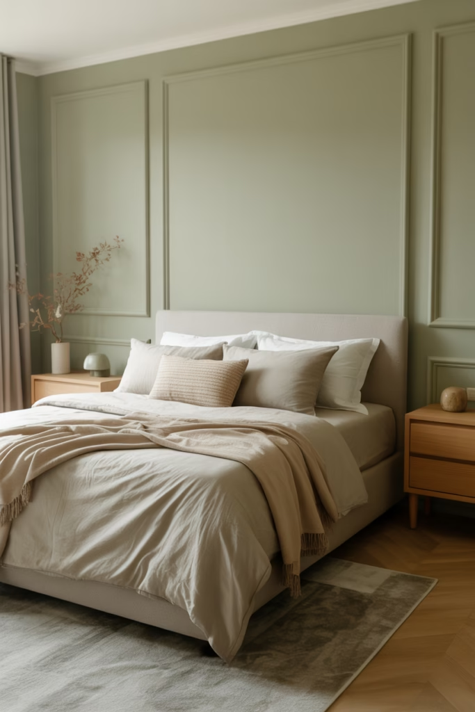
Soft sage green has become wildly popular, and for good reason. It feels earthy, relaxed, and quietly stylish without trying too hard. In my opinion, it’s one of the easiest cool paint colors for a home makeover because it plays nicely with almost everything.
This shade works in kitchens, bedrooms, entryways, and even cabinets. It gives you color without shouting for attention. That’s rare, and honestly, kind of impressive.
Why People Love Sage
- It feels natural and calming.
- It pairs well with neutrals like beige, cream, white, and gray.
- It looks timeless instead of trendy in a “why did we do this?” way.
3. Misty Gray
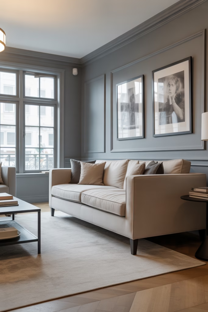
Misty gray gives you that clean, modern look without making the room feel cold or gloomy. It sits right in the sweet spot between soft and sophisticated. If you want a safe choice that still feels fresh, misty gray rarely lets you down.
I’ve seen misty gray work beautifully in living rooms and hallways because it creates a subtle backdrop for everything else. Art pops more. Furniture looks more intentional. Even clutter somehow looks slightly less offensive, which feels like a small miracle.
Where Misty Gray Works Best
- Living rooms
- Hallways
- Home offices
- Open-concept spaces
4. Pale Aqua
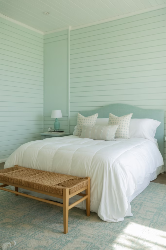
Pale aqua brings a breezy, cheerful feel without crossing into beach-house cliché territory. It mixes blue and green in a way that feels light, cool, and uplifting. If you want color but don’t want anything too serious, pale aqua strikes a nice balance.
I love this one in bathrooms and guest rooms. It feels welcoming and a little playful, but still grown-up. FYI, it also looks fantastic with white tile and woven textures 🙂
5. Dusty Blue
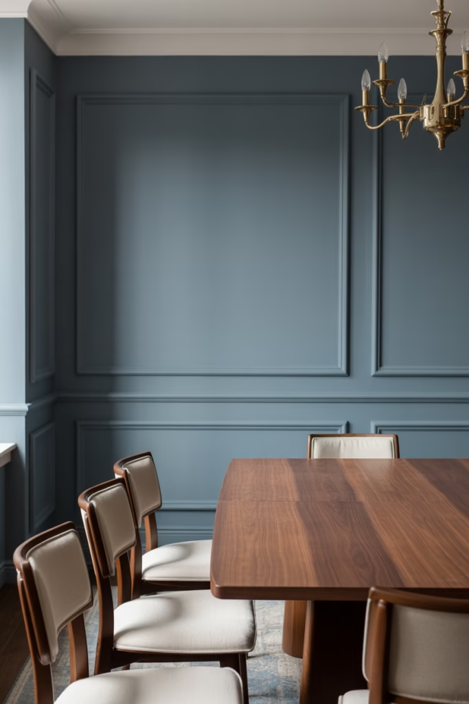
Dusty blue looks richer and moodier than icy blue, but it still feels relaxed. It has a soft gray base that keeps it from feeling too bright or juvenile. This shade works well when you want a space to feel cozy, grounded, and elegant all at once.
It shines in bedrooms, dining rooms, and built-in cabinetry. I especially like it when paired with brass hardware or warm wood furniture. Want a room that looks stylish without screaming for attention? Dusty blue gets it right.
Style Pairings for Dusty Blue
- Brass accents for warmth
- Cream textiles for softness
- Walnut or oak wood for depth
- Matte black details for a modern edge
6. Cool White
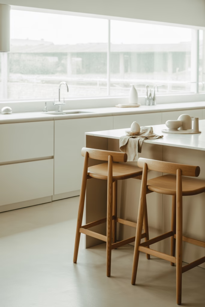
Cool white sounds basic, but it’s anything but boring when you choose the right one. It creates a crisp, fresh foundation and makes rooms feel brighter and cleaner. The trick lies in picking a white with subtle cool undertones instead of a sterile one that feels like a hospital hallway.
I use cool white when I want flexibility. It lets furniture, artwork, and decor take center stage while still making the whole room feel polished. Sometimes simple wins, and no, that doesn’t make it lazy.
How to Keep Cool White from Feeling Stark
- Layer in wood, linen, and textured fabrics
- Choose soft lighting instead of harsh blue bulbs
- Add plants or greenery for warmth and life
7. Seafoam Green
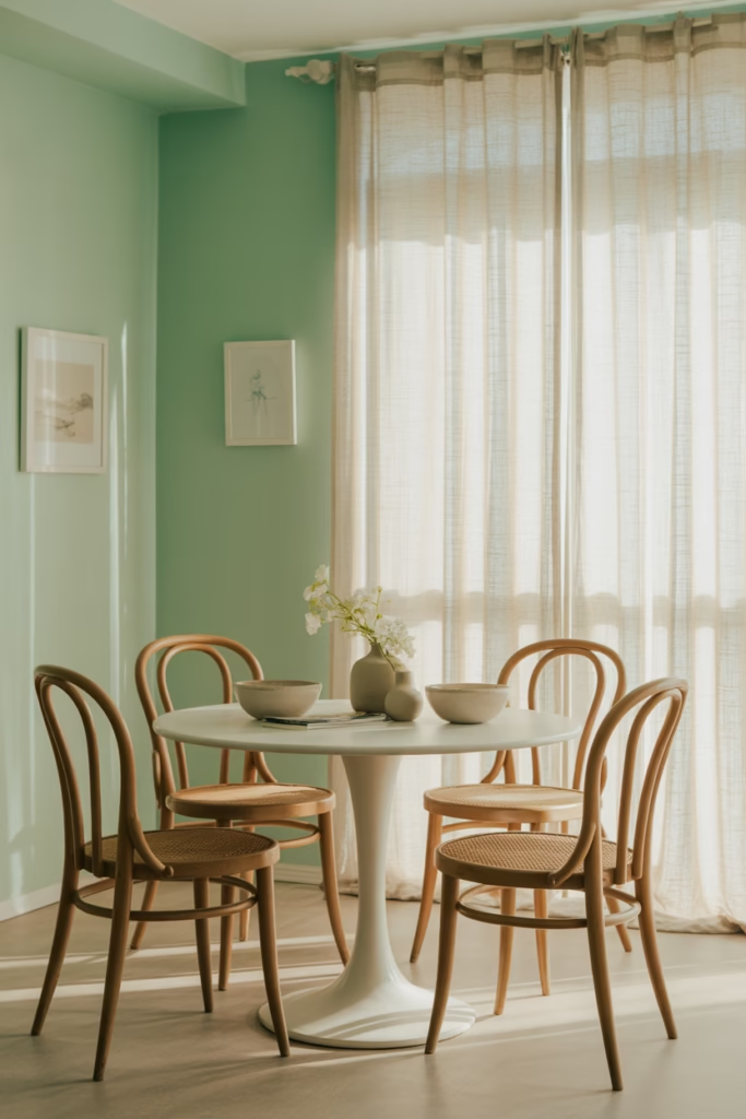
Seafoam green feels lively, breezy, and slightly retro in the best possible way. It brings softness and color to a space without overwhelming it. If you want your room to feel fresh and cheerful, this shade does the heavy lifting.
I’d use seafoam green in a bathroom, breakfast nook, or kids’ room that still needs to look stylish. It feels playful, but it doesn’t lose its cool. Ever noticed how some colors brighten a room instantly? Seafoam green absolutely does that.
8. Smoky Lavender
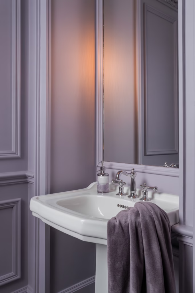
Smoky lavender sounds risky, but hear me out. This shade feels soft, muted, and elegant when it leans gray instead of sugary purple. It gives a room personality while keeping the overall vibe calm and refined.
I like smoky lavender in bedrooms and powder rooms where you can have a little fun. It looks especially pretty with white trim, velvet textures, and brushed nickel finishes. If plain gray feels too safe, this shade offers a more interesting option without turning your house into a candy shop.
Why Smoky Lavender Feels Fresh
- It softens a room without washing it out.
- It adds subtle color while staying sophisticated.
- It works beautifully with gray and silver accents.
9. Blue-Gray
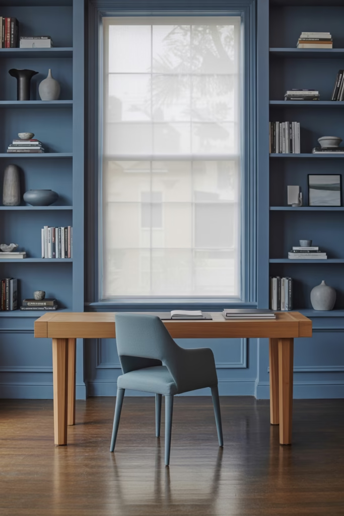
Blue-gray combines the best parts of two favorite cool tones. It has the calmness of blue and the flexibility of gray, which makes it incredibly easy to use throughout the house. If you want one of the most versatile cool paint colors for a refreshing home makeover, start here.
This shade works in bedrooms, living rooms, offices, and exterior accents too. It shifts beautifully in different light, which keeps it interesting throughout the day. That little bit of movement makes a room feel more layered and alive.
10. Mint Green
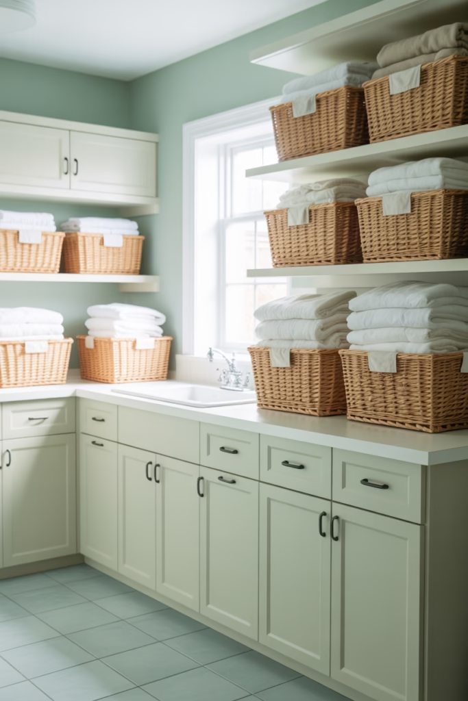
Mint green brings a clean, upbeat energy that feels fresh without looking too sugary. When you choose a muted version, it feels chic and airy instead of overly sweet. That distinction matters a lot, unless you want your walls to resemble chewing gum :/
I like mint green in kitchens, laundry rooms, and small bathrooms. It reflects light well and instantly wakes up the space. Pair it with simple white finishes, and it looks charming without trying too hard.
Best Decor Matches for Mint Green
- White cabinets
- Light gray countertops
- Natural baskets
- Simple black fixtures
11. Charcoal Blue
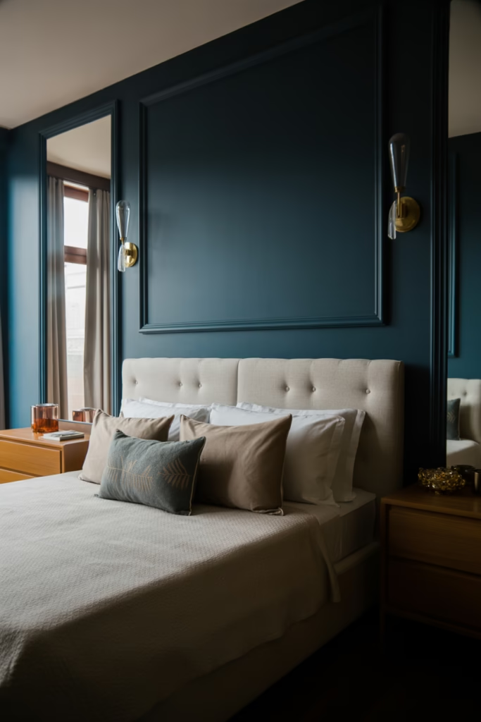
Charcoal blue gives you a deeper, cooler look that still feels polished and refreshing. It’s bold, but it doesn’t feel loud. If you want to create a statement wall or add drama to a dining room, library, or bedroom, this shade can look incredible.
I’d use charcoal blue in a room with decent natural light. In bright spaces, it feels rich and sophisticated rather than heavy. Ever wanted one wall to do all the work while the rest of the room just nods in approval? This is that color.
12. Silver Gray
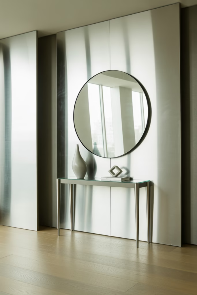
Silver gray has a sleek, airy quality that suits modern homes beautifully. It reflects light well and creates a clean backdrop for almost any decor style. If misty gray feels too soft, silver gray gives you a slightly crisper finish.
This shade works especially well in home offices, kitchens, and entryways. It looks polished without feeling fussy. I also love it with glass, chrome, and minimal decor because it enhances that fresh, uncluttered look.
13. Soft Teal
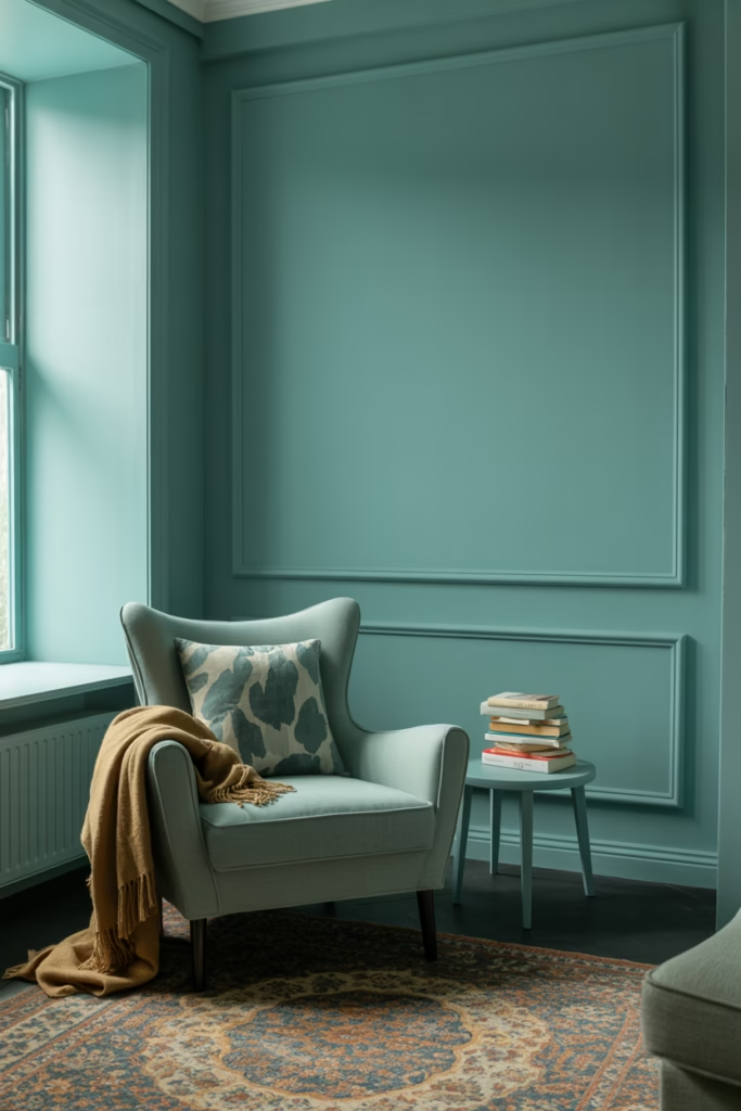
Soft teal gives you that perfect in-between mix of blue and green with a little more punch than pale aqua. It feels cool, refreshing, and full of personality. If you want a paint color that looks creative but still easy to live with, soft teal deserves a serious look.
I’ve always liked soft teal for accent walls, furniture makeovers, and powder rooms. It wakes up a dull space fast. Why settle for bland when one smart color choice can make the whole room feel more intentional?
When Soft Teal Works Best
- Accent walls
- Guest bathrooms
- Reading nooks
- Front doors
- Painted furniture
Best Cool Paint Colors by Room
Not every shade works equally well in every space. Some colors relax a bedroom, while others brighten a kitchen or make a bathroom feel cleaner. If you want a shortcut, start here.
Bedrooms
The best cool paint colors for bedrooms usually feel soft and calming.
Top picks:
- Icy blue
- Dusty blue
- Soft sage green
- Smoky lavender
Living Rooms
Living rooms need balance. They should feel welcoming, stylish, and easy to decorate.
Top picks:
- Misty gray
- Blue-gray
- Silver gray
- Soft teal for an accent wall
Kitchens
Kitchens benefit from cool colors that feel fresh and clean.
Top picks:
- Soft sage green
- Mint green
- Cool white
- Pale aqua
Bathrooms
Bathrooms shine with shades that feel light and crisp.
Top picks:
- Pale aqua
- Icy blue
- Seafoam green
- Cool white
Tips for Making Cool Paint Colors Look Better
Even the best paint color can flop if the rest of the room fights it. Paint doesn’t work alone, and yes, that sounds dramatic, but it’s true. A few smart styling choices make a huge difference.
Use Contrast
Cool colors look better when you balance them with warmth. Add wood, woven textures, brass, cream, or soft beige to stop the room from feeling too icy.
Watch the Lighting
Always test paint in your actual room. Store lighting lies. It flatters every paint chip like an overenthusiastic friend who refuses to be honest.
Don’t Ignore Trim Color
Trim changes everything. A crisp white trim can sharpen a cool wall color, while a softer white can create a gentler, more blended look.
Think About Mood First
Ask yourself what you want the room to feel like.
- Calm and sleepy? Choose dusty blue or soft sage.
- Clean and bright? Try cool white or silver gray.
- Fresh and cheerful? Go with pale aqua or mint green.
- Rich and moody? Pick charcoal blue or blue-gray.
Common Mistakes to Avoid
A refreshing home makeover sounds easy, but a few simple mistakes can ruin the effect. Luckily, you can avoid most of them with a little planning.
Skipping Samples
Never choose paint from the tiny chip alone. Paint a sample on the wall and live with it for a day or two. You’ll thank yourself later.
Choosing a Color That’s Too Cold
Some cool colors can feel harsh if the room lacks natural light. Balance them with warm decor, softer whites, or richer textures.
Forgetting the Undertones
Gray can turn blue. White can turn pink. Green can suddenly look muddy. Undertones run the show, so always compare your paint color against flooring, countertops, and furniture.
Final Thoughts on Cool Paint Colors
The best cool paint colors don’t just make a room look better. They make your home feel lighter, calmer, and more pulled together. Whether you love the softness of sage green, the crispness of icy blue, or the depth of charcoal blue, the right choice can completely refresh your space without a massive renovation.
If I had to pick the most versatile winners, I’d go with soft sage green, blue-gray, and cool white. They work in so many rooms, and they stay stylish even when trends shift. So grab a few samples, test them on your walls, and trust your eye. Your future self will appreciate the upgrade and your walls will finally stop looking so tired.