
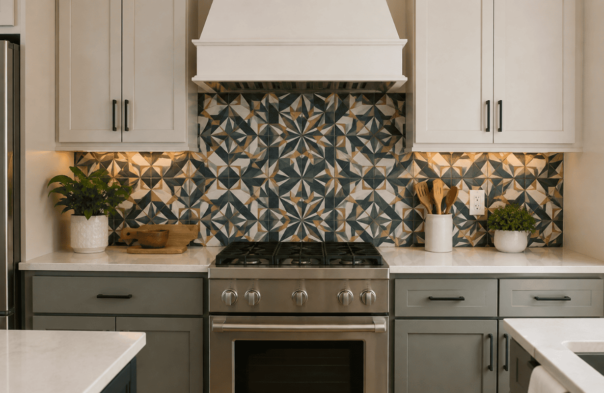
Choosing a kitchen backsplash sounds easy until you actually start looking. One minute you’re considering simple white tile, and 20 minutes later you’re comparing handmade zellige, marble slabs, geometric mosaics, glossy green subway tile, and something called “antique copper penny tile.”
The problem isn’t finding something beautiful. There are thousands of beautiful options.
The hard part is figuring out how to choose a kitchen backsplash that won’t date quickly, especially when you’re spending real money on materials and installation.
Unlike bar stools or pendant lights, a backsplash isn’t something most of us want to replace every few years. Removing tile is messy, labor-intensive, and usually leads to additional wall repairs.
Here’s the thing: timeless doesn’t have to mean boring. You can absolutely create a kitchen with personality without choosing a backsplash that immediately announces the year it was installed.
The trick is knowing where to keep things quiet, where to add character, and which design decisions tend to age better than others.
Why Some Kitchen Backsplashes Look Dated So Quickly
Most people get this wrong because they focus entirely on whether they like the tile today.
That matters, obviously. But it shouldn’t be your only test.
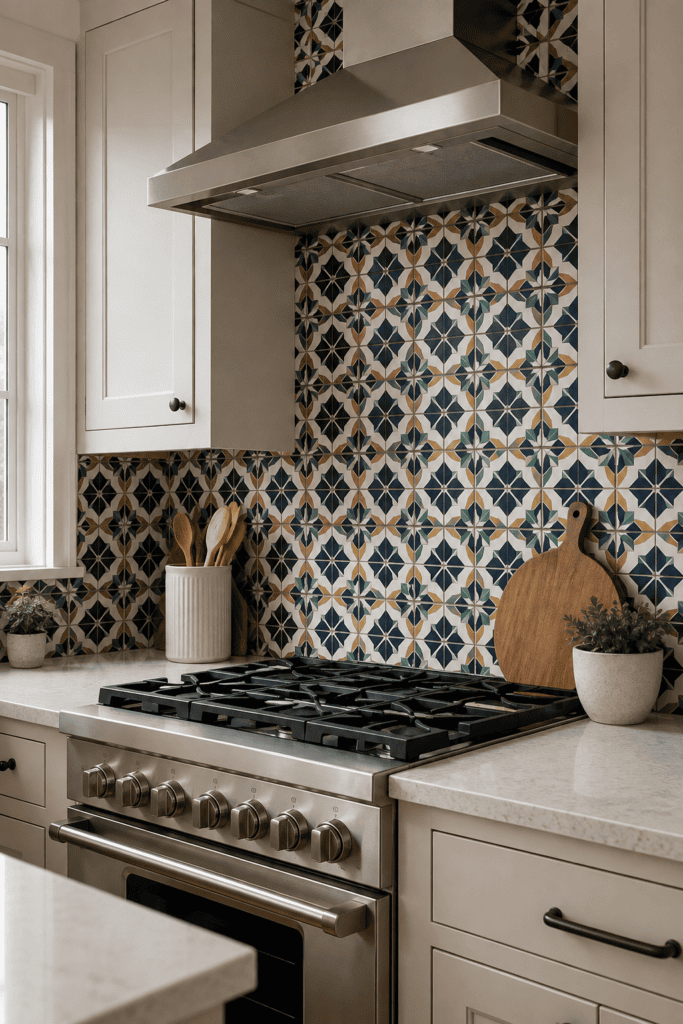
A backsplash tends to date quickly when several very specific design trends are combined at once.
Imagine a dramatic geometric tile with contrasting grout, a trendy color, an unusual layout, and a decorative border. Individually, those choices might work. Put all four together and suddenly the backsplash becomes a timestamp.
Trend stacking is usually the real problem
You don’t necessarily need to avoid trends altogether.
Instead, avoid stacking too many trends onto one permanent surface.
For example, soft sage green tile could work beautifully for years. But sage green tile combined with an exaggerated scalloped shape, high-contrast grout, and a complicated pattern has a much greater chance of feeling outdated sooner.
If you love a trend, choose one trendy characteristic and let the rest of the backsplash stay relatively simple.
That gives the kitchen personality without making the entire design dependent on what’s popular right now.
Start With the Kitchen, Not the Tile
Before browsing backsplash ideas, look carefully at what is already happening in your kitchen.
Your backsplash is supporting cast.
Your cabinets, countertops, flooring, and major architectural elements should usually do most of the visual heavy lifting.
Identify your strongest existing feature
Ask yourself what immediately catches your eye.
Maybe you have heavily veined quartz countertops. Maybe your cabinets are deep navy. Perhaps you’ve chosen warm walnut cabinetry or a dramatic range hood.
The stronger those features are, the quieter I’d make the backsplash.
A kitchen with creamy cabinets and simple butcher-block counters can comfortably handle a slightly more interesting tile.
A kitchen with bold marble-look counters, statement lighting, dark cabinetry, and brass hardware probably doesn’t need another attention-grabbing surface.
What actually works is creating hierarchy.
Not every surface needs to be interesting.
Choose Materials That Have Already Proven Themselves
One of my favorite ways to judge whether something might age well is incredibly simple:
Has some version of this material already looked good for decades?
If the answer is yes, you’re starting from a much safer place.
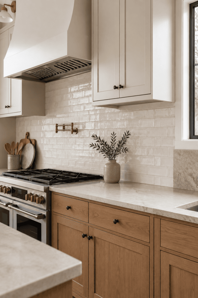
Ceramic and subway tile
There’s a reason rectangular ceramic tile keeps appearing in kitchens.
It’s simple, practical, widely available, and adaptable to different decorating styles.
You can make it feel more interesting through texture instead of choosing an unusual shape.
For example, a slightly irregular off-white ceramic subway tile has considerably more character than perfectly flat builder-grade white tile while still being easy to live with.
Natural stone
Marble, limestone, travertine, and other natural stones aren’t tied to one particular decade.
They’ve been used in homes for centuries.
That doesn’t automatically mean every stone backsplash will look timeless, though.
A highly dramatic stone combined with equally dramatic countertops can overwhelm a kitchen.
If you’re using natural stone, pay attention to the overall amount of movement and contrast.
Handmade-look tile
Subtle imperfections can actually help a backsplash age better.
Tiles with slight variation in glaze, edges, or surface texture create depth without relying on an obvious pattern.
You notice the material rather than the trend.
That’s a big difference.
Be Careful With Color Without Being Afraid of It
“Choose white because it’s timeless” is advice I think gets repeated far too often.
White can absolutely date.
A cold blue-white backsplash against warm cream cabinets can look wrong immediately, regardless of how classic the individual tile supposedly is.
The better approach is choosing a color that works with your kitchen’s undertones.
Match the temperature of the room
If your countertops contain creamy beige, warm gray, brown, or gold, look toward warmer backsplash colors such as:
- Soft ivory
- Warm white
- Mushroom
- Muted beige
- Gentle taupe
- Earthy green
If your kitchen has cooler white, charcoal, gray, or blue undertones, cooler tile colors may make more sense.
Bring actual samples home before deciding.
Seriously.
A tile that looks perfectly neutral under showroom lighting can suddenly appear yellow, gray, pink, or blue next to your cabinets.
Place samples against the wall and check them during morning, afternoon, and evening light.
Keep the Pattern Simpler Than You Think You Need
Pattern is probably where I’d be most conservative if longevity is your priority.
That doesn’t mean everything needs to be installed in a basic horizontal brick pattern.
Herringbone, vertical stacking, offset layouts, and other arrangements can work beautifully.
But the more unusual the combination of tile shape + color + layout + grout, the more recognizable the design becomes as belonging to a particular trend cycle.
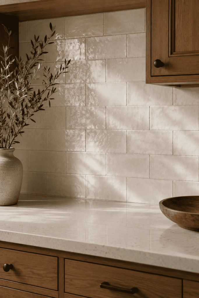
Let texture replace complicated pattern
Instead of creating interest through an elaborate mosaic, consider creating it through material.
A simple rectangular tile with a softly rippled surface can change throughout the day as light hits it.
A handmade-look glazed tile naturally varies from piece to piece.
A lightly textured stone brings its own movement.
You still get visual interest, but the backsplash doesn’t scream for attention.
Pay More Attention to Grout Than You Think
Grout sounds like a tiny decision.
Visually, it isn’t.
High-contrast grout outlines every single tile, which makes the pattern much more prominent.
Sometimes that’s exactly what you want.
But if your goal is a backsplash that quietly survives changing kitchen trends, I’d usually keep grout relatively close to the tile color.
White tile with dark charcoal grout, for example, creates a strong graphic grid. White tile with soft warm-gray grout reads much more like one continuous surface.
There’s also a practical consideration.
Pure white grout behind a heavily used stove can become annoying to maintain. A slightly warmer off-white or light gray can be more forgiving while still looking subtle.
Think Twice About Matching the Countertop Exactly
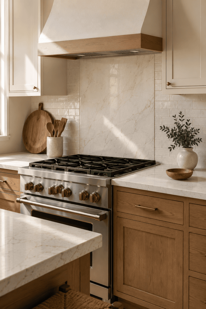
Running countertop material up the wall can create a gorgeous, streamlined kitchen.
But there’s a difference between using a restrained stone slab and creating an explosion of veining across every surface.
If your countertop already has strong movement, continuing the exact same dramatic pattern vertically may dominate the entire room.
One solution is using the slab only behind the range while keeping quieter tile elsewhere.
Another is choosing a backsplash tile that picks up one of the softer background colors from the countertop.
You’re creating a relationship rather than an exact match.
That tends to feel much more natural.
Use the Sample Test Before You Commit
Never choose backsplash tile from an online photo alone.
You need to see the actual material inside your kitchen.
Once you’ve narrowed your options down, order several samples and place them vertically against the backsplash area.
Then leave them there.
Not for ten minutes.
Give yourself several days.
Check each sample against four things
Look at how it works with your:
Cabinets: Does it make their color look better or worse?
Countertops: Is it competing with the pattern?
Flooring: Are you accidentally introducing another undertone?
Lighting: Does the color change dramatically at night?
This simple step prevents a surprising number of expensive mistakes.
You may discover that the tile you loved online looks busy next to your countertop, while the supposedly “boring” second choice makes the entire kitchen look more expensive and cohesive.
That’s useful information.
Put Personality in Places That Are Easier to Change
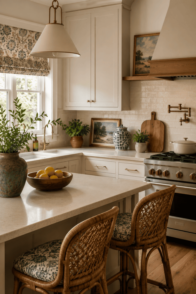
This is probably the biggest principle behind choosing a kitchen backsplash that won’t date quickly.
Don’t ask one permanent surface to provide all of your kitchen’s personality.
You have plenty of easier places to experiment.
Paint the walls. Choose interesting counter stools. Hang artwork. Bring in colorful pottery. Change pendant lights. Add vintage accessories. Use patterned Roman shades.
Those things can completely change the mood of your kitchen without requiring a demolition hammer.
Think of the backsplash as the foundation rather than the decoration.
That doesn’t mean it needs to disappear. A gorgeous handmade ivory tile, warm stone backsplash, or muted green ceramic tile can still become an important part of the room.
It simply doesn’t need to carry every design idea.
A Simple Formula for Choosing a Timeless Kitchen Backsplash
If you’re overwhelmed by options, simplify the decision.
Start with your countertop.
Pull one quiet color or undertone from it and use that as the starting point for your backsplash.
Next, decide where you want the interest to come from: color, texture, material, or layout.
Choose one or maybe two.
Not all four.
For example, you might choose a simple warm-white rectangular tile but introduce character through an irregular handmade texture.
Or choose muted green ceramic tile but keep the shape, layout, and grout understated.
Then ask yourself one final question:
Would I still like this material if I stopped seeing it on Pinterest tomorrow?
That’s a surprisingly good filter.
Conclusion
Learning how to choose a kitchen backsplash that won’t date quickly isn’t really about finding one magical “timeless” tile.
It’s about restraint.
Choose materials with a history of looking good, pay attention to your kitchen’s existing undertones, avoid stacking several trends together, and let permanent finishes support rather than compete with each other.